Concept:
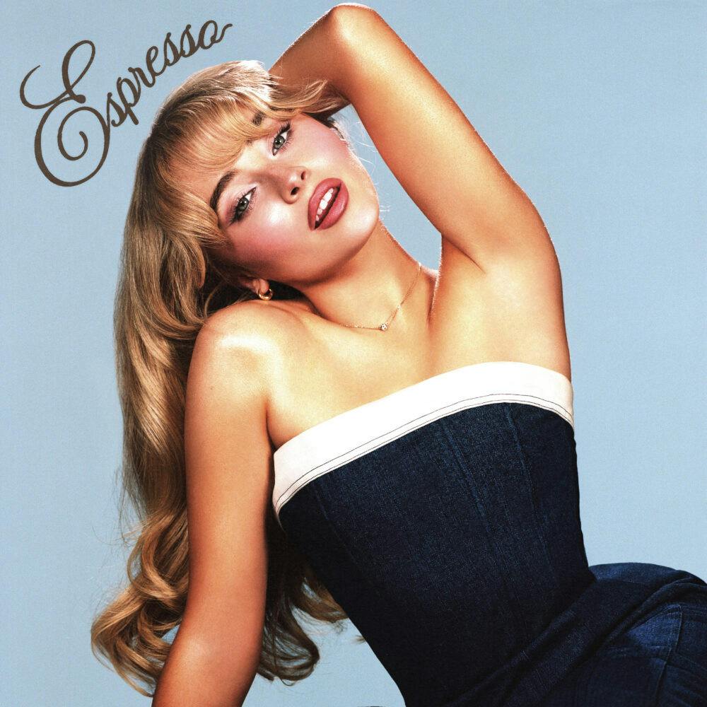
In this project, I visualized the frequency of Google searches for the word “espresso” since the beginning of 2024. My inspiration stemmed from the popularity of Sabrina Carpenter’s song “Espresso,” which has captured attention and sparked interest since its release early this year. This trend led me to hypothesize that the search volume for “espresso” would similarly experience a notable increase.

To explore this hypothesis, I aimed to create a visual representation that illustrates the correlation between the song’s popularity and the search frequency of the term “espresso.” I envisioned an effect that mimics espresso pouring out of a teacup, with the volume of the pour symbolizing the number of searches. This is accomplished using circles: the larger the circle, the greater the volume of searches.
Highlight:
A key highlight of this project was my attempt to ensure that the color of the circles corresponded to the volume of searches for “espresso.” I aimed to create a visual gradient where the shades of brown varied in darkness or lightness based on the search frequency. To achieve this, I mapped the espresso values to a color variable, allowing me to adjust the fill color of the circles by assigning this color variable as an argument to the fill().
  // Color based on espressoValue with brown tones
let colorVal = map(dataPoint.espressoValue, 0, maxValue(), 10, 120); // Adjust the color range for darker tones
fill(colorVal, 40, 20); // More muted brown tones
noStroke();
Finding the right numbers for the brown tones was also a matter of trial and error.
Reflections:
The final sketch of this visualization organizes time in an ascending manner, with the top of the y-axis representing the beginning of 2024 and the lower end depicting the months leading up to the present. The size of the circles indicates the volume of searches, while the shades of brown inversely correlate with search frequency—darker shades represent lower search volumes, and lighter shades signify higher volumes. This relationship may appear counterintuitive to viewers, highlighting one of the significant flaws in this project.
In future iterations, I would aim to reverse this color representation for clearer communication of the data. Additionally, I would like to enhance the aesthetic of the espresso pouring from the cup to create a more natural and visually pleasing effect.
