
Concept
For this week’s assignment I had to spend a lot of time brainstorming and somewhat fumbling through the dark before I had a sound idea of what I wanted to create. Originally, I was stumped as to how I would use effectively use a loop while still creating something ‘artistic’. However, after watching Casey Raes’ talk, I felt more confident in the fact that art did not fit some predetermined definition I made us.
Thus, I came to the conclusion that I wanted my piece to focus on comparison, and how it effects us as people. I started out with a sketch and planned for something much more complicated than what I ended up producing but it gave me a starting point for my code. 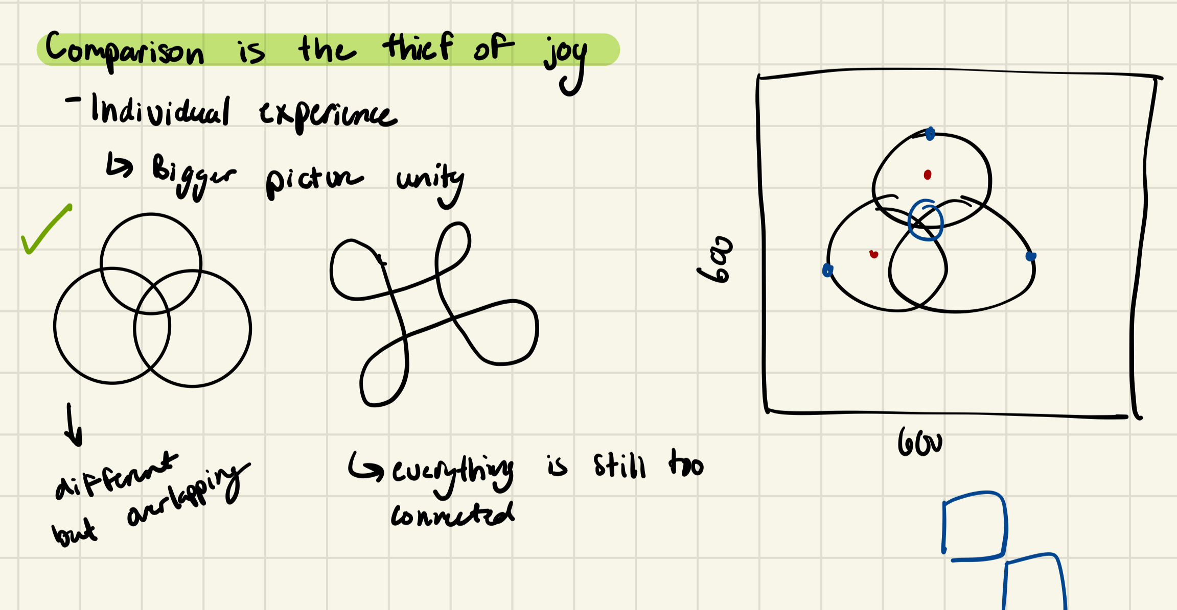
Components
After giving myself a bit of a reality check, I decided the three rings would be stationary and depending on where the user clicks the mouse, a different element of the piece would be highlighted. Each of the three rings (representing unity altogether) also represent separate themes. The highest one represents individuality and when the user clicks on it, the rings separate and display yellow and purple colors. I chose these two because across cultures they represent royalty, wealth, and prosperity which I believe can only flourish through sufficient strength and independence.
When the ring to the left is clicked an image resembling the Seed of Life appears which is a symbol of creation and harmony across many religions (in slightly different variations). I chose this symbol to represent the peace that we find through self-reflection. Lastly, when the ring on the right is clicked, the entire unity symbol changes colors randomly which represents a person’s creativity and unique characteristics.
An Aspect I Am Proud Of
The aspect I am most proud of is what happens when you click outside of the three rings. A static-like image is created in the background which is intended to represent the ‘noise’ from society that often distracts us from understanding who we are. I used nested for loops to create this and was a bit indecisive on what I wanted the image to become. As I was writing the code, I was kind of just moving some loops around to see what worked and what didn’t and when I got to the grid design, became interested in how the image could imitate that of static.
function static(){
  noStroke();
  frameRate(40);
  for (let x=0;x<6;x++){
    for (let y=0;y<6;y++){
      fill(random(255));
      rect((x*100),(y*100),100);
    }
  }
}
Final Product
Reflections
Overall, I’m quite proud of the creative process I went through to come up with this concept. Although I did not meet my original goal in terms of the technicalities, it took a lot for me to generate these ideas and actually get something out of them so I am rather satisfied. However, in terms of improvements, there are a lot of areas in which the code could be written more efficiently (i.e. not redrawing the symbol every time user interacts with the mouse and instead just adjusting the parameters). Furthermore, in the future, I would like to dive in to the ‘oscillating-objects-unity-symbol’ idea I had going just to see it through.