Reading Reflection – Week #5

I found Golan Levin’s article on computer vision to be extremely informative and useful for my future artworks, as it is highly illustrative and detailed in explaining what computer vision actually is. I particularly appreciated how the examples Levin provides demonstrate the vast array of forms in which computer vision is used in interactive media arts: from the sociopolitical Sorting Daemon by David Rokeby to the metaphorical Standards and Double Standards by Rafael Lozano-Hemmer. I believe, as the article suggests, that there is still significant room for improvement in computer vision. It undoubtedly cannot be compared to human vision, as it requires meaning to be assigned to it (a thing human eye has no need to do) through the careful design of algorithms that analyze individual pixels and patterns using techniques like differencing, background subtraction, and brightness thresholding for detection tasks.

Beyond the obvious potential for growth, one concerning issue with computer vision is its possible use as a tool for surveillance, and thus as a powerful method of control. The ethical concerns here are significant: computer vision in art has the potential not only to create but also to exploit those who interact with it without their consent (as in Suicide Box by the Bureau of Inverse Technology).

Therefore, while Golan Levin successfully demystifies the concept of computer vision, it remains unclear how we, as artists, should address the ethics of its use in relation to surveillance. How do I make an interactive artwork that is engaging and immersive without being intrusive and exploitative? That is one of the primary questions an artist should ask when working with computer vision.

 

Midterm Progress

Concept

For my midterm project, I initially considered creating an interactive experience centered around pet care in some way. While I wanted to explore the emotional connections and responsibilities that come with caring for a living creature, I thought this idea seemed kind of predictable. To add a touch of humor and absurdity, I decided to create an interactive experience where the user will cares for a pet rock (named Rocky) by feeding, playing and interacting with him to maintain his mood over a short period of time (1-2 minutes). The concept explores how minimalistic interactions, like feeding or playing, affect a virtual pet’s state of well-being.

While I still haven’t fully decided on the specifics, the user will have a few options to care for Rocky (feeding and playing for instance). Each interaction will influence the rock’s mood, with the goal of keeping him as happy as possible. For example, feeding might involve choosing from different food types, each of which impacts his mood differently while playing might involve a mini game where Rocky must avoid obstacles.

Code Design and Interactivity

In terms of coding, I’ve broken the project into several key components (I will probably be adding more later as different functionalities arise):

  1. Rocky : A class that handles the rock’s mood and his appearance on screen.
  2. Mood Meter: This reflects Rocky’s mood visually, giving feedback to the player.
  3. Buttons for Actions: Three buttons allow the user to trigger different actions (such as feeding and other care actions).
  4. Playing the Mini Game: This involves collision detection where Rocky avoids obstacles.

The game will end after the specified number of minutes, and Rocky’s final mood will be displayed.

What I’m Uncertain Of

The most challenging and uncertain part of this project is implementing the mini-game where Rocky plays by avoiding obstacles. Collision detection and ensuring the game flows smoothly without lag were concerns. To minimize these risks, I will start by prototyping the mini-game early. I will implement a basic version where Rocky moves up and down, avoiding obstacles that scroll from right to left. This will help me better understand how I can handle object collisions and movement dynamics. I also need to fine-tune ideas regarding the options available to the user to take care of Rocky.

Next Steps

Moving forward, I will continue implementing the basic features of the game, refining the interaction design, adding sound effects for feedback, and enhancing the overall user experience. I also plan to improve Rocky’s animations and ensure the game has a restart function. Overall, I’m pretty excited to see how this project turns out :))

Week 5 Reading Response

Computer Vision is a set of algorithms that are developed to be able to interpret information that are derived from a digital image or video. Human vision is able to recognize items based on past interactions with such items and its traits. Computer vision defers from human vision in that it doesn’t see things as a whole, but rather a collection of pixels, it is due to this that algorithms have to be developed to help.

For example, using pixel and color and brightness, it is able to detect motion. Also unlike human vision, computer vision is not a thing that can be widely used, it is an umbrella term for different algorithms that possesses the functions of tracking, or understanding information from images or videos.

Computer vision’s ability to track and focus on objects allows interactivity between human and art pieces. It allows for artists to create pieces that are able to have a layer of interactivity that doesn’t even need the user to be touching anything physical. As an example, in a project for a different class, using simple computer vision code, we were able to produce a program that detects hand gestures, which then translates to Morse Code.


Reading Response 5:

Computer vision and human vision differ in interesting ways. While human vision is natural and intuitive, allowing us to recognize patterns and emotions effortlessly, computers need specific algorithms to make sense of images. For instance, what we instantly understand as motion or objects, computers detect through methods like frame differencing or background subtraction. I honestly find it intresting how rigid and task-specific computer vision is compared to our flexibility. Furthermore, to help computers “see” what we want, it uses techniques like brightness thresholding or background subtraction, and sometimes adjusts the physical environment by using better lighting or reflective markers.
Moreover, in interactive art, computer vision creates exciting new opportunities but also brings up ethical questions. For instance, Videoplace used computer vision to create playful, full-body interactions, while Standards and Double Standards used it to explore themes of authority and surveillance. However, a question that popped into my mind is that, when you consider the ability of these systems to track movements and gestures, do you feel like the line between creative interaction and surveillance can sometimes blur? This reminded me of the movie M3GAN, where AI uses computer vision to care for a child, but the surveillance becomes invasive. What if we might see something similar with interactive art or technology, where the systems that are meant to engage us could start to feel more like surveillance. Hence, it’s an interesting balance between enhancing the experience but also respecting privacy.

Assignment 5 – Midterm Progress

Concept
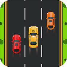
The concept for my midterm is simply my interest in arcade racing games and love for cars. I was inspired by car games such as Asphalt and Forza which I played for most of my childhood and with the knowledge from the class I felt compelled to try and implement some of these games in the best way I can. My objective is to come up with a visually engaging and simple game where a player navigates a car in a street road avoiding obstacles(oncoming traffic).
Other than that, I was eager to come up with something that will be 100% user engaging unlike my other projects and creating a game seemed to cater for this. I wanted to enhance user experience in my projects while also maintaining the good visual style which is appealing like the other projects.


Design
My design is centred around user interaction. It is a user engaging game where the player has to manouver the car across three lanes in all directions with the use of arrow keys and avoid obstacle cars. The background is a road, while the cars on canvas are specifically chosen to be sleek and easily distinguishable. As the player progresses, the game becomes increasingly difficult since the game speeds up gradually. I thought that this design will enhance the game clarity and ease of control, ensuring that the player quickly gets the mechanics but still feel challenged.


Frightening/Challenging Aspects
The most frightening parts while drafting and planning the project was how I will handle the collisions between the cars. This is the most crucial part for the game to function thus I can’t afford any errors in it.
Another challenge might be how I will balance the increasing speed of the game.


Risk Management

To counter this challenges, I did some research on how I can handle collisions and it turned out to be a really simple mathematical logic to compute. I was able to come up with an algorithm that calculates the distance between the player car and the obstacles and since the cars are rectangular it might be easy to handle.

Midterm Progress

Idea:

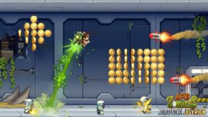
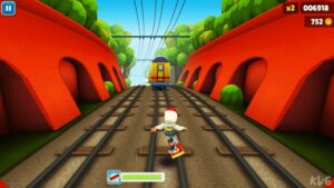
For my midterm, I originally wanted to create an interactive artwork because I assumed it was easier. After looking at some students’ previous pieces, I concluded that neither choice was easier than the other, so I settled for an interactive game that was a combination of some of my favorite childhood games, with a theme that I’ve noticed a lot in recent years. The games I thought of were: Jetpack Joyride, Subway Surfers, and Temple Run.

These endless runner games consist of a character that keeps running (or flying) while avoiding obstacles to reach the furthest distance possible. I don’t think I have the time or knowledge to create a completely endless one, so I’ll go for one that goes “You Win!” if the user can last around 1 minute 30. I decided to make the theme revolve around social media influencers that impulsively move to New York “just because it’s New York.” I’m thinking of naming it Escape from New York as word play on Marketplace’s Escape from New York Pizzeria.

Concept:

The concept is the user plays as an influencer who severely romanticizes New York and imagines it to be the way it’s portrayed in movies, only to move there and be faced with obstacles such as rats, trash, and crackheads. Their mission is to use the arrow keys to avoid driving her into the obstacles to get her out of New York.

Design:

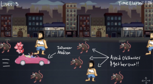
Above is a brief idea of what I want the actual game to look like. The user will be able to move the arrow keys up and down to move her to the road without an obstacle.

So far, I’ve only worked on setting some functions and coming up with the look of the main menu page and the tutorial. I’m facing some formatting issues that need to be worked on such as the game background image’s scroll and the tutorial going off of the canvas.

Uncertainty:

Honestly, I’m uncertain about being able to properly finish the entire game with just a little over a week left because I feel like it is way too complex and out of my capabilities, so I’ll be needing a lot of help. I snooped around other students’s project codes and got intimidated by how long their codes are. I think I’ll get the hang of it the more I work on it, as my progress and understanding from today was better than that of when I worked on it 3 days ago.

I’m kind of unsure of how I’ll make the game look as if she’s driving and the obstacles are still, rather than the obstacles are moving and she’s still. I’m also uncertain of how to make sure there’s a road without an obstacle, so that she wouldn’t be trapped like in the example design. I also found myself spending a lot of time trying to find the right images to use in the game, and even the ones I found still aren’t the right ones for the final.

I think there’s a lot of planning out and learning to do beyond what I’ve already done, so I’m kind of worried on how fast I’ll have to pace myself, which is way out of my coding comfort zone. To reduce this risk, I’ll have to dedicate a good chunk of my time to it everyday, rather than only working on it the days after I have Intro to IM class. I’ve already spent a good chunk of time finding the images for the game, so now I get to focus on the code and implementation of these images. I’ll also look at and refer to p5.js tutorials, YouTube tutorials, other students’ previous works, and of course the professor’s help to learn more on how to bring this game to life.

Assignment 5 – Midterm Progress

Concept:

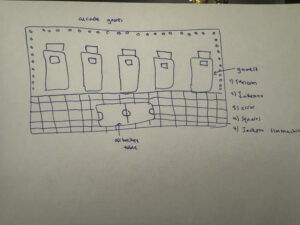
For my midterm I got the idea to recreate some of the arcade games, but the only difference would be that in this version we can easily access our favorite games on our devices. For my initial idea I decided to create 6 games and it would look somewhat like the image below.

This would be the starting screen. The way I want this to work is that if you press on one of the screens of the arcade machine, or if you press on the air hockey table the game corresponding with what you pressed would appear.

For the first game I decided to use a spritesheet of a skeleton and create a game from it. For my second game I decided to create a jukebox, where I will add different music and the player could change the song by pressing the arrows. For the third game I decided to make the machine not functional and that is because whenever I go to the arcade most of the machines are not working. For my fourth game I decided to add the moving squares a previous assignment of mine. And for my fifth game I decided to add a Jackpot slot machine. For my air hockey table I was thinking of not creating a two player game, but instead a one player, where the player just places the air hockey puck on the table and the puck moves around.

Code Progress:

The progress I have so far is the layout of my arcade room. I also started working on some of the games.


This is the skeleton game that I started working with. You have to press the spacebar to start the game, use the up, down, right, and left keys to move the skeleton and collect the bones, and when the points reach to 10 you have to press the “R” key to restart the game. What I want to add to this game is when the skeleton touches the sides of the screen you lose the game.


This is the error screen that I created for the broken machine. I used pixels to create this effect. What I want to add to this game is a text.

Challenges:

The challenges that I am facing with this project is how I will add all these games into one code and one game. And how will I create the interactivity if you press the screen of a game the selected game pops up.


Reading Response 4

In the article Computer Vision for Artists and Designers, the author explains how computer vision has become more accessible for artistic use, and I agree with the enthusiasm about its potential. Unlike human vision, which can interpret context and meaning naturally, computer vision relies on algorithms to process visual data, such as detecting objects, movement, or brightness. There are specific techniques like removing the background or altering the brightness that help computers to track what we are interested in, even though they lack human intuition.

The article showcases how artists like Myron Krueger have creatively used computer vision for interactive art, but I believe it could have addressed more about the ethical implications of using this technology. For instance, projects like David Rokeby’s Sorting Daemon and the Suicide Box by the Bureau of Inverse Technology highlight computer vision’s potential for surveillance, which raises privacy concerns in public spaces. This capacity for tracking can be both an asset and a concern, as it allows for innovative art while also presenting risks in terms of surveillance.

In conclusion, while I agree with the article’s excitement about the possibilities of computer vision in the arts, it could have explored more about its potential ethical impacts, especially with its ability to monitor and track people. Balancing creativity and responsibility is essential when using such powerful tools in interactive art.

Assignment 4

Inspiration:

In this project, I aimed to create a dynamic visualization of baby names by ethnicity, year, and gender using data from a CSV file. The inspiration for this project came from the realization that names are not just identifiers; they often carry cultural significance and reflect societal trends. By exploring how different ethnicities and genders influence naming patterns over time, I wanted to highlight the diversity and richness of society. This interactive visualization allows users to engage with the data, making it easier to understand how names evolve and resonate within various communities within the US. The data for the USA was readily available and organized, and thus I decided to pick that as my dataset.

Code that I am particularly proud of:

One of the sections of my code that I am particularly proud of is the get_top_names function. This function processes the CSV data to extract the top ten baby names based on user selected criteria including ethnicity, year, and gender. This code tallies the occurrences of each name and sorts them to ensure that the most popular names are displayed in the visualization.

// This function processes the provided data to get the top 10 names
function get_top_names(ethnicity, year, gender) {
  let names = {};
  for (let row of table.rows) {
    // filters the data based on our current selection
    if (row.get('Year of Birth') === year && row.get('Ethnicity') === ethnicity && row.get('Gender') === gender) {
      let name = row.get("Child's First Name");
      let count = parseInt(row.get('Count'));
      // sums up counts for each name to account for duplicates
      if (name in names) {
        names[name] += count;
      } else {
        names[name] = count;
      }
    }
  }

Final Product:

Conclusions and Reflections:

Reflecting on this project, I recognize the power data visualization holds in uncovering trends and fostering human understanding and comprehension. I learned how to manipulate data and create interactive elements that allow users to explore and compare information. However, there are several areas for improvement. For instance I hope to incorporate additional features such as user-input filters or a broader range of years. I hope to also include an overlay feature where two separate bar charts can be compared on the same canvas, this could be useful for example if someone wants to more clearly see the trend of a certain name through time. Additionally, I plan to improve the aesthetics of the visualization by experimenting with different color palettes and designs to make it more appealing. Overall, this project has been a valuable learning experience, and I look forward to applying these insights in later projects.


WEEK 5 READING RESPONSE

Computer vision and human vision are very different in how they process information. While people can quickly understand what they see, computers need specific algorithms to detect motion, brightness changes, and object differences. We help computers “see” by adjusting lighting and using techniques like background subtraction and motion detection to improve tracking accuracy.

In interactive art, computer vision allows viewers to engage with the artwork in real-time. By tracking movements and gestures, it creates an immersive experience where the audience becomes an active participant, enhancing their interaction with the art.

However, this ability to track people also raises concerns about privacy, especially in public spaces. While it makes art more interactive and responsive, the same technology can be used for surveillance, which can feel invasive. Artists and technologists must strike a balance between creating innovative interactive art and respecting individual privacy, ensuring the technology is used responsibly and ethically.