Reading Reflection – Week 2

We live in an era of disciplines. Human nature’s inclination to have everything organized and well-structured always creates certain rules in any kind of field. I remember watching a video on YouTube of a college entrance exam for the School of Art in South Korea. Of course, all of the paintings were amazing, but it somehow made me think that the drawings were quite artificial. I felt like there was no creativity in terms of how those drawings were made. Particularly, it was like copying things in the world rather than engaging in a creative process. I love order and discipline, so I always tend to create certain rules, but in the art field, I find myself looking for something beyond the rules I know.

Reas’s talk was eye-opening for me in the sense that I found the answer to why I was searching for some sort of chaos in arts. The world is not structured in the way that we might expect. There is no such thing as absolute order. We always face unexpected circumstances that can entirely change the outcome. I found this pattern of unexpectedness very similar to the idea Reas was raising. The difference between chaos and order is not as huge as we might expect. A single change in the algorithm can turn the entire art piece into randomness. However, the act of letting randomness do its further work and create chaos is what makes art beautiful. We actually think of it as discipline, but we live in a lot of chaos. But that’s not necessarily wrong. It takes courage to break rules. But I think that courage can make us special. That kind of specialness is what I wanted to see in art.

Assignment 2- A Nocturnal Landscape

Assignment 2- A Nocturnal Landscape

Concept

I wanted to create a vivid landscape scene with a night sky, mountains, trees, and an ocean using basic p5.js shapes like rectangles, ellipses, and triangles. I used basic shapes and coordinates, but tried to make the end result visually interesting and cohesive even if not realistic. I used a loop for the stars to randomise their position on the canvas. I also slowed down the frame rate to have a calming feel to the overall movement of the stars.

This is my final artwork:

I’m most proud of the for loop I created to make the gradient sky:

 // pretty sky
for(let i=0; i<=300; i+=5){
strokeWeight(5);
stroke(255-i,128-i,64);
line(0,300-i,width,300-i); // x,y,x,y
}

This loops over and over again and draws coloured lines that transition smoothly from dark blue to orange. The decreasing RGB values create the gradient illumination. I took inspiration from an existing p5js project by @urbanatwork for the gradient.

I spent the most time on the coniferous trees, positioning the triangle branches and creating the function proved trickier than expected but I am proud of how reusable and handy I made it. This is the drawConiferousTree() function:

function drawConiferousTree(x, y, a, b){
//tree trunk
fill('#691C37');
ellipse(x, y-20, a, b);
//tree branches
triangle(x-15, y-20, x+15, y-20, x, y-50);
triangle(x-15, y-30, x+15, y-30, x, y-60);
triangle(x-15, y-40, x+15, y-40, x, y-70);
}

What I like about this is it allows me to easily draw as many tree shapes as I want by just calling this function each time with the tree’s x,y coordinate, trunk width, and trunk height.

For example, to make two trees at different places, I can just do:

drawConiferousTree(15, 305, 4, 20);
drawConiferousTree(35, 310, 4, 20);

The variables a and b even let me adjust an individual tree’s proportions if needed.

I learned that making custom functions with parameters is hugely helpful when you want to repeat elements, like trees of the same style but different sizes and positions. It’s like having a custom stamp that you can use wherever you want!

Reflection

I’m thrilled with how this landscape came together. The colours, composition, and simplicity have an engaging but simplistic aesthetic that is calming to look at. I definitely plan to keep working on this piece.

Going forward, I want to add more interactivity into the scene to bring it alive. For example: Make the sun rise and set over the mountains as I move my mouse vertically across the screen. This would create daylight cycles and slowly change the sky colour. I would love to further experiment with the sky gradient as well.

This project has me hooked to p5js and its endless opportunities for creative projects in the best way. I’m excited to include more interactive and engaging elements in my projects moving forward.


Raya Tabassum: “Chaotic Harmony” art

The artwork is supposed to represent a grid filled with random circles, squares, and triangles, each with a unique color. The number of shapes in each grid tile is also randomly determined, adding an element of unpredictability to the artwork. The black background and semi-transparent colors contribute to a visually dynamic and intriguing composition. The outer loop iterates through the x-axis, and the inner loop through the y-axis, creating a grid of tiles. The use of a while loop inside the nested loops allows for the random generation of multiple shapes within each tile. The switch statement is employed to choose between drawing circles, squares, or triangles based on a randomly generated shape type.
The element of interaction is when the user clicks on it, it alters the composition randomly every time with new colors and grids. This intricate dance creates a mesmerizing grid of shapes, each telling its own colorful story. And if you click on it rapidly, you can see some shapes forming on their own and the whole artwork feels like it’s moving.
I think the artwork effectively utilizes loops to create a visually engaging and dynamic composition. The randomization of shape count and type introduces an element of surprise, making each iteration unique. For future work or improvements, I could experiment with additional parameters such as varying the size or rotation of shapes, and introducing gradients. I also envision expanding the symphony of this visual experience by integrating sound. Each shape could emit unique tones, creating a multi-sensory journey. Additionally, exploring interactive elements, allowing users to dynamically influence the composition in real-time, could open up new dimensions for artistic expression and engagement.
The inspiration came from my desire to make something very vibrant with popping colors and simple shapes. Changing the “tileSize” and playing with different outcomes every time was a really fun experience until I found the visuals I most loved. As I reflect on this creation, I find joy in the harmonious chaos that emerges.

function setup() {
  createCanvas(600, 600);
  noLoop(); //Only draw once
}

function draw() {
  background(0); //Start with a black background
  let tileSize = 10;

  for (let x = 0; x < width; x += tileSize) {
    for (let y = 0; y < height; y += tileSize) {
      let shapeCount = floor(random(1, 5)); //Determine how many shapes to draw in each tile
      let i = 0; //Initialize while loop counter

      while (i < shapeCount) {
        //Generate a random color for each shape
        fill(random(255), random(255), random(255), 200);

        //Randomly choose a shape to draw
        let shapeType = floor(random(3)); // 0, 1, or 2
        switch (shapeType) {
          case 0: //Draw a circle
            ellipse(
              x + tileSize / 2,
              y + tileSize / 2,
              tileSize * 0.5,
              tileSize * 0.5
            );
            break;
          case 1: //Draw a square
            rect(x + 10, y + 10, tileSize - 20, tileSize - 20);
            break;
          case 2: //Draw a triangle
            triangle(
              x + tileSize / 2,
              y + 10,
              x + 10,
              y + tileSize - 10,
              x + tileSize - 10,
              y + tileSize - 10
            );
            break;
        }
        i++; //Increment while loop counter
      }
    }
  }
}

//Allow for regenerating the artwork on mouse press
function mousePressed() {
  redraw(); //Redraw everything
}


When you change “tileSize”:

Luke – Reading Reflection – Week 2

I find the work that he did the Process 18 project to be very interesting. It’s about the nature of noise or jitters. I think that whether in a controlled or uncontrolled environment, noise particles seem to group together, or in other words, homogenize, and create odd/unique patterns. Reas proves in this project that his noise system gradually became homogenous and over time, the system still kept its homogenous characteristic but added more resolution in time and space. What I wish Reas could do is maybe to add some sort of catalyst to the noise experiment, to see how such a catalyst could impact the way the particles behave over time, mimicking the real environment.

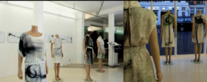
I also find his commission work in creating composited photos for the Frank Gary in Miami Beach as a miniature version of the Disney Concert Hall Los Angeles to be intriguing. Reas and his colleague Rosner used randomness as a jumping off point in tailoring the printed compositions. A lot of decision making was also taken into account to determine how they want the compositions to feel like. One of the details Reas shared behind the process is that the team rolled the dice in putting the images of the neighborhood together wherever they want it to be with a condition that they had to be at 90° angles to trigger the final composition. We talked about how randomness can prove to be a useful tool in coding in class. In Reas’ example, it not only helps him and his colleague come up with exciting artworks but also acquire a firmer grasp of the process while observing the pattern to arrive at the outcome. His work support the fac that randomness and decision making, although seeming to contrast one another, can be a helpful combination for observation in interactive media coding.

Luke Nguyen – Assignment 2

Concept:
During last week, I got to listen back to one of my favorite song, “Sativa” by Jhené Aiko from her album “Trip.” I have been obsessed with this song since high school. What really interests me is the cover for the album:

Jhené Aiko, Trip

It has graphically designed rings that circularly loop around the square cover. So, I thought I’d apply the concept learned in class to recreate my interpreted version of this album cover.

A highlight of some code I’m particularly proud of:
I’m particularly proud of creating the circular loops of the rings. I learned how to do the circular loop from Daniel Shiffman’s The Coding Train YouTube video here (https://www.youtube.com/watch?v=rO6M5hj0V-o), at around 6:27 where he teaches using the sin and cos in the for loop.

drawingContext.shadowBlur=10;
drawingContext.shadowColor=color('rgb(250,84,0)');

// first loop of rings
for (let m = 0; m < 1440; m += 30) {
noFill()
let x = 50 * sin(m) + 200;
let y = 50 * cos(m) + 200;
stroke('rgb(250,84,0)')
circle(x,y,50)

Embedded sketch:

Reflection:

Creating a loop in a circular motion is rather fascinating to me. I was trying on my own to create the effect, but to no avail. Coincidentally, I was experimenting with creating custom shapes different from the primitive shapes we’ve learned in class while learning p5js on my own. And my research online into how to do so led me to come across Daniel Shiffman’s video that taught me how to create custom shape and create a circular loop.

I had fun creating all the loops and the circles. I played around with the input for the function within the loop to create the effect. Since I have multiple loops of rings for the assignment, I have to use multiple loops.

To emulate the colors from the album cover, I also looked up how to add the glow effect to an object in p5js and came across a video by Kazuki Umeda at https://www.youtube.com/watch?v=iIWH3IUYHzM. I added two functions for the effect, namely “drawingContext.shadowBlur” and “drawingContext.shadowColor=color”.

And for the girl in the center, it’s just an uploaded transparent png file. But in order to know how to insert an image, I also look up a p5js reference created by claesjohnson https://editor.p5js.org/claesjohnson/sketches/f0huO1Y4h.

Ideas for future work or improvements:

  • The codes for the loops right now are rather repetitive, so I’m trying to figure out how to clean them up, maybe into another “while” or “for” loop.
  • I wanted to add a radial gradient background and use the white color for the looped rings instead but I didn’t know how to do so, so this is another idea for improvement.
  • I also wanted to experiment with a shape that looks like a parabol instead of the primitive circle.

Week 2, Assignment 2: “Samsung” by Hyein Kim

You might wonder why the title of this art piece is “Samsung.” Yes, it is the name of the popular electronics company in South Korea. Actually, “Samsung” in Korean translates to “three stars.” Just a fun fact: I am a huge fan of Samsung Electronics. All of the electronics, including smartphones, tablets, smartwatches, earphones, and laptops that I use, are from Samsung 🙂

I really like the shape of the star, so my initial goal was to use the star shape in some way to create art. Initially, I used lines with a ‘for’ loop to create the star shape. However, I later changed my mind to use lines in the background and triangles instead for the star. Afterwards, I wanted to add animation to my art piece. I wanted my background to change somehow. My initial idea was to create a gradation of lines in the background moving from top to bottom, but I could not figure out how to do that, so I changed my plan to make the background color change to white.

To make that idea come true, I made an animation using two white lines moving toward the center. Then, I moved the background color to the setup so that the background color would not change to black again while the white lines were moving towards the center. Using the ‘if’ function, I coded the background color to change to black again if the lines reached the center, so that all of the setups could be reset. This part of my code became the proudest work for this assignment.

//background animation
stroke('white')
x1 = x1 + 1
line(x1, y1, x1-400, height)
if (x1 > width) {
x1 = 0
background('black')
}

stroke('white')
x2 = x2 - 1
line(x2, y2, x2+400, 0)
if (x2 < 0) {
x2 = 400
background('black')
}

stroke('white')
//white lines in the background
for(let x = centerX - 200; x < centerX + 200; x += 5) {
line(centerX, centerY-200, x, height)
}
for(let x = centerX - 200; x < centerX + 200; x += 5) {
line(centerX, centerY+200, x, 0)
}

While I liked the outcome, when I saw the empty space on both the left and right sides of the star, I came up with an idea of creating two more little stars which would have black colors, so that they would appear while the background color changes to white. While the background is black, they are not seen.

I really like the work I have done, but for further improvements, I would like to try to achieve my initial goal of making the background using line gradation.

Week 2: Reading Response Casey Reas’ Eyeo talk on chance operations

The juxtaposition of the artificial, conventionally associated with rigidity and logical order, and the organic, characterized by spontaneity and fluidity, has been historically observed, as Reas illustrates in his talk, since humans ventured into the arts and the sciences. I especially enjoyed Reas’ chronicling of the journey of digital creators and artists marrying these two by exploiting “parameterized change” to give dynamism to their work, starting with the courage of early artists like Jean Arp. I also appreciated his demonstration of how he systemized the process of introducing controlled randomness in his work by formulating algorithmic elements and processes, like element 5 and process 18 that he used to produce the artwork below. As someone who has an understanding of the mathematical quantification of randomness, as defined by measures of entropy, and has also been interested in studying the historical emergence of artistic abstract and surrealist works, I was delighted to see Reas illustrate how both can be integrated, via computational methods, to produce pleasing digital artworks.
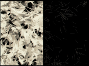
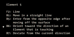
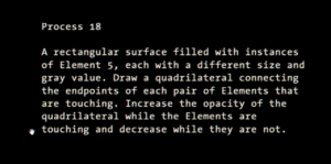
It was thought-provoking and almost ironic to see an algorithmic process attempting to simulate constrained randomness. Randomness, by its very nature, assumes the lack of regularization or adherence to a set of well-defined instructions. However, it is indeed possible, as shown by Reas, that despite their antithetical nature, randomness and order can co-exist and synergize to produce beautiful pieces of art.

One thing that caught my attention is Reas’ emphasis on producing from chaos an emergent homeostasis that is balanced and patterned. In the above example, for instance, Reas notes that repeated iterations of his process produce similar-looking, almost “unified,” results. This is essentially a product of “parameterizing” randomness. As Gerhard Richtar also states: “above all, it’s never blind chance: it’s a chance that is always planned, but also always surprising.” In a sense, randomness, then, becomes this beast that needs to be tamed, through order, to produce art that is organic and new, but still has an emergent form to it to be meaningful. This could also be demonstrated by the incorporation of symmetry in the Fractal Invaders animation to produce forms that can be readily interpreted by the viewer but were not necessarily manufactured by the artist.

This got me thinking: why can we not embrace randomness in art in its own right, without the need to constrain it or tame it in any way? Can we re-wire our brains to enjoy the unexpected jitters of white noise? Or derive pleasure from looking at TV static the way we would Renaissance paintings in museums? Lastly, if truly random art were to exist, where would that place the artist?

Assignment #2 – Casey Reas Talk

When we hear the word “Chaos” our minds automatically think of destruction and overall something negative. Casey Reas explored the meaning of this word and it reshaped my mind in terms of its meaning. Reas included many applications of “chaos” in beautiful pieces of art and explored how chaotic nature could be.

One concept that really stuck with me was the concept of randomness. Casey Reas’s talk opened my eyes on the ways in which the idea of randomness is perceived in art. I genuinely believe that randomness is sometimes important and Reas highlights that at one point.

Another concept that stuck out for me was the part where he talked about combining art with biology. Being a Psychology major student, I am very interested in one’s mind and knowing that it is possible to merge both of my interests into one made my day. I am truly satisfied after watching this talk.

Assignment 2: Creative Reading (Casey Reas)

While watching this video, I was very intrigued by the algorithms that were implemented. Particularly, I loved the pieces where they use certain algorithms to create meaningful simulations. This shows us how ordered chaos is all around us. The artwork in which the geometry of the body and tissue images are used to make clothing was very cool.

The way that randomness is portrayed is very interesting, especially when he shows different patterns which are all produced by a single algorithm. This shows how so many different artworks can be produced with randomness, just by doing a small change such as the speed in which the artwork moves or even the characters that are used for the pattern.

Another concept I found fascinating was “Fractal Invaders” where a coin is flipped and outputs either a black or white square depending on heads or tails. When it was made symmetrical, we started to see actual shapes that made so much sense.

Assignment 2: Loops

For this assignment, we were asked to use Loops to create a simple work of art. A few years ago, I came across one video of Lex Fridman on my YouTube recommendation on “Donut-shaped C code that generates a 3D spinning donut” . It is a video featuring Andy Sloane’s work on the 3D Spinning donut. Since then, this video has been on my watch later playlist. The blog post from Andy Sloane himself on this work can be found here. I always wanted to recreate this. On my first reading of the blog post, I understood the math easily, but back then, I did not have the courage to take on the coding portion.

After going through the listed examples for this assignment, it was clear to me that Andy’s work is also a work of art. So, I quickly decided to recreate that work in p5.js. After looking into the source code, I quickly realized the fearsome code is nothing but a combination of lots of loops.

In this artwork, the 3D effects are created using the mathematical process called z-buffering. This involves creating a 2D array called a z-buffer, which stores the distance to the nearest object for each pixel on the screen. When the code renders an object, it calculates the distance to the object for each pixel and compares it to the value stored in the z-buffer for that pixel. If the object is closer than the object currently stored in the z-buffer, the code updates the z-buffer with the new distance and draws the object on the screen. This process is repeated for each object in the scene, and the result is a 2D image that appears to be 3D. The detailed mathematical explanation can be found on Sloane’s blog here.

I could not directly use the source code provided by Andy Sloane. His art work was based on C code, which did not have functions like draw() in p5.js. So, although I took the mathematical grounding from his shared source code, I had to rewrite the algorithm to make this work in p5.js.

// Function to draw the rotating donut
function canvasframe() {
  // Increment angles for rotation effect
  A += 0.07;
  B += 0.03;

  // Calculating the cosines and sines of A, B
  let cA = cos(A), sA = sin(A),
      cB = cos(B), sB = sin(B);
  
  // parameters to scale and move the donut
  let scale = 400; // variable to scale up or down the donut
  let xOffset = width / 2;
  let yOffset = height / 2;
  let K2 = 10; // perspective adjust
  
  // Draw the donut
  for (let j = 0; j < TWO_PI; j += 0.3) {
    let ct = cos(j), st = sin(j);
    for (let i = 0; i < TWO_PI; i += 0.1) {
      let sp = sin(i), cp = cos(i);
      let ox = 2 + 1 * ct, 
          oy = 1 * st;

      // transform the 3D points to 2D using rotation and perspective
      let x = ox * (cB * cp + sA * sB * sp) - oy * cA * sB;
      let y = ox * (sB * cp - sA * cB * sp) + oy * cA * cB;
      let ooz = 1 / (K2 + cA * ox * sp + sA * oy); // One over Z (Depth)
      let xp = xOffset + scale * ooz * x; // translate and scale to fit the canvas
      let yp = yOffset - scale * ooz * y; // translate and scale to fit the canvas
      let L = 0.7 * (cp * ct * sB - cA * ct * sp - sA * st + cB * (cA * st - ct * sA * sp)); // calculate brightness
      if (L > 0) {
        fill(255 * L); // Set the fill color based on the brightness
        rect(xp, yp, 2, 2); //draw the point with a slightly larger size for better visibility
      }
    }
  }
}

I successfully recreated the donut’s 3D effect. However, I could not finish up the ASCII donut. So, in future I would love to finish up the work and replicate the entire art work.