Week 3 Reflection

As I consider the various viewpoints that the text have presented on the topic of interaction, I find myself drawn to the complex dance that takes place between user input and system response. Fundamentally, interaction is a dynamic exchange in which the user and the system participate in an ongoing cycle of input and feedback. This link forces us to reevaluate how we engage with commonplace items and technology, as well as how we understand interactive media.

As the reading demonstrates, the notion of interactivity encompasses more than just user participation; it also refers to a more profound and significant conversation between people and technology. It challenges us to reflect on the nature of our interactions, asking us to take into account not only the mechanics but also the purpose and result of these exchanges. Echoing the observations of my peers, I find the subjective character of interaction and the way it adjusts to the capabilities and requirements of its audience to be quite fascinating. This flexibility emphasizes how important careful design is to making experiences that appeal to a wide range of users and are both accessible and meaningful. Furthermore, the classification of interactive media into low, medium, and high levels of interaction provides a helpful framework for analysis. From the straightforward act of clicking a button at a pedestrian crossing to the intricate conversation with AI chatbots, it enables us to classify and assess interactions based on their depth and complexity. Every degree of interactivity presents different difficulties and chances for participation, highlighting the need for a sophisticated approach to interactivity design.

To sum up, the contemplations and illustrations presented throughout the class discussion enhance our comprehension of interaction. They force us to think about how our designs and interactions affect society more broadly, highlighting the importance of approaching interactive media with consideration and user-centered design. Our conceptual framework is expanded by this investigation, which also motivates us to innovate and push the limits of interactive design.

Week 3 – Reading Response: The Depth of Interactivity | Haziel

Chris Crawford’s analysis of interactivity in his article offers a thought-provoking perspective that challenged my traditional notion of what it means to interact with something or someone. His assertion that true interactivity encompasses listening, thinking, and speaking as key components highlights the depth and complexity of human engagement. The analogy of a conversation between the two people Fredegund and Gomer effectively illustrates the dynamics of these elements, emphasizing the importance of active participation and mutual understanding when we are creating a meaningful interaction.

Before reading Crawford’s insights, my understanding of interactivity was rather simplistic, limited to the idea of reacting or engaging with external stimuli. However, his examination reveals that interactivity is far more intricate, existing along a spectrum with different degrees of engagement. Inspired by this perspective, I can also see a connection between human behavior and design, as he underscores the need for designers and creators to consider the diverse levels of interactivity in their work, recognizing that each level offers unique opportunities for communication.

However, I also find myself wondering the extent to which his framework fully captures the richness of interactive experiences. Are there additional dimensions or elements of interactivity that deserve consideration? Furthermore, while the example of conversation illuminates certain aspects of interactivity, it may overlook other forms of interaction that occur in non-verbal or non-linear contexts.

Assignment 3 – Spinning Symphony | Haziel

My inspiration for this assignment was basically the forms and shapes we usually find around us. Whether it be through the whirlwind or even a simple whirlpool we see in the sink when draining the water, I wanted to created something related to spirals. Moreover, spirals are also inspired by one of my favorite astronomical objects: spiral galaxies. The beautiful spiral arms of these galaxies, stretching outward in what it seems to be a delicate movement, caught completely my attention and evoke a sense of wonder. Drawing from these natural phenomena, I aimed to create an interactive artwork that celebrates the harmony of spirals.

Keep clicking on the screen to create your Spiral Galaxy 🙂

In this project, when the mouse button is pressed, a new spiral centered around the cursor position is drawn on the canvas. The spirals consist of a series of connected points, creating a spiral pattern as they move outward. Each spiral has a random color and speed, creating a dynamic and varied composition. The spirals continue to evolve and interact with each other as the user interacts with the canvas. To create this effect, I challenge myself in creating new patterns, supported by tutorial videos on how to create the spiral effect, like this one.

class Spiral {
  // Constructor function to initialize a new spiral object with specified parameters
  constructor(x, y, radius, color, speed) {
    // Initialize object properties based on input parameters
    this.x = x; // X-coordinate of the center of the spiral
    this.y = y; // Y-coordinate of the center of the spiral
    this.radius = radius; // Radius of the spiral
    this.color = color; // Color of the spiral (as an array [R, G, B])
    this.angle = 0; // Initial angle of the spiral
    this.speed = speed; // Speed of rotation for the spiral
  }

  // Display function to draw the spiral on the canvas
  display() {
    noStroke(); // Disable stroke (outline)
    fill(this.color); // Set fill color based on the color property
    let spiralSize = this.radius * this.angle; // Calculate the size of the spiral
    // Draw a small ellipse at a point on the spiral determined by the current angle
    ellipse(this.x + cos(this.angle) * spiralSize, this.y + sin(this.angle) * spiralSize, 5, 5);
  }

  // Move function to update the angle of the spiral, causing it to rotate
  move() {
    this.angle += this.speed; // Increment the angle by the rotation speed
  }
}

For future assignments, I would like to improve my understanding of object-oriented programming concepts and explore more advanced techniques for creating dynamic and interactive visual experiences. Additionally, I aim to delve deeper into the principles of design and incorporate more sophisticated visual elements into my projects, as well as sound and music to enhance the immersive experience of my projects. 

Production Assignment – Week #3

For this assignment, we were tasked with creating a generative artwork using Object-Oriented Programming. I wanted to use something we use everyday in our culture to create my artwork, and took inspiration from the Emarati Ghutra (Ghitra):

I tried to use its some of its colors (white, and the different shades of red) and shapes (zigzags, diamonds, checkered squares, etc) to create my artwork.

I created a class for the Ghutra elements, consisting of a constructor, display function, and changeColor function to change the color on mouse click.

class GhutraPatternElement {
  
  // Setup the constructor with the required attributes to draw the shapes
  constructor(x, y, size, color, shapeType) {
    this.x = x;
    this.y = y;
    this.size = size;
    this.color = color;
    this.shapeType = shapeType;
  }

  // Display function to draw the shapes based on the attributes passed to the constructor
  display() {
    fill(this.color);
    noStroke();
    
    // Diamond Shape
    if (this.shapeType === 'diamond') {
      beginShape();
      vertex(this.x, this.y - this.size);
      vertex(this.x + this.size * 0.8, this.y);
      vertex(this.x, this.y + this.size);
      vertex(this.x - this.size * 0.8, this.y);
      endShape();
    }
    
    // Checkered Squares
    else if (this.shapeType === 'checkered') {
      rectMode(CENTER);
      rect(this.x, this.y, this.size, this.size);
    } 
    
    // Zigzags
    else if (this.shapeType === 'zigzag') {
      let numZigs = 10;
      let zigzagWidth = this.size / numZigs;

      beginShape();
      for (let i = 0; i < numZigs; i++) {
        let x1 = this.x + i * zigzagWidth;
        let y1 = this.y + (i % 2 === 0 ? -this.size : this.size) * 0.5;
        vertex(x1, y1);
  
        let x2 = this.x + (i + 1) * zigzagWidth;
        let y2 = this.y + (i % 2 === 0 ? this.size : -this.size) * 0.5;
        vertex(x2, y2);
      }
      endShape();
    }
  }

  // Function to change color on mouse press
  changeColor() {
    // Change the color only when the mouse is pressed
    if (mouseIsPressed) {
      this.color = random(colorPalette);
    }
  }
}

I used ChatGPT to generate the color codes for the different shades of red I used to avoid having to manually sample each color and waste time:

let colorPalette = [
  '#FFFFFF',    // White
  '#FF0000',    // Red
  '#990000',    // Dark Red
  '#FF6666',    // Light Red
  '#CC0000',    // Medium Red
];

Overall, this was the result:

Looking to the future, there are definitely many things I can change to improve this artwork and make it more aesthetic. Additionally, there seems to be a bug in my code that changes the shape color multiple times per each mouse click instead of just once.

Assignment 3

For this assignment, I used OOP and arrays to create an interactive Popcorn experience. On mouse Click, the user can see the popcorn bouncing from the popcorn machine straight to their popcorn box. The user can keep adding popcorn whenever they like.

<

The code that I am most proud of is allowing the user to add more popcorn at any time. I used the mousePressed function for that:

function mousePressed(){
  for(let i = 0; i < 10; i++){
    let x = i;
    let y = i*10;
    let xspeed = i*2;
    popcorns[i] = new Popcorn(x,y,xspeed,-1);

}

For improvements, I want to learn how to make the popcorn objects land on each other so that it shows that they are stacking. I also want to allow the user to enter a number which represents how much popcorn they would want to have.

Week 3 Reading Response – Saeed Lootah

When first going through the article I enjoyed the authors’ style of writing. Even though his style may not have to do with interactivity I found it interesting how he it seemed he was at times angry or fed-up with the current state of things surrounding the word interactivity. This may show that he is biased in that he starts off by feeling annoyed rather than objectively considering how the word interactivity is being used already as he only starts by mentioning advertisements, then throughout the text mentions more real-world scenarios (like reading, or dancing) but I wish I could have seen more mention of how interactivity is used in academia as words are often loosely used/defined in normal conversation.

In any case he makes a compelling alternative to how the word interactivity should be used. For example interactivity should be more than just being true or false but should consider how interactive something is. Then also mentioning what qualities are needed for something to be highly interactive. Listening, thinking, and speaking. The only problem I see is that I believe how interactive something is, is subjective, but whether or not something is interactive is objective. The author believes that if one of the qualities are missing then it cannot be considered highly interactive but people can play games against someone else who is reacting to their moves (which makes it interactive) but not speak at all for example and still find it highly interactive since it is based on emotions rather than logic alone. One of the interesting things I found towards the end is that a good interactive designer should have a good understanding of both the backend and the frontend of a product. Backend in this case meaning the algorithms, and frontend the general appearance.

Week 3 Reading Response – Khalifa Alshamsi

Reading “The Art of Interactive Design” by Chris Crawford has got me thinking about the many aspects of digital interaction, from the narrow scope of game design and conventional software development to the larger social and technical context. Among the many interesting, thought-provoking points brought up by Crawford, the essence of interaction was something I never really got to think about in the way Crawford brought it up. Crawford’s exploration of interaction as a conversation between the user and the system prompts a reconsideration of what effective communication means in a digital context. It makes me think about how devices, apps, and platforms are not just tools but participants in a dialogue with users. This perspective challenges designers to create more empathetic and responsive systems that genuinely understand and adapt to user needs, or else it becomes useless as if a person is speaking to you in a different language than the one you know.


Reflecting on “The Art of Interactive Design” inspires a personal commitment to lifelong learning in the field of technology. The pace of change is rapid, and staying informed about new theories, tools, and methodologies is essential for anyone interested in creating meaningful interactive experiences. It reinforces the importance of curiosity, creativity, and critical thinking in navigating the complexities of interactive design.

Assignment 3 – Saeed Lootah

When starting this assignment I set the goal of creating classes which behaved differently to each other. In my previous assignment I had a similar goal but wasn’t able to achieve it so I thought I would try again. When it came to the code I took inspiration from the car sketch, where the location of each car was stored as posX and posY. I also wanted to make something similar to what some of my other classmates were making without looking at their code and spending as much time figuring it out myself. I tried to replicate Snehil’s design with the use of what looked like snakes but I wanted a different color scheme. I found Darko’s color scheme more appealing. Then lastly, I wanted to make a class which I could easily repurpose or re-use if I wanted to make shapes which could move around almost randomly.

class snake {
  
  constructor(posX, posY, radius, magnitude, coefficient) {
    
    this.posX = posX;               // x-position of the shape
    this.posY = posY;               // y-position of the shape
    this.radius = radius;           // radius of the circle, could be changed if the shape is different
    this.magnitude = magnitude;     // magnitude refers to the amount the shape moves every frame
    this.coefficient = coefficient; // coefficient is the number that multiplies the frameCount in the noise function, I prefer it when it is the same for all snakes but it is a variable that can be changed regardless
    
  }
  
  // This class sets a new posX and posY based on a randomly generated heading
  update() {
    // update random heading
    
    let noiseRandom = noise(this.coefficient * frameCount);
    
    angleMode(RADIANS);
    
    let randomHeading = map(noiseRandom, 0, 1, -2*PI, 2*PI); //random heading
    
    // setting new posX, and posY based on the magnitude
    
    this.posX = this.posX + cos(randomHeading) * this.magnitude;
    this.posY = this.posY + sin(randomHeading) * this.magnitude;
    
    // The reason I used sin and cos is because setting the new values is similar to a right angle triangle: The magnitude can be represented as the hypotenuse, and the random heading an angle, then the adjacent value is the change in x, the opposite value is the change in y, then add said changes to the posX and posY respectively. Of course to calculate the new aformentioned values the formula sin(randomHeading) = x / magnitude has to be rearranged, and the same for cosine. 

  }
  
  // this class just draws the shape, it could really be anything, it could even be modified to be a rectangle or an ellipse or anything else you can think of.
  drawShape() {
    
    circle(this.posX,this.posY,this.radius);
    
  }
  
}

Above is the entire class which I named snake. I only used 2 functions not including the constructor which was update and drawShape. the update function’s purpose was to create a new heading, and update the posX and posY variables based on the heading and the magnitude inputed when creating the class. I tried to explain how it’s done but I feel the long comment does not do it justice. Before I explain, originally I tried to use vectors and the translate method. What I realized was that the translate function could also move other shapes on the screen, and instead of trial and error-ing my way around, I decided to use posX and posY like what I remembered from the car-sketch.

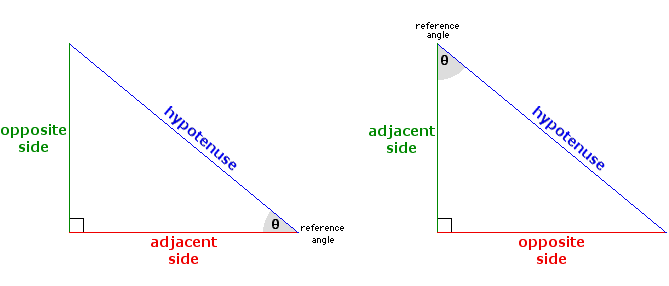
To do this I thought of a right angled triangle and using the trigonometric equations to find what the new coordinates for the shape would be.

While the math isn’t very complicated I felt it was worth explaining and documenting regardless. The hypotenuse is in this case the magnitude, the adjacent side (see left triangle) is the change in x, and the opposite side (left triangle) is the change in y, and theta is the randomHeading variable I generated in the update function. I knew the equations sin and cosine could be used as they had all the variables I needed and so by rearranging for x and y respectively, then adding the new values I got to the pre-existing posX and posY variables I could get the new posX and posY variables. This was the main problem I had, and it was what took me the most time to figure out since at the beginning I chose not to look directly into the code of others and to use what I knew already or what I remembered from class.

Below is the finished product:

Click to reset the circles.

Week 3 Assignment: The Ant Life

For this assignment, I had initially planned to create Agar Plate V2, but quickly found out that there would be very few ways to add more features and convert it to follow the guidelines of OOP without overhauling some major parts, so I decided to start from scratch. The bouncing balls example we did in class inspired me to do a project on generative art using ants.

Four Tips to Keep Ants out This Spring · ExtermPRO

Fig.: A column of ants, hard at work carrying food back to their colony

The patterns formed by scout ants searching for food and then leading worker ants to the food using pheromones always fascinated me. I wanted to replicate something along those lines in a generative art project. Because this was generative art, most of it had to involve randomness in initial positions, direction, and motions. I first got to work to converting the bouncing balls to ants. For this, I also converted my simple speedX and speedY parameters to be calculated from polar coordinates instead. The hope was that using angles instead of plain coordinate directions would allow better control over the behavior when reflecting off surfaces. I also finally figured out how to set up the collision between two objects in p5.js, which I implemented as below:

collide(other) {
  var d = dist(this.x, this.y, other.x, other.y);
  if (d < this.rad + other.rad) {
  return true; 
  } else {
  return false;
  }
}
for (var j = 0; j < ants.length; j++) {
  if (i != j && ants[i].collide(ants[j]) && !(ants[i].collide(colony))) {
    ants[i].speedDir += PI/2;
    ants[j].speedDir += PI/2;
  }
}

I was initially having the ants go in opposite directions when they met, but decided that having them bounce off 90 degrees instead better matched the behavior of real ants, who often exchange information about the presence or lack of food along their already searched path and move off in different directions instead.

This is the final result:

Finally, I decided to add a bit of randomness to the motion to avoid having them go in exact straight lines and be a closer match to ant-like motion.

Overall, there are many more things that I wanted to include in this project, but figuring out direction and the p5.js rotate() function took the bulk of my time. I had initially planned to have user interactivity in the form of sugar cubes they could drop, which would cause all the ants nearby to rush towards it. But, I had already tired of the math required just to figure out which direction the ants would be oriented in when they bounced off the walls, and I wasn’t too eager for further math. If I have more time in the future, I would love to revisit this project and improve upon it.

Assignment 3 – Pixel Dragon, Redha Al Hammad

My third assignment started with experimentation rather than ideation. As I initially struggled to grasp the concept of OOP and how to implement it into my own work, I went through the examples provided and began to change different variables just to see how they affected the output.

After some time, I decided that I wanted to continue my theme of recreating natural experiences. I initially wanted to pursue this by expanding on the concept of my last assignment (sitting under trees) to “sitting under clouds”. The idea for this was to have clouds move smoothly with a Sine function and incorporate some interactivity using “if (mouseIsPressed == true)” such as lighting or rainfall. However, after implementing Sine movement to my object, I noticed that it felt more “alive” than something as passive as clouds. As I had already conceptually situated my idea in the sky, I decided to branch off from my original concept and create a scene which depicts the body of a dragon.

While I decided to only create the body as a result of my inexperience, I personally like the unique perspective of only viewing a small part of something that is intended to be big. I believe that films often use this technique of showing a small part of a large creature in order to produce a sense of scale without having to animate its whole body.

In terms of interactivity, I still incorporated “if (mouseIsPressed == true)” in order to simulate the (off-screen) effect of the dragon breathing fire. I did this by generating a random color palette within the range of a faded red – a greenish grey on the background when the user clicks on the mouse.

I a simple yet effective piece of code from this assignment which I am proud of would be the “shading” which I managed to produce on the dragon’s body by increasing the number of rectangles in the for loop and selecting two analogous colors for the fill and stroke. I have included the two examples together below.

 // spacing and for loop
 let spacing = width / 163;
  for (let i = 0; i < width; i += spacing) {
    manyRectangles.push( new SineRect(i, 10 + i * 2)  );
  }

/////////////////

// dragon's body color
  fill(140, 70, 70);
  stroke(80, 50, 50);

Some points of improvement going forward (beyond learning how to make a full dragon) could be to create a more realistic sky as the flat/cartoonish style of the clouds contradicts the smooth aesthetic of the dragon. I feel that I could have also made the sketch more interactive by allowing the user to interact with the dragons body in some way (e.g it moves when the mouse is pressed or it follows the mouse).