Reading Response: The Psychopathology of Everyday Things, #Week4

Reflecting on Norman’s insights from “The Psychopathology of Everyday Things, Chapter:1” I find myself deeply considering the complexity hidden within simple everyday objects like doors, refrigerators, and watches. Norman points out that the designs meant to simplify our lives can sometimes make them more complicated instead. This resonates with me because I’ve often found myself frustrated by appliances and gadgets (like smart watches, bluetooth coffee maker) that have too many features. These features, instead of making the device better, can make it harder to use. Norman’s argument makes me rethink the belief that having more features means better functionality. My own experiences support this idea, as I’ve struggled with devices that seem to prioritize complexity over ease of use.

Furthermore, Norman’s critique makes me wonder about the true purpose of design. Is it more important for a product to look good and have lots of features than to be easy to use? This challenges the current trend in design, where form and complexity often take precedence over simplicity and functionality. Norman seems to favor designs that are straightforward and user-friendly, which makes me question my own ideas about what makes a design “good.” Previously, I might have thought that the more technologically advanced a product is, the better it is. However, Norman’s perspective has made me see the value in designs that balance functionality, simplicity, and elegance. This shift in thinking opens up new questions about how designers can create products that are both advanced and accessible. As technology evolves, finding the right balance will be crucial for creating products that enhance our lives without adding unnecessary complexity.

Yaakulya’s Assignment 4: Loading Data & Displaying text

Concept: I always wanted to understand the graphs and math revolve behind Real Estates, so for my Data Visualization assignment, I created a data visualization using the Boston Housing dataset. (Dataset URL: https://raw.githubusercontent.com/jbrownlee/Datasets/master/housing.csv)
This Dataset is available to public.

The resultant visualization displays the relationship between the average number of rooms per dwelling (RM) and the median home value ($1000s) for various suburbs in Boston. Each data point on the graph represents a suburb, with the x-axis indicating the average number of rooms and the y-axis indicating the median home value. Additionally, I implemented an interactive tooltip that provides detailed information about each data point when the user hovers over it, including the suburb name, crime rate, and median home value.

To make my concept work, I found inspiration from these sources and moreover I learnt a lot about attributes and functions used for loading the required data from the datasets precisely:

Highlight of Code: One part of the code that I’m particularly proud of is the implementation of the interactive tooltip, initially I found it very difficult. This feature enhances the user experience by providing additional information about the data points in a user-friendly manner. Here’s the code snippet responsible for displaying the tooltip:

function draw() {
  // Check if mouse is over a data point
  let overPoint = false;
  for (let i = 0; i < data.getRowCount(); i++) {
    let rm = map(data.getNum(i, 5), 3, 9, 100, width - 100);
    let medv = map(data.getNum(i, 13), 5, 50, height - 100, 100);
    let d = dist(mouseX, mouseY, rm, medv);
    if (d < 5) {
      overPoint = true;
      let suburb = data.getString(i, 0);
      let crimeRate = data.getNum(i, 1);
      let medianValue = data.getNum(i, 13);
      tooltip.html(`Suburb: ${suburb}<br>Crime Rate: ${crimeRate.toFixed(2)}<br>Median Home Value: $${medianValue.toFixed(2)}k`);
      tooltip.position(rm + 20, medv - 20);
      tooltip.show();
      break;
    }
  }
  if (!overPoint) {
    tooltip.hide();
  }
}

Explanation – How this Interactive feature works?: In the draw() function, which updates the canvas continuously, the code iterates through each data point in the dataset. It calculates the distance between the mouse cursor position and the position of each data point using the dist() function. If this distance is within a threshold of 5 pixels, indicating that the mouse is hovering over a data point, the code retrieves information such as suburb name, crime rate, and median home value using functions like getString() and getNum(). These functions extract specific values from the dataset based on row and column indices. The tooltip’s content is then updated to display this information, and its position is adjusted slightly from the data point using the position() function. Finally, the tooltip is shown to the user with show(). If the mouse is not over any data point, the tooltip is hidden using hide(). This process allows for interactive display of detailed information when the user hovers over data points on the visualization.

Complete Embedded Sketch:

let data;
let tooltip;

function preload() {
  // Load the Boston Housing dataset
  data = loadTable('https://raw.githubusercontent.com/jbrownlee/Datasets/master/housing.csv', 'csv', 'header');
}

function setup() {
  createCanvas(800, 600);
  background(240);

  // Plot the data points with black color
  for (let i = 0; i < data.getRowCount(); i++) {
    let rm = map(data.getNum(i, 5), 3, 9, 100, width - 100);
    let medv = map(data.getNum(i, 13), 5, 50, height - 100, 100);

    fill('rgb(197,134,88)'); // Change color to black
    noStroke();
    ellipse(rm, medv, 10, 10);
  }

  // Add x and y axes
  drawAxes();

  // Add interactive tooltip
  tooltip = createDiv('');
  tooltip.style('position', 'absolute');
  tooltip.style('background-color', 'rgba(255, 255, 255, 0.8)');
  tooltip.style('padding', '8px');
  tooltip.style('border-radius', '4px');
  tooltip.hide();


}

function drawAxes() {
  // Draw x-axis
  stroke(0);
  line(100, height - 100, width - 100, height - 100);
  for (let i = 4; i <= 9; i++) {
    let x = map(i, 3, 9, 100, width - 100);
    textAlign(CENTER, CENTER);
    textSize(12);
    fill(0);
    text(i, x, height - 80);
  }
  textAlign(CENTER, CENTER);
  textSize(16);
  fill(0);
  text('Average Number of Rooms per Dwelling (RM)', width / 2, height - 40);

  // Draw y-axis
  stroke(0);
  line(100, 100, 100, height - 100);
  for (let i = 5; i <= 50; i += 5) {
    let y = map(i, 5, 50, height - 100, 100);
    textAlign(RIGHT, CENTER);
    textSize(12);
    fill(0);
    text(i, 90, y);
  }
  textAlign(CENTER, CENTER);
  textSize(19);
  fill(0)
  text('Boston Housing Dataset Visualization (Year:1970-2006)', 400, 40);
  rotate(-HALF_PI);
  textSize(16);
  text('Median Home Value ($1000s)', -height / 2, 50);
}

function draw() {
  // Check if mouse is over a data point
  let overPoint = false;
  for (let i = 0; i < data.getRowCount(); i++) {
    let rm = map(data.getNum(i, 5), 3, 9, 100, width - 100);
    let medv = map(data.getNum(i, 13), 5, 50, height - 100, 100);
    let d = dist(mouseX, mouseY, rm, medv);
    if (d < 5) {
      overPoint = true;
      let suburb = data.getString(i, 0);
      let crimeRate = data.getNum(i, 1);
      let medianValue = data.getNum(i, 13);
      tooltip.html(`Suburb: ${suburb}<br>Crime Rate: ${crimeRate.toFixed(2)}<br>Median Home Value: $${medianValue.toFixed(2)}k`);
      tooltip.position(rm + 20, medv - 20);
      tooltip.show();
      break;
    }
  }
  if (!overPoint) {
    tooltip.hide();
  }
}

Generated Output:

Reflection and Ideas for Future Work: Overall, I’m satisfied with how the assignment turned out. The visualization effectively communicates the relationship between the number of rooms in a dwelling and the median home value in different suburbs of Boston. The interactive tooltip adds an extra layer of interactivity and information, enhancing the user experience.

For future work or improvements, I could consider adding more features to the visualization, such as:

1. Implementing color encoding for an additional variable, such as crime rate or pupil-teacher ratio, to provide more insights into the data.

2. Enhancing the design of the visualization by adding axis labels, a title, and a legend to improve clarity and understanding.

3. Exploring different types of visualizations, such as scatter plots or line charts, to represent the data in alternative ways and uncover additional patterns or trends in addition working with latest datasets.

Overall, this assignment has been a valuable learning experience, and I look forward to applying these skills to future assignments ad projects.

Related P5 References:
1. https://p5js.org/reference/#/p5/map
2. https://p5js.org/reference/#/p5.Element/style
3. https://p5js.org/reference/#/p5.Table/getNum
4. https://p5js.org/reference/#/p5.Element/hide
5. https://p5js.org/reference/#/p5.Element/position
6. https://p5js.org/reference/#/p5.Table/getString

Reading Response – The Psychopathology of Everyday Things

The psychological principles for design make a lot of sense to me. Of course affordances and mental models would shape how people use stuff – those concepts seem so core. Formalizing them into the design process feels overdue in a way. Still, I wonder – following guidelines can limit you too, can’t it? The times I’ve felt the spark of creativity or problem-solving have actually come a lot from defying conventions or unspoken “rules.” So where’s the line between guidance and overstandardization? Feels like a tension worth watching.

And even with technology’s insane pace of advancement, I think designers still have to be minimalists at heart. What separates a seamless, delightful experience from a bloated, confusing one is restraint and knowing when to stop adding features just because you can. But how designers make those calls is an art, not a science.

One part that really resonated was thinking about mental models across teams. We all carry biases and assumptions and lenses we see the world through. That exists even (maybe especially?) in cross-functional groups. Creating spaces where communication norms themselves feel simplified and clarified could make a world of difference in alignment, collaboration and innovation. There’s surely design opportunities even in how organizations function on a daily basis.

Overall this piece brought up great food for thought, and refreshed my appreciation of design thinking. I like writings that make me feel both grounded conceptually and curious to apply ideas further. This hit that sweet spot through framing the challenges creatively vs. just technically. The blend of examples and analysis kept a nice engaging pace too. Overall, this was a really enjoyable read!

Assignment 4 – Fortune Cookie

I’ve always loved cracking open fortune cookies to see the surprise message inside. I decided to recreate this idea digitally by building an animated, interactive fortune cookie in p5.js that reveals a new quirky fortune each time it’s clicked.

The core concept here was to display random fortunes generated from a list of silly phrases. I started by coming up (with the help of ChatGPT) with a whole array of potential fortune texts – things like “Run” or “Don’t eat the paper.” I tried to channel the cryptic non-sequiturs you might find in real fortune cookies.I then set up a pickNewFortune() function that can select a random element from this master list of fortunes. This gets called every time the cookie finishes its opening animation.

So on each cookie click, it grabs a new random index from the list and stores this fortune string to display.

The visual animation of the cookie opening was also really fun to build out. I made the separate cookie halves tilt back and apart slowly to reveal the text underneath. I’m really happy and proud with how realistic the motion looks!

The code for the animation looks like this:

function animateCookie() {
  let halfAnimationStep = maxAnimationStep / 2;
  let angleOffset, pullOffset;
  
  if (animationStep <= halfAnimationStep) {
    // Tilt cookie halves apart  
    angleOffset = map(animationStep, 0, halfAnimationStep, 0, -40);
    pullOffset = 0; 
  } else {
    // Finish opening animation
    angleOffset = -40;  
    pullOffset = map(animationStep, halfAnimationStep, maxAnimationStep, 0, 200);
  }

  drawFortuneCookie(angleOffset, pullOffset);

  // Progress animation
  if (animationStep < maxAnimationStep) {
    animationStep++;  
  } else {
    state = 'open'; 
  }
}

In the future I could definitely expand and refine this concept even more – perhaps allowing the fortune text itself to animate in different ways for some visual variety. I would also love to enhance the text generation further – for example, mixing and matching fortune text fragments to assemble new combinations. I could also display the text animating onto the screen for more visual interest when the fortune is revealed.

Assignment 4

For this assignment, I wanted to recreate the Matrix movie’s Neo sees the matrix for the first time in the scene, in which we see everything in green from Neo’s perspective.

I wanted to create the scene using the transcript of the movie itself. So, I quickly downloaded the transcript from open source. While looking for any tutorials online, I found Daniel Shiffman’s tutorial on creating images with ASCII text. I followed this tutorial only to complete the assignment. Following the tutorial, I started with creating the still image attached to this post with the movie transcript. I quickly realized that due to the presence of unwanted characters (numbers, :, etc.),  the visualization was not looking great. I decided to clean up the transcript according to my needs. I used p5.js to remove any unwanted characters from the data. However, following the tutorial, I could not replicate the brightness using empty/smaller ASCII text, as I was using sentences to create the visualization. So, I decided to manipulate the brightness of the text itself, and it worked. However, moving into the video loop, the code was not working smoothly. I realized that as I was using a large string (3300 lines), the array became too big to loop and refresh in the draw loop. I had to cut down the data to the first 70 lines of the transcript to accommodate that.


// draw function
function draw() {
  background(0); // setting background as black

  let charIndex = startIndex;
  // calculating the width and height of the cells
  let w = width / capture.width; 
  let h = height / capture.height;

  // load the pixels of the webcam capture
  capture.loadPixels();
  
  // loops to iterate over each pixel of the webcam capture
  for (let j = 0; j < capture.height; j++) {
    for (let i = 0; i < capture.width; i++) {
      // calculate the pixel index
      const pixelIndex = (i + j * capture.width) * 4;
      // rgb component of the pixel
      const r = capture.pixels[pixelIndex + 0];
      const g = capture.pixels[pixelIndex + 1];
      const b = capture.pixels[pixelIndex + 2];
      
      // calculating brightness 
      const brightness = (r + g + b) / 3;
      
      // Adjust the fill color based on brightness
      // map brightness to green color range
      let fillColor = map(brightness, 225, 0, 225, -150);
      fill(0, fillColor, 0);
      
      textSize(w * 1.3);
      textAlign(CENTER, CENTER);
      
      // retrieve a character from the matrixText string based on charIndex
      let textChar = matrixText.join('').charAt(charIndex % matrixText.join('').length);
      if (random(1) < 0.05) {
        textChar = matrixText.join('').charAt(floor(random(matrixText.join('').length)));
      }
      text(textChar, i * w + w / 2, j * h + h / 2);
      charIndex += rainSpeed;
    }
  }
}


I still could not replicate the rain sequence in the visuals as expected. I hope to improve that in the future.


Reading Reflection – Week 4

I think ‘communication’ is a keyword in interactive media. In real-life communication, for example, if you are a teacher, you should know whom you are talking to and give the information based on their intellectual level. It is important to ensure that the person who is listening to you understands what you are trying to convey. The same mechanism applies to interactive media. Since designers communicate through the results of their designs, the outcome should be very precise, and small details should have the power to deliver certain messages so that the user can feel comfortable. Designs become meaningless if the user does not understand their purpose. They only become useful if there are users that use them properly.

I remember from one of the core classes that I have taken, the professor mentioned the ‘desired path.’ If the walker creates a new path on a road that was not designed that way, it is the designer who miscreated the whole road and did not consider how walkers would prefer to walk. I think sometimes most designers pay too much attention to aesthetics, forgetting the experience part of design, which I understood is very important from the reading text. Designers are responsible for creating things that consider users’ preferences. I think this is the most important thing that I should remember from now on as I go through this course.

Reading Reflection Week 4 – Dachi Tarughishvili

Don Norman, author of “Design of Everyday Things” brings various examples and concepts when it comes to technology and challenges that arise with designing devices we use in our everyday lives. The thing that stood out to me the most was his example of a watch with four buttons. The whole paragraph talks about how it makes the user experience less enjoyable since now the watch is not merely about checking time but also providing users with additional functions. While the premise of a more feature-packed piece of technology is quite optimistic, the reality of it only confuses the vast majority of users as it takes away from its main function. Expanded this to today, this remains true. I personally own a smartwatch. Initially, I thought it would be very useful and offer numerous features. While it does all that, after the initial novelty wore off, I saw why so many people dislike them. There is no disagreement that some of these features are quite useful: instant notifications from your phone, the ability to call, reply to messages, check different apps, and so on. However, we already have peace of technology that provides all that and the purpose of the watch is redirected to a compromised clone of such device. Small screen, limited performance, difficulty interacting with UI and small buttons, and abundance of features I will probably never use, are the same sort of challenges Norman talked about. The fact that I have to charge it every day to keep it going puts a huge barrier to usability.
At the end of the day, a watch should serve one function, to display time at a quick glance. How many of us, have used our smartphones to do that even though we ourselves have digital watches on our wrists? We are sacrificing user-friendly design for the sake of complexity. It is a product that tries to be sophisticated – a jack of all trades but never excelling at anything in particular. Even when it comes to displaying time, the options and different layouts get overwhelming. This design ignores fundamental elements of good design which are simplicity, clarity, and ease of use. And what if something goes wrong? It is not a simple repair. It is attractive but not that affordable. Do I regret my purchase? Not really. At least I used it for my homework reflection.

Luke Nguyen – Week 4 Reading

I like how the author points out the fact that no matter how much knowledge the machines’ operators accumulate over the years and how well-versed they are in their field, they still have to make the construction and/or programming simple. It’s all about precision and accuracy, or perfection in the process in other words, which humans are not prone to. But it’s fascinating how, given the contradictory nature between machines and humans, humans have managed to churn out some very advanced technology that requires high level of precision and accuracy and to minimize the number of errors as much as possible merely through experimentation and testing! But that said, added complexities equate increased difficulty in use and frustration. High-tech machines/gadgets today require a lot of knowledge from users, and not every form of knowledge is easy to be acquired.

Another point from the author with which I resonate is about the relationship between affordance and signifier. This kind of relationship is not very clear-cut as one would say, as the author points out, “some affordances are perceivable, others are not” and “perceived affordances often act as signifiers, but they can be ambiguous” (19). Despite the fact that signifiers are more important than affordances, I’ve seen some terrible signifiers that do not fulfil their duty at all, which leaves users to figure out affordances all on their own and hence, suffer from frustration. The more high-tech and more complex machines, the more effort operators should put into curating the signifiers for a more effective affordance from the users.

Assignment 4 – “Hyein in Fast-Food Restaurant” by Hyein Kim

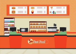
When I read the description for our assignment, I wondered how to use randomness in generating text. The idea came from my everyday experience. I remember always struggling to choose what to order in fast-food restaurants because there were so many variants. So, the concept of my assignment became using generative text to depict myself in a fast-food restaurant ordering some food.

Source: https://www.dreamstime.com/stock-illustration-fast-food-restaurant-interior-hamburger-beverage-drink-flat-design-vector-illustration-image80172236

First, I found a picture of a fast-food restaurant on the internet to use as a background. Then, I also found a speech balloon picture on the internet.

function preload() {
  mypicture = loadImage('speechballoon.png')
  backgroundpicture = loadImage('background.png')
  strings = loadStrings("fastfood.csv");
}

The preload function was used to load these pictures. I used the code I generated for the first self-portrait assignment to make an icon of myself. Then, I used scale() and translate() functions to relocate the icon.

hamburgers, fish and chips, pizza, pasta, fried chicken
french fries, onion rings, chicken nuggets, tacos, ice cream
cola, ginger ale, sprite, apple juice, orange juice

I created a .csv file where the first line was the main dishes, the second line was the side dishes, and the last line was drinks.

//text generator
textSize(30)
text('I want', 190, 100)
textSize(20)
for (let i = 0; i < strings.length; i++) {
  // Split the current line into an array of items (.csv file)
  let items = strings[i].split(', ');
  // Select a random item from this array
  let randomItem = random(items);
  // Display the random item
  text(randomItem, 150, i*30+140);
}

I made a code that chooses a random item from each line and generates text located in the speech balloon. 

function mouseClicked() {
    redraw();
  }

I used the redraw() function inside the mouseClicked() function to regenerate the entire code again, ensuring that the outcome of the three menus (main dish, side dish, drink) would change if the mouse was clicked.

For further improvements, I think I can use a different font and also maybe add more menus, or add a picture of the menu that was chosen randomly and display it with the text.

Luke Nguyen – Assignment 4 – Top 20 Movies of 2023

I went to the cinema a lot so I was fascinated about the box office of the movies released in 2023 (mainstream movies only as their box offices are always reported with accurate data from cinemas). I wanted to make a data visualization of the top box office of movies released last year. I searched on Kaggle and came across a CSV files compiling the US Domestic box office of top 200 movies in 2023 (https://www.kaggle.com/datasets/mohammadrizwansajjad/top-200-movies-of-2023). I edited the dataset a little bit, removing unnecessary data columns and reducing the dataset down to 20 to reflect the top 20 movies with the highest box office. The chart displays the movies’ box offices as well as the month they were released while also vertically ranking them according the box offices.

Snippets of code:

//Retrieving data from the table
  let Month = movies.getColumn("Release Date");
  let Name = movies.getColumn("Title");
  let Rank = movies.getColumn("Rank");
  let Boxoffice = movies.getColumn("Total Gross");

  for (let i = 0; i < img.length; i++) {
    // split data into string
    let splitString = split(Month[i], "/");

    //     displaying data
    image(
      img[i],
      12.5 + ((int(splitString[0]) - 1) * (width - 20)) / 12,
      map(Rank[i], 1, 22, 50, height - 20),
      53,
      23
    );
  }

Embedded Sketch (hover mouse diagonally to see all box offices):

The chart essentially displays the movies’ logos according to their box offices using the Map function. We can eyeball and compare one movie’s box office with another’s. The hardest part is to figure out the placements of the movies’ logos. But more importantly, it is also about extracting the data from the dataset and come up with a way to graph them.

For future improvement, I want to come up with a way to display the movies’ logos in a more visible manner. As of now, because of the size of the chart, the logos are pretty small and the accompanying hover number for the box offices are also small. I also want to display the box office number separately as well, i.e. it only shows when the mouse hover on the image. The challenge here is to figure out the coordinate of mouseX and mouseY.