
“The Psychopathology of Everyday Things” lays a foundational understanding of how good design should bridge the gap between user experience and functionality.
One intriguing aspect that Norman highlights is the concept of “affordances,” which refers to the perceived and actual properties of an object that determine how it could possibly be used. A door handle, for example, affords pulling, while a push plate suggests pushing. This concept raises questions about how well the design communicates possible actions to users and how intuitive these actions are. It leads one to ponder: How many everyday frustrations are due to poor design rather than user error?
Norman also introduces the idea of “signifiers,” signals that communicate where the action should take place. This is particularly interesting when considering interactive media, where the interface must clearly communicate how to interact with digital environments. These concepts beg the question of how digital interfaces can be designed to be more intuitive and reduce the cognitive load on the user.
“Good design makes a product understandable” – it encapsulates the essence of user-centered design—making the purpose of an object or interface self-evident. Consider the evolution of smartphone interfaces. Early smartphones often required users to navigate through multiple menus to perform simple tasks. Modern smartphones, however, have refined their interfaces to be more intuitive, using design principles like those Norman discusses. Icons are designed with affordances and signifiers in mind, making actions like deleting an app or finding settings more intuitive. This evolution showcases the impact of good design on everyday technology and its role in enhancing user experience.
How can we, as future designers, ensure that our creations are not just functional but also joyous to interact with? How can we minimize frustration and maximize satisfaction? That are the questions it’s high time we ask ourselves.
Month: February 2024
Assignment 4 – Data Visualization
Concept
For this assignment, I drew inspiration from one of the previous students works where they used the 2018 world cup data to create a graph. As a passionate football enthusiast, with football being my favorite sport, and considering that the FIFA world cup is the biggest sports tournament in the world, I decided to collect the data on the total number of goals scored in every World Cup tournament from 1930 to 2022. My goal is to present this data in the form of a bar graph, visually depicting the historical trends and patterns of goals scored across different tournaments.
A highlight of some code that you’re particularly proud of
// Inserting bars
    for (let i = 0; i < data.length; i++) {
    let year = data[i].getNum('YEAR');
    let goals = data[i].getNum('GOALS');
    let x = map(year, 1930, 2022, margin+20, width - margin); // mapping the Year
    let y = map(goals, 0, maxGoals, height - margin, margin); // mapping the number of goals
    let barWidth = w / data.length;


    fill('#E8B6B6'); //color of the bars
    rect(x - barWidth / 2, y, barWidth, height - margin - y); //draws the bar

    fill('#100D0D'); //color of the texts
    text(goals, x+6, y -10); //writes the number of goals
  }
Embedded SketchReflection and ideas for future work or improvements
For future improvements, I would like to add various patterns into the bars of the graph and additionally, I plan to implement interactivity, allowing users to click on individual bars to reveal which country achieved the highest goal count in each respective tournament.
Afra Binjerais – reading response 4
This week’s reading has been incredibly enlightening, offering valuable insights into the realm of interaction and design. It prompted me to reconsider the intricacies of design processes and their impact on user experience. The discussion on the challenges of everyday interactions, particularly with objects like doors, emphasized the pivotal role of effective design in usability. The concept of “Norman doors” sheds light on the common struggle users face in navigating poorly designed interfaces, a challenge I’ve personally encountered.
Similar to the confusion of push and pull doors, I also get confused every time I try to open my curtains. It annoys me when I pull the curtain string to open and it gets closer even further instead.


Through engaging anecdotes and examples, the reading emphasized the importance of discoverability and understanding in design, advocating for intuitive products that require minimal instruction. One aspect that stood out to me and that I believe is crucial to keep in mind for my future career in IM is the exploration of human-centered design and its integration of psychology and technology. Understanding how to prioritize human needs, capabilities, and behavior in design solutions is paramount, as it ensures products are not only aesthetically pleasing but also functional and user-friendly. This insight is something I find both intriguing and essential to carry forward as I pursue my career in IM.
Raya Tabassum: Generative Text Assignment
Concept:
This kinetic typography transforms static text into an interactive visual display. By treating each point of the font’s letters as a vehicle, the sketch brings the text “Dream” to life, allowing it to respond dynamically to the viewer’s mouse movements. Vehicles “arrive” at their designated spots to form the letters of the word and “flee” when the mouse comes close, creating an engaging effect that feels both chaotic and ordered. The addition of the gradient background adds depth and visual interest, making the typography a part of an aesthetically pleasing composition of a sunset.
Use your mouse to go through the word to interact with it:
Font Points Extraction and Vehicle Initialization:
//Extract points from the font
let points = font.textToPoints(textString, 75, 320, fontSize, {
  sampleFactor: 0.1
});

//Initialize vehicles for each point
for (let i = 0; i < points.length; i++) {
  let pt = points[i];
  let vehicle = new Vehicle(pt.x, pt.y);
  vehicles.push(vehicle);
}
Extracting points from text and converting them into “vehicles” was a bit complex due to the need to handle font rendering and point manipulation. The textToPoints() function is used to get the vector points for each letter, which are then used to create vehicle objects that simulate motion.
Also for the Vehicle class, implementing behaviors such as “arrive” and “flee” required understanding of steering behaviors and force accumulation in a physics-based simulation. Balancing these forces to achieve smooth and natural movement was challenging, especially when trying to simulate both attraction to a target point and repulsion from the mouse cursor.
Full code:
//Preload the font
let font;
let vehicles = []; //Array to hold the 'vehicle' objects

function preload() {
  //Load the font from the assets
  font = loadFont('Hogfish DEMO.otf');
}

function setup() {
  createCanvas(700, 500); //Set up the canvas
  //Create a background gradient
  setGradient(0, 0, width, height, color('#EBC249'), color('#A52D56'), Y_AXIS);

  //Define the text properties
  let textString = 'Dream';
  let fontSize = 180;
  //Convert the text to a series of points
  let points = font.textToPoints(textString, 75, 330, fontSize, {
    sampleFactor: 0.1 //Determines the density of the points
  });

  //Create a vehicle object for each point
  for (let i = 0; i < points.length; i++) {
    let pt = points[i];
    let vehicle = new Vehicle(pt.x, pt.y);
    vehicles.push(vehicle);
  }
}

function draw() {
  //Refresh the gradient background each frame
  setGradient(0, 0, width, height, color('#EBC249'), color('#A52D56'), Y_AXIS);

  //Update and display each vehicle
  for (let i = 0; i < vehicles.length; i++) {
    let v = vehicles[i];
    v.behaviors();
    v.update();
    v.show();
  }
}

//Constants for gradient direction
const Y_AXIS = 1;
const X_AXIS = 2;

//Function to create a gradient background
function setGradient(x, y, w, h, c1, c2, axis) {
  noFill();

  //Create a vertical gradient
  if (axis === Y_AXIS) {
    for (let i = y; i <= y + h; i++) {
      let inter = map(i, y, y + h, 0, 1);
      let c = lerpColor(c1, c2, inter);
      stroke(c);
      line(x, i, x + w, i);
    }
  }
  //Create a horizontal gradient
  else if (axis === X_AXIS) {
    for (let i = x; i <= x + w; i++) {
      let inter = map(i, x, x + w, 0, 1);
      let c = lerpColor(c1, c2, inter);
      stroke(c);
      line(i, y, i, y + h);
    }
  }
}

//The Vehicle class
class Vehicle {
  constructor(x, y) {
    this.pos = createVector(random(width), random(height)); // Start position
    this.target = createVector(x, y); //Target position
    this.vel = p5.Vector.random2D(); //Initial velocity
    this.acc = createVector(); //Acceleration
    this.r = 8; //Radius
    this.maxspeed = 10; //Maximum speed
    this.maxforce = 1; //Maximum steering force
  }

  //Combine behaviors
  behaviors() {
    let arrive = this.arrive(this.target);
    let mouse = createVector(mouseX, mouseY);
    let flee = this.flee(mouse);

    arrive.mult(1);
    flee.mult(5);

    this.applyForce(arrive);
    this.applyForce(flee);
  }

  //Apply a force to the vehicle
  applyForce(f) {
    this.acc.add(f);
  }

  //Update the vehicle's position
  update() {
    this.pos.add(this.vel);
    this.vel.add(this.acc);
    this.acc.mult(0); //Reset acceleration each frame
  }

  //Display the vehicle
  show() {
    stroke(255);
    strokeWeight(8);
    point(this.pos.x, this.pos.y);
  }

  //Steer the vehicle towards a target
  arrive(target) {
    let desired = p5.Vector.sub(target, this.pos); //A vector pointing from the position to the target
    let d = desired.mag();
    let speed = this.maxspeed;
    if (d < 100) {
      //Adjust speed based on distance to the target
      speed = map(d, 0, 100, 0, this.maxspeed);
    }
    desired.setMag(speed);
    let steer = p5.Vector.sub(desired, this.vel);
    steer.limit(this.maxforce);
    return steer;
  }

  //Make the vehicle flee from the mouse
  flee(target) {
    let desired = p5.Vector.sub(target, this.pos);
    let d = desired.mag();
    if (d < 50) {
      desired.setMag(this.maxspeed);
      desired.mult(-1); //Go in the opposite direction
      let steer = p5.Vector.sub(desired, this.vel);
      steer.limit(this.maxforce);
      return steer;
    } else {
      return createVector(0, 0); //No force if the mouse is far away
    }
  }
}
Assignment #4 – Stefania Petre
For this week’s assignment I decided to do aa text with an interactive part.
First, I did the sketch and put the text in. I have to admit, it was difficult to choose the background color because I wanted something that would suit every single random color generated when you press the button. At first I thought of a beige, sand color but it did not look right. So, I decided to stick with black.
After that, I created a function for the mouse interaction.
I have to admit, I did not have much time to do this but this is the end result! All in all, I am pretty proud of my improvement on coding giving the fact that I started 4 weeks ago.
For the future, I want to figure out how to use other fonts as well.
Week 4-Assignment
CONCEPT:
In this assignment, my primary objective was to visualize data pertaining to different types of energy consumption spanning from 1900 to 2018. Given the diverse nature of energy sources and their consumption patterns, I decided to employ a line graph as the mode of visualization. However, due to the multitude of energy types and their varying magnitudes of consumption, presenting them all on a single graph would result in a cluttered and incomprehensible visualization. To address this issue, I opted to implement a dropdown menu using the createSelect() function. This feature allows users to select a specific energy type, and subsequently, the graph updates dynamically to display the consumption trend exclusively for the chosen energy source.
One of the prominent challenges encountered during the implementation phase was the disparate scales of energy consumption among different energy types. Some energy sources exhibited significantly higher consumption values compared to others. Consequently, if a uniform y-axis scale were to be applied across all energy types, it would lead to visual distortions, making the graph incomprehensible. To mitigate this challenge, I implemented a dynamic scaling mechanism. This involved calculating the maximum consumption value for the selected energy type and mapping the y-axis scale accordingly. By dynamically adjusting the scale based on the maximum consumption value of each energy type, the visualization maintains clarity and accuracy across all displayed data points.
My favorite part of the code is processData(). It extracts and organizes data for visualization. It initializes empty arrays xValues and yValues, then loops through each row of the dataset. It extracts year and energy consumption values based on the selected energy, storing them in the arrays. This function ensures accurate representation of energy consumption trends.

REFLECTIONS:
Completing this assignment was definitely challenging, but I persisted by referring to the p5.js documentation whenever I encountered difficulties. This helped me understand how to use different functions and techniques to achieve my goals. I also attempted to enhance the visualization by incorporating a background picture, but encountered some issues with how it interacted with other visual elements. I’m eager to continue exploring this project further. I see a lot of potential for adding more interactive elements to make the visualization even more engaging and informative.
Reading Reflection – #4 Stefania Petre
The banality of evil design is everywhere. Don Norman’s argument is trying to prove that there should be thought behind every new idea. On top of that, there is also a need for some boxes to be checked before coming out with a new product.
This first chapter of his work reminded me of the book ‘Universal Principles of Graphic Design’ by Jill Butler and how there are certain instructions when it comes to good design.
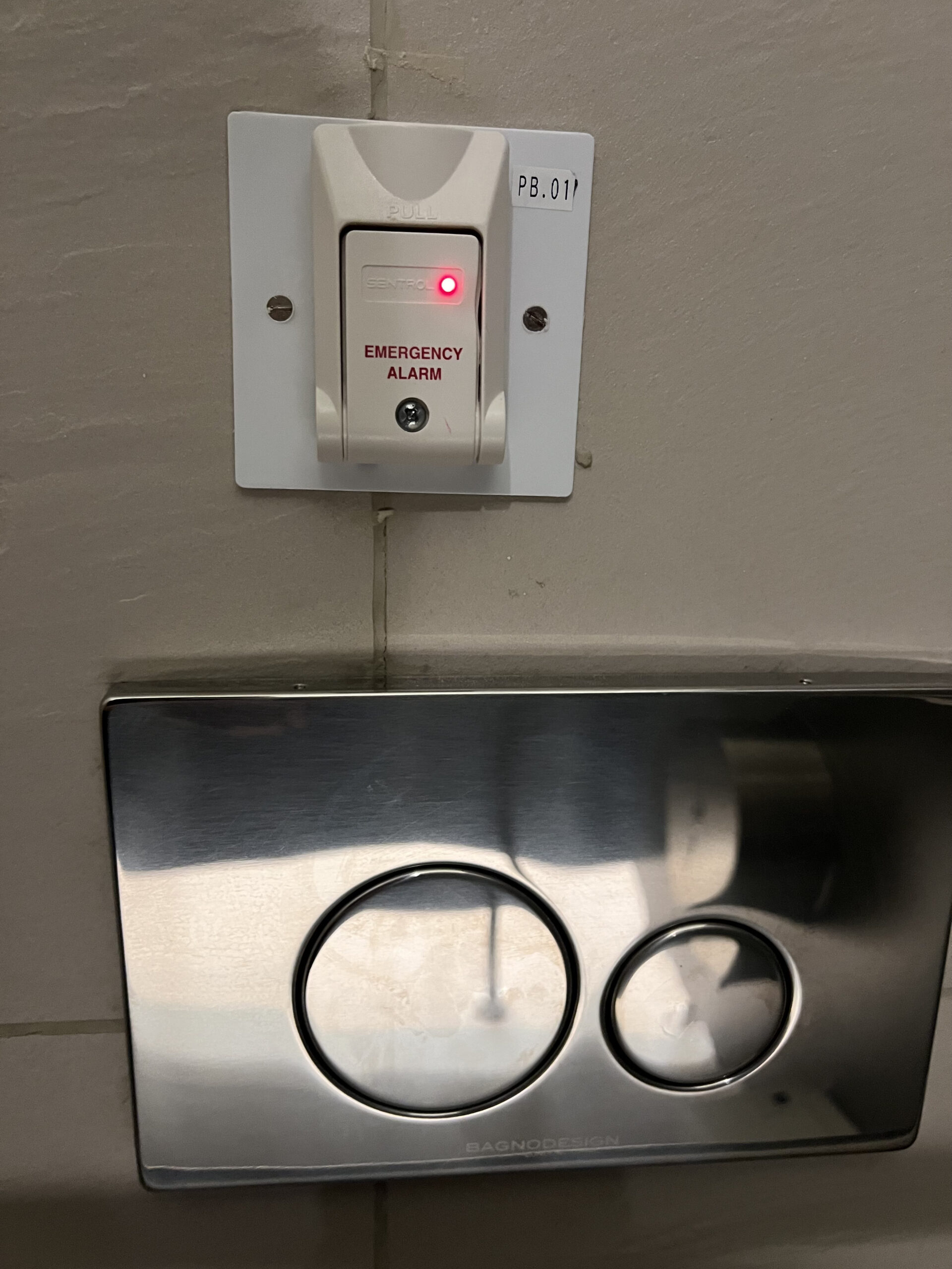
Since my arrival at NYUAD in August, I have encountered several instances of design oversights within the campus environment. For instance, the positioning of football court seats on the incorrect side of the field exposes them to relentless sunlight, diminishing their utility and comfort. Similarly, the placement of the alarm button adjacent to the toilet flush button presents a comical yet concerning scenario, where inadvertent activation could disrupt the tranquility of the Arts Center.
All in all, I believe that good designers think ten times before coming out with a product. It is better to think twice at first than having to deal with redesigning it over and over again.
Reading Response Week 4
After delving into the first chapter of Don Norman’s “The Design of Everyday Things,” I find myself resonating deeply with his emphasis on the significance of understanding human behavior and psychology in design. Norman’s argument about the importance of putting ourselves in the shoes of users resonates with my own approach to design. I firmly believe that creating anything without considering the end user’s perspective is futile. Design should always prioritize usability and functionality to ensure a seamless interaction between users, systems, and designers.
Norman’s discussion on the paradox of technology also caught my attention, particularly his insight into how experiences shape users’ perceptions of interactions. It serves as a reminder that even the most aesthetically pleasing designs must prioritize functionality and user experience above all else. This resonates with me as I reflect on instances where overly complex features have hindered rather than enhanced my experience with products.
Moreover, Norman’s critique challenges the prevailing notion that more features equate to better functionality. It prompts me to reconsider what truly defines a good design and the balance between form, complexity, simplicity, and functionality. As I continue to contemplate Norman’s insights, I aim to adopt a dual perspective—as both a user and a designer—to ensure that my designs are not only visually appealing but also intuitive and user-friendly. Norman’s work serves as a valuable guide for navigating the complexities of design and human interaction, prompting me to strive for designs that enhance users’ lives without adding unnecessary complexity.
Generative text Output | Assignment 4 |Aadil
Concept
Initially , I tried figuring out whether data visualization or generative text would be a cooler project to work on . I tried data visualization for precipitation for every city but I couldn’t find large clean datasets and had difficulty in setting the world map to scale as the background of my canvas .
Meanwhile , in the generative text side , I experimented with different fonts and different ways to display and adjust text . I came across the texttoPoints() method that creates an array of points from a text when using a specified font . I looked for cool implementations online and came across this video by Ed Cavett –
I thought this was amazing and decide to do something using this code and logic to create interactive generative text .
-
- First of all, I wanted to have dynamic text such that whatever the user would input in a text box would be displayed on the screen. Although I thought this would be easy, it was challenging for me to implement it as I had to understand the class lineMaker() created by Ed Cavett fully and had to change some aspects of it to ensure that text was generated dynamically.
- I wanted to add the words that were typed in the background too – this involved changing the position of the words in the background depending upon the textlength and using loops to fill the whole screen with the correct spacing . I also experimented with color and alpha values to see what suited the best .
- I wanted some moving letters based on what the user had typed . For each letter typed by the user, I created a letter object that would move in a circle of changing radius to give the effect that the circle was closing in to the center of the canvas . The letters would disappear as the text was changed .
- After reading about signifiers in this week’s reading , I had to make sure that the user knew how to change the text at the center of the canvas . So , I added a message next to the text box so that when the user presses enter, the message at the center is updated .
- I also wanted to add a ‘fire ‘ effect instead of a lightning effect to the letters at the center so I changed the color values for highlighting the text and the color of the ‘darts’ too .
Sketch
PLEASE ENTER TEXT IN THE TEXTBOX AND PRESS ENTER !! HAVE FUN !!
Challenges while implementing
-
- I had a lot of errors while implementing the code. The backspace functionality to remove any letters already on canvas was tricky to implement . It would duplicate the letters . I found a way to clear the array and regenerate it every frame to remove this error . Althouugh this is not the most efficient way to do it (which would be to push and pop elements at the end of the array)
- The aligning of words typed to the background of canvas was another aspect . It took some time to get the alignment right. Initially , I had tried to use the array generated by textToPoints() function for drawing the words as points but the program would lag/crash due to the large number of points so I decided to stick with using text .
- The code to generate the darts and form the word in the center that is based on Ed Cavett’s code was fairly complicated for me and it took a lot of time understanding it . Thankfully , I did not have to change much and it was only important to broadly understand what each segment does so that I could change the properties as intended .
Code that I am proud of
This project took a lot of time and I am really proud of the fact that I was able to make a dynamic version of Ed Cavett’s text art . In addition , I implemented the background and the spiral letters as well as the Letter class . I am most proud of the code for letter class as follows :
class Letter {
  constructor(char) {
    this.char = char;
    this.x = random(width);
    this.y = random(height);
    this.angle = atan2(this.y - height / 2, this.x - width / 2); // Angle from center
    this.radius = 300;
  }

   update() {
    let angularSpeed = 0.05;

    // Increase or decrease radius based on current value
    if (this.radius >= 400) {
      this.radiusDecreasing = true; //boolean to determine whether circle should increase or decrease
    } else if (this.radius <= 200) {
      this.radiusDecreasing = false; //flase if radius is below 200
    }

    // Increment or decrement radius
    if (this.radiusDecreasing) {
      this.radius -= 1;
    } else {
      this.radius += 1;
    }

    // Update angle
    this.angle += angularSpeed;
    this.x = width / 2 + cos(this.angle) * this.radius;
    this.y = height / 2 + sin(this.angle) * this.radius;
  }

  display() {
    textSize(fontSize);
    fill(255,150,0);
    text(this.char, this.x, this.y);
  }
}
I also spent a lot of time implementing the alignment for the words in the background , this is the piece of code that does that :
// Word Decor
let charArray = input.value().split('');
word = input.value(); //implementing word decor

// Calculate text width
let text_Width = myFont.textBounds(word, 0, 0, fontSize).w;

// Calculate horizontal position for centering
let centerX = (width - text_Width)/2;


  // Draw points
  push();
  stroke(255);
  for (let i = 0; i < points.length; i++) {
    point(points[i].x, points[i].y);
  }
  pop();
}*/
for(let j=0;j<num_cols;j++){
  for(let i=0;i<num_lines;i++){
    fill(200,200,200,20);
    text(word,centerX,50+ i*fontSize);
  }
  translate(-text_Width,0);
}
//reset canvas
translate(text_Width*num_cols ,0);

for(let j=0;j<num_cols;j++){
  for(let i=0;i<num_lines;i++){
    fill(200,200,200,20);
    text(word,centerX,50+ i*fontSize);
  }
  translate(text_Width,0);
}
//resets canvas to OG position
translate(-text_Width*num_cols,0);
Here, the translate functions have been used to fill the whole canvas . I have made sure that I translate back to the original position once the drawing is done . Although looking back , I think using pop() in the right way would make it easier , this is the way I decided to implement it .
Reflection/Scope for improvement
I am very happy with what I achieved at the end . The project took a lot of time but I learnt a lot – especially while trying to understand the lineMaker() class . However there are certain additional implementations that I had thought of which I would love to look into in the future but I couldn’t implement now because of errors that would take time to debug :
-
- Increase the number of letters in the circle – you will notice there is an unused variable called lettermultiplier in the beginning that is set to 5 as well as a commented out for loop in). This was for adding extra letters to the circle, however the for loop doesn’t work as expected for some reason and the letters attain complete randomness in motion instead of moving smoothly ( it probably has to do something with instantiating each letter object but I couldn’t pinpoint the source of the error) .
- Use different font (I have used Roboto which is fairly common , maybe a fancier font could look better)
- Experiment with different uses of texttoPoints() function . This function can be used in a variety of interesting ways . Although I have used it only for one such way , there seems to be endless possibilities with this function.
Reading Reflection – Week#4
In the chapter “The psychopathology of everyday things”, Don Norman brings up a multitude of examples of bad design that hinders human experience with the object of said design. He proposes the idea of human-centered design as the ultimate goal of a good design. I do not think that the bad design in some cases is a problem that desperately needs to be fixed. For instance, confusing buttons of a dryer-washing machine is an example the author gives for bad design choices. I agree that the design is not human-centered and can be improved, but I find the emphasis on it being a problem unnecessary. The sales of such machines are profitable and people still buy the complicated technology despite the bad design, otherwise the production of such machines would be terminated. This could indicate that human-centered design is not the primary concern of the businesses selling the complicated technology. This also might suggest that creating a machine with more of a human-centered design is not beneficial to the company. Moreover, consumer can use fridges and washing machines for decades and I think the designers bet on the longevity of the product – it can be confusing at first, but not after 10 years of using the device and it is my understanding that the consumers are attracted to the bursting variety of features rather than the ease of use.
That being said, the author mentions that the good design choices come at an expense and have their fair share of constraints, but it is only discussed in chapter 6, therefore to make a conclusive judgement of the topic I would need to read about what author has to say in chapter 6. I hope the author can prove me wrong by offering worthy alternatives that would benefit the consumer and be feasible for the producers. Disclaimer: my points mentioned in the previous paragraph would apply to consumable goods, but not necessarily other products with bad design.