Assignment 4 – The Emotion Tree

To make this assignment, I browse the Kaggle for a while to find any suitable data table that can be used for my assignment. I came across a table about emotion of the twitter quotes. The table consists of 6 emotions: sadness, joy, love, angry, fear, surprise.

Since the data has different emotions, I am inspired by the movie Inside Out and assign each emotion with a color. In particular, sadness is blue, joy is yellow, love is pink, angry is red, fear is purple and surprise is green. These colors will be displayed as options for the users to choose what type of quotes they want to read.

Since the initial file consists of different mix of emotions, I organize the file and make it into 5 different files for different emotions. Then I load the emotion tables into the sketch file and continuously display a random text from the file after the MousePressed event. Below is the example code for the first 2 emotions:

function mousePressed() {
  //sadness
  if (dist(mouseX, mouseY, 30, 30) < 50) {
    let stringList = sadness.getColumn('text');
    string = stringList[int(random(stringList.length-1))];
    push();
    translate(width / 2, height);
    background('black');
    fill("white");
    branch(70, 0);
    pop();
  } 
  //joy
  else if (dist(mouseX, mouseY, 30, 100) < 50) {
    let stringList = joy.getColumn('text');
    string = stringList[int(random(stringList.length-1))];
    push();
    translate(width / 2, height);
    background('black');
    fill("white");

    branch(70, 1);
    pop();
  }

Furthermore, the colors of the emotions will also be presented as the color of the leaves on the tree. I initially want the leaves on the tree to be responsive to display text after clicking on them. However, it is incredibly difficult because of recursively called translation function. As a result, I can not figure out the position of the leaves to add interactions. I believe that this is not the best way to do for this approach. However, I modify the idea so that the users can still choose the emotions using the circle at the top of the page.

Reflection:

As I said before, I want to add interaction to the leaves of the tree. I added the class for the leaves (Leaf class), but I was successfully implemented that. Furthermore, I wanted to add animation such as leaves falling and changing of night and day.

My sketch:
Reference:

Recursive Tree

Reading Reflection – Design is difficult

I feel that design is difficult, especially when we are designing for others. Since the product is designed for the users, we have to understand their behavior. Take the example of a door in the reading: The way a hurried person interacts with the door will much different from someone who takes their time to use the door. While the first one needs to prioritize the efficiency of how the door works, the latter can be focused on the creative aspects of it.

Furthermore, it sometimes difficult to be someone’s shoes. Assume that we are designing a product for the public customer. However, because we are the product owner, we understand the product much more than anyone else outside of the product scope. There will be a lot of things that are obvious under our eyes but it serves no meaning in the users’ eyes. That is why Human Centered Design is really important. However, the human here is our application users and not ourselves.

Assignment 4: Cards For Humanity

For this assignment, I wanted to create a generative text output. I was thinking of games that play with words and phrases and I immediately thought of Cards Against Humanity. So I wanted to create a PG version that just uses playful humor and thus called it “Cards For Humanity”:)

The way my game is played is that the user first clicks on the deck of black cards and reads the prompt. Then, they will click on the deck of white cards and read the comical response. They can then click the button below to try multiple rounds. It is based on the party game below:
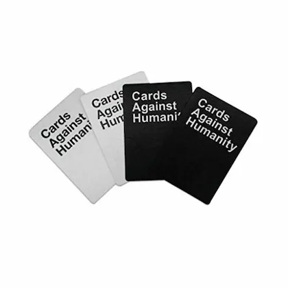
The part of my code that I want to highlight shows how I fit the varying text within the card. Since I didn’t want to limit the length of the text or the size of the font, I could only make the text fit by separating it into different lines. Words are added to the same line until it exceeds the max length.

function drawSelectedCard(x, y, cardText, isBlack) {
  fill(isBlack ? 0 : 255); //checks if card is from black deck and assigns color
  rect(x, y, cardWidth, cardHeight, 10);

  fill(isBlack ? 255 : 0); //text color opposite to card

  // Split the card text into lines to fit within the card
  let lines = splitLines(cardText, 70); //Maximum characters per line set to 70

  // Display each line of text within the card
  for (let i = 0; i < lines.length; i++) {
    text(lines[i], x + cardWidth / 2, y + cardHeight / 2 - (lines.length - 1) * 10 + i * 20); //vertical centering
  }
}

function splitLines(text, maxLength) {
  let words = text.split(' '); //split text into array of words
  let lines = [];
  let currentLine = '';

  for (let i = 0; i < words.length; i++) {
    if (textWidth(currentLine + words[i]) <= maxLength) { //checks if adding the current word to the current line exceeds the maximum length
      currentLine += words[i] + ' '; }
    else {
      //if the max length is exceeded, push the current line to the array and start a new line
      lines.push(currentLine);
      currentLine = words[i] + ' ';
    }
  }

  lines.push(currentLine); //push the last line to the array
  return lines; 
}

Overall, I am happy with the output. I would like to work further on this by adding more amusing prompts and responses. I would also like to improve the game by letting the user choose the best response from their set of already-selected white cards, like the actual game. Lastly, I could organize my code better by using OOP and making the cards objects.

Assignment #4 – Reading Response – Mundane Acts Made Hard

This text reminded me of the book «Thinking, Fast and Slow» by Daniel Kahneman, in which he talks about the two modes of thinking. The first is «System 1», which is the intuitive and fast way of thinking, and the other is «System 2», which takes more effort and conscience. Often, when we learn new things, we think with System 2. Eventually, it becomes more «automatic» and therefore turns into System 1. One example of this is how we learn how to multiply as children. For instance, to solve «2 x 3», at first we count on our fingers. It is a more conscious effort, therefore involving System 2. Over time, we learn the solution to «2 x 3». Thinking the solution to that multiplication becomes automatic, therefore turning into a System 1 way of thinking. The bottom line is through repetition, we do things more intuitively, without thinking much about them. In relation to Norman’s descriptions of poor design, there seems to be some things which will never be systematic, though they should be easy to use. The example of the doors is well fitting. We push and pull through a number doors everyday, yet there will still be moments in which we push instead of pull, or push on the wrong side of the door. An example that came to mind when I read this was SD cards and SD card readers. As a film major, I cannot begin to count the amount of times I have had to insert an SD card into a reader. Yet, I never manage to put it in the right way. The worst part is: it gets stuck if you put it in the wrong way. For something that should be so easy, it takes a lot of mental effort to do. Even when the SD card symbol is on the reader in order to instruct in which way to insert it, it just does not come to me. I would think that maybe it is just a me issue, but I have seen this happen with so many people, whether they be filmmakers who do this repetitively or not.

At the end of his text, Norman talks about how technology is supposed to make things easier yet manages to make it harder sometimes. He gives the example of the phone, to which so many unnecessary functions are added making it so complicated. But even in much more simple things, this also happens. Automatic doors for instance are enabled by sensors. But there have been so many times in which the sensors don’t work, leaving you stranded outside or locked inside. Poor design and some bad technology therefore make mundane acts so complicated sometimes…

Reading Reflection – Week 4

The following will be an overview of the points I have gathered throughout the reading, and with these points, I have come to criticize our campus design—or more specifically, campus doors.

Chapter 1 begins by reflecting on how a simple concept or thing like a door could be so confusing. We know that the design of a door should indicate how to operate it without any need for signs, certainly without any need for trial and error (Page 7). Norman emphasizes on page 3 that the two most important characteristics of good design are discoverability and understanding, something the C2 building doors don’t seem to have. Although equipped with sensors, these so-called ‘automatic’ doors require more strength and patience than any regular door. There have been many instances where people have gotten ‘squished’ or ‘trapped’ trying to walk through them. Additionally, the sensors installed above the doors are not precise at all; they are intended to sense motion straightforwardly facing the palms, yet people tend to approach from either the left or right, rarely from the center, so that’s another issue. That being said, and in Norman’s definitions, I would say that NYUAD doors have failed in industrial design, interaction design, and experience design (Page 5). Hence, we say that when designs are done badly, it leads to frustration and irritation (Page 5), and the reason behind that, I believe, is that engineers are trained to think logically (Page 6). They don’t really take into account the possibilities of how people other than themselves would interact with a product, in other words, user testing. Because at the end of the day, design presents an interplay of technology and psychology, and designers must understand both (Page 7).

Further, Norman introduces HCD or human-centered design, which is an approach that puts human needs and capabilities first, then designs to accommodate those needs (Page 8); something I stand by, especially in terms of accommodating people of determination in their day-to-day activities like battling D2 doors. So, in line with HCD’s philosophy, it is important to start with a good understanding of people and the needs that the design is intended to meet (Page 9). Moreover, the chapter “The Psychopathology of Everyday Emotions” highlights the importance of affordance (Page 11), defining what actions are possible, and signifiers, specifying how people discover the made possibilities (Page 12). In line with the author’s statement, I believe that signifiers are of far more importance to designers than affordance (Page 19). In addition, Norman mentions how it’s important to give feedback to users because how else would I know that something worked? So, it is important to provide confirmation & immediate feedback, but not too much feedback (Page 23).

Overall, I believe that the reading contains many of the most fundamental things a designer must know. I have come across these topics through other classes I’ve taken, such as UX Design and Wayfinding, so this book covers a great intersection and gives a proper overview of key points. With proper design comes a great product, and with great products comes happy customers; it can be done, says Norman (Page 36). However, in the eye of the campus designers, it’s a different story.

Week 4: Reading Response – The Design of Everday Things by Don Norman

The underlying assumption of anything artificial is that it operates based on a set of logical rules and assumptions. Engineers verify their designs by checking their conformity to logical principles, deeming their work reliable only once it passes a set base of logical benchmarks. Norman Don argues that while engineers prioritize logic as the central guide in their design of new technology, the consumers of these designs, on the other hand, seldom operate based on logical principles when interacting with new devices. Indeed, we humans pride ourselves on being logical beings, but struggle with fundamental logic puzzles or, as Norman illustrates, actions as simple as opening doors. Instead, we rely on our accumulated experiences and previous interactions to inform our ability to use new designs.

Hence, Norman outlines the two most important characteristics of good design: 1) Discoverability and 2) Understanding. Indeed, the usage of a well-designed product needs to be understandable or at the very least discoverable with minimal effort and/or resources. I found myself surprised when I reflected on how many devices I use frequently that lack these basic properties. For years on end, for instance, I wondered why my clothes were still wet after multiple hours in the dryer on the highest heat setting. Only by watching another person drain the water in the cartridge on the upper left side of the dryer, a signifier to the affordance of emptying the cartridge, was I able to get my clothes dry in the first cycle. It is, thus, important to center the human user, not abstract logical frameworks, in the process of designing interactions and experiences involving technology via human-centered design principles and techniques.

The degree to which Norman was able to predict the current complexity of modern technology back in 2013 when he revised this text is astonishing. He hypothesized that we would get to a point where different technological devices, such as smartphones and watches, would merge into one, tapping into the complexity of designing gadgets that combine internet access and smart displays and making them intuitive for the user. Reflecting upon this now that such gadgets have become a part of our reality revealed to me certain insights that seem a little unexpected. While traditional wristwatches with a standard rotating knob were intuitive back in the day, I would argue that a child in our day and age would be more capable of navigating how to set up an Apple Watch over discovering that the knob of a wristwatch needs to be pulled first and then rotated to set the hands. Personally speaking, I am puzzled every time I have to find a particular station on an old radio but can do it within seconds on my smartphone. My grandmother, however, would probably be able to perform the former much more easily than the latter. With evolving technologies and cultural/generational differences, how can we ensure that our standardization of conceptual models of devices that perform similar functionalities provides “understandable, and enjoyable products” for everyone? Does standardization make sense as we innovate our understanding of effective design principles? If not, what would methodologies of comparing different design frameworks look like?

Week 4 Assignment: Generative Text

Inspiration

For this assignment, I aimed to build on my previous projects and utilize the concepts from class to create a generative piece of text. I felt a strong urge to extrapolate the design from my previous butterfly animated sketch in creating the outline of a text made by a set of moving butterflies. I also wanted to use my last name, Al-Towaity, as opposed to my first name. The reason for this is twofold: 1) it is amusing to use butterflies to represent an Arab, tribal name, and 2) I am using the number “280” [two-eighty], which, if read fast enough, approximates the pronunciation of my name. These two reasons bring in an additional layer of personalization to the sketch that extends beyond the design itself.

Process and Implementation

As for the technical implementation, I exported the Butterflyclass from my previous assignment into this sketch. I, then, modified the hyperparameters of the parametric function to scale it down and adjusted the rate of drawing the curves of each butterfly to give the illusion of moving butterfly wings. I also made sure to include replaying the drawing of each butterfly once the curves have spanned a given angle (4pi in this case).

// source: Sarah Al-Towaity-Intro to IM- Assignment 3.1 https://editor.p5js.org/sarah-altowaity1/sketches/YqvekMK43 

class Butterfly {
....
  drawButterfly() {
    push(); // save the current drawing state 
    translate(this.x, this.y); // move the origin to the object's position
    stroke(this.color); // set the stroke color based on the chosen color 
    rotate((this.angleRot * PI) / 4); // rotate the object 
    noFill(); 
    strokeWeight(1);
    beginShape();
    // draw the curve 
    for (let i = 0; i <= this.theta; i += 0.06) {
      // calculate the radius based on the parameteric equation for the butterfly curve 
      let r =
        exp(sin(i)) -
         this.a * cos(4 * i) +
        pow(sin((1 / this.b) * 12 * (2 * i - PI)), 5);
      // calculate x and y position of the curve 
      let x = r * cos(i) * 1.5 * noise(i, frameCount*0.01);
      let y = r * sin(i) * 1.5 * noise(i, frameCount*0.01);
      // draw circle 
      curveVertex(x, y, r);
    }
    endShape();
    if (this.theta < 2 * TWO_PI){
      this.theta += 0.09; // increment theta for animation 
    }
    else{ // reset theta to 0 once its value reach 4*pi to create the effect of flying effect
      this.theta = 0; 
    }
    pop(); // restore original sketch state 
  }
}

I also used the method of extracting points from text from Professor Aaron’s Circle word example to create butterflies centered around each extracted point.

function setup() {
  createCanvas(500, 500);
  // set background 
  background(148, 69, 71);
  
  // create a bounding box around the text 
  let boundingBox = font.textBounds(textString, 0, 0, textSize);

  // convert texts to an array of points 
  // sampleFactor and simplifyThreshold control the smoothness and quantity 
  // of generated points 
  points = font.textToPoints(
    textString,
    width / 2 - boundingBox.w / 2,
    height / 2 + boundingBox.h / 2,
    textSize,
    {
      sampleFactor: 0.07,
      simplifyThreshold: 0,
    }
  );
  
  // populate butterflies array with generated butterfly objects using the points
  // obtained above 
  for (let i = 0; i < points.length; i++) {
    let x = points[i].x;
    let y = points[i].y;
    butterflies.push(new Butterfly(x, y));
  }
}

For an added touch of animation, I added a resizing factor attribute to the Butterfly class that changes when the mouse is within a particular distance of the butterfly. This way, the butterflies enlarge when the mouse is over them and return to their normal size once the mouse moves further away.

function mouseMoved() {
  // resize butterflies that are within 40 pixels from the 
  for (let i = 0; i < butterflies.length; i++) {
    let distance = dist(mouseX, mouseY, butterflies[i].x, butterflies[i].y);
    if (distance < resizeDistance) {
      butterflies[i].resizeFactor = random([-1, 1]) * random(2,3);
    } else {
      butterflies[i].resizeFactor = 1; // restore normal size when the mouse is moved away
    }
  }
}


Embedded Sketch

Reflections and Ideas for the Future

One thing I struggled with was minimizing lags and delays while drawing. I would have loved for the sketch to be bigger and to have more sample points (and butterflies) for a fuller, more vibrant look. However, I noticed that the editor would get stuck and the animation would lag with more components. I attributed this to the many butterfly objects being drawn, a process that involved multiple looping iterations. Hence, as a future improvement, I would like to find ways to optimize the memory and space requirements of this sketch so that it can be seamlessly scaled up without issues.


Assignment 4 / Reading Response – Shaikha AlKaabi

For this week’s assignment the main goal was to make the letters of the word “Cotton Candy change color to shades of pink, purple, or blue and to float when the mouse hovered over them, with an automatic reset of the effect after a specified time.

One of the challenges faced was ensuring that the floating effect was smooth and visually appealing. This required fine-tuning the sine function used to calculate the floating amounts so that the movement would be gentle and continuous. Another challenge was to center the word on the canvas regardless of the window size, which involved calculating the correct positioning for each letter relative to the canvas dimensions for which I applied what we learned in class.

A highlight of the code that I’m particularly proud of is the implementation of the timed reset function. This feature automatically resets the color and floating effect every  seconds, which gives the sketch a dynamic feel as it periodically returns to its original state without user intervention. This was achieved by using the modulo operator with the `frameCount` variable that keeps track of the number of frames since the sketch started.

Here’s the snippet of the code responsible for the timed reset:

// Reset colors and floating effect 
if (frameCount % resetInterval == 0) {
  resetEffects();
}

// Function to reset colors and floating effect
function resetEffects() {
  for (let i = 0; i < letters.length; i++) {
    letterColors[i] = color(255, 182, 193); // Reset color to pink
    floatingStartFrames[i] = -resetInterval; // Ensures the effect is stopped
    floatingAmounts[i] = 0; // Reset floating amount
  }
}

This part of the code demonstrates the use of a simple yet powerful timing mechanism, allowing for periodic actions without the need for complex timing functions. It also shows how a clear understanding of the p5.js framework’s drawing loop can be used to create interactive and dynamic animations. Overall, despite the challenges, this project was an enjoyable and educational experience in using p5.js to create engaging visual effects.

Reading Response: 

In his book, “The Design of Everyday Things,” Don Norman hits on something we all kind of know but don’t always talk about: how everyday stuff around us can be super annoying when they’re badly designed. He’s not just talking about making things pretty, he’s diving deep into why we struggle with simple things like doors and switches and how good design can make our lives way easier.

Norman drops some real talk about design concepts, like affordances and signifiers. Affordances are basically what an object lets us do, and signifiers are like hints or clues on what actions we can take. It sounds fancy, but it’s really about making stuff user-friendly.

He brings up some wild examples that show just how weird design can get. Like, ever heard of a sink in a fancy London hotel that makes you dirty your hands again just to drain it? Or a wall in Korea that wasn’t meant to be a shelf but ended up as one because it looked like it could hold your coffee cup? These stories aren’t just funny, they show how designs can mess with our heads.

Then there’s the Coffeepot for Masochists – a design so backward it’s like a joke, but it actually makes a point about how not to design things. And those confusing doors that don’t tell you whether to push or pull? We’ve all been there, and Norman uses these everyday traps to show why design needs to be clear and intuitive.

Even digital watches get a shout-out for being needlessly complicated. Why do we need a manual to tell time? On the flip side, Norman props up car seat controls that just make sense because they mimic the seat’s layout. It’s like, why can’t all things be this straightforward?

So, what’s Norman really getting at? He’s saying that design isn’t just about looking good, it’s about making our interactions with objects smooth and natural. Designers need to think about how we, as humans, use stuff and then make it as easy as possible for us. It’s about getting the small things right, so we don’t end up fighting with a door or a coffeepot. In a way, Norman’s book is a call to make the world a less frustrating place, one well-designed object at a time.

Assignment #4 – Code – ☆Meticulous Misleading☆

When we learned how to do data visualization, I immediately knew that this is what I wanted to do for this assignment. I find data very interesting, but probably not for the reasons you think. Ever since I am little, my dad tells me to think about and interpret data critically. In fact, data is very nuanced in the media. In many aspects of journalism, digital or not, the data may be honest. However, it is not about the data itself. It is about how it is presented.

I remember one instance two years ago: my dad showed me a  two-sided graph comparing deaths due to two different factors over time (I can’t remember what the factors were, nor can I find the picture unfortunately). At first glance, the two graphs seemed pretty similar. But after looking closely, the x-axis for factor A went from 0 to 10, whereas the x-axis for factor B went from 0 to 100. Therefore, the visual representation was very misleading. So, data is in fact about how it is presented, and often, it will be presented in a way that favors the author’s argument despite it being deceitful – whether that be by withdrawing or skewing information

For this assignment, then, I wanted to visualize data in a way that would say ABSOLUTELY NOTHING to the reader. I just wanted to make a sort of artwork with it to prove my point. I searched for “art” on Kaggle, and found a sheet containing the artists whose works are featured in the MoMA collection. Here is the link to the file: https://www.kaggle.com/datasets/momanyc/museum-collection

And here is my sketch:

The data I first wanted to visualize was the gender of the artists, in order to create some sort of visual comparison between the number of male and female artists featured in the collection. For that, I mapped the birth and death years to the canvas, which I then used to represent circleX and circleY respectively (I ended up switching from circles to points, so I just used circleX and circleY as the coordinates for the latter). I then used an if else function to attribute the colors green to female artists and orange to male artists.

Then, I started working on turning the visualization into an inaccurate/incomplete one:

  1. I changed the mapping to include birth years only after 1850, although some were born between 1730 and then. Similarly, I only included the artists who died after 1900, though some died between 1795 and then.
  2. I added 50 to both the width and the height in the mapping in order to “enlarge” the position of the sketch.
  3. I added a random component to circleX and circleY, which slightly randomized the position of each point, making it dynamic.
  4. I used the sin function to randomize the size of each point. Some are therefore bigger, and some are smaller, creating some sort of “illusion” when it comes to the data.
  5. I animated the background to transition from orange to green to black continuously. This way, you sometimes see all the points, sometimes only the green ones, and sometimes only the orange ones. It all depends then on at which point of the sketch you look, and you will see different things.
  6. Finally, I set the alpha of the background to 70 in order to have a trail. This gives the impression of having more points than there actually are.

For parts 5 and 6, here is the code:

//   mapping the sin value to different colors
let sinValue = (sin(angle) + 1) / 2;

let r, g, b;

if (sinValue < 1 / 3) {
  // transitions from black to green
  r = map(sinValue, 0, 1 / 3, 0, 215);
  g = map(sinValue, 0, 1 / 3, 0, 234);
  b = map(sinValue, 0, 1 / 3, 0, 193);
} else if (sinValue < 2 / 3) {
  // transitions from green to orange
  r = map(sinValue, 1 / 3, 2 / 3, 215, 232);
  g = map(sinValue, 1 / 3, 2 / 3, 234, 103);
  b = map(sinValue, 1 / 3, 2 / 3, 193, 42);
} else {
  // transitions from orange back to black
  r = map(sinValue, 2 / 3, 1, 232, 0);
  g = map(sinValue, 2 / 3, 1, 103, 0);
  b = map(sinValue, 2 / 3, 1, 42, 0);
}

background(r, g, b, 70);

I feel like I’ve achieved what I wanted to, and as usual, it has been a learning process. I would say I didn’t really encounter any difficulties, I just had fun practicing data visualization especially in my own little way 🙂


Assignment 4 – “On My Nerves” by Sara Al Mehairi

Overview

Neurons Affected by Epilepsy Identified
Sourced from Genetic Engineering and Biotechnology News

The concept for this assignment came about after some self-reflection on the “workings of my mind” throughout past semesters. From those moments when deadlines approach to when things get on my nerves, I had hoped to capture this chaos visually, but not through random lines because we have come to an agreement that randomness is our biggest enemy, rather through nerve cells (cells that send messages all over your body to allow you to do everything from breathing to talking, eating, walking, and thinking). With that, my goal was to depict my genuine experiences, to the best of my capability. That’s when the idea came to utilize my actual Notion to-do lists, which have been my go-to resource since my first semester during freshman year.

Data Visualization

let courses = [
  { name: "Discrete Mathematics", tasks: { Assignment: 4, Quiz: 3, Other: 2 } },
  { name: "Intro to Computer Science", tasks: { Assignment: 6, Other: 2 } },
  { name: "Pre-Calculus", tasks: { Assignment: 14, Other: 4 } },
  { name: "Wayfinding", tasks: { Assignment: 9, Other: 2 } },
  { name: "Calculus", tasks: { Assignment: 15, Other: 2 } },
  { name: "Stereotyping", tasks: { Assignment: 9, Other: 4 } },
  { name: "FYWS", tasks: { Assignment: 17, Other: 2 } },
  { name: "UX Design", tasks: { Assignment: 12, Other: 2 } },
  { name: "Inequality", tasks: { Assignment: 5, Other: 8 } },
  { name: "Communications Lab", tasks: { Assignment: 18, Other: 4 } },
  { name: "Data Structures", tasks: { Assignment: 16, Quiz: 4, Other: 2 } },
  { name: "Techniques for Safety & Production", tasks: { Assignment: 2, Quiz: 2 } },
  { name: "Space Diplomacy", tasks: { Assignment: 7, Other: 2 } }
];

Each color within the visualization represents a course I’ve taken up until fall 2023, while the size of the circles correlates directly with the workload associated with each course (categorized into assignments, quizzes, and other tasks from my actual to-do list). The lines, aimed to create a nerve system-like structure, are meant to connect circles of the same color/course to illustrate the connections. Additionally, the back-and-forth motion that results from touching the edges was intended to mimic the beat of a human heart (so did the oscillating opacity), with the hope of adding a human touch to the art piece.

Challenges & REFLECTION

One of the challenges was trying to make the piece look like something from the human body. Although I didn’t perfect it, I tried drawing inspiration from images of what nerves would look like in our body. Another challenge was deciding the colors. Initially, I wanted to symbolize stress and complexity, so I started with reds and warm tones. However, they ended up looking more like a calm sunset, which led to the idea of using cool tones to oppose the idea of “nervousness” and “perplexity“, hence being “cool” and “relaxed.” Another challenge was definitely implementing the code. I had to use many of the things we had done in class and had a lot of debugging throughout. Many of the things you see happened by accident, but I’m happy with it. Through this attempt, I hope to give you a glimpse into my academic journey – the ups, the downs, everything in between, and more specifically, the things that got on my nerves. Pun intended.