Assignment 4 – Saeed Lootah

Going into this project I originally had no idea what I was going to do. With the previous projects it was easy to come up with ideas but when it came to typography I didn’t know how I was going to make it aesthetic. I could have done data visualization but I couldn’t think of any data or statistics that mattered to me. In any case, the first idea that came to mind was to first try and make a bouncing ball which goes across the screen, then to make it about typography I would have said ball go to a certain point on the screen to spell out a word. It was a simple idea but as you will see down the line I added a few small details to make it more appealing.

I began first with creating the bouncing circle as you can see below


For some reason it has decided to fall through the bottom of the screen, but I promise when I first made it it worked fine :). In doing this simple animation I learned a lot. I had taken a lot of inspiration from my previous assignment where I wanted to make circles that went around. In that previous assignment I wanted to use vectors originally but didn’t know how to. However, after showcasing it in class my professor as well as Pi explained to me how to use the vector to add a new position. It was done by adding the vectors x or y value to the x or y value of the circle. You can see this in more detail in the code below.

update() {
    
    angleMode(DEGREES);
    
    this.posX = this.posX + this.v0.x;
    this.posY = this.posY + this.v0.y;
    
   // theres a problem where when it hits the corner it decides to go in a straight line into the next corner. Not sure why this happens, I think its to do with the if statements, but its rare enough where debugging isn't worth it (at least by my standards).
    
    // overarching if statement, if false then it goes into other if statements to see which part is false
    
    if(!(this.posY < height && this.posY > 0 && this.posX > 0 && this.posX < width)) {
      
        if(this.posX > 0 && this.posX < width) {
        // top and bottom
        if(this.posY < 0) {
          // top reflect
          print("reflect top");
          this.v0 = p5.Vector.reflect(this.v0, this.upVector);
        }

        if(this.posY > height) {
          //bottom reflect
          print("reflect bot");
          this.v0 = p5.Vector.reflect(this.v0, this.downVector);
        }
      } else {
        // left and right
        if(this.posX <= 0) {
          // left reflect
          print("reflect left");
          this.v0 = p5.Vector.reflect(this.v0, this.leftVector);
        }

        if(this.posX >= width) {
          // right reflect
          print("reflect right");
          this.v0 = p5.Vector.reflect(this.v0, this.rightVector);
        }
      }
    
    }
    
    // noise for the heading
    
    
  }

The specific line where I do the adding of the vectors x and y component is at the top. Afterwards I made a lot of if statements and created some other vectors from which the object could reflect off. The reason I did this with vectors again was because there was a method that already existed which I could use instead of doing math. By the time I had gotten all of this to work I was very happy with how it turned out. You’ll see with the bottom comment that I at one point was going to add noise to make the direction slightly random, but it didn’t work out unfortunately. I may work on this for the next assignment just as I worked on vectors for this assignment.

Then after that, I made another sketch. The plan for this other sketch was to just make the points surrounding text. Up to this point I had only ever done it once in class and that wasn’t enough for me to really understand how it works.


Its a very basic sketch, and that was kind of the point. It took me a while to make it and that was mainly because I was trying to center it. The way I did it was by subtracting half of the width of the text to the x position of the text since by default it’s drawn from the bottom left of the text (as far as I know, it may be top left but it doesn’t matter for centering). The problem was getting the width, for some reason textWidth() wasn’t working so I had to use the textBounds() function which is part of the font class which already comes with p5js. After all that I was finally ready to make the final project.

Also I should mention, my original plan was to make the text in arabic but I saw a stack-overflow post which said p5js isn’t great at doing right to left text and so I decided not to in order to save time.

By this point, my plan was that I would have all of these bouncing circles, one for each point in the text and then when the user holds down a button each button would return to it’s appropriate point on the text. Because I had done a lot of work before this working on separate features I was struggling with I could bring it all together and in theory it would mean that I wouldn’t have to spend as much time. I put the text sketch into a function, and since I had made the bouncing circle in a class I copied that too. In hindsight, I could have made the bouncing circle its own class to see how that would work and to learn a bit more but I, again, my try to do that for the next assignment.

Below is the finished product (press left click)

The text can be changed

Week 4 Reading Response: The Psychopathology of Everyday Things

This was a really interesting reading on the principles of good design. A lot of considerations mentioned by Don Norman seem obvious from the user standpoint but are often forgotten by product designers. Norman goes in depth regarding the principles he sees as crucial for designing good products, especially products with increasing functional complexity.

This reading is archaic. After all, the latest technologies mentioned here include new types of landline telephones. But everything mentioned here is relevant in the Web age. Even now, we still see complicated products in the market that need you to search for an instruction manual on Google. And UI/UX is a very important consideration on websites and applications. Yet many websites fail at one or more of Norman’s principles of good design: providing good conceptual models, making things visible, mapping, or feedback. A common example is the fact that a lot of websites that are mapped well on desktops completely lose all sense of mapping on mobile, even when (and sometimes especially when) using the mobile version of the website. An example from the application side of things might be Slack, whose problems range from the fact that separate channels usually do not display notifications if not actively logged into them (at least in my experience), the interface that seems hostile to new users with its multiple menus of options (some of which don’t visibly change anything), and notification “quiet hours” being turned on by default. Many of these problems have slowly been fixed by updates, yet Discord, or even WhatsApp, feels like a better alternative to Slack as a group messaging service. Which is not to say that the other two apps don’t have their own UX problems either.

To close off, the final line about the paradox of technology struck a chord with me. “Added complexity and difficulty cannot be avoided when functions are added, but with clever design, they can be minimized.” This, after all, is the very principle of UX design.

Assignment #4 – Diamond Machine

For this week’s assignment, I decided to stay away from displaying only basic shapes (not really) and instead do something different, as in having no inspiration from other sources. This code could arguably not be considered art in the sense that it does not portray an intriguing, thoughtful work; instead, it is more of an interactive piece of media that showcases data in an interactive way.

Since I also have a passion to try new and challenging ideas, I thought about implementing “gravity” and collisions in a database, and I decided to use the following CSV: Diamond Prices 2022. From this data, I removed some information that was not useful for this canvas. So, once I finish implementing my idea, we have the following canvas that displays falling diamonds, each one with a different price and size:

Even though it appears simple at first hindsight, it was difficult for me to properly implement the collisions without creating a code that could be considered spaghetti. I easily spent around 4–5 hours to make it work properly without the use of external tools for guidance; I generally tried to stay away from them since the idea of having a challenge is compelling for me. Furthermore, since I was also thinking about the user, I tried to implement as much information as possible to help the user understand what was going on “behind the cameras”.
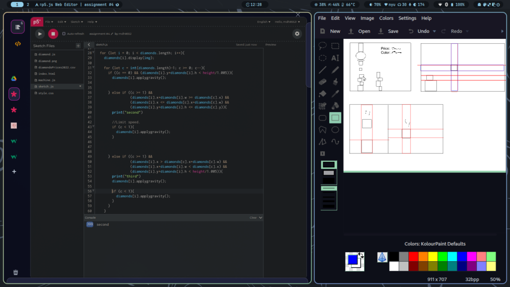
Me trying to understand how to implement the collisions with sketches.

As mentioned, the implementation of the collision was challenging, although I could find a way to implement it with the following code:

//Check for collision.
 for (let i = 0; i < diamonds.length; i++) {
   diamonds[i].display(img);

   if (i > 0) {
     for (let c = diamonds.length - 2; c >= 0; c--) {
       if (
         diamonds[i].x <= diamonds[c].x + diamonds[c].w &&
         diamonds[i].x + diamonds[i].w >= diamonds[c].x
       ) {
         if (diamonds[c].y < diamonds[i].tempy && diamonds[c].landed == 1) {
           diamonds[i].tempy = diamonds[c].y;
         }
       }
     }
     if (diamonds[i].y + diamonds[i].h < diamonds[i].tempy) {
       diamonds[i].applygravity();
     } else {
       diamonds[i].landed = 1;
     }
   } else if (diamonds[i].y + diamonds[i].h < height / 1.005) {
     diamonds[i].applygravity();
   } else {
     diamonds[i].landed = 1;
   }

   //Check if it is safe to release another diamond given the Y and X coordinates.
   if (diamonds[i].y > machine.y + 140) {
     machine.safetorelease = 1;
   } else if (
     machine.x + machine.w - 15 > diamonds[i].x &&
     machine.x + machine.w - 15 < diamonds[i].x + diamonds[i].w &&
     diamonds[i].landed == 1
   ) {
     machine.safetorelease = 0;
   } else {
     machine.safetorelease = 1;
   }
 }

 //Helps to erase the last displayed diamond to avoid overlapping.
 if (machine.safetorelease == 0) {
   diamonds.pop(diamonds.length - 2);
   machine.safetorelease = 1;
 }

This code also helps to avoid overlapping between diamonds, since the machine will not stop releasing diamonds.

In conclusion, I learned a lot with this assignment, and while I wish I could find ways to implement sin()and cos(), this time at least I could do something different and challenging.

Assignment 4 – Redha Al Hammad

As I was short on time for my fourth assignment I decided to utilise it as an opportunity to experiment with several different ideas.

The first of these ideas was an attempt to replicate the playfulness of the Pixar opening animation. For me (and I’m sure many others in the class) this opening sequence featuring Pixar’s familiar serif typography and iconic lamp character is incredibly nostalgic. I specifically remember how satisfying the movements  of the lamp and the reaction to the letter was to me as a child. I attempted to replicate the most notable movement from this reference in my sketch by focusing on the element of bouncing.

Pixar Movies and Shows | Disney+

I did this by enabling the individual letters of the word ‘jump’ to  jump and bounce once they reach their starting point. I am happy with the jumping and bouncing effect as I feel that is smooth and encapsulates the playfulness I was going for. However, as I was unfamiliar with how to go about it I used ChatGPT as a reference and, while it did give me a good starting point for my desired effect, it also produced a noise-like shaking which I could not figure out how to remove. I am still proud of this piece of code which enables the jumping and bouncing effect onto the individual letters.

 isMouseOver() {
    let letterWidth = textWidth(this.char);
    let letterHeight = this.size;
    return mouseX > this.x - letterWidth / 2 && mouseX < this.x + letterWidth / 2 &&
      mouseY > this.y - letterHeight / 2 && mouseY < this.y + letterHeight / 2;
  }
}


Using ChatGPT was a result of my limited time and, had I given myself enough time, I would have avoided the other main problem in my code which is that it became difficult to read after adding my second word – “zoom” – which moves across the screen when pressed. As I was attempting to do many different things (with the help of AI) in a short amount of time, things became overlapped and the “jump” function became used for both words.

Despite this, I feel that I have a better understanding of physics, classes and arrays after producing this work and will look to incorporate them more in my upcoming projects.


Week 4 Assignment – What da Names?

In week 4, we learned how to display text by loading custom fonts and manipulating CSV (Comma-Separated Values) files to visualize the contents.

I was originally working on some cool stuff (yes, very cool) by randomizing texts and using custom fonts for them. It was inspired by Typefaces of Toronto, an Instagram page that finds out the fonts used in facilities within the Toronto city. During this I found out that p5js have some limitations, that is the editor can only load specific font file types (such as those from Google Fonts) and not crazy ones like from Da Font.

However, I wanted to go even beyond just displaying text and wanted to manipulate data as well. So I tried to import some data sets from Kaggle and expected to play around with it. But for some reason, these data were not read properly by p5. I tried workarounds to see if appending them to a list would work but I could not get it to display properly and got errors regarding readableStream instead.

In the end, I opted for ChatGPT to help me generate a .csv file with this prompt:

Generate a CSV file. 50 rows, with three columns: name, year, count, for 50 random names within the year 2010 – 2024, in a random quantity between 1 – 5000, no spaces

After some workaround, here is the result that I came up with:

The result is a simple data showcase of Name, with Year in behind it, and the Quantity information under it. I utilized push() and pop() for the texts so that they are separate permutable objects. You can click to refresh the canvas.

//QUANTITY
  push();
  textSize(21);
  countMsg = "In that year, there are " + str(count[myNum - 2]) + " babies.";
  text(str(countMsg), width/2, height/2 + 50);
  pop();

While coding, I also noticed that I needed to subtract the list index by 2 for it to show properly. I am still figuring out why this is the case, but I assume it is because I loaded the header (index[0]), so the program treated it by skipping to the next index immediately.

Overall, it is a fun project. Had I not encountered many problems and gotten sick over the weekend I might have created something much more appealing. But for now, this is the very best I can do with my time.

References

Browse Fonts – Google Fonts

ChatGPT (openai.com)


Reading Reflection – Week #4

The assigned reading was interesting. It provided information on how design, readability and usability can coexist with each other. This is something that I have been looking into lately, as when you have a mind as a designer, you not only care about how things look, but rather, how can you communicate to the user everything they should know about how to operate a device without the need to go through a manual? In my life, I have been confused over several devices since they operate in strange manners. Take, for example, a modern iPad. Their power button can seem very hidden if the tablet is using a fall protector, and it is frequent that I do not find an obvious quick way to turn it on since I am not familiar with the device, so I just ask the owner to turn it on for me.

The same connection regarding design can be applied to operating systems, for example. If one person uses Windows and makes the switch to Mac, it is very likely that common features will stand out between them, but since both operating systems excel at the act of “show, don’t tell,” their UIs will often communicate to the user what a certain thing will do to avoid confusions in this shift. The same scenario cannot be applied to someone who is new to computers, as it will require more time to get used to them.

Assignment 4, Rama

For this assignment, I experimented with the concept of word clouds using p5.js, where the size and style of each word vary randomly. The word cloud relies on the frequency of words in the input text data. When the mouse is pressed on the screen, the word cloud is restarted, providing an interactive experience for the user.

Initially, I learned how to create the world cloud using a couple of YouTube videos, however, they did not go through the link between word frequency and size of the words in the sketch. So, I found this code (https://editor.p5js.org/dano/sketches/1_RLNdYnT) which uses a different method of text input and method of display than my initial sketch, however what’s cool is the word size is determined through word frequency. Here’s the code:
split(text) {
return text.split(/\W+/);
}

validate(token) {
return /\w{2,}/.test(token);
}


process(tokens) {

for (var i = 0; i < tokens.length; i++) {

if (! tokens[i]) continue;
var token = tokens[i].toLowerCase();
if (this.validate(token)) {
this.increment(token);
}
}
}


getKeys() {
return this.keys;
}getCount(word) {
return this.dict[word];
}

increment(word) {
if (!this.dict[word]) {
this.dict[word] = 1;
this.keys.push(word);
} else {
this.dict[word]++;
}

The code technically breaks down the words in the text and keeps count of their frequency. Then it validates these words (true/false), keeps track of their count/frequency in the passage or text. It’s like a simple tool for counting and analyzing the words in a piece of text.

I incorporated this feature into my sketch,; it just does everything in one loop rather than split up like the linked sketch. And to analyze what function does what I used trial and error to see how I can simplify it to get to my final product.


One potential improvement I considered is the ability to load external text data so the user could make the word cloud generator more versatile and useful in different contexts.

Assignment 4 + Reading response – Shereena AlNuaimi

For this assignment, I planned to incorporate something that I have been passionate about for 10 years now which is archery. Truthfully, I’m pleased with how this task turned out. My life has involved archery greatly and continues to do so. And it’s awesome to be able to integrate that aspect of myself somewhat with my university education.

In order for this assignment to be interactive, when mouse is clicked the archery target appears circle by circle. Each circle color resembles a score. Realistically speaking, I wanted the colors to be as accurate as possible that’s why I chose the colors that I did. For it to be as close to the target as possible. Overall, i’m pleased with the outcome of this assignment.

let circleColors = [[255, 255, 0], [255, 0, 0], [0, 0, 255], [0, 0, 0]]; // Yellow, Red, Blue, Black
let circleSizes = [100, 200, 300, 400];
let circleIndex = -1;

function setup() {
  createCanvas(600, 600);
  textAlign(CENTER, CENTER);
  textSize(48);
  fill(255, 255, 255);
}

function draw() {
  background(240, 255, 255);
  // Draw the circles for the archery target
  for (let i = circleIndex; i >= 0; i--) {
    fill(circleColors[i][0], circleColors[i][1], circleColors[i][2]);
    stroke(0);
    strokeWeight(1);
    let circleSize = circleSizes[i];
    ellipse(width / 2, height / 2, circleSize);
  }
  
  // Draw the arrow-shaped letters
  let nickname = "Shroon";
  let startX = (width - (nickname.length - 1) * 50) / 2;
  let startY = height / 2;
  let arrowSize = 50;
  let spacing = 50;
  for (let i = 0; i < nickname.length; i++) {
    drawArrow(startX + i * spacing, startY, arrowSize, nickname.charAt(i));
  }
}

function mouseClicked() {
  if (circleIndex === circleSizes.length - 1) {
    circleIndex = -1; // Reset to show innermost circle again
  } else {
    circleIndex++; // Increment to show the next circle
  }
}


function drawArrow(x, y, size, letter) {
  // Draw the arrow body
  fill(255);
  stroke(0);
  strokeWeight(2);
  beginShape();
  vertex(x - size / 4, y - size / 8);
  vertex(x - size / 4, y - size / 2);
  vertex(x + size / 4, y - size / 2);
  vertex(x + size / 4, y - size / 8);
  vertex(x + size / 2, y - size / 8);
  vertex(x, y + size / 2);
  vertex(x - size / 2, y - size / 8);
  vertex(x - size / 4, y - size / 8);
  endShape(CLOSE);
  
  // Display the letter
  fill(0);
  textSize(size / 2);
  textAlign(CENTER, CENTER);
  text(letter, x, y - size / 8);
}


Reading Response:

Don Norman’s book “The Design of Everyday Things” addresses the difficulties people encounter with everyday possessions by emphasizing the design concepts of affordances, signifiers, and mapping. Norman illustrates the uncertainty and frustration brought on by poor design by sharing personal tales about his problems with doors and other everyday items. He highlights the significance of discoverability and understanding in effective design, talking on the necessity of clear and understandable signals that convey the right information about what may be done and how.

Furthermore, he emphasizes how important it is for designers to comprehend both technology and human behavior. He draws attention to the difficulties brought about by technology advancements, such as the growing complexity of everyday items as a result of functional additions. Norman talks on the paradox of technology, which has the ability to improve people’s lives and make things easier, but it also creates complexity that can cause users to become frustrated and struggle. Additionally, when designing products, the interaction of psychology and technology is crucial to making sure that people find the end result delightful and pleasurable as well as useful. Norman’s observations highlight the necessity for designers to put behavior and human needs design (HCD) first while utilizing technology to improve the user experience as a whole.According to him, the foundation of successful design is a thorough understanding of people and their wants, which is attained by observation and adaptive design processes that guarantee products actually satisfy user needs.

Assignment 4 – reading reflection

Diving into “The Design of Everyday Things,” particularly the chapter about the everyday challenges we face with seemingly simple objects, was like turning on a light in a room I didn’t realize was dimly lit. It struck me how something as mundane as a door could become a puzzle. Don Norman eloquently sheds light on this, making me nod in agreement and chuckle at the universal struggle against “Norman doors” – those doors we push when we need to pull and vice versa, named humorously after Norman himself for highlighting these design missteps.

In interactive media, users should grasp not only what they can do within an interactive piece but also have some insight into the cause and effect of their interactions. An interactive narrative created in p5.js, for example, should provide clear feedback in response to user inputs, making the narrative’s branching paths understandable and meaningful. Because a lot of the time when we create an “interactive art”, the interactivity is there and looks amazing, but sometimes confusing or unclear to explore.

Week 4 Reading Response – Khalifa Alshamsi

Reading “The Design of Everyday Things” by Don Norman has made me rethink my everyday frustrations with things like doors and appliances. It’s pretty eye-opening to see how common it is to struggle with objects that are supposed to be simple. The idea of “Norman doors” – doors that confuse you whether to push or pull – is something I can relate to. It turns out these annoyances aren’t just random; they’re often the result of poor design choices that don’t consider the user’s experience.

Norman talks a lot about the importance of making things intuitive, which makes sense. It’s frustrating to need signs or instructions for something as basic as a door. But the book also points out how often design prioritizes looks over functionality, leading to unnecessary complexity. This struck a chord with me because it’s not just about aesthetics; it’s about making things harder to use than needed.

The book has made me more aware of the design choices around me and sparked an interest in looking at everyday objects more critically. It’s one thing to appreciate good design when everything works smoothly, but Norman’s perspective has made me more conscious of how rare that is.