Don Norman’s refrigerator example from “The Design of Everyday Things” is a significant example that highlights several important design, user experience, and cognitive processes related to human-machine interaction concerns. The idea of cognitive dissonance in design, which occurs when users’ expectations and reality are distinct which causes annoyance and inefficiency, is embodied by the refrigerator’s confused controls. In my opinion, this example is a smaller issue of a much larger issue in the fields of design and technology.
The controls on the refrigerator expose a basic breakdown in the way designers and consumers communicate. The designers have a high in-depth knowledge of how the product works, but they often neglect what information users need to comprehend and utilize the product as intended. The belief that consumers will “figure it out” might result in designs that make sense to the designer but seem complex to the user.
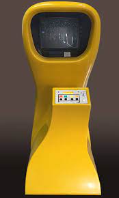
After reading about the refrigerator it reminded me of “Computer Space” by Nolan Bushnell. This was one of the first arcade games which was made and did not conquer the market as the controls on the machine were way too complicated/complex for the user to comprehend. Although the vision of the game was intuitive, no one would want to read instructions to play a video game so the controls for the game became very hard for the users.
All of this made me wonder, how does the design of everyday objects influence our behavior and interactions with technology?

