Overview

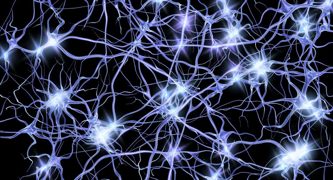
The concept for this assignment came about after some self-reflection on the “workings of my mind” throughout past semesters. From those moments when deadlines approach to when things get on my nerves, I had hoped to capture this chaos visually, but not through random lines because we have come to an agreement that randomness is our biggest enemy, rather through nerve cells (cells that send messages all over your body to allow you to do everything from breathing to talking, eating, walking, and thinking). With that, my goal was to depict my genuine experiences, to the best of my capability. That’s when the idea came to utilize my actual Notion to-do lists, which have been my go-to resource since my first semester during freshman year.
Data Visualization
let courses = [
  { name: "Discrete Mathematics", tasks: { Assignment: 4, Quiz: 3, Other: 2 } },
  { name: "Intro to Computer Science", tasks: { Assignment: 6, Other: 2 } },
  { name: "Pre-Calculus", tasks: { Assignment: 14, Other: 4 } },
  { name: "Wayfinding", tasks: { Assignment: 9, Other: 2 } },
  { name: "Calculus", tasks: { Assignment: 15, Other: 2 } },
  { name: "Stereotyping", tasks: { Assignment: 9, Other: 4 } },
  { name: "FYWS", tasks: { Assignment: 17, Other: 2 } },
  { name: "UX Design", tasks: { Assignment: 12, Other: 2 } },
  { name: "Inequality", tasks: { Assignment: 5, Other: 8 } },
  { name: "Communications Lab", tasks: { Assignment: 18, Other: 4 } },
  { name: "Data Structures", tasks: { Assignment: 16, Quiz: 4, Other: 2 } },
  { name: "Techniques for Safety & Production", tasks: { Assignment: 2, Quiz: 2 } },
  { name: "Space Diplomacy", tasks: { Assignment: 7, Other: 2 } }
];
Each color within the visualization represents a course I’ve taken up until fall 2023, while the size of the circles correlates directly with the workload associated with each course (categorized into assignments, quizzes, and other tasks from my actual to-do list). The lines, aimed to create a nerve system-like structure, are meant to connect circles of the same color/course to illustrate the connections. Additionally, the back-and-forth motion that results from touching the edges was intended to mimic the beat of a human heart (so did the oscillating opacity), with the hope of adding a human touch to the art piece.
Challenges & REFLECTION
One of the challenges was trying to make the piece look like something from the human body. Although I didn’t perfect it, I tried drawing inspiration from images of what nerves would look like in our body. Another challenge was deciding the colors. Initially, I wanted to symbolize stress and complexity, so I started with reds and warm tones. However, they ended up looking more like a calm sunset, which led to the idea of using cool tones to oppose the idea of “nervousness” and “perplexity“, hence being “cool” and “relaxed.” Another challenge was definitely implementing the code. I had to use many of the things we had done in class and had a lot of debugging throughout. Many of the things you see happened by accident, but I’m happy with it. Through this attempt, I hope to give you a glimpse into my academic journey – the ups, the downs, everything in between, and more specifically, the things that got on my nerves. Pun intended.
