“The problem with the designs of most engineers is that they are too logical.”
😱 Ouch ouch! Don Norman’s quote above from “The Psychopathology of Everyday Things” was harsh enough to get my blood boiling. Despite feeling personally attacked, both the devil and the angel on my shoulders say “Wait, wait, he has got a point”. I fully join Don in standing ovation for his idea of Human-Centered Design. When I wrote in my last post “The good design speaks for itself, the learning curve is so smooth such that the users enlightens themselves without any guidance and hitting F1 for user manuals.” I was saying exactly the same points. Discoverability is a vital concept… the user should be able to discover how the thing works, without it being explicitly stated… and how do you mainly achieve this? Nudges!! Although Don has not mentioned it in Chapter 1, I would like to highlight the Nudge Theory to the rescue… and some examples.
The Nudge Theory
I don’t have a human kid, but I know for a fact that at one point, they have to stop breast milk 🍼 and start to eat actual solid food 🍗. This process is called weaning and back home, they start to train babies to stop feeding on breast milk around 6 months to 1 year of age. Like cocaine addicts with withdrawal symptoms, the babies will cry endlessly and become super desperate whenever they come into close contact with their mother… then these little zombies will reach out for the breast.
![]()
This behavior has to change, of course. Back home, they have a traditional method of weaning… where you literally “spice 🌶️ things up” by putting turmeric powder on the mother’s nipples so that when the baby gets its breastmilk next time, it goes “What the blistering barnacles?” with eyes popping out 😳. Next time, it learnt its lesson… “Chicken wings are tastier than breastmilk from now on”.
[Turmeric Powder – Source]
Cruel, effective, spicy…🔥
Woah woah Pi, how is this spice powered weaning method related to Human-Centered Design?
Wait wait, I am just explaining the idea of a “nudge theory”.
This is an example of nudge theory in action – a nudge is a gentle push towards a desirable behavior without any force or mandate. Here, the baby discovers on its own that it should switch from breastmilk to chicken by itself.
Don Norman’s discoverability in action!
In similar, but less spicy ways, the nudges can be applied to aid discoverability in a lot of human centered designs, to gaslight the humans into figuring stuff out on their own. In the rest of the post, I would like to share 3 of my favorite examples of this discoverability in action.
Applying Nudge Theory to Everyday Design
Flies 🪰
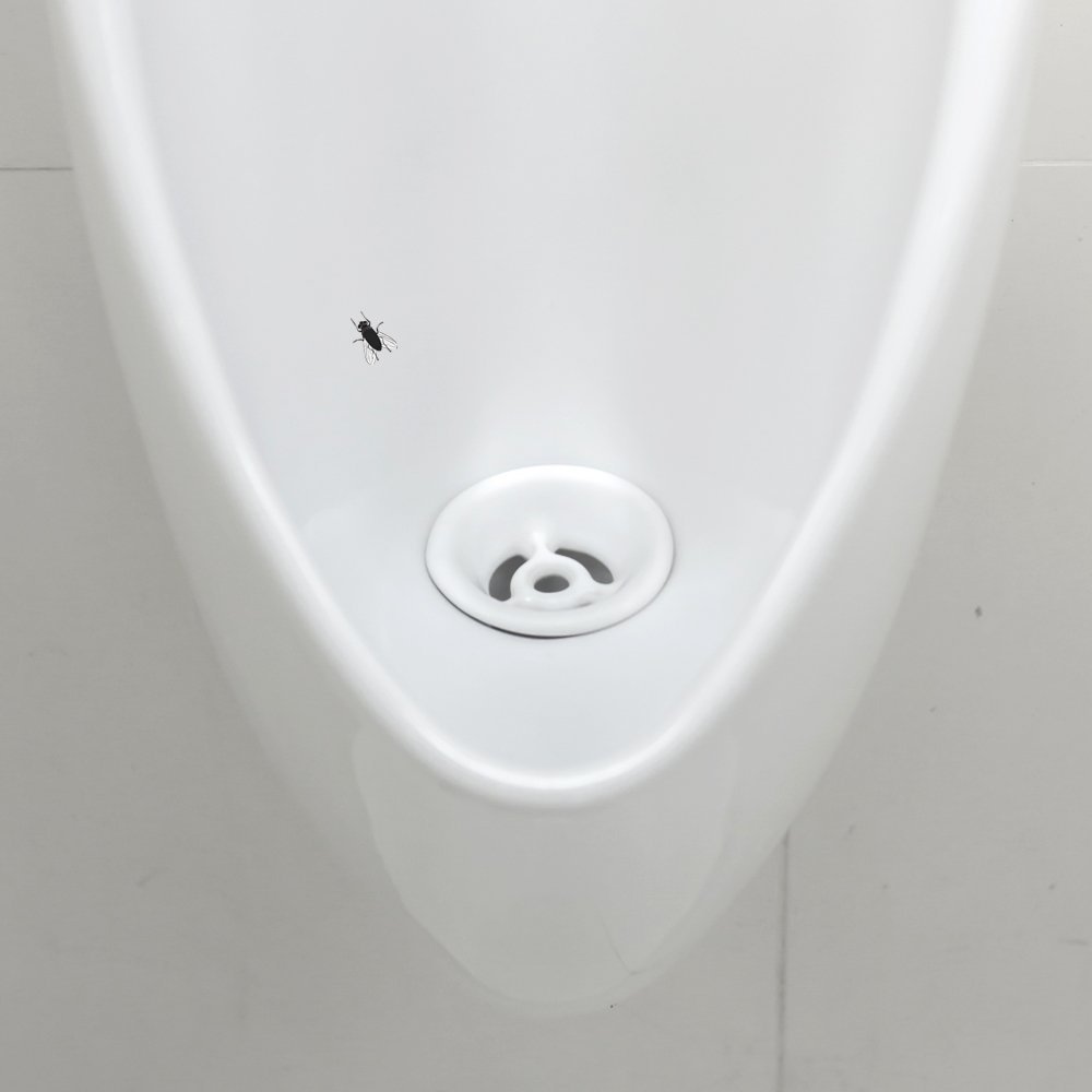
My personal favorite of all time solves the age-old problem of men’s restrooms: the messy urinal area. The aftermath is a nightmare for anyone tasked with cleanup. But here comes the nudge solution, as simple as it is ingenious.
A tiny sticker of a fly, or sometimes a target, is placed strategically in the urinal. It’s almost laughable how such a small thing can redirect a grown man’s attention. Yet, it works!
Men, either out of amusement or subliminal inclination, aim at the sticker.
The result? A cleaner urinal area, less spillage, and a sigh of relief from janitors everywhere.
It’s fun, it’s effective, and the best part? It doesn’t need a user manual or a ‘how-to’ guide. Men just get it, and they go along with it, often without even realizing they’re being nudged into better behavior.
World’s Deepest Bin 🗑️
Traditional bins are all but invisible to the average person. Enter the world’s deepest bin – not literally the deepest, but it sure sounds like it.
The nudge here is a bin that, when used, emits a humorous, exaggerated deep sound. It’s like dropping a piece of trash into a never-ending well. The sound is so unexpected, so comically over the top, that it draws people in. The result is as effective as it is entertaining: people actually look for things to throw away just to hear that sound again.
It turns an ordinary act of disposing of trash into a mini-adventure. And just like that, littering is reduced.
People are engaged, amused, and more importantly, they are nudging themselves and others to keep the surroundings clean.
Piano Stairs 🎹
The last example is a delightful play on human nature’s love for music: the piano stairs. The problem is clear: given the choice, most people opt for escalators or elevators, shunning the stairs, missing out on an easy opportunity for some physical activity.
The nudge solution? Transform a staircase next to an escalator into a giant working piano. Each step is a piano key that makes a sound when you step on it. The result is magical. People are drawn to the stairs, curious and excited. They hop, skip, and jump on the stairs, creating music as they go. What was once a mundane climb turns into a playful experience.
People actually go out of their way to use the stairs, sometimes repeatedly.
It’s human-centered design at its most whimsical and effective.
Conclusion
In each of these examples, the key factor is the design’s ability to communicate and guide behavior without explicit instructions. The fly in the urinal doesn’t need a sign explaining what to do. The World’s Deepest Bin doesn’t have a manual on how to use it. Piano Stairs don’t come with a user guide. They work because they tap into human instincts and make the desired action the more appealing choice. This is the essence of human-centered design – creating solutions that are so in tune with human behavior and needs that they guide us subtly towards better habits.


