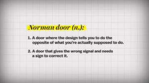
In this weeks reading I really had fun exploring the composition of designing and the elements, complexity and usefulness of design with an example of a door. Yes, a single door was used to explain the whole theory of the design of everyday things.
A door is a perfect example of confusion in design. Even though simple, we always find a way to confuse ourselves and pull a door if we should push it, push a door if we should pull it, or neither of those, maybe we just needed to slide the door open.
A good way to fix that is to look at the hinge (or if you are a designer: don’t hide the hinge please) or give the “user” proper information on how they should handle the door. That leads to us talking about the two big aspects of good design:
-
-
- Discoverability
- Understanding
-
A story that the author mentions is a story of a friend that got trapped in a doorway of a Post Office in an European system. The door system, which was made out of six doors, is a perfect example of failed discoverability since it did not provide enough information for the “user” and it just led to confusion.
Another topic that comes into conversation is the complexity of modern devices. The theory is that modern devices and machines are made by humans so they are quite limited in what they can do. At the same time, proper guidance (aid, manuals) must be provided in these complex devices since they are created by engineers who have deeper understanding of the device, unlike the people that operate it.

