Once, a very thirsty traveler came to the bar and asked, “Water!”
The bartender, raising an eyebrow, says “Sure, sire, would you like room temperature or icy chill water 🥛?”
“Uh, cold please”
“Do you lean towards distilled, mineral, or perhaps a sparkling variety?”
The traveler scratching his head says, “Just regular water is fine”.
The bartender goes “In terms of regular water, we have classic spring regular water or purified tap…”
Judging by Chris Crawford’s Interactive Design definition, this is an interactive process.
- There are two actors – the bartender and the traveler
- They actively listen to each other,
- and think (Whether bartender thinks or not is debatable)
- and speak
The only catch here is that this interactivity “did not solve the problem”. They did interact, there is flow of information between them, but the problem remains unsolved.
Just like how Crawford ranted about people in that day and age re-brands “The Same Old Stuff” as “New Interactive Technology” with hype and criticized how the “plays” ranks about a 0.01 on a 10-point Crawford Scale of Interactivity, I am also going to use this writing to rant about how his interactivity definition ranks pretty low (say around 3.14ish) on the 100-point Pi’s scale of Aesthetic Practicality. This definition of [Interactivity = “two actors” AND “listen” AND “think” AND “speak”] ought to be, at least expanded to be applicable.
Expanding the definition of Interactivity
Personally, when I encounter “Interactivity” I see it not as a “process” (unless you are dealing with human to human problems, where you have to Talk It Out Loud ™). Normally in the context of Human-Software Interactions, UI/UX design, interactivity is about how efficiently you can give the user the complete tutorial so that they can utilize the system with minimal guidance.
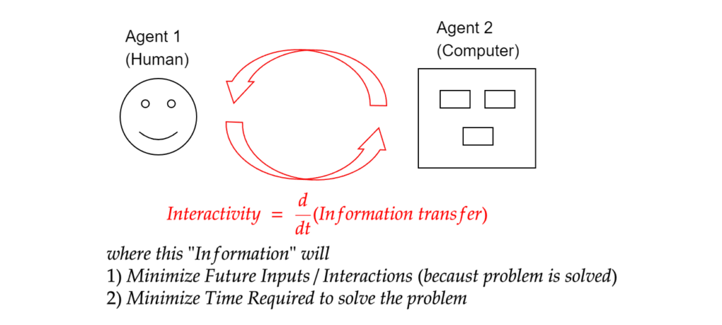
On more formal terms, if we ignore the video game industry (because by definition, games have to be interactive), I see interactivity as a measure of “the rate of transfer of information between two agents (i.e. Human-Computer), where this transferred information helps solve human problems using the computer with minimal input in minimal time.” just as in the diagram below.
Note that my definition explicitly states that the more interactive the system is,
- the more time it saves and
- the less guidance it needs to give the user in the future.
Otherwise if we go by Crawford’s definition, we fall into the danger of “Impractical Interactivity Deadlock Situation” where two parties keep on interacting without results, just like the bartender joke above.
In short, the holy grail of “Interactivity” is, ironically, to minimize more “interactivity” in the future. Because if you have to keep interacting… if you have to keep going to the bank because the bank customer service keeps tossing you back and forth with other departments and your credit card issue is still not solved, the “interactivity” is simply … not “interacting”.
In short, the holy grail of “Interactivity” is, ironically, to minimize more “interactivity” in the future.
~ Pi
Best Interactivity is Implicit Interactivity, change my mind
Personally, I agree with Crawford, that “Good Interactivity Design integrates form with function.” However, the only pebble in my shoe is that Crawford has the explicit “speak” component in his definition. In a well-designed software, you don’t necessarily have to explicitly speak. The good design speaks for itself, learning curve is so smooth such that the users enlightens themselves without any guidance and hitting F1 for user manuals.
There was a good old time in the UI design when “Skeuomorphism” – a user interface design which adds real-world design cues to virtual objects to make those objects more understandable.
This is the perfect marriage of form and function.
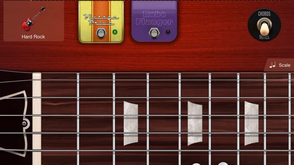
For instance, just look at the Garage Band guitar User Interface.
Super short, sweet and simple. Anyone who have intimately slid their fingers up the fretboard , do not need additional tutorial in order to play the Garage Band guitar. It is intuitive. There is no need to explicitly have the expanding speech bubble saying “In order to use the overdrive/flanger pedal, tap here.”
Also, the interface is just beauty in purest form 😌👌.
The design itself is already intuitive and interactive.
However, just like the average American marriage [source], after 8 years, the form and function got a divorce ☠️… and the entire world catches minimalism/flat design virus, to the extent that where intuition is murdered (Yes, I am looking at you, Material Design and Neumorphism).
The best example of the such worst UI nightmare is the audio mute/unmute icons.
After years of experience during COVID, and after using Zoom countless professional settings, my dad still cannot tell whether the audio is muted or not just by looking at the button. (Does red color mean that it is already muted? Or I click the red and it will mute?)
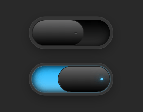
Whereas a sensible, more intuitive audio on/off button will look more like this.
(Flip the switch, light means it is currently on, no light means it’s currently off… Everyone know this from interacting with other electronic gadgets, there is no need to specially train the user)
Hence, when you don’t have this auto intuition built into the original design, explicit interactivity (a.k.a. helper texts here and there, or your IT support guy) has to come in unnecessarily. This interactivity is just a bloat in the system, and a waste of space, and resources.
Well, as they say “Communication is key”, I appreciate the importance of interactivity in human-software interactions. However, in the context of Good software, such “talk-back” explicit Interactivity should be the last resort a good designer should fall back to.
A good doctor doesn’t easily prescribe antibiotics… this is supposed to be the last resort.
Hence, from the artistic engineer point of view…. When designing anything, intuitive function has to come first, then the form, and only then throw in the “explicit” when there is no other way out.
Perhaps, it is time we rebrand Crawford’s definition to Practically-Aesthetic-Interactivity (abbreviates to PAI? Hahaha, very punny Pi, very punny.), and we may be…. just may be… see better intuitive software in the future.


