Unusual Switch

Concept

Have you ever been startled by a midnight headache, only to find yourself fumbling in the dark for painkillers? Been there, done that. So for this assignment, I decided to tackle this problem. I wanted to create a switch that would illuminate my bedside table drawer automatically as I opened it.

Process

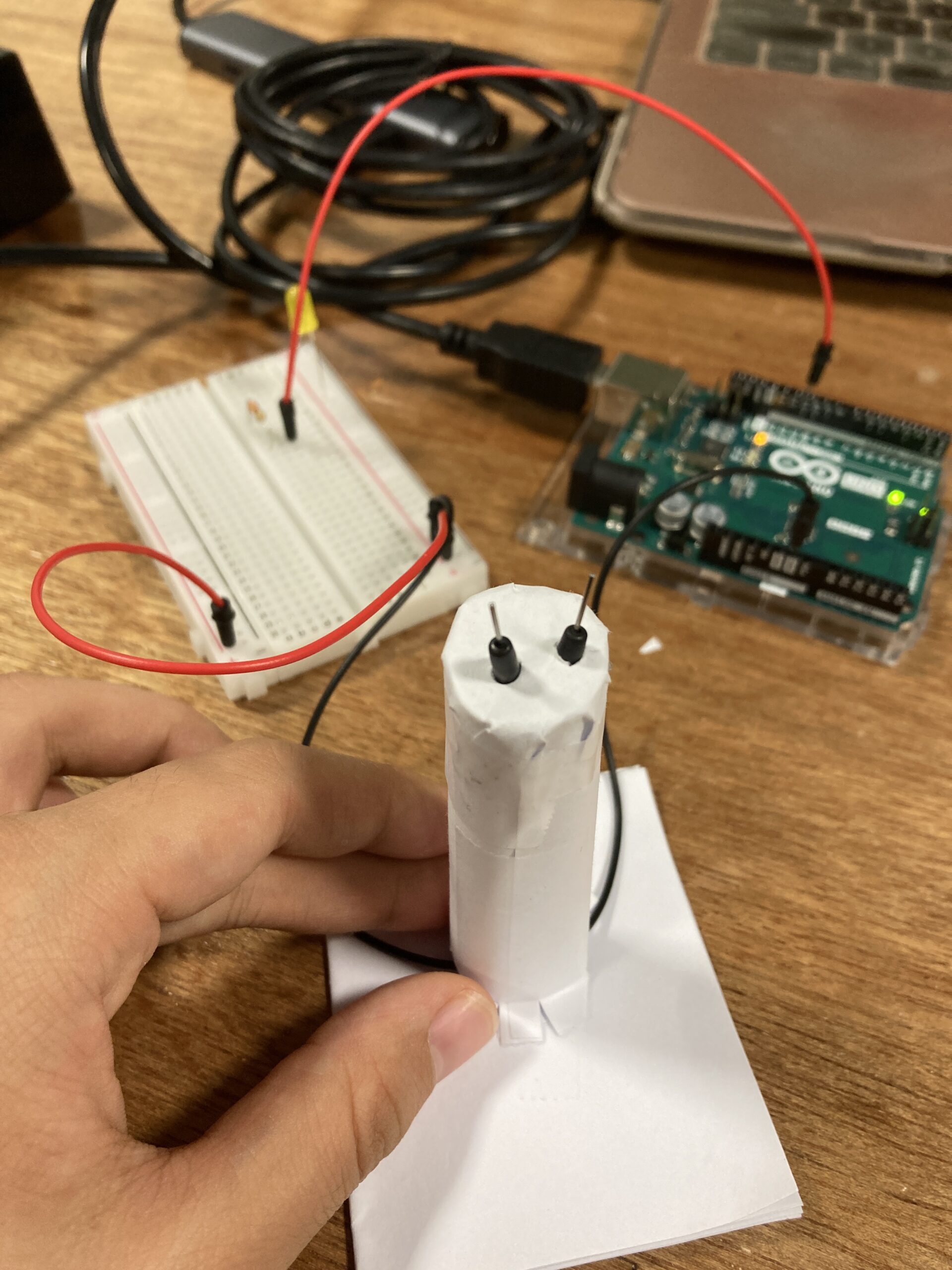
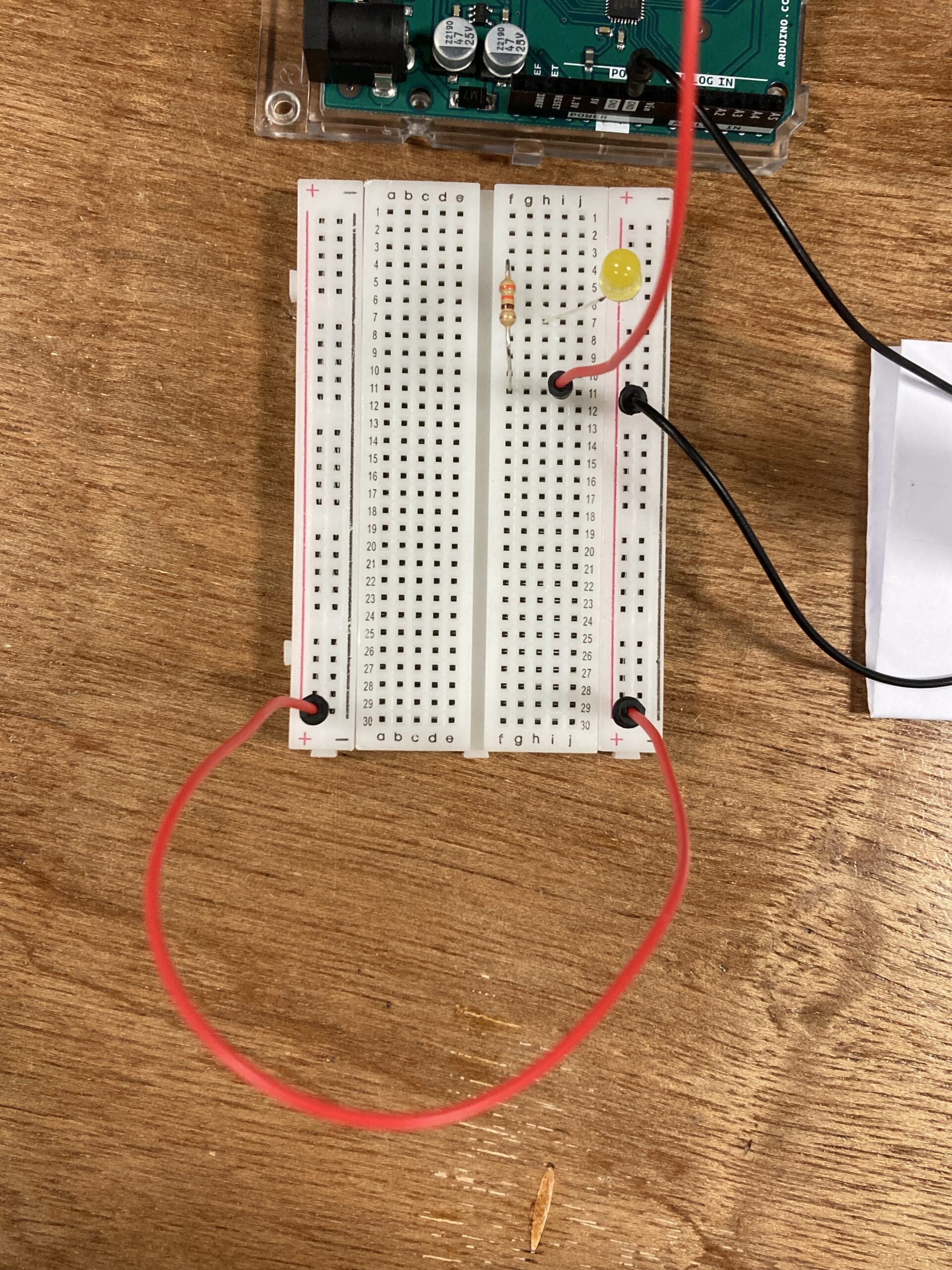
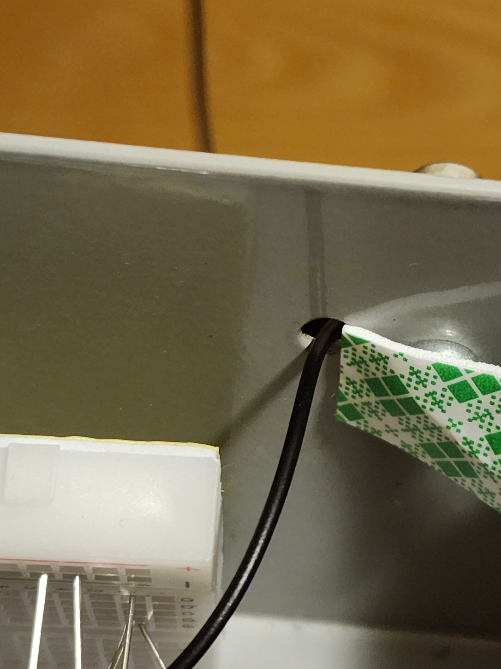
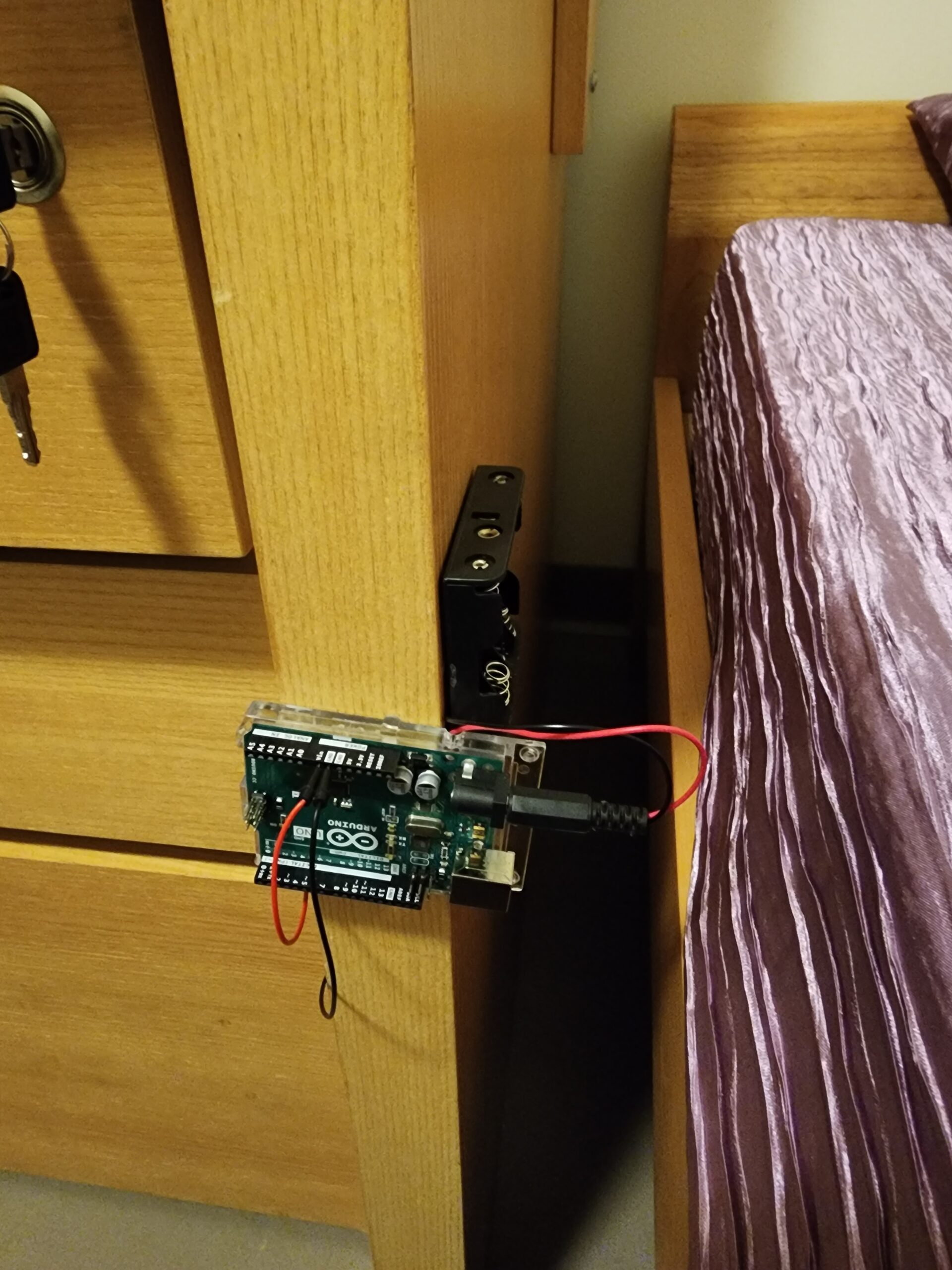
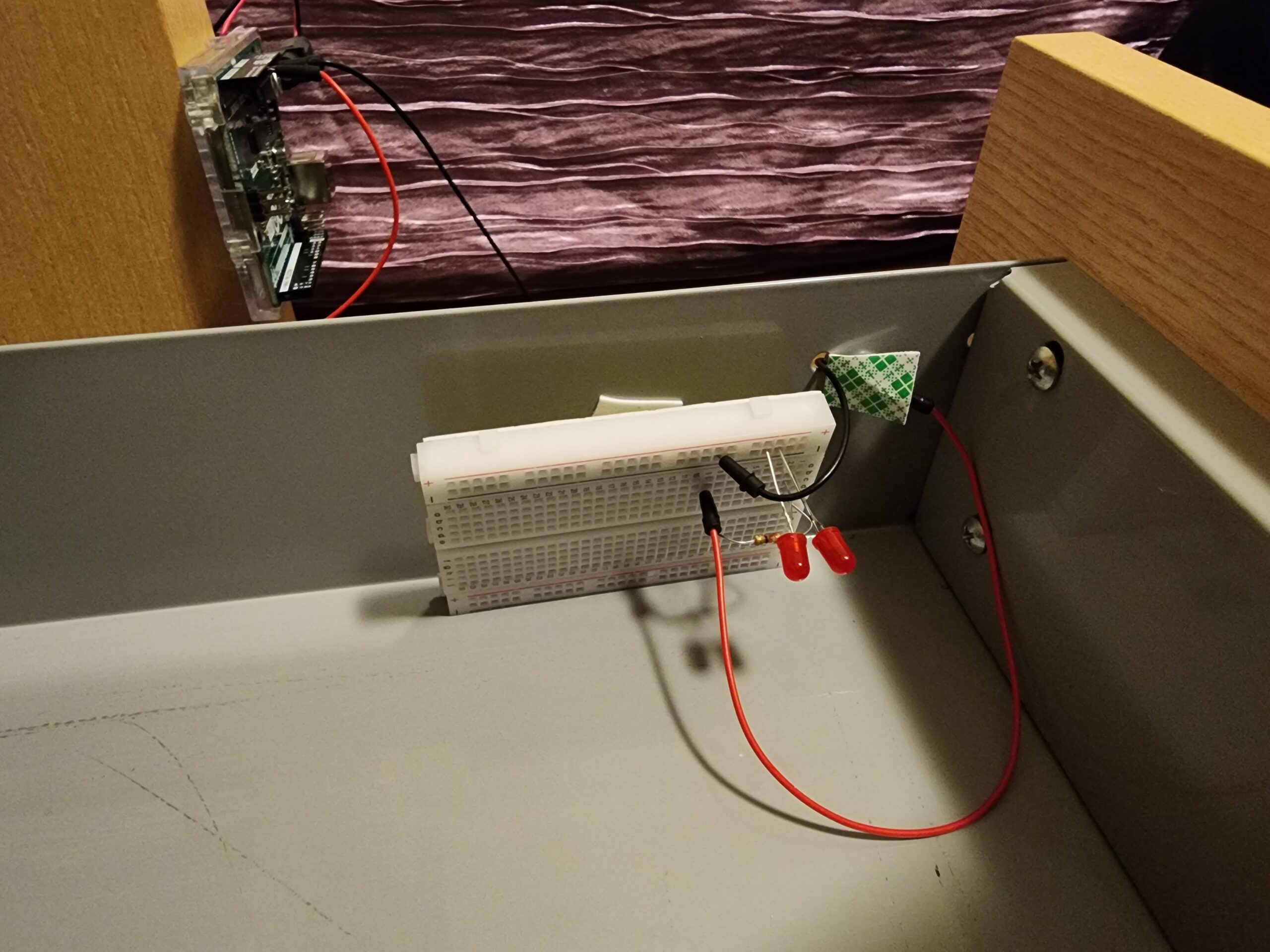
I set up my breadboard inside the drawer and attached it to the side of the drawer using tape. Outside, on the side panel of the drawer, I attached the arduino board. Then I had to figure out how to make the wires connect in a way that somehow allows the drawer to still close all the way. Luckily I discovered this tiny hole (its the same hole through which the drawer locks) on the same side i attached the breadboard and this turned out to be the perfect way to connect the wires to the board outside.

I used two black wires so I can pull the drawer all the way out.

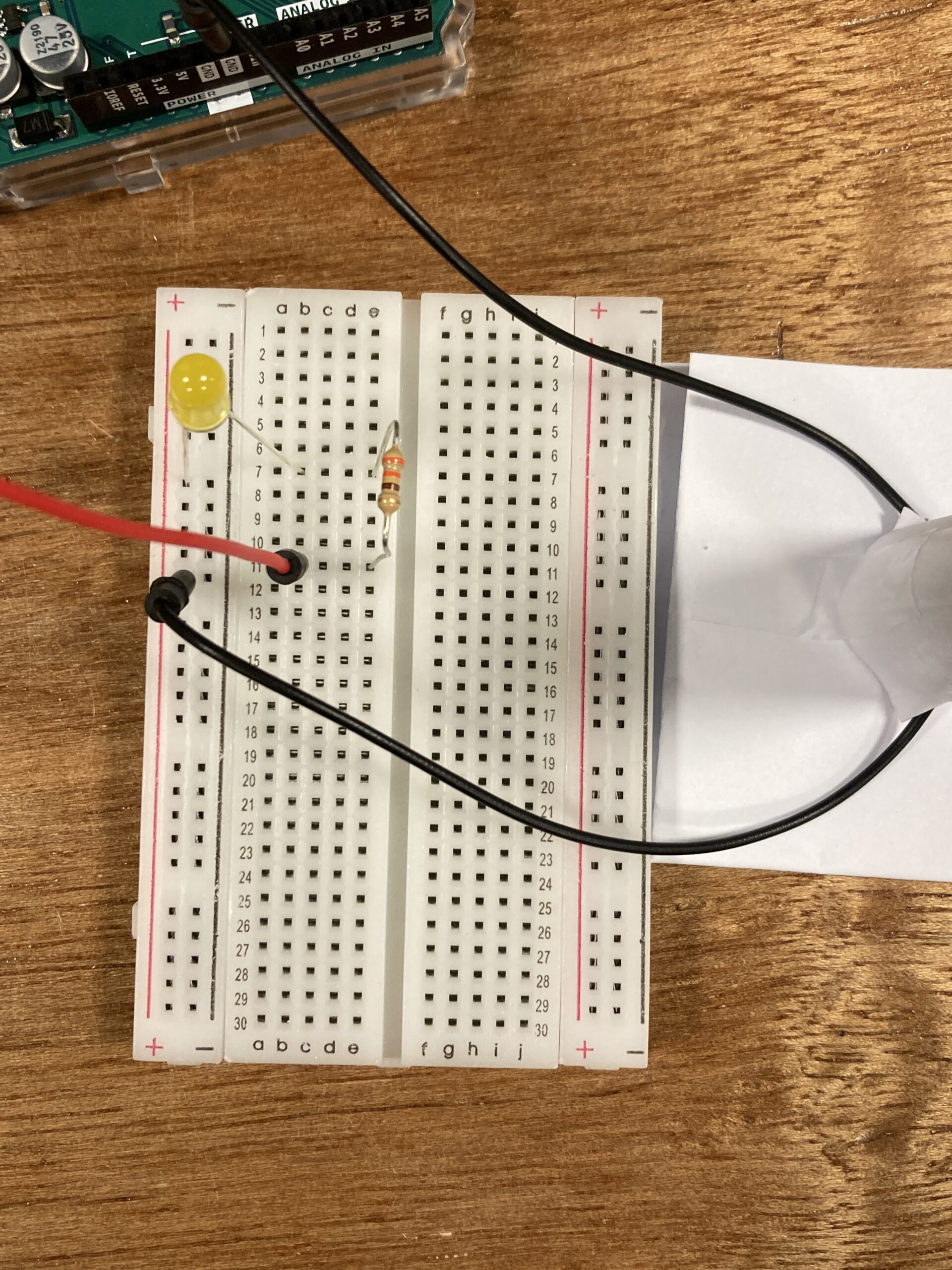
The way the switch works is: as i pull out the drawer, the red wire comes into contact with the metal side slide surface and inside the drawer, i attached another red wire to the breadboard and connected it to a metal nail drilled into the drawer. So when the red wire comes into contact with the metal surface, it allows flow of electricity and lights up the led (current passes to the metal nail inside the drawer). When the drawer is pulled back in, the metal surface also slides back, disrupting the flow of electricity and hence the light turns off.

Here is a video of how the switch works:


And to show that the light actually turns off when the drawer is closed, I put my phone inside the drawer to record the inside of the drawer once its closed:


Future Improvements

Overall, I feel like I was able to accomplish what i had envisioned. If I could improve one thing, it would be somehow making the connections between the wires more stable. I noticed that as I moved the drawer, the light would fluctuate a little. A more stable connection would make the lights more consistent.

Week 8: Reading Reflection

A friend returned from Bosnia with the nicest pack of cigarettes I’ve ever seen. They were gold tipped, shiny, and bodied black in a velvety way. Smoking one, I felt like a Roaring Twenties aristocrat, a brooding Hollywood actress swept up by the whirlwinds of doomy and gloomy, a Peaky Blinder, a potayto, a potahto, it goes on. Disappointingly, much like the Hollywood actresses I was embodying, the cigarettes were all glitter and no gold, all show and no sand. They were tasteless, bland, and vapid. I write all this to say that I understand Norman’s proclivity towards usability in design. In this day and age, everything is about being pretty to the point of sacrificing utility. Everything is curated for the aesthetic. In the Decade of the Doom Scroll and the Age of the Advert, you don’t really need substance to get by, just sexiness. It’s all tricks and no party. Just look at the Kardashians. We have christened Captain Kim to helm us into the maw of Charybdis. I shudder for our souls.

Nevertheless, we are creatures of beauty. And design really does work better when it works in tandem with the aesthetic tendencies within us. We sort of, sway, together then. Our insides match our outsides and all is right with the world. That’s why it’s important for cities to be beautiful. I hope one day humanity will gain enough sense to raze every American suburb and most Midwestern cities to the ground. Beauty is necessary for objects to reflect the higher profundity within us. Norman nailed it on the head when he said designers have to balance both. The zeitgeist of today prioritizes prettiness over punctiliousness, but I will always petition for prioritizing usability while using beauty like a cherry–an ice cream sundae is never quite right without that cherry.

Everything really is about equilibrium, ain’t it. Norman’s comments on balancing between negative and positive affect struck deep too. We live in an ultra-motivated society, and I think the best way to navigate it is to channel strength and energy from your darker emotions while retaining a positive-enough mentality that keeps you from becoming an incel. I think the greatest individuals are people who achieve both great depth and breadth and while extracting from each side to maximum effect. Margaret Hamilton was probably one such individual. I admire her more than anyone could know.

Week 8 Reading Reflection

I’ve always been aware of the importance of aesthetics in design and how greatly it changes the perception of objects, websites, apps, etc., and Donald Norman’s article proved such a position to be right. Even though the whole article was dedicated to the positive and negative affects, I would be more interested to see the author’s point of view on what a positive and negative affect is and how the processes in our brain and the system of human perception influence our view of pleasuring and unaesthetic things. How does a person decide whether something is pleasurable or not? How big of a difference in perception is there between different people? Is there a universal understanding of pleasant-looking objects and unpleasant objects? Someone may say that humans like following patterns, and we may see this concept date back far into human history. But what about transitions, smoothness, sharpness, and color palette—concepts widely used in art? What neurobiological processes are responsible for recognizing pleasurable things?

Furthermore, I believe that humans are limited in recognizing aesthetics in such a way that there are no other creatures whose perception of things would be on a higher level than ours and who could communicate with us. Everything that is being produced is limited by a human’s mind, even though it’s conceptually very broad. I’m wondering how different our world would be if we could see how creatures on a higher level perceived the world, and would we be able to understand them at all?

After reading the article about Margaret Hamilton, I was very surprised to find out that she was one of the founders of the software engineering industry. Being interested in astronautics, I’ve gone through many materials dedicated to the Apollo program, but I can’t remember her name being mentioned. I believe that she deserves much more recognition for what she has done to advance technology and humanity.

Week 8- Unusual switch

  • Your concept

The unusual switch idea for my switch is an inspiration from the interaction between a football net and a ball. In this concept, the switch activates whenever the ball makes contact with the football net. To bring this idea to life, I utilized a combination of materials and components, including:

LED lights
Cardboard
Resistor
Wire
Clips
Metal plate
Aluminum foil
Duct tape
Breadboard
Arduino board
Batteries

By combining these elements, I was able to create a responsive and innovative switch design that engages users through the playful interaction between the ball and the net, triggering the LED lights to illuminate upon impact.

  • Embedded pics and videos

  • Reflection and ideas for future work or improvements

I’m really happy with how my Unusual circuit turned out. I like that it has a fun football theme and it was a creative project that I worked on, and I’m excited about what I’ve learned with Arduino, which is super cool. When I think about what I could do next, I’m thinking of making the circuit even more interactive and trying out other sports themes in my projects also maybe i can add a recorded sound of like someone saying GOOALL! when the ball hits the net.

Week 8: Reading response

The text delves into the intricate interplay between the usability and aesthetic appeal of everyday objects. It posits that while usability is undeniably crucial, the significance of aesthetics and the emotional response they evoke should not be underestimated. Essentially, a product should excel not only in terms of its functional efficiency but also in its capacity to captivate users visually and stir positive emotions.

A central argument which interested me is that our emotional state, referred to as affect, has a profound impact on our ability to interact with products. During periods of stress or anxiety, our focus tends to narrow to immediate tasks, often causing us to overlook minor design flaws. Conversely, when experiencing positive emotions, our creativity and problem-solving capabilities are enhanced, making us more tolerant of design imperfections.

The future of everyday objects lies in achieving a harmonious equilibrium between usability, aesthetics, and emotional resonance. The overarching goal should be to create products that not only fulfill their intended functions effectively but also deliver a delightful and emotionally enriching user experience. In essence, it calls for a comprehensive design approach that takes into account both functionality and emotional impact.

The central idea that I totally agree with is that well-designed, visually appealing products tend to not only excel in usability but also enhance the overall user experience. Striving for a seamless fusion of practicality, aesthetics, and emotional appeal should be the aspiration of designers and manufacturers to create products that deeply resonate with their users.

Week 8 | Reading Response

Emotion & Design: Attractive things work better

Norman’s article explains the often misunderstood relation between design, usability, and aesthetics. It’s a refreshing perspective that challenges the notion that usability and beauty are at odds with each other. Instead, he suggests they can and should coexist, creating products that are not only functional but also visually pleasing.

I found Norman’s personal examples, like his collection of teapots, to be relatable. It’s a reminder that the objects we use daily can be more than just tools; they can be sources of joy and satisfaction. The idea that an attractive design can make a product work better may sound unconventional, but it resonates with my experiences in web development. Often, web visitors experience better browsing and interactivity with a webpage if it is visually appealing.

The discussion about the impact of emotions on design is particularly interesting. Norman’s insights into how positive and negative affect can influence our cognitive processes and decision-making make me rethink the relationship between our emotions and the things we interact with daily.

Her Code Got Humans on the Moon

Margaret Hamilton’s story underscores the significance of gender diversity in the tech field. It prompts us to reflect on the ongoing gender disparity that still plagues the industry. While there has been some progress, we’re far from achieving true gender equality in tech. Indeed, some studies specifically focused on software developers suggest that as few as 8-10% of all software developers are female [1]. Hamilton’s journey from an era when women were discouraged from pursuing high-powered technical roles to becoming a pioneering figure in software engineering is incredibly inspiring.

What strikes me most is Hamilton’s unwavering determination and resilience. Her ability to lead a team, make critical technical decisions, and solve complex problems during the Apollo project is a testament to her expertise and commitment. Her dedication to perfection and her diligence in addressing potential issues serve as a valuable lesson in the importance of rigorous testing and debugging in software development. Moreover, we need to keep in mind the time when she was working, especially in terms of technological progress. Just picture this: the thousands of lines of code we can effortlessly write, compile, and debug in a matter of seconds today were back then written and meticulously refined using the available technology of that era. Here is her photo [2] while standing next to listings of the Apollo Guidance Computer (AGC) source code.

Hamilton stands next to listings of the Apollo Guidance Computer (AGC) source code.


Resources:

[1] https://jetrockets.com/blog/women-in-tech-why-are-only-10-of-software-developers-female
[2] https://www.wired.com/2015/10/margaret-hamilton-nasa-apollo/

Week 8 – Unusual Switch

The Unbirthday Candle

Video of the Unbirthday Candle in action

Concept

When the assignment of making a switch that doesn’t need the use of one’s hands was introduced, I first thought of other body parts that could be used to trigger a switch. Then, I realized that touch is not even needed — a switch could be triggered by blowing! Initially, I wanted to make some sort of fan or windmill that would bring the two ends of the wire together and complete the circuit, but when I was browsing through the IM Lab materials closet, the idea of a candle came to me. A folded piece of foil is attached to the end of one wire, and when one blows on it, the foil swings around and comes into contact with the end of another wire, making the LED light up. I thought it was kind of funny that blowing on the candle caused the LED to light up (since, traditionally, one blows on a candle to put out the light), so I named this candle the “Unbirthday Candle” after the unbirthday celebration from Disney’s Alice In Wonderland film.

via GIPHY

Highlight
A highlight of my design is how the bottom of the candle is attached to the piece of paper I used as a base. I quickly discovered that just taping a tube of paper to another paper was not stable, so I made both the candle and the base thicker by folding the paper a few times. Then, I fanned out the bottom of the candle to create a wider surface that I could then attach to the base, and cut slots for the two wires to be fed through. With these slots, and the holes on top of the candle, it was relatively easy to make adjustments to how much wire I wanted sticking out. 

Reflection
This assignment was very helpful in terms of making me more comfortable with how a breadboard works. Initially, I set up the circuit by copying the image in the lecture notes, like so:

However, after a while, it became clear that it was rather awkward to have the two black wires be so far from the candle. It was hard to adjust them to the desired length. Thus, I used an additional red wire to connect the two power strips so I could freely experiment with different circuit configurations, and eventually settled on the one below, which gives both wires easy access to the slots in my candle.

Ideas for future work or improvements
An improvement could be made by somehow stuffing the inside of the candle with paper or adhesive material, so that the black part of the wire can be completely concealed within the tube. This would make for a more “realistic” looking candle. I would also place a small tube of foil within the two layers of foil that make up my “flame” so that the foil can only rotate, not tilt side to side. Currently, sometimes, the switch does not work because the flame will tilt too much and not connect with the other wire when blown.

Week 8 – Reading Response

I think the first and the second reading is both contradictory and complementary to each other in talking about the relationship between functionality and aesthetics.

The first reading centers around the question “Do attractive objects work better”. The author argues that it is okay for things to be aesthetically appealing even when the appearance is not necessarily related to its functionality. But he also points out that for objects people use when they are under stress and need a series of actions, the functionality outweighs aesthetics. I think his argument is true and important to keep in mind when designing everyday objects, such as the teapot example in the article. With things like teapots, even if they are not functional at all, people can just enjoy it looking at it and have a bit of fun. And in many real life cases, such as phones and furnitures, appealing things actually work better with us; people more tend to buy and use objects that look better than just function well.

However, the second reading points out the case where the argument of the first author does not hold. In the case of Apollo and related softwares, full attention to functions and details is what matters. Aesthetics is not important at all, as any error in functionality could result in irreparable harm. In this case, what works well is more significant than what looks good.

Taken together, both readings shed light on a central principle in HCD, which is the balance between aesthetics and functionality. And I think what’s more important here is the balance should be based on the essential purpose of the design, which should be the driving force of all kinds of designs.

Week 8 – Response – Emotion & Attractive , Margret Hamiltion story

Norman’s reading made sense to me. I totally agree that emotions play a role in what tools or elements we use daily, and it could be as simple as a pot. We design things with purpose in mind, but making them appealing is as important. I really liked the part about the transformation from black and white screens to colors, and his argument that the inspiration of colors does not have a scientific effect but rather have an emotional one. It made me think of colors a painter would use to emphasize certain moods. For example, if an artist wants to emphasize loneliness or sad emotions they would use blues, and if they are emphasizing hope and love they would use worm colors like yellow and orange. I believe appealing design is as important as affordance, and having a balance between functionality and appearance is what good design is about.

Margret Hamiltion was an inspiring read. Her work did not only transform technology and software but opened possibilities for the developments we see today. It is a success story that proves a quote I read once: when there is a well, there is a way. We design what we want to be, but we can always re-design anything that does not fit into our plan. Similar to Hamilton who did not limit herself, we push our borders higher and higher every time we reach something. In a way, we push our lives the same way designers re-design objects and ideas. What made her different is that she had a vision that best suited her passion and inspiration. It is good to be inspired; nevertheless, everyone is inspired to aspire.

Week 8 Reading Response

Norman’s chapter on emotions in good design was enlightening and reminds us that humans are more than just rational, logical machines. People appreciate art and beauty, and I suppose that even in the field of design, where ones of the goal is to make something as logically simple for a user as possible, there is still room for aesthetics. He wrote that ‘attractive things work better’, and I was reminded of how that applies to human interactions too — pretty privilege is a real thing. “Pretty people are perceived as smarter, funnier, more sociable, healthier, and successful” (First link I found on Google). Between two teapots that achieve the same goal of brewing tea, the more attractive design is usually the favored one, and sometimes you might even be willing to give up some functionality in favor of the design. Norman also talks about how different designs might be interacted with depending on the user’s mood or situation. In a stressful situation, a panicking user might not know how pull the fire doors, and might just push harder. This principle should be applied to all manners of design, and consider users that might not have the privilege of the time of figuring out a badly-designed place. For example, a hospital should be well-designed and clearly marked, because a panicking person bringing in their mother will not have the mental capacity to stand and read signs on where the Emergency Room is.

I found the anecdote in Margaret Hamilton’s article on her repeatedly warning the higher-ups about a potential bug really funny, and representative of the experiences I have had so far. A common design principle is to assume the user is stupid. Any error that is possible to be made can be made, even if they’re trained, or given the manual, or even if there’s a written “Do not Touch” sign in front of the object they’re not supposed to touch. From a design perspective, they have done everything right — verbally warn the astronauts not to touch the program, add a reminder in front of the screen to not touch the program. Yet, the astronauts touched the program even when it is usually not run in this scenario. Designs should always have tolerance for fault, no matter how unlikely the fault is. Of course, not every fault can be covered, for example you can’t design a door that can handle being torn apart by someone, so there should be some risk-reward management. How unlikely is it for this fault to be encountered, and how bad will it be if this fault is triggered? In the case of Hamilton’s code, the fault was unlikely to be triggered, but it causes a very scary crash with data loss if it was triggered, thus it would made sense to guard against that case, though I am saying this with the gift of hindsight.