Week 5 – Midterm Progress

Concept

Something that I have always been interested in but never had the opportunity to make is visual novels. Having the option to influence and experience a story with your own choices is a concept that has always fascinated me in video games, and I believe that P5.js would be great for that. Through this form of interactive fiction, I would be able to tell a story that would not only be engaging but also intriguing, creating something that would look aesthetically pleasing while also invoking several emotions.

In regards to the story, my intention is to depict a weird and disturbing yet comical narrative, focused on making the user uncomfortable. Topics will most likely be related to dark themes, but in subtle and fun ways in order to not cheaply shock the user.

Design

My initial inspiration for the visual novel came from the game “Phucker in the Woods”, due to its bizarre storyline and visuals. What captures my attention is the uncanny design of the characters, something that I want to replicate although in a minimalistic way. The ambient and sounds will be dark, using mostly black and white colors and eerie ambient music and sound effects. The storyline will be short and simple, but with different choices that the player can make, altering the endings. Each screen will have drawn characters and objects along with dialogues.

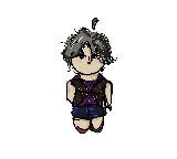
Below is an example of the character which the player will follow:

Additionally, I would like to implement different game mechanics as opposed to just using the point-and-click aspect of a visual novel. Two of these mechanics could be scenes in which the player can control the character and walk around the screen by using sprites and the “keyIsDown” function, and a maze scene in which the player controls a cursor.

Frightening / Challenging Aspects

  • Coding the logic of screen transitions after each choice
  • Implementing an engaging story within a reasonable amount of resources and lines of code
  • Applying different game mechanics under one project

Risk Prevention

  • Utilize boolean variables to update the screen after each choice
  • Write a concise story with a limited amount of choices and refactoring the code as much as possible
  • Only focus on the point and click aspect or make the scenes with different mechanics as simple as possible

Midterm Progress 2 – Street Crash

What’s New!

Enhanced Menu Section

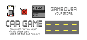
Since the first draft, I’ve implemented several exciting features to enhance the gameplay. The first notable change is in the game’s menu section. In the initial version, the game started with a simple spacebar press. Now, when you launch the game, you’re greeted with a pixelated title, instructions, and a sleek “Start” clickable button. All the text elements were crafted using a pixel font, giving the game a retro aesthetic.

Enhanced Car Controls

Once you’re in the game, you’ll notice significant improvements in the player’s car control. Your car can now move in various angles when turning left or right, offering a more immersive driving experience. You also have the freedom to move forward and backward, giving you complete control of your vehicle.

Here’s a code snippet showcasing how the player’s car rotates as you turn left and right:

// Function to handle player movement based on keyboard input.
this.move = function() {
  // LEFT
  if (keyIsDown(LEFT_ARROW)) {
    this.pos.x -= this.vel;
    if (this.a > -0.3) {
      this.a -= 0.05; // Adjust rotation speed here.
    }
  } else
  // RIGHT
  if (keyIsDown(RIGHT_ARROW)) {
    this.pos.x += this.vel;
    if (this.a < 0.3) {
      this.a += 0.05; // Adjust rotation speed here.
    }
  } else {
    // If the player isn't turning left or right, set the angle to 0.
    this.a = 0;
  }
}

Redesigned Bot Cars

I decided to revamp the bot cars and made slight design changes, all achieved using a pixel art style created with the help of the “Scratch” platform. These unique car designs add character to the game and create a visually appealing racing environment.

Fuel Management

One of the exciting new features I’ve introduced is fuel management. As you play, you must keep an eye on your fuel level. Collecting randomly placed fuel pickups in the game replenishes your fuel. If you neglect to refuel your car, the game ends. This adds an extra layer of challenge and strategy to the gameplay.

Improved Game Over Options

When you want your racing adventure to end, you now have two options to start over. Clicking the “Menu” button takes you back to the main menu, eliminating the need to crash into another car to restart the game. However, if you prefer the classic way, colliding with another car still ends the game, displaying your score and a “Game Over” message right after it.

Unique Self-Crafted Pixel Art

I’ve infused a touch of creativity into every detail of my game, meticulously crafting all the visuals using the Scratch platform. From the charming car designs to the captivating game titles, I’ve poured my artistic flair into each element. These pixel art creations add a unique and nostalgic appeal to the game, promising players an engaging and visually delightful experience. Below, you’ll find a selection of these original designs that contribute to the game’s distinct charm.

Edit Link

Week 5: Reading response

 Among the three sections of the paper, the one I liked the most was “Computer Mission in Interactive Art.” When the author initially introduced the idea that our entire body could interact with computers, I was a bit skeptical and didn’t fully grasp it. However, as I read more about it, I found it to be truly amazing because it represented the first step in enabling people to interact with computers in this way. It was like the initial building block for human-computer interaction. What I found particularly fascinating was how people were exposed to a new platform they had never encountered before. Just imagine the reactions of those who first learned about it; it must have been quite impressive.

Though many examples are given, One of the examples that caught my attention within this section was “Messa di Voce,” a performance where voices were transformed into images. What struck me as the coolest aspect of this artwork was that the sounds themselves generated the images. At a time when audio platforms were not as common as they are today, the concept of visuals emerging directly from audio would have been incredibly intriguing for the audience.

The next art installation, “Standards and Double Standards” from 2004, featured fifty belts suspended from the ceiling using special robotic motors. The interactive element here was particularly engaging and exciting for viewers. The belts responded to the movements of people in the room, creating a dynamic and immersive experience. It was as if the belts came to life, interacting with those present, making the overall experience dynamic and captivating.

These examples span a wide range of artistic categories, highlighting the diversity in how artists use technology to create interactive experiences. It’s remarkable to think about how these early innovations have played a significant role in shaping the technology-driven world we live in today. They served as the foundation for the kinds of interactive experiences we now take for granted.


Week 5 | Reading Reflection

“Computer Vision for Artists and Designers: Pedagogic Tools and Techniques for Novice Programmers” offers a fascinating exploration of computer vision and its applications, particularly within the realm of art and design. It shows how computer vision has traditionally been reserved for experts in fields like signal processing and artificial intelligence. What I liked the most about this paper is how it breaks down complex concepts related to computer vision into simple terms, making them accessible to readers without a technical background.

Among the diverse applications discussed, one that particularly stood out to me is the audiovisual performance “Messa di Voce.” This performance seamlessly combines whole-body vision-based interactions with speech analysis to visually enhance the expressions of abstract vocalists.

Furthermore, the paper introduces the concept of motion detection, which proved to be a valuable insight for my own project. My midterm project heavily relies on motion detection, as it involves tracking the movements of the user and objects within the video frame. Techniques like frame differencing, as discussed in the paper, offer a practical approach to dynamically adjusting colors and content in specific video areas. This knowledge aligns perfectly with my project’s objective of creating an immersive and responsive text display.

Midterm Progress #1

Name: Designer Chair Plunge

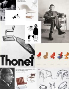
Concept: For my midterm project I want to implement a simple game inspired by famous designer chairs. Currently I am taking a core class named “Have a Seat” where we explore various ideas about seating, posture and chair design, and so this class is my main inspiration for my midterm. Regarding the strategy of the game, I want to create a falling designer character that the user has to catch by manipulating the chair on the bottom of the screen. The chair is responsive to the mouseX position therefore the user controls the game just by the movement of the mouse.

Moodboard: –>


Sketch:

I firstly started by implementing the control strategy of the game with simple figures. The ball and the rectangle are both objects, and the ball starts to move faster after each successful catch to increase the pace of the game.

Further/ complex implementations:

The nexrt steps will be to replace the simple figures with the png character and the chair. I would like the chair figure to be randomized from a number of different chairs to increase the variety. I will also need to work on the start game and end game windows to match the aesthetic. I will want to add some background music and add sound effects for each succesful catch or miss. I would love to draw the figures myself, so probably this would be the most challenging part.


midterm proposal

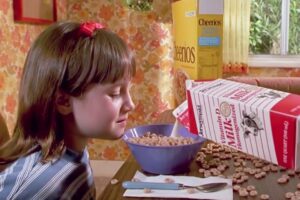
I think as a kid, for the longest time, I was obsessed with telekinesis. I had just watched Matilda, and although I didn’t know the name for it yet, I already knew how groundbreaking it was that Matilda could move things by the power of her mind, without touching anything. I would focus really hard on something like she did, and try to make it move (just a centimeter would have been enough), but it never worked.

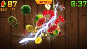
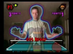
I am happy, elated even, to announce that I think I am finally old enough to finally realize my childhood dreams. So for my midterm project, I will be building a computer vision game that lets you interact with the virtual world without using a mouse or keyboard — your “stdin”. I am looking at classic games for inspiration, such as Fruit Ninja, or maybe the games for PlayStation EyeToy mentioned in the reading.

I can use ml5.js+PoseNet for this project, and there are so many online resources for learning about them. Even Daniel Shiffman has PoseNet tutorials and code examples, so I hope this idea isn’t too ambitious for a midterm project. I still haven’t written any code, but this is how I imagine the final project structure will look like:

1. The basic structure is built with p5.js
2. Using PoseNet, I will train my model to recognize specific poses (such as throwing a punch, or dicing the fruit with a slash of the hand, etc.)
3. The data returned by the model will be used in the core p5.js code to alter the appearance of elements on screen. For example, if it is something like Fruit Ninja, I could use sprite sheets to animate the fruit being cut up.
4. Obviously, sound plays a big part in our reality, so to make the game more immersive, I would have to trigger particular sound effects based on the user’s actions.

I am a little wary of using the ML model and of having to train it. Everything else I could just look up and implement, but training an ML model seems a little daunting. I have worked with PoseNet before, but it was a much simpler task than the one I now plan to undertake.

Week 5 | Midterm Progress

The concept:
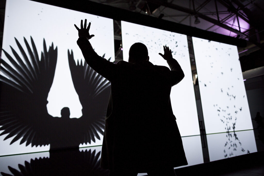
For my midterm project, I was inspired to create a unique piece of interactive art that would heavily rely on the user’s live video display. This idea had been brewing in my mind for several weeks, sparked by two key moments: first, when I saw a screen outside the introduction to interactive media (IM) lab displaying users amidst a backdrop of language characters, and second, when our professor showcased a project featuring flying birds (shown in image 1). These encounters left me captivated by the potential of technology and user interactivity in the realm of art. Additionally, I’ve always had a keen interest in game development, especially when it comes to implementing various elements such as graphics, animations, and user interactivity. So, I set out to combine both concepts by creating a simple engaging game that would contribute to the dynamic text video display.

Image 1

The core concept of the game revolves around collecting words. In this game, the player maneuvers a box to capture randomly falling words. These words are a fusion of adjectives that depict various moods and emotions. To add an extra layer of depth, these words are categorized, with each category corresponding to a specific display color and score. As the player collects these words, they have a direct impact on the text video display. The collected words are seamlessly integrated into the live video feed, dynamically altering the text and its color based on the specific word the player successfully captures.

Design:
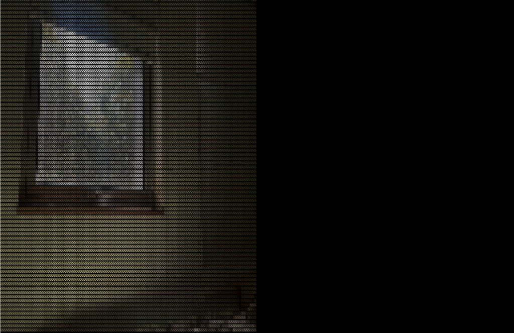
when it comes to the visual layout, I’ve split it into two halves (as shown in image 2). One side is all about the game interface (right side), where you interact with the falling words and move that collecting box. The other side (left side), well, that’s where the magic happens. It’s your canvas for the live video display, where you get to experience the fusion of gaming and art.

Image 2:

Sketch:

Challenges:
One of the challenges I’ve encountered involves effectively implementing the text video display within the project. It requires intricate coding and synchronization to seamlessly integrate dynamic text updates with the live video feed, ensuring a cohesive and engaging user experience.
Another challenge is handling every single pixel to ensure a crisp and smooth video display. To achieve a higher level of visual quality, I’m opting to increase the pixel density on my canvas. However, this choice brings the potential for glitches and slower performance.

Risk prevention:
To implement the text video display, I’ve delved into tutorial resources that explain similar concepts. These tutorials have been invaluable in guiding me through the complexities of working with a canvas as a grid of individual pixels. I’ve gained insights into handling pixel-level manipulations.
To achieve the perfect balance between visual clarity and smooth execution, after getting done with other project parts, I will try to optimize the number of pixels which I think will be done by testing different pixel settings.

Week 5 | Creative Reading Reflection: Computer Vision for Artists and Designers + Mid-Term Progress

Creative Reading Reflection – Computer Vision for Artists and Designers:

This article talks about computer vision, which helps computers understand pictures and videos using special math rules (algorithms). In the past, only experts and the military used it, but now regular people and artists can use it too, thanks to better software. It talks about examples like Videoplace and Sorting Daemon, these examples demonstrate how computer vision can be used in creative and thought-provoking ways to engage with audiences and address social issues.

In the second part of the article, it talks about simple computer vision techniques that beginners can use. These techniques include things like detecting motion, figuring out if something is there, and using brightness to find objects. These techniques are like the basic building blocks for making interactive systems that react to people or things in videos.

And it’s crucial to think about the physical environment when working with computer vision. It talks about how things like good lighting, using special lights, reflective markers, and picking the right camera parts can make computer vision work better.

A real-life example I can think of computer vision is Self-driving Cars. Also known as autonomous vehicles, they use computer vision technology along with many sensors like cameras,  LiDAR, radar, and GPS to understand and drive safely in their surroundings which also count as the physical environment of the car.

Mid-Term Progress:

My idea so far is baesd on an interactive digital collage artwork centered around a female portrait. Users would have the opportunity to add elements to the portrait, such as changing the color of the eyes, selecting different noses, or altering the mouth. These interactive dimensions could allow users to personalize and customize the artwork according to their preferences. The objective of creating a fun artwork that helps individuals express themselves and enjoy the creative process is a commendable goal. While the idea is still in its conceptual stage, it holds the potential to become an enjoyable and expressive digital art experience, especially if you continue to develop and refine it further.

This was last week when I wasn’t sure of the idea yet:

Untitled Notebook (3)

Code Design:

I still wish to attain the collage-style effect of pictures blending into each other, and I still aim to incorporate this into my project somehow

As of now, I think its better to start the project with the instructions page, even though proffesor Michael advised to start with thats hardest, but I dont think i can do that personsally. i can start with the first page and carry on with the rest.

  1. At least one shape – Most probaby added in the artwork to create a a even further collage style or added in the intsutrctions page not sure yet.
  2. At least one image – Main portrait would be images, multiple images will be added to my project.
  3. At least one sound – background music to give a vibe of a painter creating a portrait.
What I find Frightening:

I havent started with the main point of the project which is the portrait, but I do think thats the part where ill be struggling the most and as well the saving file output which will finalize the portrait, as im adding concepts and ideas that I havent done before, I have yet to look at videos to explain the ideas. In order to overcome this, I plan to attend an office hour with Proffesor Michael, and research concepts and ideas of how I can implement them.

Week 5: Midterm Progress

Concept:

For my midterm project I want to create a piece that resonated with a hobby of mine. I have always enjoyed baking and cooking. It’s such a calming experience, creating something from scratch. Whenever I get stressed out, I turn to my kitchen and let myself get lost in my recipe book, I let it take away my stress and heavy thoughts, therefore I decided to create a small kitchen simulation. I hope that through interacting with my piece users a can get to feel a semblance of the calmness I get to experience when I bake/cook.

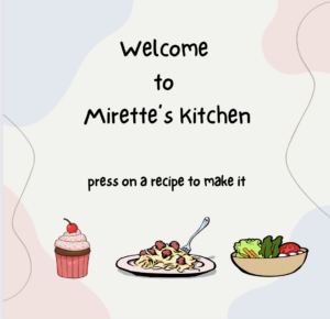
I will design it in a way so that the user will get to choose one of 3 recipes, cupcakes, spaghetti and meatballs or an avocado salad, to bake/cook. 

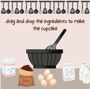
Each recipe will be displayed as an icon on the homepage, when pressed it takes the user to the next page to start the preparations. The user will have to drag and drop the ingredients in order to prepare the food and then put it in and take it out of the oven if needed, there will be different steps for each recipe that resemble the actual recipe being followed. I will also try to attach a recipe that the user can download at the end to try the recipe in real life if they’re interested. 

Design:

I want to use a soft palette to resonate with the calming experience I am relaying to the users as well as deliver an aesthetically pleasing design. I did a quick sketch to show what I have in mind for the homepage and an example of the following stages, I will add more dynamic objects and interactivity features within my design when I am actually implementing it.

homepage:

cupcake-making page:

Expected Challenges:

I am expecting to have some troubles with the drag and drop feature and the transitions between the screens. I want the transitions to be as smooth as possible without having any awkward jumps or glitches. I also expect to have some troubles with transitioning between different music files when switching different scenes because I do not want to have any weird transitions when switching tracks.

Risk Prevention:

For the drag and drop, I plan on watching several youtube videos, and look at other people’s code to understand how to implement the drag and drop feature as easily and as efficient as possible because I am a bit conflicted on how to make without running into other bugs in the code.

for the transitions, so far I have come up with having multiple screen variables and a function for each screen that would be called at the relevant times to switch to the desired screen. I will also refer to the p5js. reference page and examples page to get some inspiration for the transitions that could be used to make my project as close to perfect as I can.

p5js Sketch:

for now this is what I have created, I am still working on class definitions, function creations and music loading. I have only created the first page, but I have implemented the icon buttons, however they only direct the user to an empty screen right now.

An issue I faced is the decrease in the resolution of the icons when I loaded them onto p5js, which I am trying to fix as well because it completely ruins the visuals.

I have also used MouseIsPressed to implement the buttons, but I realize that this makes the selection harder and not as smooth so I plan on changing it to MouseIsClicked to function better.

Midterm Project Progress 1: I’m Not/Too Bored

Concept:

Boredom is a state of mind that craves some type of change. I ask myself sometimes when was the last time I have gotten bored. My answer would be is that I do not remember. While discussing other’s people state or level of boredom, I can see a glimpse of the different life each one of us has. As well as the pace humans like to take for themselves.

In my game I’m Not/Too Bored I wanted to create a dialogue between characters that experince different life pace than others. Each holds a unique lifestyle that changes how they decide to go on with their way of living. While engaging in a conversation with three people, I want to gain data, that shouldn’t be too seriously taken, to showcase the level of boredom the player might experince in life. I could also add a little input that could help them as I myself never get bored.

Code & Functions:
function draw() {
  background(255);
  //main menu 
  if (instructionsVisible) {
    tint(160);
    image(startupImage, 0, 0, width, height);
    noTint();
    fill(0);
    textFont(myFont);
    textSize(20);
    fill(225);
    textSize(55);
    
    //title
    text("I'm Not/Too Bored", width / 2, height / 5);
    textSize(20);
    
    //instructions
    text("Use WASD keys to move around.", width / 2, height / 2 - 20);
    text(
      "Engage in conversations with all the characters",
      width / 2,
      height / 2 + 20
    );
    text("to get a somewhat boring result!", width / 2, height / 2 + 60);
  } else {
    
    // Display character images only after Start button is clicked
    
    image(backgroundImage, 0, 0, width, height);
    //NPC locations
    image(hugo, 50, 135);
    image(fuLi, 0, 0);
    image(rene, 280, 162);
  }
}
// Hide the start button after it has been clicked
function showInstructions() {
  instructionsVisible = false;
  startButton.hide(); 
}
Challenges Faced:

-Controlling the appearnce time of different elements took some time to organise.

-Having my images uplaod without an external server required me to rewrite my code multiple times.

So far…:

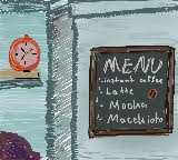
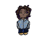
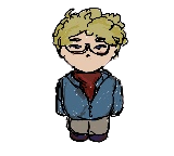
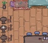
As shown below all I have right now is the main menu and my NPC just there.

I have been able to create an acceptable looking background and characters.

https://editor.p5js.org/mariamalkhoori/full/L-i2O01PV

Next Steps:

-My next step is to add the player and allow them to move around. I want the character to run around in certain areas ans bump into objects they can’t pass by (like a wall or table).

-Enable my characters to only engage with the NPCs if they are near them.

-Figure out a set of codes that allows the player to save the choices made after talking to each character and get the results.