
concept:
For this assignment, I saw this piece by Aaron Koblin and I immediately knew I wanted to visualize some form of auditory data. Initially, I wanted to do musical data, but I knew it was difficult to do because of the lack of datasets and the rate limits of using APIs for platforms like Spotify. However, browsing on Kaggle I found a dataset of heartbeat sounds and I knew it’d be perfect for the job.
Initially I wanted to do something similar to Koblin’s piece, I graphed the waveforms as lines corresponding to the amplitude. But frankly, they looked ugly and it was because the audio wasn’t as dense as the ones Koblin was using. I instead graphed them as a continuous graph, and the line reminded me of a heartbeat monitor, so I stylistically updated my project to look like that.
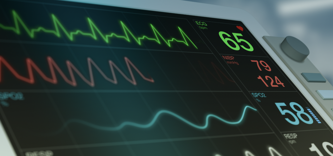
All of the lines when static are green, and when you click the screen, a random heartbeat is chosen and it is dynamically drawn in red with different parameters so that the peaks and changes are more pronounced.
code highlights
I’m proud of the draw function, because it took me a while how to figure out how to do it (statically and then dynamically).
  drawSelf() {
    noFill();
    stroke(0,100,0);
    drawingContext.shadowBlur = 15;
    drawingContext.shadowColor = '#8FBC8B'
    if (!this.audio.isPlaying()){
    beginShape();
    for (let i = 0; i < this.peaks.length; i++) {
      vertex(this.startX + i, this.startY - this.peaks[i] * this.scalingFactor);
    }
    endShape();
    } else {
      let vol = currentAmp.getLevel();

      this.volumeHistory.push(vol);
      stroke(128, 0, 0);
      drawingContext.shadowBlur = 15;
      drawingContext.shadowColor = color(255, 0, 0);
      beginShape();
      for (let i = 0; i < this.volumeHistory.length; i++) {
        vertex(this.startX + i, this.startY - this.volumeHistory[i] * this.scalingFactor * 4);
      }
      endShape();
    }

}
improvements
I think the transition from a sound wave being drawn directly to going back to its static form is too abrupt, so I’d like to find a way to improve that.
Super cool!