Reading reflection: week 3

The author’s humble introduction, where he admitted that none of us truly have a crystal-clear understanding of what interactivity is, immediately resonated with me. It’s a sentiment many of us can relate to – we often have a sense of what certain concepts mean, but articulating a precise definition can be difficult to find.

The idea of using the conversation between Fredegund and Gomer as an example to define interactivity was a pleasant surprise. It underscored the importance of key elements in any interactive exchange: listening, thinking, and speaking. It made me realize that without these components, a conversation can hardly be considered truly interactive; instead, it becomes a one-way process, lacking the depth and richness of true interaction.

The analogy of actors and a branch of a tree further clarified the concept. I’ve always believed that interactions are a two-way street, and when I engage with someone new, I often observe how they perceive the interactive process. Do they view it as a collaborative effort, like the intertwining branches of a tree, or is it merely a one-sided performance?

Prior to reading the article, I was uncertain about what qualified as interactive and what did not. The depiction of interactivity into different levels provided me with a valuable framework for understanding and categorizing interactive experiences.

However, it was the author’s explanation about the importance of listening that truly resonated with me. Each sentence in that section felt relatable. We’ve all encountered individuals who do not truly listen, and the negative vibe they emanate in such interactions is noticeable. Conversely, engaging with someone who not only listens but comprehends and engages with our thoughts is an immensely positive experience.

In conclusion, the article shed light on the multifaceted nature of interactivity and the crucial role of listening, thinking, and speaking in fostering meaningful interactions. It provided clarity on what constitutes true interactivity and offered a humorous take on subjective perspectives. Ultimately, it reminded me that genuine interactions are a delicate balance of engagement, empathy, and active participation.

Week 4: Reading Response

In Chapter 1, I was interested in how the author discusses the dual nature of technology, highlighting how it can simultaneously make life easier and more enjoyable while also introducing added complexities and frustrations. They use the example of the wristwatch to illustrate how technological advances have led to more functions and features in devices, which can pose design challenges. The author envisions a future where various devices, such as phones and watches, might merge into one unit with flexible displays and advanced capabilities.

The central argument of the text revolves around the paradox of technology: it offers increased benefits but also increases the difficulty of use. This paradox presents a significant challenge for designers who must balance the desire for more functionality with the need for user-friendliness and simplicity.

In my opinion, the author raises valid points about the challenges posed by technology’s ever-increasing complexity. It’s true that as devices become more advanced and multifunctional, there is a risk of overwhelming users with features and controls. This can lead to frustration and, in some cases, users opting not to use certain devices altogether, as the text suggests with the example of people replacing watches with cell phones. Moreover, the author’s mention of the potential merger of devices like phones and watches into one unit with flexible displays and advanced capabilities is already becoming a reality with the development of wearable technology. For instance, smartwatches now integrate features like messaging, fitness tracking, and even contactless payments. While this convergence provides convenience, it also requires designers to carefully consider how to present these functions in an accessible and user-friendly manner, avoiding overwhelming users with too much information or complexity.

The author’s suggestion of agreed-upon standards for controls and interfaces is a practical approach to mitigating the complexity issue. Standardization can indeed simplify the user experience by ensuring consistency across devices and reducing the learning curve for users. However, as the author acknowledges, reaching such agreements in a rapidly evolving technological landscape can be challenging.

In conclusion, I agree with the text’s assertion that technology presents a paradox: it can both simplify and complicate our lives. Designers face the ongoing challenge of striking the right balance between functionality and usability to ensure that technological advances genuinely enhance our lives without causing unnecessary frustration.

Assignment 4: Generative Text Output (La Mariposa)

I wanted to make artwork using a Spanish poem I liked. It is called “La Mariposa”.

La Mariposa
“Si yo fuera otra cosa, sería mariposa” (If I were something else, I would be a butterfly”)
Sin dirección salvo la brisa (With no direction but the breeze)
Flotaría entre belleza y belleza (I would float among beauty after beauty)
Tocando el cielo y la fresa (Touching the sky and the strawberry)
Una vida que sale como risa (A life that emerges like laughter)
“Si yo fuera otra cosa, sería mariposa” (“If I were something else, I would be a butterfly”)
Doradas del sol mis alas (Golden are my wings in the sun)

This poem evokes a sense of freedom, beauty, and simplicity. The speaker imagines the carefree life of a butterfly, fluttering from one beautiful thing to another, symbolizing a desire for a life unburdened by worries and constraints. I also wanted to highlight the fleeting, delicate, and ephemeral nature of life, much like a butterfly’s existence in this project.

function mousePressed() {
  // Display the next poem line when the mouse is pressed
  currentLineIndex = (currentLineIndex + 1) % poemLines.length;
   clear();
  // Display the current poem line
  text(poemLines[currentLineIndex], width / 2, height / 2);
}

The biggest challenge was that I could not clear the remaining lines of the poem after I clicked the mouse. So, the lines did not renew, it kept writing new lines above the remaining line. After I learned the “Clear” function, I could clear the canvas and display the next line of the poem each time I clicked the mouse, renewing the poem text.

Furthermore, I tried to make the butterfly move around the canvas more realistically.

  // Calculate the angle for butterfly rotation based on velocity
  butterflyAngle = atan2(butterflyVelocityY, butterflyVelocityX) + PI / 2;

  // Apply the angle and display the butterfly
  push();
  translate(butterflyX, butterflyY);
  rotate(butterflyAngle);
  imageMode(CENTER);
  image(butterflyImage, 0, 0, butterflySize, butterflySize);
  pop();

  // Update butterfly position
  butterflyX += butterflyVelocityX;
  butterflyY += butterflyVelocityY;

  // Wrap the butterfly around the canvas edges
  if (butterflyX > width) {
    butterflyX = 0;
  } else if (butterflyX < 0) {
    butterflyX = width;
  }
  if (butterflyY > height) {
    butterflyY = 0;
  } else if (butterflyY < 0) {
    butterflyY = height;
  }

  // Add a flapping wing animation
  butterflySize = 100 + sin(frameCount * wingFlapSpeed) * 10; // Adjust wing flap speed
}

The butterfly image is rotated based on its velocity direction to make it more realistic. Also, a wing-flapping animation is added by changing the butterfly’s size over time. This gives the appearance of the wings flapping. To make the butterfly rotate slowly, I adjusted the wingFlapSpeed variable to control the speed of wing flapping.

Next time, it would be better to mix data visualization and generative text output together rather than to use images in the background.

Week 3 – train tracks

Concept:

For this assignment, I wanted to portray train tracks. I don’t know what it is about trains, but I have been fond of them ever since I was a little girl.  I decided to combine the concept of OOP and arrays with my love for trains to create the piece. I used two classes to define the train cars and the tracks and used arrays to store the instances created. The speed of the trains is randomized to have a visually pleasing image of trains moving in different directions at different speeds.

When the mouse is clicked, the screen is paused for 1 second and then the trains start moving again. I also added another functionality so that when a key is pressed the day changes into night.

A highlight I’m proud of:

I am proud of the way I got to make the trains move in alternating directions by creating a variable that stores either 1 or -1 and depending on the value, the direction of motion is set.

move(direction) {

  if(direction == 1){
      this.x = this.x + this.xspeed * this.xdirection;
      this.y = this.y + this.yspeed * this.ydirection;
  }else{if(direction == -1){
          this.x = this.x - this.xspeed * this.xdirection;
          this.y = this.y + this.yspeed * this.ydirection;
  }
    
  }

Reflection and ideas for future work or improvements:

For future work, i would like to work on creatively coming up with more visually and aesthetically pleasing art works. I would also like to include more advanced interactivity elements within my artwork.

Reference:

setTimeout() functionality: https://www.w3schools.com/jsref/met_win_settimeout.asp


Week 3- Generative Artwork

Generative City Artwork 

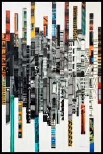
My concept: I was really inspired by the work “Patchwork City 65” by Marilyn Henrion (fig 1), which depicts the development of urbanization. The ever-growing urban landscape is a familiar phenomenon for the majority of us because the migration from rural areas to urban places has skyrocketed last 20 years, significantly affecting the demographics of the countries. In order to accommodate the citizens and the immigrants, the countries are building more and more civil constructions of different levels. I wanted to make a ‘timelapse’ kind of thing, presenting the growth of the urban landscape. 

Fig 1.“Patchwork City 65” by Marilyn Henrion

A highlight of the code I am proud of is the code for creating one building at a time and moving it randomly by the X and Z axis in the specified range. Considering the fact that the box which is the 3D object is initially positioned in the center of the canvas and the specific dimensions cannot be given directly for them, I was struggling to move the boxes. Every new box was created at the same point. Because of this, I tried to implement the translation learned in class and the movement has created. 

function draw() {
  orbitControl();

//setting the limits of the range the buildings can be created on the X and Z axis. 
  let randomX = random(-60, 60);
  let randomZ = random(-50, 50);

// creating one building at a time and moving it randomly by the X and Z axis. 
  for (let i=0; i<1; i++){
   translate(randomX, 0, randomZ);
    buildings[i] = new Building(); 
    buildings[i].show();
  }
}

Embedded sketch 

FINAL WORK

Reflection and ideas for future work or improvements: I was trying to make the city develop in a parabolic function so that the highest buildings would be constructed in the center, giving a nice image of the city. However, the parabolic function worked oppositely, meaning that the vertex became the lowest point in the center. So all the high buildings were created from two sides with the low buildings in the center of the canvas. The example of the sketch is attached below. Although I tried to make the function inversely proportional by dividing one by the parabolic function, the outcome wasn’t successful either because the extreme heights in the center were ruining the overall image. Hence, I would like to try to work with the giving the limits on the outcomes of the functions more to achieve the initial idea. 

FAILED ATTEMPT (THE PREVIOUS SKETCH IS FINAL, NOT THIS)

Week 3- Reading Response

What exactly is interactivity? This is a question that I asked myself when I first decided to pursue Interactive media as a minor. At one point, I thought that interactivity is anything that is dynamic, then I learned that interactivity doesn’t necessarily mean dynamic. It took me some time to realize that interactivity is a complex definition that is commonly misunderstood. 

Taking the Mona Lisa as an example, I have always thought that the Mona Lisa is an interactive painting, inviting people to go around trying to see her eyes moving, but now that I think of it, it shouldn’t be considered an interactive painting, in fact the example of the tree branch the author gave is very similar to the example of the Mona Lisa, it constitutes a reaction not an interaction. I now realize that I have confused the concept of reactivity and interactivity most of my life.

The author invites readers to consider the following question: Is interactivity subjective? I believe that to some extent you can argue that interactivity is indeed subjective, depending on the quality of both the processing power that generates the action, and the response action itself. However, I believe that there is a limit to what we can call interactive. If there is no processing power and action whatsoever, like the example of the rock then this cannot be labeled as an interactive object. After thinking this through for quite some time, I realized that I agree with the author that interactivity can and should be scaled to levels to be able to compare different types of interactivity.

I was intrigued by the argument the author raised of whether a book is considered interactive or just reactive. I asked myself what I consider a book is. I guess you can say that I have never actually thought that books are interactive. I have always thought that a book is subjective, no two people can or will interpret it the same way. No matter how detailed a book is, it leaves some room for each person’s imagination to fill, but that does not mean that it is interactive, I would say that it is just a matter of different reactions and not different answers as the author puts it.

Lastly, the example of the movie given in the reading reminds me of a movie I watched, or putting it in a more accurate way, I experienced, a while back. The movie is Black Mirror: Bandersnatch on Netflix. Throughout the movie, Netflix pauses and asks you which decision you want the main character to make and depending on what you choose, you go through a different track of the movie. The decisions range from “should the main character take this job” to “should the main character kill this person”. It is reported that there are 5 main endings to the movie but there are trillions of different tracks you can follow in the movie making each experience unique. I believe that this “movie” makes the argument that movies are not interactive stronger. I would rank this movie high on the interactivity scale because it offers endless answers and invites users to keep trying over and over to see how many different endings they could reach.

week 3 – reading reflection: defining interativity

I really enjoyed Chris Crawford’s interpretation of interactivity, especially because he challenges conventional notions of interactivity. I specifically wanted to comment on his definition, in which he likens interactivity to having a conversation:

“interaction: a cyclic process in which two actors alternately listen, think, and speak.”

I think framing interactivity as a conversation is both interesting and perhaps controversial because it brings the interactivity of many pieces into question. In class, we have had discussions on “types of interactivity”, where some pieces were defined as being once interactive, as in the user clicks and the interaction happen, or perpetually interactive, pieces whose motions and responses went on infinitely. The latter form of interaction, under Crawford’s definition, is barely considered interactive then. It is just a little above a movie in terms of interactivity, where a user can engage once but then is compelled to watch the result.  It is not a conversation, it is just a one-word response.

Another form of interactivity brought into question are the interactive pieces that have one response to user activity. Two contrasting pieces that I can think of are the “Deep Walls” piece and Chris Milk’s “The Treachery of Sanctuary”. Both these works are considered iconic pieces in the space of interactivity. Deep Walls, under Crawford’s definition is a truly interactive piece – it is a conversation between the art piece and it’s viewers at any specific time. It captures the true essence of dialogue because it will always appear different depending on who is engaging with it and how they’re engaging with it. The Treachery of Sanctuary, on the other hand, in my opinion, falls short of Crawford’s definition. It is not accurate to describe it as a conversation – but moreso as a script. Actors in their performances choose how to enunciate their words and the level of emotion they convey with their lines, but, at the end of the day, the dialogue will always be the same. The same is with Milk’s piece – users have wiggle room to play around a bit, but at the end of the day, the ultimate result will always be the same.

I think it is for this reason Crawford begins to speak about degrees of interactivity. Certainly, every piece alluded to in this response is interactive, but exactly how much? These trains of thought are especially important for us as creators in the Interactive Media space, as it forces us to mindfully think about how open-ended the conversations are that we are creating through our art.


“Pookalam” with animation

For this assignment, I was inspired to create a generative piece that would celebrate my cultural tradition. That’s when the idea of animating a “pookalam” came to mind. A “pookalam” is a vibrant and intricate floral arrangement made during the festival of “Onam,” in Kerala where various colorful flowers are meticulously plucked and their petals separated. These petals are then artfully arranged in front of houses as given in the picture below.

To bring this tradition to life in my assignment, I tried to create an animation where colorful flower petals descend from above, autonomously converging towards the canvas’s central point. This concept not only pays homage to the beauty of “pookalam” but also adds a dynamic and engaging visual element to the tradition.

Initially, my approach involved animating a single flower falling from above, but as I progressed, I decided to incorporate an array function and created an empty array to work with. To achieve the effect of multiple flowers descending, I introduced a variable for the number of flowers and utilized multiplication to replicate them.

Animating their falling was a relatively straightforward task, but the challenge arose when I aimed to gather them elegantly at the center point of the canvas. It was during this part that I acquired a deeper understanding of using the “target” function to achieve this goal. And that is the part of coding I am particularly proud if:

moveTowards(targetX, targetY) {
  // Move the dot towards the target position
  let dirX = targetX - this.x;
  let dirY = targetY - this.y;
  let distance = sqrt(dirX * dirX + dirY * dirY);
  let speed = map(distance, 0, width, 0, 4);
  this.x += (dirX / distance) * speed;
  this.y += (dirY / distance) * speed;
}

While my original intention was to transform these grouped flowers into a beautiful “pookalam,” like arts, this is the outcome I managed to create.

Reading Reflection | Week 3

“The Art of Interactive Design” does a good job in delivering its content by being interactive while it’s just a group of simple words but really made engage in the reading like if it is a narrator. The first chapter raises a question reagarding the definition of interactivity, claiming that interactivity is usually misunderstood. The author defines interactivity as a conversation between two actors. Last week while working on a website design, a UI-UX designer told me that whenever users interact with an element in the design, they expect to recieve a response. These words jumped to my head while reading the chapter and thus, I believe that this definition is exactly what interactivity is supposed to mean.

The author also discusses the concept of degrees of interactivity which is crucial in our understanding of interactivity while working on producing interactive designs. It is crucial because, as the author mentioned, most people believe that interactivity is a boolean property while it is, indeed, can be measured and evaluated. The degree of interactivity depends on the ways of communication between two actors whether listening or thinking or others. So, I believe that with the rapid evolution of technology this era, the degrees of interactivity will have a wider variation depending on the way its implemented in. For example, Virtual Reality applications should have the most sophisticated degree of interactivity as the users fully engage in these type of applications.

Assignment 3

The Concept:
For this assignment, I aimed to create something that truly captivates my interest. Among the many wonders that intrigue me, one stands out – the precise system of our universe. The accuracy by which planets, stars, and galaxies rotate around each other is really worth contemplation. So, I tried to work on creating a simple version of our solar system where some planets rotate in their orbits around our warm sun. However, my solar system is more dynamic with my choice of planets and stars number and random planets’ sizes and colors.

Code Highlight:
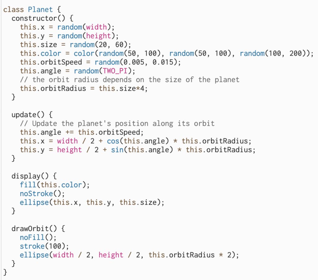
The part of code I am proud of is drawing the planets and especially figuring out how to draw their orbits because the planets sizes are randomly generated. So, the orbit radius is dependent on its planet size.
Sketch:

Reflection and ideas for future work or improvements:
I like the final output of my sketch. However, I look forward to simulating the solar system in a more realistic way and giving each planet its own characteristics and implementing 3D visualization of it.