
Don Norman’s first chapter has been an eye-opening experience. It’s astonishing to realize how much thought and intentionality should go into the design of even the simplest objects we encounter daily. Norman’s concept of “the psychopathology of everyday things” resonates deeply with me because I’ve often found myself frustrated by poorly designed objects like confusing interfaces or counterintuitive controls. His emphasis on Human-Centered Design is particularly relevant in today’s world, where technology is pervasive, and products should cater to a wide range of users. What struck me the most was the reminder that good design should make our lives simpler, not more complicated. This chapter has made me appreciate the importance of clear communication between designers and users and has left me with a newfound awareness of the impact of design on our daily experiences. It’s a lesson I’ll carry with me as I continue to learn and explore the world of design.
Month: September 2023
Assignment 4: Smlie :)
Concept:
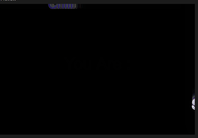
Creating this Assignment I was feeling sad so I decided to create an auto text generator that tells whoever interacts with the screen what I think about them. Tap on the screen to see what you are 🙂
Highlight:
I decided to use everything we learned in class besides data analyses to create this artwork. I was inspired by the bouncing ball example used in class so I decided to replace the ball with a word and with that, I just utilized loops and if-else statements to create a generator that can will print random words in an array of words.
The parts of the code I found challenging were; The choosing of the words as random numbers to generate numbers in double casting and also because I didn’t pay attention to when you were talking about how to cast numbers. But after asking Powers I was able to solve this situation.
The main problem that I wasn’t able to also solve was fitting the words on the canvas. I tried to use “addition and subtraction” means to do so but this didn’t solve the problem but rather created another one.
bounce() {
  if (this.x > width-120 || this.x < 0) {
    this.xspeed = this.xspeed * -1;
    this.colorChange();
  }

  if (this.y > height-5 || this.y < 20) {
    this.yspeed = this.yspeed * -1;
    this.colorChange();
  }
}
Because I added and subtracted, if an object was created in the space I excluded the object bugged.

I solved this with the use of the return function but it is not exactly how I want it to be. The objects still go out of the canvas and sometimes they bounce when they haven’t hit the edges.
if(this.x>width-120||this.y<20||this.y>height-5){
      return;
    }
For the addition of objects and deletion I used the “function KeyPressed()” and “function mouseClicked()” as well as return loops and dynamic memory allocation. I am proud that I made sure to not cause memory leak as I applied what I have learnt even though it didn’t cause any error.
Finally, I used the opacity in the fill function as well as some randomness to cause this kind of flashy look in the end and I don’t know if this work made you smile but it made be happy after I was done.
Final Work:
Reflection and Ideas for Future works:
I really hated the fact that the letters kept going out of scope so maybe in future I would correct this error, if not in this project, in another similar one.
Reading Reflection – Week 4
The world we live in is designed. We interact with many things in our day-to-day life, from doors to mugs, to the screen you’re reading this off of right now.
Great design is something that often blends in with our lives so well that we don’t realize how well these things are designed. Take an ordinary pair of scissors for example. When you pick one up, you know where your fingers have to go. When you open and close the scissors, you have an intuition about its purpose. How is this information communicated to us? Do we all have an innate understanding of what a scissor is?
The answer lies in great design. In chapter 1 of “The Design of Everyday Things”, Don Norman highlights some concepts that come together to explain what makes a design great. These include affordances, which are the types of relations between two entities that are possible. Paper affords cutting for a pair of scissors, but for the same scissors a chunk of metal does not afford cutting. Another concept that is important is that of signifiers. These are indicators that signify where an action is supposed to take place.
Lastly, feedback is another aspect of design that—if implemented correctly—can help a person understand how to use something. There are two examples of machines with feedback, one good and one bad, that I use in my daily life. One is an electronic toothbrush that beeps violently when I apply too much pressure. I didn’t have to use any manuals to understand what it was telling me. Whenever I brushed too hard, it beeps to let me know that I’m being a bit harsh. On the other hand, I have an espresso machine that has three buttons: two for espresso and one for steaming milk. The milk-steaming button has been blinking orange for a while. I didn’t notice it until a friend who owns the same machine saw it and told me that the machine needs descaling. How would I have known that? The toothbrush is an example of good design, where the feedback is conveyed without needing a manual. On the other hand, my espresso machine has a poorer feedback design.
After reading this chapter, I instantly thought of the doors that we have installed on campus. The automatic doors that should open when a sensor detects a person, and they usually do. Except when they stop working:
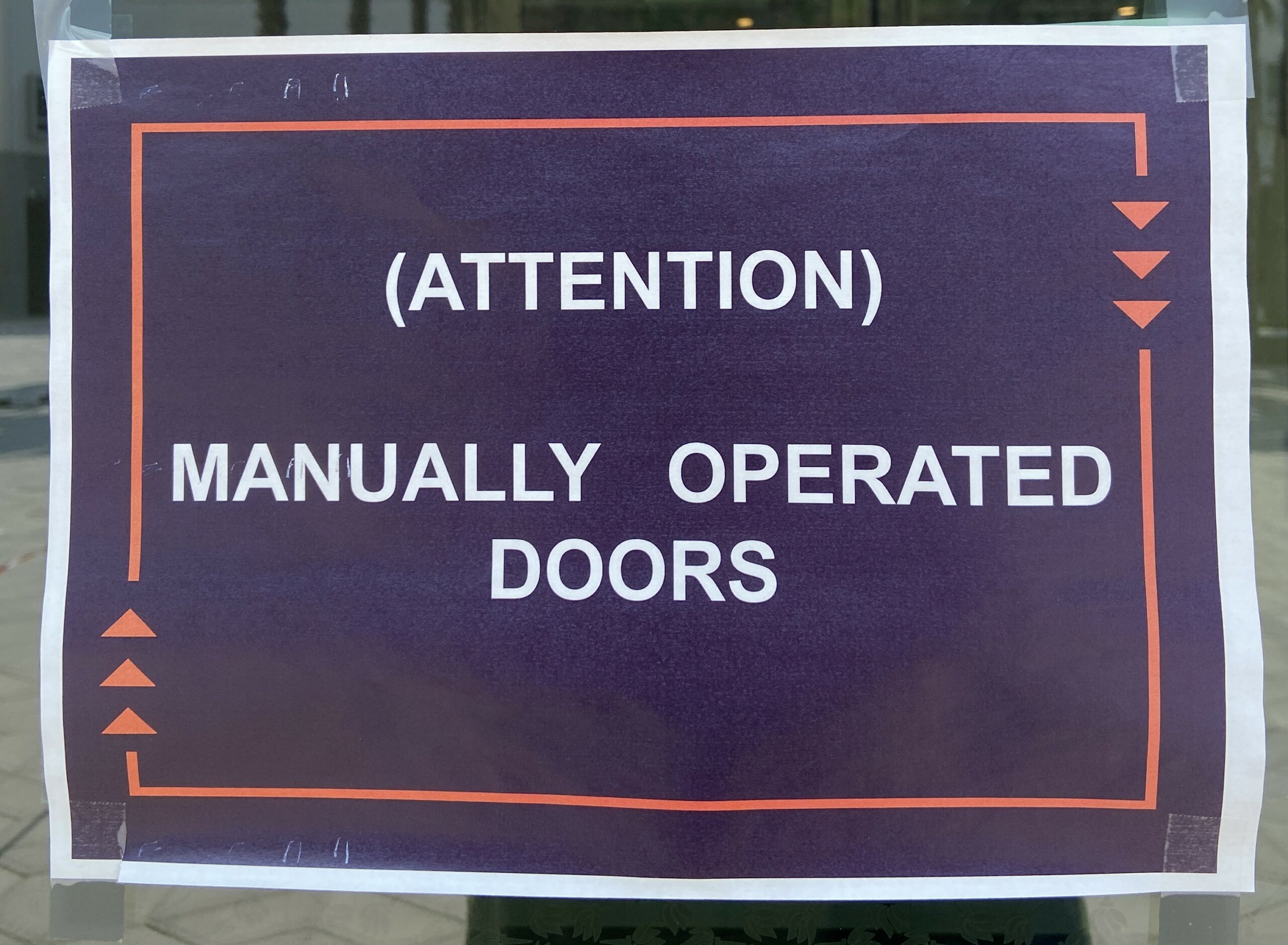
Which happens more often than it should. But that’s fine, machines break. After seeing these signs so often, I’ve made it a habit of using every door manually. You would expect that to work all the time, but something weird happens with the automatic doors that we have on campus. When I push on a “functional” automatic door, it decides to resist. It will not move until I stop pushing, even if it was perfectly keen on doing so before. What does this feedback even mean? Is the door saying that I should let it do its job?
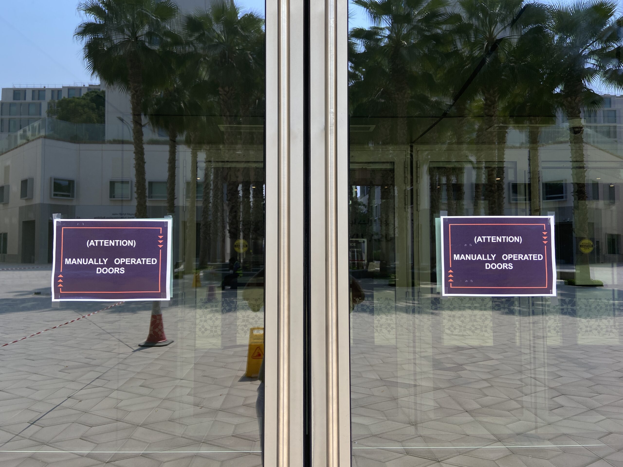
Then why are the handles and push bars there? They handles are affordances—they allow me to pull on the door, and also signifiers as they tell me where to pull on. Yet when I listen to the design, I am misled; I am met with resistance that leaves me confused. Why call to me to be pulled and then push against me as if telling me that I never should have pulled. It is deception. Bad design is deception.
Assignment 4 – Waves After Waves
Concept
I was inspired by my love for the beach and how it resonates peace and calmness within me. So, I decided to create a digital representation of a tranquil beach scene at night. The idea was to capture the essence of the ocean waves, a crescent moon, and embed generative text that represents the soothing and rhythmic nature of the waves. For the generative text, I chose lyrics from the song ‘Waves’ by Mr. Probz, as it perfectly encapsulates the feeling of being by the ocean, and it’s a song that holds personal significance to me.
Highlight of the Code
One particular aspect of the code that I’m particularly proud of is how I created the wave-like motion for the generative text. Specifically, the following block of code:
let waveOffset = sin(frameCount * waveSpeed) * waveAmplitude;
  xPosition += direction * 1; // here we can adjust the speed (horizontally)

  // Reverse direction when text goes off-canvas
  if (
    xPosition > width + textWidth(myString) ||
    xPosition < -textWidth(myString)
  ) {
    direction *= -1;
  }

  // Draw the characters of myString with wave motion
  for (let i = 0; i < myString.length; i++) {
    let myChar = myString.charAt(i);

    // Calculate the horizontal position for each character
    let x = xPosition + textWidth(myChar) * i;

    // Display each character of myString with vertical wave-like motion
    text(myChar, x, yPosition + waveOffset);
This code combines the use of “sin()” to create a smooth wave effect and dynamic movement of the generative text as it moves horizontally across the canvas. It seamlessly simulates the rise and fall of ocean waves, adding a captivating visual element to the scene.
Reflection/Improvements
Creating this beach scene with generative text has been an engaging journey where I combined my passion for art and coding to express a personal connection with nature and music. For future improvements, I envision extending the project by incorporating interactive elements, different times of day, realistic sound with the song ‘Waves’ playing, and user customization of lyrics. These improvements would create a more immersive and user-friendly experience, making the artwork more fascinating and interactive for viewers.
Update: 2 October 2023
I wanted to share an update on this assignment! As mentioned in my class presentation, I was initially working on creating a digital representation of a tranquil beach scene with generative text that captures the soothing essence of ocean waves. However, due to time constraints, I was unable to achieve the exact wave-like motion I had envisioned for the generative text before the submission deadline.
But, I didn’t give up on my assignment. I continued to work on it, digging deeper into the code and experimenting with different techniques. After some additional research and coding, I finally figured out how to make the generative text move in a wavelike motion, just as I had initially planned.
Initially, the text was moving as a straight sentence going up and down in motion. However, with the new update, I have successfully implemented the wave-like motion, simulating the rise and fall of ocean waves. I’m incredibly proud of how it looks now, and I believe it truly captures the essence of the beach scene I aimed to create.
here is a snippet of the edited code:
// Draw the characters of myString with wave motion
for (let i = 0; i < myString.length; i++) {
  let myChar = myString.charAt(i);

  // Calculate the horizontal position for each character
  let x = xPosition + textWidth(myChar) * i;

  // Calculate the vertical position with wave-like motion
  let y = sin(frameCount* waveSpeed + i * waveAmplitude + waveOffset) * 5;

  // Display each character with vertical wave-like motion
  text(myChar, x, yPosition + y * 3);

  // Display each character of myString with vertical wave-like motion
}
Here is the final result:
Week 4 – Reflection Assignment
Don Norman’s first chapter, “The Design of Everyday Things,” sheds light on the complicated world of design and its tremendous impact on our daily lives. As I reflect on the reading, several key points and questions come to mind.
The importance of user-centered design is emphasized by Norman. He contends that excellent design should prioritize the wants and expectations of users, which makes perfect sense. However, this raises a question: How often do designers genuinely consider the end users when creating products? This might be a huge difficulty in a world where firms may prioritize money or aesthetics over usability.
The example of the refrigerator’s temperature controls struck a chord with me. It made me think about how frequently I’ve faced similar problems with common things, leaving me upset due to a lack of clear design. This experience has made me more appreciative of well-designed products and less forgiving of those who prioritize aesthetics over usability.
Norman’s idea of conceptual models and their misalignment with the system image is compelling. Users clearly form mental models of how things work based on their interactions and experiences. However, usability challenges arise when these models clash with the actual workings of a product. This approach has made me realize how important it is for designers and users to communicate clearly and consistently.
In terms of bias, while Norman appears to advocate for user-centered design, it does not appear to be inherently biased. Instead, it appears as a call for a more balanced and thoughtful approach to design.
Reading Reflection – Week 3
Before delving into the first chapter of Chris Crawford’s “The Art of Interactive Design”, my understanding of “interaction” was rather straightforward—I saw it as any form of engagement that elicited a response. However, learning about Crawford’s comprehensive criteria, which highlight the significance of cyclically reciprocal actions such as active listening, speaking, and thinking, has expanded my viewpoint. His idea allows for evaluation of the depth of interactivity in different mediums, which challenged my previous idea that something either is interactive or not.
Another idea that caught my attention was that interactivity is in fact subjective. This thought makes complete sense, as different users have different expectations, levels of interest, motivation and personal preferences. For instance, someone who prefers a more passive form of engagement and somebody who strikes for a more immersive experience will most likely not find something like the YouTube algorithm interactive on the same level. Another factor I considered after the reading is that interactivity can be staged; in other words, it is not difficult to make something appear interactive when, in fact, it is not. This issue arises for several reasons. First, there is often a false overuse of the term “interactive”, leading to a dilution of its meaning. This aligns with the misconception with which Crawford opens the first chapter, highlighting the need for a more precise understanding and definition of true interactivity. Second, there seems to be a common tendency to mistake participation and reaction as true interaction. While these elements are integral to many interactive experiences, they lack the deep, cyclically reciprocal engagement that Crawford’s definition of interactivity highlights.
An example that comes to mind is gamification, which involves applying game-like elements, such as points, badges, leaderboards, and rewards, to non-game activities to make them more engaging and interactive. Such strategy is often used in various apps, for example, educational applications such as Duolingo. Duolingo gained its popularity since it was perceived as highly interactive due to the visual feedback and competitive elements, but that is more or less only the surface of the application. Upon closer examination, one may realize that the core learning experience remains passive and one-directional, with limited opportunities for genuine engagement, discussion, or deep understanding of the subject matter.
Assignment 4: 676 Wonder Hues
676 Wonder Hues
For this project, I needed to use data visualization, but instead of portraying it in a graph or a static image, I was striving to make it look dynamic while also giving agency to people to have a personalized experience. To start with, I began looking for different sets of data, but none of them were as customizable to each person as much as their names. However, there are millions of names, and it would not be possible to link all those names in a CSV file. Hence, there was an alternative way, getting a smaller sample of names and counting the number of names associated with each alphabet. To begin, I was able to get 7000 different male and female names, then using Excel I counted the number of names that starts with each alphabet. Next, I imported the Excel to my project in p5. After hours of brainstorming , I was able to modify a previous code of mine to give different visual illusions. By using only the initial of each name, I am only limited to 26 different combinations. However, by using the person’s first and last name initials, I am able to bump it to 676 different visual illustrations and hence the project name “676 wonder hues”.
Below are a few patterns to different initials.
Initials: “PM”
Initials: “DS”
Part of the code
function setup() {
  createCanvas(600, 600);

  let alphabet = names.getColumn("alphabet");
  let frequency = names.getColumn("freq");

  sampleName = "P,M";

  let splitString = split(sampleName, ",");

  alpha1 = splitString[0];
  alpha2 = splitString[1];

}
function getValue(targetAlphabet) {
  let alphabet = names.getColumn("alphabet");
  let frequency = names.getColumn("freq");
  let rowNum = names.getRowCount();

  for (let i = 0; i < rowNum; i++) {
    if (alphabet[i] === targetAlphabet) {
      return frequency[i];
    }
  }
}
Reflections and improvement
In the future I want to add a section on the screen for the user to input their initials.I also look forward to add more color combinations to increase the customizability of the visual illustration.
Week#3 – Reading Reflection
Chris Crawford’s approach to redefining interactivity challenged my previous understanding. Before reading his work, I had simplistically viewed “interaction” as any engagement that elicited a response. However, Crawford’s detailed criteria, emphasizing cyclically reciprocal actions like active listening, speaking, and thinking, expanded my perspective. It dawned on me that interactivity is not solely objective; it also involves subjective assessments of its degree. This revelation prompted me to reconsider instances I’d deemed interactive but didn’t align with Crawford’s definition. This reevaluation applies to the concept of participation as well. My initial interpretation had primarily focused on the term “interact,” which, as I realized, is distinct from “interactivity” and represents two surprisingly different notions.
To illustrate this point, consider social media platforms. We often think of them as interactive because users can like, comment on, and share posts. However, these platforms are primarily built around interfaces for content presentation and interaction with other users. The core design is about presenting information rather than fostering deep interactivity. Another example is YouTube. While viewers can like, comment, and subscribe, the core design revolves around presenting videos and ads. It offers interaction elements, but they don’t necessarily facilitate the deep, cyclically reciprocal engagement that Crawford’s definition of interactivity suggests. So, interactive design can indeed transcend traditional interface design, encompassing a wide range of digital experiences that may appear interactive on the surface but don’t fully align with the rich criteria Crawford outlines for true interactivity.
The Design of Everyday Things – Response
In my opinion, Donald A. Norman’s insights in the first chapter of “The Design of Everyday Things” are incredibly relevant and thought-provoking. He raises a crucial point about the role of design in our daily lives and the impact it has on our experiences.
Norman’s concept of “the psychopathology of everyday things” is something we can all relate to. How often have we struggled with a poorly designed door handle or a confusing remote control? It can be incredibly frustrating, and Norman rightly shifts the blame from the users to the design itself. The idea that design should prioritize the needs and convenience of regular people, rather than serving as a showcase for designers’ creativity, resonates with me. Good design, in my view, should indeed be about simplifying and enhancing our lives, not adding unnecessary complexity. I appreciate Norman’s emphasis on Human-Centered Design, which underscores the importance of considering how people actually use things in their daily lives. It’s a reminder that designers should be creating products and interfaces that make our lives easier, not more complicated.
Moreover, I also agree with the author about how design should be approached as a deliberate subject rather than relying solely on intuition. It’s not a straightforward task, especially when considering the diverse ways people across the globe understand things based on their cultural and environmental contexts. What may seem logical in one culture or region may not be the same in another. For instance, a common design for doors in America might not apply universally in a place like Egypt. This highlights the need for a universal design approach that transcends individual logic and cultural differences. Designers must strive to create solutions that can be understood and used effectively by a broad spectrum of users, acknowledging that their own logic may not align with the users’ perspectives and expectations.
Ultimately, Norman’s message serves as a valuable reminder that when things are hard to use, it’s not our fault. It’s a call to action for designers to prioritize usability and user experience in their creations, and I wholeheartedly agree with that sentiment.
week 3 -reading
I greatly enjoyed the discourse on interactivity versus reactivity, and as someone who’s been trying to read a lot recently, the description the author gives on why books are not interactive was enlightening. An interactive object has to “listen, think, and speak”, and when you think about it, many forms of entertainment center around the object “speaking” to us, be it a TV or a book.
For a piece to be a good interactive piece, it has to strike a good balance between the three as pointed out by the author, and “trading off” one component to prioritize the other two weakens the whole project’s interactivity as a whole. However, personally I feel that for an interactive piece, I disagree with the author in that it doesn’t need to fulfill all three components to be a successful piece. For example, Chris Milk’s “The Treachery of Sanctuary” may not be the most interactive piece from the “listening” perspective, but it does “think, and speak” well enough to compensate for the relatively few actions that a viewer can take, saying a lot even if it isn’t listening that much ( for example, the first two screens where it doesn’t really matter what the viewer is doing ).
A question I had was that I struggled to understand how an object would “think”. I understood it in the context of a conversation between two people, but I don’t really get it from the perspective of something like an art piece. In my opinion, the “think” part of an interactive object does not matter too much, and the most important parts is “listening” and then “speaking” back an appropriate reply, though “thinking” is likely needed to construct a good reply. Is the “thinking” for a piece then simply how the UI/robot/art constructs a reply to a user’s interaction with the piece?