Week 4 – Reading: The Design of Everything


The reading offered a general idea of good design and what components it should have. The author talked about the demands new technology expects from design, why engineers fail to make the design of things more affordable and accessible, the importance of human-centered design, fundamental principles of designs, the image users have from reading and searching about a product versus the designers and the paradox of technology. I honestly could not agree more with the author’s approach to good design. This reading reminded me of some books I read about design like “The Universal Principles of Design”, where the author simply explains different design principles. Attached below is his definition of affordance.

I agree that signifiers are more important than affordance, but I also believe that a well-designed object does not need a lot of signifiers. If its affordance is good enough. I also think that a good understanding of the psychology of humans helps in making good designs. One important concept I believe when understood would affect a design. These are abidance to authority by Milgram, confirmative bias by Asch, and situation of power by Zimbardo. Abidance to authority was briefly based on psychological experiments that discovered that humans would obey instructions even if these instructions harm other people because they ‘had orders to do them’. Asch in the Confirmative bias experiment discovered that humans by their mere nature tend to follow the group even if the group is wrong just to fit in. Finally, Zimbardo, in his Stanford prison experiment, puts forth that if someone is given power, they gradually become bad. He argues that people will conform to their assigned roles and take advantage of stereotypes and power.

 

Reading Reflection – Week 4

The Design of Everyday Things, The Psychopathology of Everyday Things.

From this reading, I found the principles of affordances and signifiers most interesting. Norman writes, “Affordances determine what actions are possible. Signifiers communicate where the action should take place” (14). The authors frustration with doors not having signifiers that appropriately and intuitively demonstrated their affordances reminded me of my frustration with mobile apps, specifically the apps used to order takeout, when I first moved to China to attend NYU Shanghai. The apps are often overcrowded with symbols, words, and pop-ups, akin to the complex instruction manuals for machines that the author mentions. The affordances of these apps were not clear at all if you could not read Chinese fluently. Apps, like doors and refrigerators, could be designed to have simpler, more visible affordances.

However, this made me wonder if all perceptions of affordances are created equal. For example, when I encounter the “Settings” app on any phone (even in Chinese), I can find my way around because the layout is the same (or similar) across all operating systems (usually “General” settings is at the top, then there are some sections for wallpaper, brightness, sounds, notifications, etc). In contrast, my mom or my grandparents have a harder time finding setting controls that are second nature for me to find.

It is also interesting to consider how there exists a need to specify a design field as “human centered design”. Does this suggest that, if we do not consciously remind ourselves to design for the ease of use by humans, that the design of products will inevitably be pushed towards “profit centered design” or “efficiency centered design”? Seems rather depressing, because aren’t humans designing for ourselves?

Another thought the reading brought up for me is our tendency to value logic above emotion. The text stated that engineers are trained to think logically, and I think that we as a society have been trained to think that logical thinking is better, even though emotion colors every decision and experience we have.

Reading reflection – Week #4

This chapter was really straightforward, and I liked how Norman explains that technology and psychology should act in interplay. I totally agree with the author, as he points out ‘big’ problems that are common for everybody. After reading this chapter, I came to the conclusion that many designers, engineers, and other people who create objects for our everyday use, sometimes forget about the importance of people. Specifically, they do not care that people are the key actors in the process of interaction with technology/objects. There are numerous examples of how I could not understand how something works, where to find information, etc. This proves a point that understanding human psychology is therefore essential to be able to produce the best products that are suitable for people.

Even though every example used in this chapter was clear, I feel that Norman looks at products that do not cause harm: a freezer, a sink, a door, etc. Only once, in the example of a wall that prevents people from falling down the stair shaft, he suggests something that is an example of a design used for humans’ well-being. I believe that HCD is a great way to ensure people’s safety. For instance, the instructions for emergency situations in case of a fire or in the cabin of the airplane. The instructions must be extremely understandable for people in general, and especially for those who cannot see well or are colorblind. But I have never seen those instructions made appropriate for this kind of audience.

Week 4 | Creative Reading Reflection: The Design of Everyday Things, The Psychopathology of Everyday Things + Generative Text Assignment

Creative Reading Reflection – The Design of Everyday Things, The Psychopathology of Everyday Things:

Imagine trying to open a door, use a smartphone or operate a microwave and it’s just frustratingly confusing. That’s what the text talks about when it mentions “poor design.” Poorly designed everyday objects can lead to inconvenience, annoyance, and even accidents.

The reason behind this frustration is that many designers, whether they are industrial designers or interaction designers, often overlook a critical aspect of their work: understanding the people who will use their products. They might focus too much on making things look sleek or fancy without considering how users will interact with them.

The text also mentions that even simple things like stoves or washing machines can be overly complex, with too many buttons and settings. It’s like trying to pilot a spaceship when you just want to make some toast. These are instances where designers should prioritize simplicity and make sure that their products don’t overwhelm users with unnecessary features.

Ultimately, the key message here is that designers should put themselves in the shoes of the people who will use their creations. They should understand how we think, what we find easy or difficult, and what we need. This understanding should guide their design choices to create products that not only look good but also make our lives easier, safer, and more enjoyable.

Generative Text Assignment -Coldplay Lyrics Archive:

I created this assignment while listening to a Coldplay song, which ultimately led me to immerse myself in their entire discography. Coldplay’s lyrics are profoundly relatable and carry substantial meaning, which inspired me to develop a generative text program using Coldplay’s lyrics. My aim was to demonstrate that even when lyrics from different songs are combined, they can still cohesively convey a profound and meaningful message. It may not always make perfect sense, but the beauty lies in the words and the literary artistry that they create.

I opted for a text generative project rather than pursuing data visualization because I found it challenging to formulate a compelling concept within data visualization. While data visualization can be a powerful tool for conveying information, text generation allowed me to explore a different view, working artistic expression to convey meanings and to experiment with the beauty of words and literature

whenever you click: a new starry background and lyrics generate 🙂

Code:

I developed this code with the guidance of Professor Michaels, who provided a “roses are red” poem example. However, I simplified and extended it to incorporate a CSV file containing Coldplay lyrics instead of random words. This project presented some challenges, but thanks to the assistance of a friend and my perseverance through trial and error even if doesn’t make sense, I successfully completed the code. I also took care to ensure that the code is well-structured, easy to comprehend, and thoroughly explained by adding comments to elucidate each step of the process.

  let lyric_lines = []; 

  
  // loading the CSV file that has the coldplay lyrics
  function preload() {
  lines = loadStrings("coldplay_lyrics.csv");
  photo = loadImage("coldplaymeme.jpeg");
  
}
  // set up function to set up the canvas 
  // text size and position, and if it loops or not
  function setup() {
  createCanvas(300, 300);
  textSize(14);
  textAlign(LEFT, TOP);
  noLoop();
}

  // function to generate the lyrics
  function generateLyricPoem() { 
  let lyricPoem = " ";

  // randomly select lines from the CSV
  // file that has coldplay lyrics
  let coldplay_line1 = random(lines);
  let coldplay_line2 = random(lines);
  let coldplay_line3 = random(lines);

  // construct the poem with randomly
  // selected lines 
  lyricPoem = lyricPoem + coldplay_line1 + "\n";
  lyricPoem = lyricPoem + coldplay_line2 + "\n";
  lyricPoem = lyricPoem + coldplay_line3;

  // return statement to return the lyrics
  return lyricPoem; 
}

  // draw function to draw the lyrics + star background
  function draw() {
    
  background(0); // background color to black
  
  drawStars(100); // the number of stars
    
  // new variable of generateLyricPoem
  let drawlyric = generateLyricPoem(); 
  
  // filling, displaying and positioning + (x,y,h,w)
  // the text contain in drawlyric 
  fill(255);
  text(drawlyric, 20, 20, 360, 100);  
    
  // checks if the image has been loaded
  if (photo) { 
  image(photo, 85, 120,150,150);
  }
  
}

  function drawStars(howManyStars) {
  noStroke(); // no outline for stars
  fill(255); // sets color to white

  for (let i = 0; i < howManyStars; i++) {
    let x = random(width); // random x-coordinate
    let y = random(height); // random y-coordinate
    let size = random(1, 5); // random star size
    ellipse(x, y, size, size); // draw a star
  }
}


  // drawing a new canvas to generate 
  // a new poem on mouse click
  function mouseClicked() {
  draw(); 
}


Reflection:

I faced numerous challenges throughout this project, often relying on trial and error to find solutions. At times, I questioned whether my approach aligned with the requirements for the generative text homework assignment. To clarify my understanding, I’ve scheduled a meeting with Professor Michael to seek guidance and discuss my progress.


Assignment 4: Crafting a Nighttime Scene with Text

Concept: Converting Names into Visual Forms

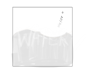
The main idea behind this project was to create imagery by using the names of objects to represent their form.  I wanted to implement water as I felt that I could create a cool wave pattern by moving the letters. The final result was this sketch:

Process

I began by sketching out different ideas on combining text and imagery:

Water as text spilling from a point and fills up the screen, revealing “WATER” written in the background

In the end, I ended up liking this idea the most:

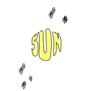
Sun drawn with the word “sun”, with rays coming out that also say “sun”

To implement this, I looked up functions that would allow me to manipulate texts as objects. I was able to find the textToPoints function, which allows me to convert text to an array of points that make up the shape of the text. With this array of points, I could use the beginShape function to create a closed shape of the text. Then, by altering the position of the points, I could manipulate the shape of the text.

However, I found that converting the shape of the text when converting the entire string at once didn’t give me a clean shape. So, I decided to split the text into individual characters, and converting each of those into a separate shape.

After adding some rippling effect and moving each letter like a wave, I ended up with the following result:

Since I went with an object-oriented approach, I could just replicate the water across a grid to generate a wave of water. I repeated the same steps to create a moon and added points that twinkled to add stars in the background.

Code Highlights

My favorite part of the code was creating the rippling and wave effect. It was so simple, but I believe it added amazing detail to the sketch.

//make the water ripple
let rippleFactor = map(this.textSize, MINFONTSIZE, MAXFONTSIZE, 0, 2);
y += noise(frameCount * 0.02 + j * 0.02) * rippleFactor;

//make the water wave
let waveHeight = map(this.textSize, MINFONTSIZE, MAXFONTSIZE, 1, 2);
y += waveHeight * sin(frameCount * 0.02 * (i + 1) + this.offset);

I added some noise and used the frameCount variable to make the letters move in a wave pattern. The crucial part was to make these changes when drawing, since I did not want to modify the points directly, otherwise I would need to reset their position. If I didn’t do that, the movement would add up and move the letters out of place. So, this was a simple way of getting this effect.

Reflection

For this project, I feel like I really pushed my creativity. Although my previous projects might have been more technical, I really enjoyed the planning and ideation of this project.

Sources

Reference | p5.js

Font used: Super Funky Font | dafont.com


Week 4 – Reading Response

In this reading, the author discusses the psychopathology of everyday objects. Essentially, the author argues that there are several factors determining the user experience about everyday objects, and that the design for everyday objects is hard and complex because it also involves many parties, such as designers, users, and manufacturers. With these factors, the author introduces the concept of Human-Centered Design (HCD).

One prominent feature of HCD is that it focuses on both the human psychology and the functionality of the object. Therefore, the design for everyday objects should also comply with these two principles. However, to add to the HCD, especially in modern times, I think it is also important to point out the constant evolving of our psychopathology of everyday objects. Our perceptions about affordances, signifier, and so on are constantly challenged and changing with the emergence of new designs and new design regimes. For example, the recent transformation to flat design in almost every field of digital design might indicate our less desire or need for digital designs to completely represent the daily objects in their most realistic form. On the contrary, we realized that we were able to understand the minimalistic flat design and found it aesthetically appealing. Maybe, one day, the example of the unworkable pot the author presented at the beginning would become the mainstream of design when people find it interesting, appealing, or even practical.

In a nutshell, in the digital era, everything is evolving at a rapid pace, so is our psychology for design. Except for the challenges the HCD faces as the author presented, designers must also realize or even foresee the future of our psychopathology of everyday objects and make movements towards our needs not only in the moment, but also in the foreseeable future.

Week 4 – Data Visualization

Concept: Simulating Brownian Motion

In this project of data visualization, I chose the data set about the wind directions at Hong Kong International Airport (HKIA) from 1997-2023. It is interesting from two aspects. Firstly, the airport and wind directions have a close relationship. The wind directions impact the operation of the airport. Secondly, the wind directions are random to some extent. It is a natural and random phenomenon even though it could be observed or predicted. This leads to another concept called Brownian Motion, describing the random motions of particles in fluids. This makes me think what it looks like if the winds are particles moving in the air. Therefore, I decided to simulate the Brownian Motion with the data.

Highlight of the code

Firstly, I extracted the wind direction data from the CSV file and store them in the array call angles[]

for (let rowNum = 0; rowNum < strings.length; rowNum++) {
    let angle = split(strings[rowNum], ",")[3];
    if (angle != "***") { // This skips the unavailable data in the file
      angles.push(angle);
    }
  }

Then, each point is a vector, and it adds with another vector which has the angle from the angles array. This simulates the movement of particles, which in this case following the wind directions

if (
    // if the point reaches the boundaries, it will start from a random place within 
    // the canavas
    startPoint.x >= width ||
    startPoint.y >= height ||
    startPoint.x < 0 ||
    startPoint.y < 0
  ) {
    startPoint = createVector(random(20, width), random(20, height));
  } else {
    startPoint.add(createVector(sin(angles[i]), cos(angles[i]))); // this makes the 
    // point turn according to the angles in the file
  }

Note that because at one location the overall direction of winds is consistent, the points will move out of the canvas if not constrained. Therefore, I wrote in the code that if the point went beyond the boundaries, it should move to a random place within the canvas and continue drawing.

Reflections and future improvements

For this data visulaztion project, I tried other ideas like particle fields or mapping, but eventually I think that stimulating the Brownian Motion with the wind direction data is much more interesting. It explores the relations between randomness, nature, and art making while visualizing the data. Therefore, I am satisfied with this project. However, some improvements or alternations could be made, such as smoother movements, better color selections, etc.

Week 4 – Reading Response

Don Norman’s observations regarding the design of everyday objects, such as doors, were so interesting for me to read as they raise the issue in technology: engineers and designers sometimes get so caught up in logical thinking that they forget about the end user’s perspective. I liked how this idea can actually relate to what we read last week about Crawford’s idea of “interactivity” as a conversation. It’s almost like technology and users speaking a different language, and this disconnect can lead to a host of problems. In a good conversation, it’s not just about speaking; it’s about listening, understanding, and responding thoughtfully. This same principle applies to human-machine interactions. Users need to “listen” to the machine by deciphering its controls and understanding how it works, while the machine must “listen” to the user’s commands and respond appropriately. When there’s a breakdown in this dialogue, things can quickly go awry.

What particularly interested me is how the difficulty users face in comprehending a machine’s interface can be likened to the “listening” aspect of interactivity. Users struggle to figure out how a machine functions, which makes it harder for them to effectively communicate with it. This can result in the machine misinterpreting their intentions or causing confusion, essentially a conversation that’s gone off the rails. So, my take on this connection between Norman and Crawford is that intuitive and straightforward design is non-negotiable for fostering better interactivity. It’s about designing technology that speaks the user’s language, aligning with their mental model and expectations. But it’s also about making sure the machine can “listen” and understand the user’s commands without any issues.

With all of this, I realized the critical importance of UX design: considering the end user when creating technology. We can’t simply assume that users will figure things out the way we do; we need to empathize with their needs, thought processes, and limitations. And user experience and user testing must be a part of my work when I start working on my midterm project.

Week 4 – Data Viz Wind Turbines

Concept:
During class on Wednesday, one of the example datasets that was brought up in class was wind data as the professor played with the globe data visualization. When I saw the wind data, I immediately thought of drawing wind turbines that matched the wind speed data, and that’s what I ended up doing for this project.

Sketch:

While in the planning phase, I thought that this project would be just fun to look at and not a data-focused piece, but this had the unexpected result of being surprisingly insightful about wind speeds during the day. The wind is strongest during the day at about 14:00-17:00, and weakest around midnight to late morning.

Code: 
I was proud of my day/ night cycle code, as I thought it was clever. I drew a black box over the entire screen, and the opacity changes depending on the time of day so it is able to give off a feeling of ‘darkness’ during midnight hours, and it is fully transparent during the daytime.

// opacity of black screen over the screen to give illusion of day/night cycle
const darknessLevel = mapOfHourToDarkness[curHour - 1]
push()
fill(0, 0, 0, darknessLevel * 5)
square(0, 0, 400)
pop()

// complex math -- basically calculates the curSkyColor as an average of darkSky and brightSky, weighted towards darkSky based on the current darknessLevel
curSkyColor = p5.Vector.add(p5.Vector.mult(darkSkyColor, darknessLevel), p5.Vector.mult(brightSkyColor, 10 - darknessLevel)).div(10)

Improvements
There was more data in my .CSV file including wind direction, but I couldn’t think of a good way to implement but it would’ve been nice. I was also not able to find a free API for UAE wind data, and I had to manually scrape the data for a certain day. It would have been fun to be able to visualize the wind speeds of the current/previous day instead of being stuck on 27 Sept 2023.

Assignment 4 – Books I Read

Concept:
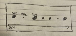
I wanted to use data that I generated myself for this data visualization, as I find it fascinating that, as time progresses, we are tracking more and more aspects of our lives — for example, # of steps walked, places visited, songs listened to, etc. One thing that I track is my reading data, on the app StoryGraph. I wanted to visualize my StoryGraph data on a timeline, where the size of the point corresponded to my rating.

Highlight:
I am proud of the sorting portion of my code, because data visualization has been the hardest unit for me to understand so far, and it required some time and an office hours visit for me to grasp the logic of sorting. In the end, I split the whole array twice, once on “,” to separate each row into its elements, and again on “/” to separate the dates into individual numbers. Then, I sorted according to the month.

function findMinMaxMonth() {
  //go through each row of bookData to sort by month
  let singleRow = [];

  for (let csvRowNumber = 1; csvRowNumber < bookData.length; csvRowNumber++) {
    singleRow = split(bookData[csvRowNumber], ",");

    //split date 2023/03/21 into 2023, 03, 21 on "/"
    let dateSplitted = split(singleRow[5], "/");
    // print(dateSplitted)

    dateReadMonth = int(dateSplitted[1]);
    // print(dateReadMonth)

    if (dateReadMonth < minMonth) {
      minMonth = dateReadMonth;
    }
    if (dateReadMonth > maxMonth) {
      maxMonth = dateReadMonth;
    }
  }

Reflection and ideas for future work or improvements:
I initially had many more data points in my CSV spanning multiple years, but due to time constraints and my skill level, I had to simplify the CSV to include only one book per month, read within one year (2023). If I could, I’d like to include the whole dataset, which would require first sorting by year, then by month, then by day. This would provide a much more interesting visualization. It would also be cool to vary the color of the book depending on the genre or the number of times I read it (darker shades = more times read).

Resources:

https://p5js.org/examples/typography-text-rotation.html