Week 4 Reflection

After reading this text, I started to think and investigate about discoverability. In my opinion, the concept of how easily users can understand, find, identify, and access a design product’s features, functions, or content is a vital pillar in UX design.

I especially agree with the author’s idea of good design. The washer-dryer machine example was a scene that I felt really close to home. I remember multiple designs that even though they provided high levels of personalization to the user, they did not allow an intuitive learning of its use. Discoverability ensures that users can navigate and operate an interface with minimal effort with minimal guidance or instructions, which in my personal experience, is what makes a great design.

The idea the author provides that “machines have no leeway or common sense” is interesting, because it shows one of the fatal flaws of bad design. Failing to follow the exact process of the machine leads to problems, frustration, and misunderstandings. If the machine cannot provide an experience that is forgiving to user mistakes, then it is a bad design. Even if the design itself does not lead to the correct functioning, then it is a bad design. So, what can we do to improve this?
Every design should not be ruthless. The idea of having no mercy in terms of how many errors can the user make goes completely against the whole concept of user experience and interactivity. In special, when designing, it is crucial that we are able to lead the user toward the main user flow. Therefore, we allow the washing/drying machine to have many options and different customizable settings: however, users should be directed with colors, arrows, sizes, and lights to the main features, washing and drying clothes.

Week 4 Assignment

Concept:

For this week, I focused on creating a project on data visualization. The idea here was to provide a map of every single airport in the world, no matter the size or the location. To provide some interactivity in the project, I decided to add the function of moving the mouse and slowly revealing the map.

I was inspired while checking the passport map and ranking available at https://www.passportindex.org/. In here, we can see a map that is divided by countries and shows the ranking of each passport in terms of visa-less travel.

Having obtained the altitude, longitude and latitude of each airport, I presented a map that would plot all three coordinates. Hovering the mouse will show the airports around that area and pressing will reveal the map.

Implementation:

For this project, I browsed different APIs and datasets that I could plot and represent in the sketch. I ended up finding this dataset in Kaggle.

https://www.kaggle.com/datasets/mexwell/world-airports

Initially, I implemented different types of datasets for the airports. However, the biggest problem was regarding the size. Due to the fact that removing items from the list would go against the purpose of the project itself, I decided to search for a CSV file that would be within the limits of P5JS.

function draw(){
  background(0);
  for(let i = 0;i<airportsX.length;i++){
    //if it is close to the mouse and we are not pressing the mouse.
    if(abs(mouseX-airportsX[i]) < 100&&abs(mouseY-airportsY[i]) < 100 && !mouseIsPressed){
      stroke(255);
      strokeWeight(airportsAlt[i]/400)
      point(airportsX[i],airportsY[i]);
    }
    //show whole map if we pressing.
     else if (mouseIsPressed){
       stroke(255);
       strokeWeight(airportsAlt[i]/400);
       point(airportsX[i],airportsY[i]);
     } 
  }
}


Challenges and Improvements:

I would have liked to improve the interactivity and the amount of data provided. For example, I already have the names of each airport and their altitude. With this, I would have liked to show the name of each airport, but I was not able to solve the problem with the size of the dots. In order to show every dot properly, I could not change the size too much, because it relies on the altitude.

Interestingly, the map ended up showing a very pretty plot, which resembles logically the altitude of different areas around the world. We will see that the north-western side of South America has a lot of big circles, which symbolize the amount of high airports there are around Bolivia and countries around the area.

Week 4 | Reading Reflection

In the first chapter of The Design of Everyday Things, Don Norman delves into our interaction with commonplace items and how the fundamental principles of design shape this interaction. He also explores the concept of design and how everyday objects can create usability problems and frustrations for users. Reading about two of the most important characteristics of good design which are discoverability and understanding made me much more aware of the design of everyday objects that I encounter. Discoverability is about making it clear, often at first glance, what actions are possible with a product or interface. In my experience, a good example of easily discoverable designs that I deal with every day is well-designed mobile apps often have easily recognizable icons and intuitive gestures, enhancing discoverability. Don Norman also discussed a common problem that I faced personally in my first days in the university, which is the confusing doors. Dealing with doors is actually a common example that demonstrates the importance of user experience in the design process.

Another part of the reading that was really interesting is the paradox of technology, especially because it relates to the content of this course. Norman illustrates the trade-off between the convenience that technology brings and the increasing complexity it introduces. This resonates with my experience of using various applications where the initial excitement of features can sometimes be overshadowed by the challenges of mastering them.

Week 4 Assignment

I used the geolocation data of power plants around the world combined with the data for the production capacity for each plant. I used the geolocation to put them on the canvas, and then at each point a bar extends from the canvas vertically upward to account for the capacity of the plant.

I think something to make this more visually appealing would be to add some interactivity. I think it could be that as the user clicks on a point, they can get more information about that power plant, like the country, capacity, type of plant, etc. A pop-up text box could display such information.

Week 5 Reflection

The article begins by discussing the historical context of computer vision, giving a story of Marvin Minsky’s early attempts in the 1960s to solve the difficult subject of computer vision. It highlights the field’s continuing difficulty, particularly in high-level picture-processing tasks like pattern recognition. Given these difficulties, the text recognizes that low-level computer vision algorithms have been developed and become available to even young programmers.

The article goes on to discuss how digital video lacks fundamental conceptual information and requires computer vision to extract meaning from it. The author then introduces three essential methodologies for computer vision research: frame differencing, background subtraction, and brightness thresholding. He stresses the importance of developing physical conditions in combination with software development for good computer vision. The text points out the need to increase the contrast between objects of interest and their surroundings in the physical environment in order for algorithms like background removal and brightness thresholding to function properly.

The article also emphasizes the significance of the physical environment in computer vision, because algorithm performance is highly dependent on the quality of the incoming video scene. It goes on to predict that as technology advances and software tools improve, computer vision applications will become more common in a variety of areas, particularly media art education and interactive artworks.

I like how the text discusses how computer vision continues to impact the field of interactive media and the tremendous potential computer vision offers for interactive artwork. The artwork Messa di Voce was very interesting to me in this article. I think it was an incredibly exciting idea to have computer graphics (using computer vision) create real-time graphics to interpret the sonic quality of the singers’ voices. I only wish I could have seen this demonstration live!

Reading: The Design of Everything

Donald Norman’s exploration of the intersection between technology and psychology in the context of design strikes a chord with anyone who has ever interacted with modern products. In a world where technological advancements abound, Norman’s central argument, that design should encompass more than just functionality, resonates deeply. It’s a view that goes beyond the realm of theory and feels undeniably pertinent to our daily lives.

Engineers often excel at creating products that function flawlessly, yet they may falter when it comes to the user experience. A personal experience that illustrates this disconnect is the time I ordered a make at home clock on amazon that came with a complete user manual. On the surface, assembling the clock seemed like a straightforward process. However, despite the presence of a user manual, I found myself grappling with the intricacies of the clock’s operation.I think this experience underscores Norman’s assertion that effective design should prioritize the user’s experience, making products not only functional but also intuitive and accessible. The clock’s design may have been functionally sound from an engineering perspective, ensuring that it kept accurate time. Still, it failed in terms of user-friendliness.

Morever, Norman’s discussion on “discoverability” also resonates with my own experiences. He emphasizes the importance of understanding the connection between cognition and emotion in design. When interacting with products, users must effortlessly perceive how they work and what operations are possible based on the design cues and characteristics (affordances) of the product.

I think Norman’s insights challenge the conventional engineering-centric approach, advocating for designs that seamlessly cater to the average user’s perspective and understanding. I think Human centered design, as proposed by Norman, has the potential to bridge the gap between technological functionality and intuitive user experiences.


Reading Reflection – Week 4

The Psychopathology of Everyday Things was quite a fun and informative chapter to read. The author’s descriptions of his experiences with products that have ineffective designs were pretty relatable, which helped me to understand the importance of good design in my mind. The topic of how engineers build products that are overly logical while expecting unrealistic outcomes was also amusing. I have heard so many developers complaining about users because they cannot grasp their interfaces, but they have never stopped to think that not everyone has the same knowledge that they do, or that they have a completely social lack of communication. Worse yet is when some products are so annoying that it feels like the designers behind them did it on purpose. I have seen washing machines that had the most excruciating beeping sounds that had no indication of how to make them stop, and that is precisely what the author talks about when he mentions the problem of too much feedback.

Moreover, I do not think the reading changed any of my beliefs, although it definitely made the importance of psychology and communication in technology more clear to me. However, the concept of mapping could have been more explored in my opinion. For instance, I would have liked to see more examples of good and bad mapping in digital technology, and how we could take into consideration factors such as cultural differences in order to improve mapping.

Assignment 4 – Cards Against Humanity

Concept

For this assignment, I decided to recreate a popular game called “Cards against humanity.” In this game, each participant is presented with a black card containing a humorous or absurd prompt. The objective is for players to select from a set of white cards, each bearing a comical response, aiming to match the prompt with the funniest, most unexpected, or outrageous answer.

Sketch
Code highlight
function generateCards() {
  let randomIndex = floor(random(blackCardTexts.length));
  blackCardText = blackCardTexts[randomIndex];

  whiteCardOptions = [];
  while (whiteCardOptions.length < 3) {
    randomIndex = floor(random(whiteCardTexts.length));
    let selectedCard = whiteCardTexts[randomIndex];
    if (selectedCard.trim() !== "" && !whiteCardOptions.includes(selectedCard)) {
      whiteCardOptions.push(selectedCard);
    }
  }

  cardsGenerated = true;
  displayInitialText = false; // Update the variable to switch to displaying cards
}


The function generateCards() is responsible for displaying the cards with random prompts from the csv files. First, I generate a random index to pick a prompt at random from the blackCardsTexts array which holds all the possible prompts in my game. Next, I initialize an empty array whiteCardOptions to store the white card responses to display on the 3 white cards. To ensure they are all distinct responses, I use a while loop which continues until whiteCardOptions array has 3 distinct responses. I did this by:

1. generating a another random index (randomIndex) from the whiteCardTexts array.

2. extracting the white card response at this random index and storing it in a variable called selectedCard.

3. checking if selectedCard is not empty (i.e., it contains text) and if it’s not already included in the whiteCardOptions array. This  is the step that ensures I only add valid and unique responses to the white cards.

Reflection

I had the most fun working on this assignment so far because I tried to recreate a game that I love playing with my friends. While I’m quite happy with the outcome and how the core mechanics of the game function, I think there is definitely room for improvement, particularly in terms of the aesthetics of the sketch. For this project, my primary focus was recreating the fundamental concept and gameplay of the game rather than emphasizing the visual design.

Nonetheless, I’m still pretty satisfied with what I’ve been able to create. Reading some of these responses made me chuckle as well (even though I wrote them myself), and that’s ultimately what this game is all about—laughter and amusement.

Assignment 4 – Minimalist Water

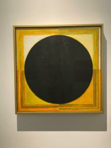
Concept: In this assignment, I wanted to do minimalist artwork inspired by my visit to Louver Abu Dhabi. I looked into many ideas before I settled into my final one. I researched L-systems in the p5js examples where one can create automated drawings based on the growth of biological structures, but I did not know what data I could use to implement it. Eventually, I decided to look into the Water Security Dashboard because it is an important issue nowadays. I got some data from the World Bank that was published in 2021. My goal was to transform this data into a simplistic art piece, leading me to the realm of minimalist art.

This type of art says “the most with the least “ (Bob Newhart).

Highlight:

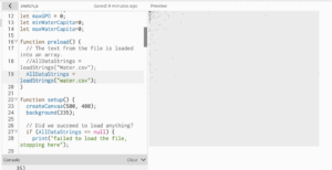
This is how the data is initially. looked like

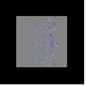
 My journey began with the task of making the code functional, which needed a lot of time, focus, and dedication. I got a lot of errors at first and I had to deal with each one separately. First, the code was not reading the file properly because some names within the files had commas within them. I decided to remove the commas that were not necessary in the file. It is not the best solution though especially if the csv file is big. After that, I had to figure out how to get the minimum and maximum values of GPD and Water per Capita which took some time. Finally, I had to think of the aesthetics of it all. First, I added the results into a circle and mapped them into random positions within the circle constraints but that was not a good representation of the data because of the randomness. Consequently, I switched to a square format, mapping the data relative to the square’s dimensions while incorporating a central circle.

Random mapping

Throughout the experimentation process, I generated interesting results and different shapes and forms. Finally, I settled on the result below. Although I explored creative coding, gradients, and glitch shaders through video tutorials, these elements, while captivating, did not align with the minimalist vision I had in mind.

Reflection and Future Improvements:

For future improvements, I would want to think of other ways to use data in art without losing the representation of the data. I want to start working with 3D and maybe do something with the L-systems and Glitch Shader. I also want to start thinking of the interactivity of what I do and in which ways I want users to interact and feel when incorporating these interactive concepts.

 Resources: 

https://www.youtube.com/watch?v=r5YkU5Xu4_E

https://www.youtube.com/watch?v=rTqvf0BkTNE&list=PLyRZnpOSgMj3K8AV2I6UldnvTj6d_Zrf0

https://wbwaterdata.org/dataset/water-security-dashboard

Week 5 Reading

The reading sounded technical to me. It had a lot of insightful new information about interactive designs using computer vision.  The author talked about Low-level computer vision algorithms and three techniques: frame differencing, background subtraction, and brightness thresholding, detecting motion using frame differencing, and differentiating pixels. ­­Detection through brightness thresholding makes desired objects darker or lighter than their surroundings using illumination. Object tracking is related to finding injects based on the brightness of pixels. Basic interaction locating body pixels and the information can be used in graphical responses in interactive systems. He also highlights problems that come with these algorithms for instance, if people are too close or if the physical circumstances are not good enough. Using IR (infrared) helps in these situations. He also talks about how the use of a “telecentric” lens can significantly improve the performance of certain kinds of shape-based or size-based object recognition algorithms.

I liked the quote: “But even the most sophisticated algorithms and highest-quality hardware cannot help us find meaning where there is none or track an object which cannot be described in code” mainly because it emphasizes the limited capabilities of computers and highlights that without human beings and their logic the computer can do nothing because it only understands zeros and ones. I think computer vision algorithm in interactive and computer-based artworks adds more to the user’s experience, and from the reading, it is not as hard or overwhelming as it sounds. I am not a technical person, but I think that the reading provides a good overview of the potential of computer vision in interactive art. It made me think of codes or the digital world as tools with which Art can be empowered and improved and not just something that is solely technical or logical.