Reading Reflection – Week 2

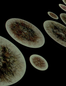
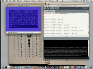
Casey’s talk at the Eyeo Festival 2012 first introduced the usage of randomness in modern art starting from the 20th century, then showed some of his work that used the concept of chance within algorithmic rules. I find this concept very interesting because, intuitively, chaos and art don’t belong together. Just as random alphabets combined don’t convey information, random pixels featuring random colors also shouldn’t have artistic value. However, Casey and various other artists created artistic pieces by combining chaos with some constraints, which is simply amazing. Also, these artworks are closely related to algorithms and technology, which I am particularly interested in.

When I heard about combining randomness with art, I immediately thought of the infinite monkey theorem. This theorem states that, given an endless amount of time, a monkey randomly typing on a typewriter can type out anything, including Shakespeare’s “Hamlet” word for word. Changing to computed art instead of typing would mean randomly distributed pixels on a canvas can produce artworks like “Mona Lisa” to a specific resolution. Casey’s works are like using programming algorithms to give instructions to the “monkey” while maintaining its freedom to an extent so that it could produce abstract pieces of art. The algorithms also provide interactivity to artworks that are otherwise impossible in traditional art pieces. Therefore, the artist’s job is no longer creating art itself, but generating rules for the “monkey” to enter the art piece’s basic building blocks randomly. This is also very intriguing to me.

Week1: Self Portrait

The concept:
For this assignment, I tried to implement some dynamic functionality while keeping the design visually appealing. So, I implemented two backgrounds that basically reflects my two main areas of interest, coding and design. The design background is a display of randomly-oriented “Fady” texts of different colors. The other background follows the same idea but displaying binary number instead. Also, another indicator of my identity is the text written on the hoodie that also changes by switching between both roles. A viewer can switch between the two backgrounds by clicking the two buttons on both sides of my character.

A highlight I am proud of:
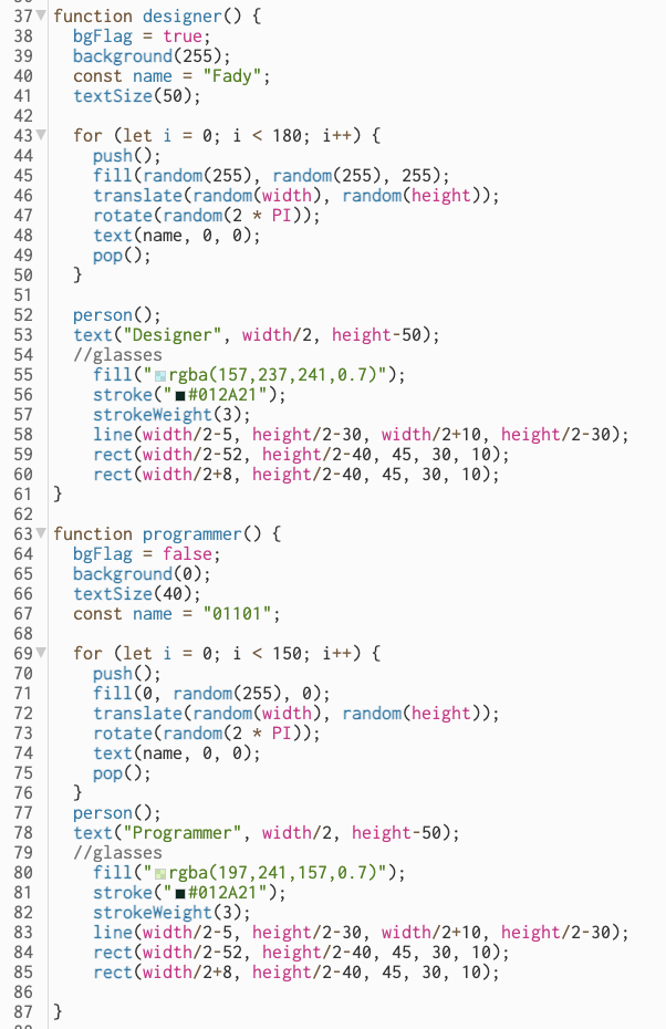
The most important part of my portrait is the possibility to switch between both backgrounds. So, I am proud of this part of code that where I used functions to implement my idea.

code screenshot

The Sketch:

Future improvements:
While I am proud of doing this kind of art, I find the face doesn’t look like mine. So, some future improvements or recommendations include re-creating a character that looks more like me.


Assignment 2: Simple Art Work

Concept

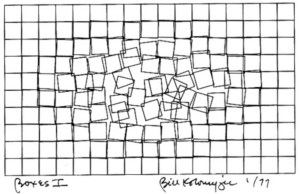
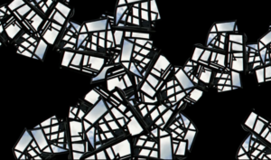
This assignment focused on creating a simple computer art piece using loops, basic shapes, and the fundamental concepts we’ve learned in the course. I quickly reviewed the attached documents for inspiration, and one illustration from Computer Graphics and Art immediately caught my attention.

The concept depicted in the image appeared straightforward to execute, but I had an idea to add interactivity to the art. I thought it would be enjoyable to allow users to move the tiles on the screen using their mouse. So, I set out to do just that. My tasks included generating tiles on the screen, keeping track of their coordinates, and finding a way to displace them based on mouse coordinates. I discovered that the most effective approach was to create a class for tile objects, allowing them to manage their attributes and methods. I designed the Tile class with a constructor that required x and y coordinates based on the screen’s dimensions and the desired tile size. The class also featured update and draw methods, responsible for tile displacement by the cursor and rendering to the screen, respectively. The draw method used the rect function to draw rectangles on the screen, while the update method checked if the mouse cursor was within a tile and adjusted the tile’s position accordingly.

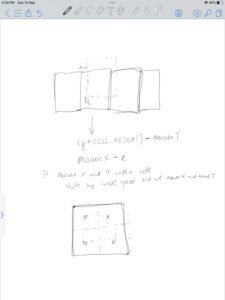
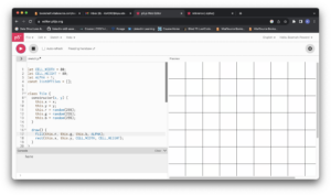
After successfully drawing the tiles using a nested for loop, I developed a straightforward algorithm for moving them. Here’s how it appeared in the planning stage:


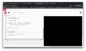
During the coding process, I encountered a couple of logic errors. The first issue I faced resulted in a completely black screen when I expected to see a colorful canvas.

To troubleshoot, I added console messages to verify whether the code block for drawing the tiles was executing.

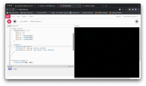
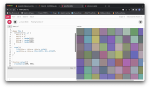
I eventually traced the problem to how I was using the ALPHA option in the fill function. Initially, I had used a low alpha value, which resulted in everything appearing black. After removing the alpha option, I obtained this result:

I adjusted the alpha value correctly, leading to this result:

Highlight of Code

I take particular pride in how I handled tile displacement. I applied an animation concept from class to achieve smoother displacement instead of snapping to fixed positions. I included logic to determine whether the mouse cursor was inside a tile and added a constant variable to its coordinates. I experimented with different code versions to manipulate tile size, reset tile properties, adjust speed, and control whether to draw the tiles without strokes.

Snippet of condition checking

update() {
    // checking if cursor is within tile
    if(mouseX > this.x  && mouseX < (this.x + this.breadth) && mouseY > this.y && mouseY < (this.y + this.length)) {
      // adjusting the position of the tile based on which quarter the cursor is in
      if (mouseX > this.x + (this.breadth /2)) {
        this.x -= displacementSpeed;
      }
      
      if (mouseX < this.x + (this.breadth /2)) {
        this.x += displacementSpeed;
      }
      
      if (mouseY > this.y + (this.length /2)) {
        this.y -= displacementSpeed;
      }
      
      if (mouseY < this.y + (this.length /2)) {
        this.y += displacementSpeed;
      }
    }
    
    // resetting the tiles to their original positions
    else {
      if(this.x > this.xBeforeDisplacement) {
        this.x -= resetSpeed;
      }
      
      if(this.x < this.xBeforeDisplacement) {
        this.x += resetSpeed;
      }
      
      if(this.y > this.yBeforeDisplacement) {
        this.y -= resetSpeed;
      }
      
      if(this.y < this.yBeforeDisplacement) {
        this.y += resetSpeed;
      }
    }
  }

Variations of the main sketch:

Reflection and Ideas for Future Work

While I successfully completed the task I set out to accomplish, there remains a glitch when the mouse cursor is positioned on a tile or group of tiles. I tried various approaches to address it but only managed to reduce the issue slightly. Hopefully, I can debug the code and completely resolve this problem. For future work, I plan to explore other shapes, possibly more complex ones, to unleash my creativity. Additionally, I aim to incorporate input from different devices beyond just the mouse and keyboard.


Week 1: Self-Portrait

For the self portrait assignment I had the idea of recreating the painting “The Son of Man” by René Magritte. What I appreciate about the painting is its simplicity and the way it could be worked in the project. The general idea of the painting can be easily recreated in the library, even with simple shapes. In other words, it might not look aesthetically pleasing, but anyone that knows the painting would be able to recognize it here. Moreover, the fact that there is an apple in front of the face opens many fun possibilities that could be drawn. I wanted something silly so I just went with a stick face that appears when the screen is clicked.

In terms of code there is nothing exceptional that could be highlighted. I guess I am proud that I managed to make something that looks decent, although I know I will do way more once we progress in class. However, here is the simple onclick toggle to switch between apple and face that can also be seen in the documentation.

if (mouseIsPressed == true) {
  if (mouseButton == LEFT) {
    strokeWeight(0)
    fill(0);
    circle(-40, -20, 20) // left eye
    circle(40, -20, 20) // right eye
    rect(-30, 40, 60, 20); // mouth
  }
}
else {
  fill(140, 174, 152);  // apple
  ellipse(1, 10, 150, 140);
}

In the future I will make sure to add more interactivity and utilize vertexes for better drawings.

Week 2 _ “Eyeo2012 – Casey Reas”.

When Science and Art become one, unexpected things happen. This thought came into my mind while watching Eyeo2012 – Casey Reas”. At first, I was confused, as the speaker was talking in a metaphorical tone. However, what followed was a journey of great exploration, where the realms of science and art intersected to yield breathtaking results. Casey Reas revealed a world where technology and creativity came together, leading to interesting concepts and expressions.

Through the lecture, a couple of concepts inspired me. I hope that I will explore even further during this course. Some of these were the phenomena of emergence, the conceptional vehicles project, emotions in Art, and the use of randomness to create art pieces.

The phenomena of emergence:

In this part of the lecture, he touches upon the idea that in coding behavior and forms become elements that create the fundamentals of the images he creates. I understood that these generative properties took a lot of precise geometry and calculations to take form. It was interesting how ideas in physics, biology, chemistry, or day-to-day interactions could be transformed into coding logic and then into generative art. In this part, I realized that understanding the underlying fundamentals is key to boosting creativity and decision-making.


The conceptional vehicles project:

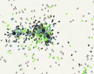
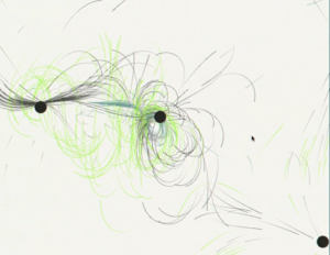
 This part was focused on the concept of hypothetical vehicles based on the animal nervous system. What I like the most about this part is how it gradually transforms into Art. I have realized that when we only see the final product of a project we do not understand or appreciate the underlying process or story behind it. If I only saw the final piece, I would have never thought it was based on this specific concept or any concept at all. I would have thought it was a form of expression and that is it. I have realized that often the story behind something along with its representation gives beauty and a stronger connection between the viewer and the piece.

Emotions in Art:

Human connections between one another and between the surroundings are vital characteristics in my opinion. In the lecture, Casey Reas showed some forms of Art that were far from human connection. These pieces were interesting but are not something I would want to explore. I believe that when Art has a humanitarian dimension it is far stronger than when it lacks it.

 The use of randomness to create art pieces:

 In this part of the lecture, Reas showed how some artists like Marcel Duchamp. His idea that through Art you “make your reality” made me think of how filmmakers, performances, and illustrations put individuals into a new place where they can explore a new logic alienated from reality.

Then he explored the idea of random numbers. When he showed the demos, I realized the infinite possibilities of creating different forms of art with the same logic. Here I understood the importance of exploring different things and taking risks because in this part, if one does not try so many ways, one would not realize the possibilities or discover what one wants to present.

Finally, during his lecture, I realized that there are limitless opportunities to bring in my thoughts, logic, and creativity to create Art. In a world where science and art intersect, a lot of unexpected possibilities take form.

WEEK 2 ASSIGNMENT

Concept:

I wasn’t sure what I wanted to do when I first started designing my animation. I simply went with the flow. When I was finished, I was very pleased with what I had produced. My animation shows a moving train from the side perspective. The lines are supposed to represent how fast the train is moving, and the large circles are the train’s windows! This train brought back memories of the trains I used to ride in Berlin. I’d be waiting at a stop when the train would fly by, taking my breath away with its speed. The colors and shapes become more saturated and beautifully mesh together as you move your mouse upward. 

Highlight of the Code:


//LAYER 1
 noStroke(0)
 fill('rgb(93,35,253)')
 circle(circleX,400,10);
  fill('rgb(243,72,137)')
  circle(circleX,300,10);
    fill('rgb(7,204,29)')
    circle(circleX,180,10);
   circle(circleX,190,10);
    circle(circleX,160,10);
    circle(circleX,150,10);
    circle(circleX,130,10);
    circle(circleX,120,10);
 circle(circleX,100,10);
 circle(circleX,90,10);
  fill('rgb(93,35,253)')
  circle(circleX,390,10)
   fill('rgb(243,72,137)')
 circle(circleX,310,10);
fill('rgb(219,243,72)')
   circle(circleX,380,10);
     circle(circleX,350,10);
 circle(circleX,170,10);
 circle(circleX,320,10);
   circle(circleX,260,10);
 circle(circleX,290,10);
 circle(circleX,230,10);
  circle(circleX,200,10);
    circle(circleX,140,10);
 circle(circleX,110,10);
 circle(circleX,80,10);
  circle(circleX,50,10);
  circle(circleX,20,10);
   fill('rgb(93,35,253)')
  circle(circleX,370,10)
  circle(circleX,360,10)
    circle(circleX,340,10)
 circle(circleX,330,10) 
  circle(circleX,70,10);
  circle(circleX,60,10);
  circle(circleX,40,10);
  circle(circleX,30,10);
  circle(circleX,10,10);
  circle(circleX,0,10);
 fill('rgb(243,72,137)')
 circle(circleX,280,10);
 fill('rgb(243,72,137)')
 circle(circleX,270,10);
   circle(circleX,250,10);
   circle(circleX,240,10);
 circle(circleX,220,10);
 circle(circleX,210,10);
 circle(circleX,150,80)

I used 10 layers of circles and colors and arranged them in different positions on the x – axis. Depending on the layer, I also changed the coordinates of certain circles and placed them in different color blocks for contrast.

Reflection and Improvements:

I really enjoyed creating this piece! I swear that I will begin to move on to different shapes in the future…lol.  For this project, I felt that circles fit best to the image that I was trying to depict. I hope to become better at condensing my code using loops since I had a lot of repetition throughout my code.


TRAIN VIDEO ⬇️

IMG_7377 2

Reading Reflection – Week#2

As a psychologist, I learned about chance, randomness, and probability through the scientific perspective. I learned that there is always room for chance when making conclusions, decisions, etc. Reas’ talk reminded me of this but also helped me to see the similarities and differences in understanding chance in arts and science. The most obvious difference is the people’s attitudes toward chance events. In medicine, for instance, people hope to minimize it and bring negative connotations to it, while artists look at chance as something positive, bringing more variability and opportunities in their works. Understanding such varied opinions on the chance concept, makes me think about humans’ urge for power. Power in medicine lies in the fact that scientists want to control chance and eliminate it. Artists want to have less control over chance in order to create works of art that can be powerful in the sense that they are decentered or are moving away from the preconceived traditional notions, e.g., symmetry, rationality, perspective, etc. This point was brought up by Reas and I find it extremely pleasing. However, I might wonder whether his opinion on moving away from “traditional” is a little bit biased in the sense that he talked about specific points of art history or coding when a radical change was necessary.

One idea from the talk which I agree with was that we are all similar in the fact that we are the key decision-makers in the process of choosing how much randomness we allow in our lives/artworks, etc. My key question to this would be how do we decide what is good or bad? Is it more chance or less chance? Although, the answer to this question depends on the context, how much of a chance we are truly capable of perceiving, welcoming, and approving? Moreover, because chance is something that in the long run emerges into something predictable, I believe that it is hard to make a clear judgment of whether chance is always surprising and always unpredictable, which can oppose people thinking of chance as something new. 


Week 1 | Self-Portrait Assignment: Luna 🐈‍⬛

Portrait:

Concept:

For this assignment, I attempted my first-ever p5.js project, creating a self-portrait of my beloved cat, Luna. As a beginner, I relied on tutorials and lecture notes to learn how to craft different shapes and apply colors effectively.  This project marked the beginning of my journey into coding, and I enjoyed the challenge of capturing Luna’s character on the canvas.

Code:

This is my code. I’ve aimed to keep it well-organized while providing step-by-step explanations for clarity in understanding the outcome.

function setup() {
  createCanvas(400,400);
  background('orange');
 
}

function draw(){
  
  //luna's head
  fill('gray');
  noStroke();
  ellipseMode(CENTER);
  ellipse(200, 200, 150, 150);
  fill('');
  
  //luna's body
  fill('gray');
  noStroke();
  arc(205, 320, 150, 150, PI, TWO_PI);
  rect(130, 320, 150, 150);
  
  
  //luna's left ear
  fill('gray');
  triangle(160, 140, 180, 80, 200, 140);
  fill('white'); triangle(170, 135, 180, 85, 190, 135);
  
  
  //luna's right ear
  fill('gray');
  triangle(240, 140, 220, 80, 200, 140);
  fill('white');
  triangle(230, 135, 220, 85, 210, 135);
  
  //luna's eyes + puplis
  fill('white');
  ellipse(170, 180, 35, 35);
  ellipse(230, 180, 35, 35);
  
  fill('black');
  ellipse(170, 180, 20, 20);
  ellipse(230, 180, 20, 20);
  
  //luna's nose
  fill('pink');
  triangle(200, 190, 195, 200, 205, 200);
  
  //luna's mouth
  stroke('black');
  strokeWeight(2);
  noFill();
  arc(200, 220, 80, 40, 0, PI);

  //luna's left whiskers
  line(150, 200, 110, 195);
  line(150, 210, 110, 205);
  line(150, 220, 110, 215);
  
  //luna's right whiskers
  line(250, 200, 290, 195);
  line(250, 210, 290, 205);
  line(250, 220, 290, 215);

}

Reflection:

This code was a journey filled with challenges. It took time and dedication to overcome errors, and I spent hours reviewing tutorials and lecture notes. Despite the difficulties, I’m proud of the final outcome.

Week 2 – Graphic Art

Concept: Order and Chaos

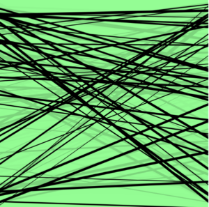
I get the inspiration from this week’s reading (watching) assignment, which is a talk by Casey. He talks about chaos and order in computer generated arts, and I think it is interesting to explore myself how computers can generate arts of order and chaos. My idea is to use simple lines to generate different shapes. I have experimented mostly with random() function, and discovered that even the randomly generated lines can actually follow certain patterns to form different shapes! In the meanwhile, the user can manipulate these lines to form different patterns and shapes so that they can personally feel the change from complete chaos to some order. Hope you enjoy!


Highlight of the code

The code is relatively short and simple. I mainly started with generating completely random lines with random sizes:

for (let i = 0; i < 50; i ++){
  let xPos1;
  let xPos2;
  let yPos1;
  let yPos2;
  let thickness = random(1, 5);
  strokeWeight(thickness);
  xPos1 = random(mouseX, 400);
  yPos1 = random(mouseY, 400);
  xPos2 = random(mouseX, 400);
  yPos2 = random(mouseY, 400);
  
  line(xPos1, yPos1, xPos2, yPos2);
}

Then for the user to manipulate the lines, I created a circle that follows the mouse so that the user can see clearly where the mouse is and better control the lines. Moreover, I modified the last line of the previous code to achieve user’s manipulation of the lines:

line(xPos1 - mouseX, yPos1 - mouseY, xPos2, yPos2);

I tried to use Perlin noise to make the lines move more naturally as we learnt in class. However, I feel the natural movement here undermines the sense of chaos, which is not intended here. Therefore, I decided not to use it and keep how these lines move as now.

Reflections and improvements

The execution is relatively easy, but it took me some time to finally come up with this idea. I tried several other ideas, but they all failed because my coding ability did not allow me to realize them. And this is why I ended up with this relatively simple code, but its effectiveness in exploring chaos and order is still strong.

And for future considerations, I am interested in knowing probably what other elements, such as other shapes, colors, movements, etc, could be added to the work to further explore the idea of chaos and order in computer generated arts. To me it is a very interesting concept even in other fields. Therefore, I’d like to explore more possibilities to discuss and apply this concept!

Sources:

Casey’s talk: https://vimeo.com/45851523

P5.js reference page: https://p5js.org/reference/

Assignment 1: Self Portrait

For this assignment, the task was to create a self-portrait, and I’ll admit I’m someone who can’t draw at all. So, I approached this assignment with a mixture of excitement and nervousness and I decided to keep my self-portrait simple yet cute, which I hope would come across effectively.

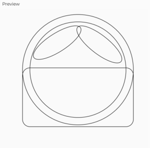
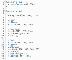
I began by sketching the outline for the head and hair. It started off decently, but I faced significant challenges when it came to layering various shapes to achieve the correct hair texture. After a few tries, I eventually managed to get it  right.

So initially this is how my portrait looked like

And this is what my final portrait looks like

As I mentioned before, I take pride in the part of the code that allowed me to create the hair, even though it might not be particularly intricate. The layering aspect was a challenging but rewarding aspect of this assignment.

Working on this project was a delightful experience because it made me realize that while I might struggle with drawing on paper, I can create something visually appealing using Processing. I particularly enjoyed adding interactivity to my portrait, as I believe it adds an interesting dimension to the work. While I am satisfied with my final submission, there are a few areas I would like to improve upon. One of them is creating a more detailed body for my self-portrait since I kept it relatively simple this time.