Assignment 2 – Loops

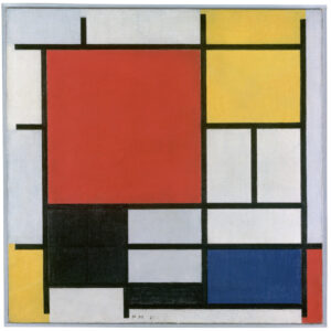
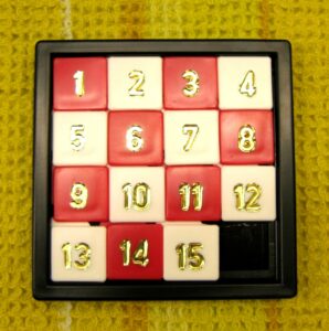
I thought Mondrian art was pretty fun to look at, and I liked the geometric simplicity of it, and so I thought of making a simple p5.js program with loops to try to mimic the look. However, I somehow also thought of sliding puzzles, where there’s a grid of squares and there’s one empty cell that other pieces can be slid into. I thought it might be fun to combine the two of them, and I ended up creating a little animated piece that runs on its own randomly.

    • A highlight of some code that you’re particularly proud ofI came across a problem where I wanted to randomly select 3 indexes in an array without any duplications, and it was something that I had to stop to think about as just randomly selecting elements sequentially could run the risk of the same index being selected twice. My code removes the selected index from the array before randomly selecting again.
      // make sure that there are always 3 colors, and we dont select same index for two colors
      let redBoxIndex = random(listOfNums);
      let index = listOfNums.indexOf(redBoxIndex);
      listOfNums.splice(index, 1);
      
      let blueBoxIndex = random(listOfNums);
      index = listOfNums.indexOf(blueBoxIndex);
      listOfNums.splice(index, 1);
      
      let yellowBoxIndex = random(listOfNums);
      index = listOfNums.indexOf(yellowBoxIndex);
      listOfNums.splice(index, 1);
    • Embedded sketch

  • Reflection and ideas for future work or improvements

    I feel that this piece did not meet my own expectations compared to my Hello Kitty self-portrait I did for last week, but I thought it was my idea that was weak rather than the execution. It’s satisfying to watch the pieces move, especially when a coloured square moves, but I’m not too sure what the entire point behind this project is.

assignment 2: loops

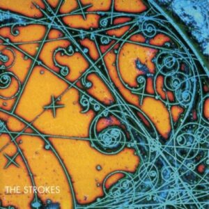
I tried recreating The Strokes’s “Is This It” album cover for this project. Here’s the reference picture:

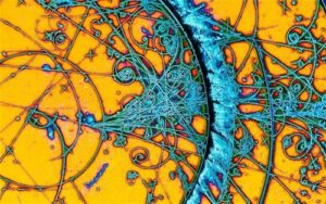
The album originally had a different cover, but some time after the first batch of vinyls had already been pressed, frontman Julian Casablanca called his product manager saying he found “something even cooler.” The record label obliged, and later productions of the album appeared with a picture from CERN’s Big Bang experiments in the 70s. This new image shows tracks left by subatomic particles in a bubble chamber. As each charged particle moves through superheated liquid hydrogen, it leaves a trail of “bubbles” as the liquid boils in its wake. The trajectory of their paths can then be analyzed to identify the particles. For example, two particles with opposite charges would travel in opposite directions, because of how they interact with the magnetic field in the chamber.

This is how I approached the problem of animating these particles: I use a for loop to generate some sets of random values (within defined limits) for initial coordinates, radii, angles, and stroke weights. Each set determines the initial frame for each particle. A heavier particle, such as an alpha particle, would have a smaller radius than a smaller particle, such as an electron, because the heavier particle moves slower, which is why each track needs to have a different radius. They can also curve in one direction or the other as they travel, depending on the charge they carry. So the angle needed to be randomized between negative and positive values.

// array to store trail "head" information
for (let i = 0; i < 20; i++) {
  let x = random(width);
  let y = random(height);
  let weight = int(random(1, 5));
  let angle = random(-TWO_PI, TWO_PI);
  let radius = random(1, 10);
  particleArray.push({ x, y, weight, angle, radius });
}

Every time the draw() function is called, I offset the values in each set by a little, to define the new position for a particle, and then draw a line joining these two coordinates. The for loop in this function goes over each “particle” in the array and gives it a new position to be at. When the frame refreshes, this happens all over again.

There’s a lot more that’s going on in the album cover, and I’m trying to make my artwork something more than just lines on a yellow background. So far I’ve only added some grain to the canvas. I can also make out some drop shadow in the original picture, but it’s a little complicated to achieve that effect with code. Since the arcs are comprised of infinite small lines, I don’t have the shape of the full arc at any point in time, so I can’t add drop shadow to the whole arc. But if I add shadows to each little line, the shadow falls not just on the background but on neighboring lines too, and that makes the arc look disjointed. I just added some noise to the coordinate calculation so that the arc look just slightly more realistic and not completely smooth.

I think the trickiest part was figuring out the logic for how to connect each coordinate. At first, I was trying to use ellipses instead of lines, and wrote some more complicated logic to connect them in an arc, but I did something wrong so it would connect points of different arcs, shown below. It looks cool in its own right, but it just wasn’t what I was trying to do.

reading reflection: week 2

Casey Reas opens with a traditional understanding of order and chaos. “Chaos is what existed before the creation, and order is what was brought by a God or gods into the world.” More generally, then, chaos is the natural state of things, and it is the hand of a higher being that brings order to chaos. But I struggled to meet Reas at his point of departure: is a higher order of being inherently correlated with higher capacity for order? God might have set the planets into motion, but their orbits remain subject to the unbound randomness of the universe. A meteor could very well strike Pluto today and move it off course by a few degrees. Would that still be God’s doing? I think that if the order brought on by even a God is not impervious to the seemingly ubiquitous and natural chaos of the universe, then even the little order we observe is only an isolated fragment of the bigger piece in chaos, meaning there is always net chaos in the universe.

Reas’s whole premise of incorporating randomness in art is to me an expression of the general human conceit. We like to think of ourselves as beings capable of creating and maintaining order. But then in the face of the infinite chaos of the world we live in, we go on and generate artificial randomness, in art and what not, as if by adding just a bit of chaos into the grand sum, we can rise to the ranks of the forces behind the universe. Take Keith Tyson’s sculptures for example, as discussed in the talk, and which reminded me of Mondrian’s paintings. Tyson tried his best to arrive at pure chaos, by allowing the shape and form of his sculptures to be dictated by dice rolls. But then Reas mentions that “he sent an algorithm to a gallery, which was then fabricated.” By incorporating an algorithm, basically a set of rules, in the manufacturing process, Tyson succumbs to his mortal fate, that of a creature of order, but still below the highest power in the universe, chaos.

Week 2: A Simple Work of Art

Concept:

Initially, I began with an uncertain direction for my generative art piece, starting with a simple sketch that lacked a clear vision.

And then I added some texts.

As I experimented with shapes and transitions, I stumbled upon the idea of creating an inspiring quote for myself. At the time, only three weeks into the semester, I was juggling numerous responsibilities and wanted this artwork to serve as a motivational reminder to persevere during moments of overwhelm.

Highlighted Code:

I am proud of my implementation of a dynamic gradient background. It was a challenging task to control color transitions at specific interpolation points to ensure a smooth shift between soft and soothing colors.

// A function to draw the background
function drawBackground() {
   // initialize the colors of the gradience
  begin = color("#FFC3A0"); 
  finish = color("#A4C3E1"); 
  
  // adjust the colors
  let r = map(sin(angle0), -1, 1, 180, 255); 
  let g = map(cos(angle0), -1, 1, 180, 255); 
  let b = map(sin(angle0 * 2), -1, 1, 180, 255); 
  begin = color(r, g, b);
  
  angle0 += 0.05;

  // loop through the canvas height from top to bottom
  for (let i = 0; i < height; i++) {
    // calculate the constant range of change based on the current vertical position
    let change = map(i, 0, height, 0, 1);
    
    // to make a smooth color change, interpolate between the starting and the ending colors
    let color = lerpColor(begin, finish, change);
    stroke(color);           // set the color for the current row
    
    line(0, i, width, i);     // draw a horizontal line with given color stroke
  }
}

Also, I’m satisfied with the overall code structure, which incorporates the use of global and local variables, functions, and an object-oriented programming design.

Embedded Sketch:

Reflection and Ideas for Future Work:

For the next projects, I would aim to enhance the visual appeal of my artwork by planning the design more meticulously before diving into implementation. This thoughtful approach will likely result in a more meaningful and aesthetically pleasing final product. Also, I want to introduce more interactivity to make the artwork more engaging and fun for the audience.

Week 1 HW) Self-Portrait

For me, while it may sound funny, getting the ‘artistic part’ of the project right was the biggest challenge. I had the picture of myself in my head, but I lack the ability of expressing that artistically (both by hand-drawing or code). Accepting the self I am, I decided to try to draw as many things in the portrait so that it would be good practice for me to try drawing different things.

The concept was to show how the sun in Abu Dhabi gives all of us a tan as time goes by. I wanted to make it interactive, so I made the skin colour change depending on the position of the user’s mouse.

//Outside (red part)
beginShape();
noStroke();
vertex(p1.x, p1.y);
bezierVertex(p1.x, p1.y, 310, 36, p2.x, p2.y);
bezierVertex(p2.x, p2.y, 345, 76, p3.x, p3.y);
bezierVertex(p3.x, p3.y, 360, 100, p4.x, p4.y);
bezierVertex(p4.x, p4.y, 320, 134, p5.x, p5.y);
bezierVertex(p5.x, p5.y, 295, 145, p6.x, p6.y);
bezierVertex(p6.x, p6.y, 245, 70, p7.x - 10, p7.y);
bezierVertex(p7.x, p7.y, 235, 80, p8.x, p8.y);
bezierVertex(p8.x, p8.y, 275, 50, p1.x, p1.y);
fill(250, 95, 85);
endShape();

As for the code, I want to highlight more on the trouble I had as there’s nothing too complicated in my project. The outside layer of the sun is drawn by bezierVertex()- I had to put in multiple different coordinates until it seemed okay. I personally thought this was a very inefficient way of doing it. Also, it was hard to exactly get it drawn how I wanted it to be. I spent quite a lot of time looking for different methods, but wasn’t able to find one. I would love to see if anybody has suggestions regarding this.

I think for my future projects, I would try to draw a grid by hand and figure out the aesthetics first. I saw a few people’s blog posts and saw how the image they wanted to draw was set first and the code specifically followed how each elements were drawn (the angles, the coordinates, etc). I think maybe if I take that step, the aesthetics could be better.

Homework 2- Animated self portrait – catch up

Hi everyone, my name is Batool Al tameemi, I joined this class on Sunday so I am trying to catch up the work

Overview:

This dynamic self-portrait, crafted using the expressive capabilities of p5.js, offers an intriguing blend of artistic finesse and interactive elements. It breathes life into the digital canvas with a symphony of visual animations and engaging features.

Enchanting Cloud Animation: The canvas adorns itself with ethereal clouds that gracefully drift across the sky, bestowing an atmospheric and immersive aura upon the portrait. These celestial wanderers move with a fluid elegance, enhancing the overall visual allure.

Meticulous Facial Representation: The self-portrait meticulously captures the quintessence of a visage, with a particular focus on its defining characteristics – the eyes, nose, lips, and cheeks. These features are intricately designed, resulting in a lifelike and evocative portrayal.

Dynamic Blinking Eyes: This project introduces a captivating blink animation for the eyes, infusing the portrait with an element of realism and endearing quirkiness. The eyes gracefully transition between open and closed states, establishing a captivating connection with the observer.


Embedded sketch

A Highlight of a code I am proud of:

One of the code segments that truly stands out in this self-portrait project is the implementation of interactive eye movement. This feature elevates the portrait’s interactivity and brings it to life in a captivating manner.

Within the code, the calculation of the new positions for the pupils based on the mouse cursor’s movement is a testament to both creativity and technical finesse. The snippet carefully calculates the angle between the mouse cursor’s position and the position of each eye. It then determines the new coordinates for the pupils, resulting in the illusion of the eyes tracking the viewer’s actions.

  // Calculate the angle between the mouse and each eye
  let leftEyeAngle = atan2(mouseY - leftPupilY, mouseX - leftPupilX);
  let rightEyeAngle = atan2(mouseY - rightPupilY, mouseX - rightPupilX);

  // Calculate the new positions for the pupils based on the angle
  let pupilRadius = 15; // Adjust the pupil size as needed
  leftPupilX = 170 + cos(leftEyeAngle) * pupilRadius;
  leftPupilY = 175 + sin(leftEyeAngle) * pupilRadius;
  rightPupilX = 230 + cos(rightEyeAngle) * pupilRadius;
  rightPupilY = 175 + sin(rightEyeAngle) * pupilRadius;

  fill(139, 69, 19);
  ellipse(leftPupilX, leftPupilY, 20, 20);
  ellipse(rightPupilX, rightPupilY, 20, 20);
}

Reflection:

Creating this self-portrait project in p5.js was an exciting journey that allowed for a fusion of artistic expression and interactive coding.

Future Improvements:

  1. Enhanced Realism: To push the boundaries of realism further, I plan to explore the incorporation of even more intricate facial details. Elements such as eyelashes, wrinkles, or variations in skin texture can elevate authenticity and immerse the viewer deeper into the self-portrait.
  2. Background Storytelling: To enrich the viewer’s experience, I intend to delve into the addition of a meaningful background or narrative context. Crafting a compelling backdrop can provide insights into the subject’s personality, convey specific moods, or tell a captivating story.
  3. Gesture and Pose: I look forward to experimenting with different facial expressions, poses, or gestures in future self-portrait projects. This exploration will enable me to convey various emotions or themes through the artwork, adding diversity to my portfolio.

Code:

//Batool Al Tameemi , Intro to IM 
//Homework 1 
function setup() {
  createCanvas(400, 400); // Creates a canvas with a size of 400x400 pixels
  background(0, 0, 250); // Sets the background color to blue
}

function draw() {
  let centerX = width / 2; // Calculate the x-coordinate of the center of the canvas
  let centerY = height / 2; // Calculate the y-coordinate of the center of the canvas

  let skinColor = color(255, 204, 153); // Define a custom skin color using RGB values

  // Draw the face background
  fill(87); // Set the fill color to a shade of gray
  noStroke(); // Disable outline (stroke)
  ellipse(200, 420, 250, 200); // Draw an ellipse as the face's background
  fill(0); // Set the fill color to black
  noStroke(); // Disable outline (stroke)
  ellipse(centerX, centerY, 230, 250); // Draw an ellipse as the face
  rect(225, 200, 90, 230); // Draw a rectangular shape as the neck
  ellipse(200, 330, 90, 50); // Draw an ellipse as the mouth area
  fill(skinColor); // Set the fill color to the custom skin color
  ellipse(centerX, centerY, 170, 200); // Draw an ellipse as the skin
  
  fill(0, 0, 0, 100); // Translucent black
  stroke(255);
  ellipse(170, 100, 50, 40); 
  ellipse(230, 100, 50, 40);
  line(195, 100, 205, 100);

  // Draw eye whites
  fill(255); // Set the fill color to white
  noStroke(); // Disable outline (stroke)
  ellipse(170, 175, 40, 30); // Draw the left eye white
  ellipse(230, 175, 40, 30); // Draw the right eye white

  // Draw eye pupils
  fill(139, 69, 19); // Set the fill color to brown
  ellipse(170, 176, 20, 20); // Draw the left eye pupil
  ellipse(230, 176, 20, 20); // Draw the right eye pupil

  // Draw the cheeks
  fill(255, 182, 193); // Set the fill color to pink
  ellipse(144, 240, 40, 40); // Draw the left cheek
  ellipse(256, 240, 40, 40); // Draw the right cheek

  // Draw the nose
  fill('#C4A484'); // Set the fill color to a light brown
  ellipse(200, 210, 20, 30); // Draw the nose

  // Draw light eyebrows
  fill(0); // Set the fill color to black
  noStroke(); // Disable outline (stroke)
  ellipse(170, 145, 30, 8); // Draw the left eyebrow
  ellipse(230, 145, 30, 8); // Draw the right eyebrow

  // Draw the mouth
  fill(255, 0, 0); // Set the fill color to red
  arc(200, 250, 50, 50, 0, PI); // Draw a semi-circle as the mouth (smile)

  // Draw the lips
  stroke(0); // Set the stroke color to black
  strokeWeight(2); // Set the stroke weight (line thickness)
  noFill(); // Disable fill for the lips (outline only)
}


Homework week 1 Self Portrait- Catching up :)

Hi everyone, my name is Batool I joined this class on Sunday and this is my HW1

Overview: 

In this artistic self-portrait project crafted using p5.js, I’ve created a graphical representation of myself especially adding the sunglasses because I think they represent me so much. The canvas dimensions have been meticulously set to 450×450 pixels, with a background color reminiscent of a tranquil blue sky.

  • A highlight of some code that you’re particularly proud of
// Draw the face background
fill(87); // Set the fill color to a shade of gray
noStroke(); // Disable outline (stroke)
ellipse(200, 420, 250, 200); // Draw an ellipse as the face's background
fill(0); // Set the fill color to black
noStroke(); // Disable outline (stroke)
ellipse(centerX, centerY, 230, 250); // Draw an ellipse as the face
rect(225, 200, 90, 230); // Draw a rectangular shape as the neck
ellipse(200, 330, 90, 50); // Draw an ellipse as the mouth area
fill(skinColor); // Set the fill color to the custom skin color
ellipse(centerX, centerY, 170, 200); // Draw an ellipse as the skin

fill(0, 0, 0, 100); // Translucent black
stroke(255);
ellipse(170, 100, 50, 40); 
ellipse(230, 100, 50, 40);
line(195, 100, 205, 100);

I am proud of the sunglasses sketch While the process of drawing them was relatively straightforward, it led me into a fascinating realm of discovery and experimentation, particularly concerning the use of the translucent shade of black. It’s in these nuanced details that I discovered the power of subtle design choices, and it brought a satisfying depth to the overall composition.

Reflection and ideas for future work or improvements

Reflection:

In creating this self-portrait through the utilization of p5.js, I’ve garnered valuable insights into the realm of digital art and creative coding. The process emerged as both enlightening and fulfilling, yielding a range of noteworthy insights.

Primarily, I ascertained that the fusion of geometric configurations and judicious selection of hues can yield a visually stunning impact. The capacity to manipulate shapes and color palettes for the portrayal of intricate facial components, including the eyes, nose, lips, and cheeks, proved to be an enthralling exercise in the manifestation of creativity.

Ideas for Subsequent Undertakings or Enhancement:

While I derive satisfaction from this self-portrait endeavor, I also discern domains warranting further exploration and refinement:

  1. Texture and Elaboration: The incorporation of heightened intricacies and textures could elevate the verisimilitude of the portrait. Delving into techniques like texture brushes or introducing supplementary geometrical forms might confer enhanced captivation to the artwork.
  2. Interactivity: The infusion of interactivity into the portrait, enabling users to manipulate facial expressions or color schemes, holds promise for engendering heightened engagement. This could be realized via user-initiated input and adept event management.
  3. Background Dynamics: The realm of dynamic or animated backgrounds is ripe for exploration. By engrafting subtle movements or nuanced visual effects into the background, the viewer’s focal point could be duly engaged.
  4. Variations and Personalization: The provision of options for viewers to tailor specific facets of the portrait, such as hair color or facial attributes, would extend an invitation for greater interaction and emotional resonance.
  5. Emulating Artistic Exemplars: Imbibing the methodologies and artistic styles of other digital virtuosos can provide wellsprings of inspiration and catalysts for refinement in my own oeuvre. Learning from the rich tapestry of the creative community stands as an invaluable repository.

Code:

//Batool Al Tameemi , Intro to IM 
//Homework 1 
function setup() {
  createCanvas(400, 400); // Creates a canvas with a size of 400x400 pixels
  background(0, 0, 250); // Sets the background color to blue
}

function draw() {
  let centerX = width / 2; // Calculate the x-coordinate of the center of the canvas
  let centerY = height / 2; // Calculate the y-coordinate of the center of the canvas

  let skinColor = color(255, 204, 153); // Define a custom skin color using RGB values

  // Draw the face background
  fill(87); // Set the fill color to a shade of gray
  noStroke(); // Disable outline (stroke)
  ellipse(200, 420, 250, 200); // Draw an ellipse as the face's background
  fill(0); // Set the fill color to black
  noStroke(); // Disable outline (stroke)
  ellipse(centerX, centerY, 230, 250); // Draw an ellipse as the face
  rect(225, 200, 90, 230); // Draw a rectangular shape as the neck
  ellipse(200, 330, 90, 50); // Draw an ellipse as the mouth area
  fill(skinColor); // Set the fill color to the custom skin color
  ellipse(centerX, centerY, 170, 200); // Draw an ellipse as the skin
  
  fill(0, 0, 0, 100); // Translucent black
  stroke(255);
  ellipse(170, 100, 50, 40); 
  ellipse(230, 100, 50, 40);
  line(195, 100, 205, 100);

  // Draw eye whites
  fill(255); // Set the fill color to white
  noStroke(); // Disable outline (stroke)
  ellipse(170, 175, 40, 30); // Draw the left eye white
  ellipse(230, 175, 40, 30); // Draw the right eye white

  // Draw eye pupils
  fill(139, 69, 19); // Set the fill color to brown
  ellipse(170, 176, 20, 20); // Draw the left eye pupil
  ellipse(230, 176, 20, 20); // Draw the right eye pupil

  // Draw the cheeks
  fill(255, 182, 193); // Set the fill color to pink
  ellipse(144, 240, 40, 40); // Draw the left cheek
  ellipse(256, 240, 40, 40); // Draw the right cheek

  // Draw the nose
  fill('#C4A484'); // Set the fill color to a light brown
  ellipse(200, 210, 20, 30); // Draw the nose

  // Draw light eyebrows
  fill(0); // Set the fill color to black
  noStroke(); // Disable outline (stroke)
  ellipse(170, 145, 30, 8); // Draw the left eyebrow
  ellipse(230, 145, 30, 8); // Draw the right eyebrow

  // Draw the mouth
  fill(255, 0, 0); // Set the fill color to red
  arc(200, 250, 50, 50, 0, PI); // Draw a semi-circle as the mouth (smile)

  // Draw the lips
  stroke(0); // Set the stroke color to black
  strokeWeight(2); // Set the stroke weight (line thickness)
  noFill(); // Disable fill for the lips (outline only)
}


Assignment 2 – AakifR

Concept:
I wanted to use the Urdu word عشق or Ishq and create a fun pattern with it while also involving some level of animation in it. I created a function that would make the word and then I called it in the draw function to repeatedly draw the word on the canvas and create a repetitive pattern. I changed how the word looks each time it is called by using random(). If you want the animation to restart, you can click your mouse.

Highlight:
Not technically too exciting, but I’m kind of proud of creating the word عشق through programming. It was a slightly tedious process and I’m also interested in learning how to streamline that process.

Sketch:

Reflection:
I really wanted each عشق to rotate around a point, but it turned out that it was harder than I thought and it’s something I still need to figure out.

let angle = 0; 

function setup() {
  
  
  createCanvas(1200, 1200);
  background(250, 141, 141);
  
  // let's draw ishq
}
  
//   function executeishq(){
    
//    for (let xchange = 0; xchange < width; xchange = xchange +30){
//     for (let ychange = 0; ychange < height ; ychange = ychange +30){
    
//     noStroke();
//     fill(random(100,105),random(10,55),random(25,55));
//     rotate(random(1,90));
      
//   drawishq(xchange + random (1, 100),ychange + random(1,100), random(1,5));
//     }
// }

// }


function drawishq(xpos,ypos, size){ //the xpos, ypos change the position of ishq on screen
  
  //first letter
  
  
  square(16 + xpos,20 + ypos,size,2);
  square(22 + xpos,20 + ypos,size,2);
  square(28 + xpos,20 + ypos,size,2);
  square(34 + xpos,25 + ypos,size,2);
  square(16 + xpos,26 + ypos,size,2);
  square(16 + xpos,32 + ypos,size,2);
  square(16 + xpos,38 + ypos,size,2);
  square(22 + xpos,38 + ypos,size,2);
  square(28 + xpos,38 + ypos,size,2);
  square(34 + xpos,38 + ypos,size,2);
  square(40 + xpos,38 + ypos,size,2);
  square(10 + xpos,38 + ypos,size,2);
  square(4 + xpos,38 + ypos,size,2);
  
  
  //2nd letter
  
  square(-2 + xpos,38 + ypos,size,2);
  square(-2 + xpos,32 + ypos,size,2);
  square(-8 + xpos,38 + ypos,size,2);
  square(-14 + xpos,32 + ypos,size,2);
  square(-14 + xpos,38 + ypos,size,2);
  square(-20 + xpos,38 + ypos,size,2);
  square(-26 + xpos,38 + ypos,size,2);
  square(-26 + xpos,32 + ypos,size,2);
  square(-32 + xpos,38 + ypos,size,2);
  square(-38 + xpos,38 + ypos,size,2);
  
  //dots
  
  square(-14 + xpos,14 + ypos,size,2);
  square(-20 + xpos,20 + ypos,size,2);
  square(-8 + xpos,20 + ypos,size,2);
  
  //third letter
  
   square(-44 + xpos,38 + ypos,size,2);
   square(-50 + xpos,38 + ypos,size,2);
   square(-50 + xpos,32 + ypos,size,2);
   square(-50 + xpos,26 + ypos,size,2);
   square(-50 + xpos,20 + ypos,size,2);
   square(-56 + xpos,26 + ypos,size,2);
   square(-56 + xpos,20 + ypos,size,2);
   square(-50 + xpos,44 + ypos,size,2);
   square(-50 + xpos,50 + ypos,size,2);
   square(-50 + xpos,56 + ypos,size,2);
   square(-50 + xpos,62 + ypos,size,2);
   square(-56 + xpos,62 + ypos,size,2);
  square(-62 + xpos,62 + ypos,size,2);
  square(-68 + xpos,62 + ypos,size,2);
  square(-74 + xpos,62 + ypos,size,2);
  square(-80 + xpos,62 + ypos,size,2);
  square(-86 + xpos,62 + ypos,size,2);
  square(-92 + xpos,62 + ypos,size,2);
  square(-92 + xpos,56 + ypos,size,2);
  square(-92 + xpos,50 + ypos,size,2);
  square(-92 + xpos,44 + ypos,size,2);
  
  // dots
  square(-50 + xpos,8 + ypos,size,2);
  square(-62 + xpos,8 + ypos,size,2);


}

function draw() {
  
  rotate(angle); 
  
  
  drawishq(random(0,width),random(0,height),random(1,5));
 
  angle += radians(2);
  
  if(mouseIsPressed){
    background(250, 141, 141);
  }


  print(mouseX + "," + mouseY);

}


Week 2 – Graphic Art

Design Concept

At first, I wanted to make something that spirals around a pivot point. To make it look less monotonous, I made the spiral only the trajectory. The actual thing going along that spiral consists of lines of increasing length with the same distance to each other with various colors normal to the spiral. But simple or random colors seemed too messy, so I made the lines rainbow-colored. Inspired by Casey Reas’ works, I decided to add a touch of randomness to the project. Therefore, I randomized the spawn points of the spiral while fixing the pivot point to the center. I also wanted the audience to have some control or involvement in the project, so I made the spirals detect the pivot point in real time, and the audience could change the pivot point themselves with a click of their mouse.

Code I am Proud of

The part that I am really satisfied with is the trajectory algorithm. This outcome was, in fact, unexpected. I spent a lot of time calculating angles so that the angles align. I gave the trajectory an original angle relative to the x-axis and calculated the angle that the x-axis, the pivot point, and the trajectory head make. then I used these two angles to determine the direction of the trajectory head should turn to. I made it turn 1/15 of the angle between each frame. Because it is a percentage change, the trajectory will never touch the pivot point. Also, the distance traveled by the trajectory head between each frame is fixed, when it is very close to the pivot point, the relative angle between the pivot and the trajectory head will change dramatically between the frames, making it leave the pivot point even further. I wasn’t sure what this would bring, and it really surprised me when I saw this interwoven structure with four corners. The code is shown below:

class Dot{
  constructor(x,y,ang,len){
    this.x=x;
    this.y=y;
    this.ang=ang;
    this.len=len;
  }
  
  display(){
    // Rainbow color collection
    let firstColor=color("red");
    let secondColor=color("orange");
    let thirdColor=color("yellow");
    let fourthColor=color("green");
    let fifthColor=color("blue");
    let sixthColor=color("indigo");
    let seventhColor=color("violet");
    let actualColor;
    
    // Interpolated color generation
    for(let i=0;i<this.len;i++){
      if(3*i/this.len<=1){
        actualColor=lerpColor(firstColor,secondColor,3*i/this.len);
        stroke(actualColor);
        point(this.x-i*cos(this.ang),this.y-i*sin(this.ang));
      }
      else if(3*i/this.len>1 && 3*i/this.len<=2){
        actualColor=lerpColor(secondColor,thirdColor,3*i/this.len-1);
        stroke(actualColor);
        point(this.x-i*cos(this.ang),this.y-i*sin(this.ang));
      }
      else if(3*i/this.len>2 && 3*i/this.len<=3){
        actualColor=lerpColor(thirdColor,fourthColor,3*i/this.len-2);
        stroke(actualColor);
        point(this.x-i*cos(this.ang),this.y-i*sin(this.ang));
      }
      if(3*i/this.len<=1){
        actualColor=lerpColor(fourthColor,fifthColor,3*i/this.len);
        stroke(actualColor);
        point(this.x+i*cos(this.ang),this.y+i*sin(this.ang));
      }
      else if(3*i/this.len>1 && 3*i/this.len<=2){
        actualColor=lerpColor(fifthColor,sixthColor,3*i/this.len-1);
        stroke(actualColor);
        point(this.x+i*cos(this.ang),this.y+i*sin(this.ang));
      }
      else if(3*i/this.len>2 && 3*i/this.len<=3){
        actualColor=lerpColor(sixthColor,seventhColor,3*i/this.len-2);
        stroke(actualColor);
        point(this.x+i*cos(this.ang),this.y+i*sin(this.ang));
      }

    }
  // Calculating angle
  updateParam(){
    this.x=this.x-10*cos(this.ang+PI);
    this.y=this.y+10*sin(this.ang+PI);
    this.len=sqrt(sqrt(sqrt(fibRec1)));
    let navAng =atan2(navdot.y-this.y, navdot.x-this.x);
    if(navAng<0){
      navAng=abs(navAng);
    }
    else{
      navAng=2*PI-navAng;
    }
    let angleDifference = navAng-this.ang;
    while (angleDifference > PI) {
      angleDifference -= 2 * PI;
    }
    while (angleDifference < -PI) {
      angleDifference += 2 * PI;
    }
    let clockwise = angleDifference < 0;
    let rotationAngle = abs(angleDifference);
    if (clockwise) {
      this.ang -= rotationAngle/15;
    } else {
      this.ang += rotationAngle/15;
    } 
  }

Improvements

The lengths of the lines were a Fibonacci sequence, down to its 8th root. I wanted the increase of the lines to become gradually bigger, while not exploding to a number too huge. I haven’t experimented with other sequences due to limited mathematical abilities, but I believe there can be better sequences that will produce smoother increases in the length of the lines.

Week 2 – Reading Reflection

I enjoyed Casey Reas’s talk on the randomness, and how the chaos of randomness can sometimes be turned into art. I love the concept presented — of making order out of chaos, as noise exists all around us. Computers were once thought to be orderly machines, that would calculate the exact same result every time it is run. In an already-chaotic world, why would one introduce chaos to one of the very few things that are orderly? Yet, I think that managed chaos can be beautiful. Renaissance paintings are considered good art, but they are not perfect. Simply because of the fact that it exists in the real world, there are always minor deviations even in a perfect brush stroke. Each individual hair in a brush creates enough deviation that no two brush strokes are the same, and somehow those minor deviations are what gives character and life to the drawing. In digital drawing apps, it would not be difficult to create brushes that always produce uniform results, but yet, noise is artificially added in to mimic brushes in the real world, intentionally creating chaos and randomness.

Something that I’ve been thinking about in context to P5.Js and randomness is that I won’t be fully able to control the user experience of the output. What if the randomness I’ve implemented spits out a ‘bad’ output for a certain user? But the more I thought about it, the less likely that sounded to happen. Order from chaos was the moral I’ve learnt from Casey Reas’s video, and I must constrain the randomness in a way that’ll look like something I expect most, if not all the time. A sketch of 10 randomly generated points might sometimes gets me a good result, for example 10 points shaped like a heart or a box, but most of the time it will just give me something that makes no sense. Perhaps then, it might make more sense to generate 10 points in the shape of a heart, but with minor, randomly generated deviations in it’s coordinates so that the heart looks jittery which might be more interesting than a perfect heart. The BASIC lines program of infinitely generated forward and back slashes. If every viewer generates 500 characters of the program, the chances of two viewer having the same outputs of /\/\ would be (1/2)^500, infinitesimally small. It is likely that two users have never seen the same output, but yet the program generates a neat, pleasant-looking output no matter how often it’s run. Perhaps that the idea behind randomness.