Week 3 Reflection

I have always thought of ‘interactive design’ or ‘interactivity design’ as just a  necessary component of the UI design role. In general, I also realized upon going through this reading that the word ‘interactive’ had in a sense lost its meaning to me. It was refreshing to actually think of the concept and its importance in a systematic way as the reading puts us up to do.

An idea that the author introduces, and I love, is how interactivity isn’t a Boolean value but should rather be seen as a scale. This allows us to still call low level interactions such as those between a person and a TV remote interactive but on a lower level – while still maintaining our initial definition that involves thoughtful communication/conversation between two agents.

Circling back, the section of the discussion most relevant for me here is the one on ‘interactivity design’ which pertains to human-computer interaction. The author here mentions a key difference between User Interface design and interactivity design:

UI  designers never presume to address the ‘thinking’ part of the software. While interface designers also take into account the ‘thinking’ part or the function of the software alongside the other dimensions when coming up with a solution.

This comparison makes me draw from my own limited experience in UI design in a Software Engineering class and an internship at a startup. I had always felt that the UI design approach was too restrictive and shallow – that there needed to be more work done to actually take the now functional design and actually integrate it in a way that it flows naturally with the actual ‘function’ of the software.

Lastly, on a more philosophical note, the discussion on new paradigms leading to rapid progress is one I have interacted with frequently in the context of rapidly developing AI. However, I had always assumed for some reason that the paradigm for software and computer design had already been established (similar to how microbiology had the paradigm of cell theory strongly established for example). Interacting more with the field of creative computing through this course, and doing this reading have led me to the realization of how wrong this intuition may have been.

Reading Response- Interactivity

Chris Crawford really gets it right when he talks about interactivity. He explains it in a clear and organized way, especially when he connects it to our senses. Making this connection between interaction and our senses is a big deal. I think interactivity gets super powerful when it tugs at our feelings and expressions.

Imagine interactive games or events that use special sounds, words, colors, and lights. They make a whole new experience for the person taking it all in. It’s like diving into the art itself. Regular movies might not have a lot of interactivity but think about formats like 4DX. They change the game. You’re not just watching; you’re feeling things like air blowing, water splashing, and chairs moving. It’s like the movie comes to life, playing with your senses. As Crawford points out, a vital part of interactivity is making you think, feel, and express yourself. When art really hits you deeply, it makes you stop and feel. This feeling is what kicks off the real interaction with the artwork, creating a strong bond between you and what you’re seeing.

In my view, interactivity goes even further. It’s about connecting with individuals on a deeper level, creating an experience that really resonates with them. This, in turn, leads to the kind of reaction Crawford talks about – a reaction that truly does justice to the interactive nature of the encounter. It’s like a dance between the viewer and the medium, each responding and influencing the other in a meaningful way. This, to me, is the true essence of interactivity.

Assignment 2 – Generative Art

Concept:
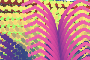
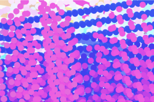
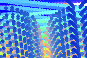
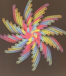
For this assignment I looked for many works of computational repetitive art and found really interesting works. However, the one I liked the most is this one I saw in the art center (shown in the figure below). I don’t know why I liked this one so much but maybe because I saw it in real life. I decided to work on a similar idea but with introducing more colors and different pattern. While working some things didn’t go the way I wanted but it resulted in some really cool stuff.

Code Highlights:
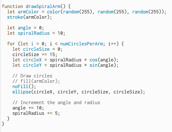
The part of code I am proud of is drawing the spiral arm and especially figuring out how to utilize sin and cos functions for my work.
Sketch:

Reflection and ideas for future work or improvements:
I am proud of the final output of my sketch. However, I think of implementing different modes where every mode would have a bit similar color combinations to make it more visually coherent. For example, one mode can contain the shades of blue.

Assignment 3

The Infinite Canvas

Concept

This project came about by chance. Initially, my goal was to design two color-changing balls. While I was exploring ways to enhance the project, I stumbled upon the idea of removing the background function. This allowed the ball from the previous frame to remain on the screen. I eliminated the stroke and implemented a color gradient transition, which produced a visually pleasing effect. To expand on this concept, I decided to create multiple duplicates of both balls, aligning them with the “mother” ball. Then, I began experimenting with adjusting the hardcoded bounce variables. Each time I increased the value by 0.1, it resulted in a distinct pattern, sometimes even yielding unique “art pieces” that had an appealing element of randomness.

The “random” Art pieces


Furthermore, I developed different versions of this project. The first version functions as a standard screensaver-like visual effect. By tweaking the bounce function variables, users can generate their own one-of-a-kind art pieces. In the second version, I introduced user interaction. Initially, the screen displays two beams, and when a user clicks on it, an additional beam appears, leaving a trace on the screen. The beam stops when the user releases the mouse button. This change opens up endless possibilities for creating an unlimited number of distinctive patterns.

Version ONE

Version two

Code that i’m proud of

//Ball colors
var r = map(sin(frameCount), -1, 1, 50, 255);
var g = map(cos(frameCount / 2), -1, 1, 50, 255);
var b = map(sin(frameCount / 9), -1, 1, 50, 255);
fill(r, g, b);

//creating ball/ ellipse
ellipse(this.x, this.y, 24, 24);

//adding second beam on click
let count = 0;
if(mouseIsPressed)
{
count += 24
}
for (let i = 0; i < 12 + count; i += 24) {
ellipse(this.x + i/4 , this.y + i * 2, 24, 24);
}
}

Reflection and IMPROVEments

In the future I would love to add a feature that enables the user to pause the moving beams and save the sketch.


ASSIGNMENT 3 REFLECTION


The first chapter in Chris Crawford’s book “The Art of Interactive Design” identifies some of the essential traits of great design and addresses common misconceptions about interactive design. 

He begins the chapter by analyzing the increasing popularity of “interactivity” over the years, as well as the numerous ways that “interactive design” has been mischaracterized as a result of its unexpected popularity. He specifically mentions the overuse of the term “interactivity” in marketing campaigns for products ranging from children’s toys to shampoo and even cereal. 

Before getting into the fundamentals of great design, he attempts to describe interactivity through metaphor, stating that interactivity must allow for hearing, speaking, and thinking. Crawford acknowledges that there are degrees to interactivity but emphasizes that without these qualities, true interactivity cannot be achieved or done so to the greatest extent. He also provides numerous instances of non-interactive items, such as books, movies (not yet), and paintings, since these items fail to meet all three elements of interactivity. 

Later on, Crawford touches on the differences between user interface design and interactive design, stating that UI design focused on “…optimizing communication between people and electronic devices”, while interactive design “…addressed the entire communication between the user and computer.”.  

Crawford’s concept for great design as “speaking, listening, and thinking” was very intriguing to me in this chapter. Each of these activities has an enormous effect on the individual, allowing for full-body engagement with whatever they are observing. For me, this will always be what I find most astonishing about the work being done in the IM field. Interactive media/design transcends passive observation and evokes emotion, showcasing the most beautiful parts of life.

Reading Reflection – Week 2

Being an avid lover for randomness, Casey Reas’s talk was very interesting for me. The way he presented how chaos can be applied to visual art to bring out masterpieces answered a question that I always ask myself whenever I face this kind of art, “how was the artist able to think of such art.” What makes the art really awesome is that there is no specific correct way to create it. So, what if a bit of chaos is added to this open-source artisitc world? Indeed, the idea of randomness in art is very interesting.

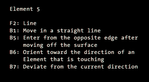
Although I enjoyed his beautiful art works, another thing really intrigued is the way he approaches his work. As Casey Reas demonstrated in his talk, he artfully describes the elements within his work through a series of simple commands (shown in the figure below), eloquently narrating the shapes and movements that give life to his compositions. This method of breaking down the artistic process into its fundamental building blocks not only demystifies the creation of complex artworks but also provides a unique insight into the mind of the artist. It’s a testament to the power of code as a medium for artistic expression, where algorithms become brushes, and pixels become paint on the digital canvas.

The Art of Interactive Design

The way the author explains interactivity is quite interesting. What caught my attention was when the author talked about a falling tree branch in the woods, and how what happens next is a reaction, not a true interaction. The author was able to present a well-structured step-by-step approach to defining interactivity. He started by discussing communication and the roles of different actors, then went on to propose the idea of categorizing interactivity into two levels: low and high, and explained how to tell them apart.

Chris’s viewpoint on interactivity is really unique and got me thinking that we might need a new word to describe what He’s talking about, especially since the term “interactivity” has been used incorrectly so often. This also brings up the question of how we decide if a digital artwork or project is interactive or not. On the flip side, it seems like he is mostly focused on human interaction (communication) as the main type, comparing computer limitations to human communication and interactions which might be insufficient to create a strong argument. This might mean they’re missing out on considering other forms of interactivity that don’t involve humans.

Furthermore, the author gave good examples to differentiate between an interaction and a reaction. For instance, he spoke about a reader reading a book where they only react to what they read rather than “interact” with it. Even though I believe these examples are prevalent, they were essential in explaining the difference between both terms. However, if we refer back to the initial examples presented in the beginning of the paper, such as the image of a child playing on an “interactable” rug, it could indeed be considered a form of interaction if it provides distinct feedback to the child based on the specific actions they take.

In general, the author has made a compelling case and touched upon a subject that could be relevant to various contemporary buzzwords we employ nowadays. Take, for instance, the phrase “Immersive experience.” Lately, numerous businesses have adopted this term to describe their offerings as immersive, even when they fall far short of delivering a high-quality, enjoyable experience for the user.

assignment 2 – generative art: a flower bed

Concept:

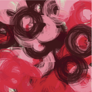
I was introduced to the phenomenon of Perlin noise from one of the readings in class. I looked deeper into it, and I kind of fell into a rabbit-hole where I was googling the sort of things one could generate using this property. Always a fan of vaguely spherical shapes, I used the noise to make distorted spheres. While playing around, I noticed that from above it it almost looked like a flower. I decided to make multiple of them, and increase the density so that they look thicker. I randomized the locations, so that slowly the screen fills up and once it’s finished, it should somewhat resemble roses (as if you’re looking down at them). This is what it looked like initially:

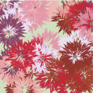
But after messing around with some parameters and adding a seed the end product becomes something like this:

Code Highlights

Because most of this is randomized and is one shape over and over again, the code isn’t the most technically impressive. I do like the use of Perlin noise to make radial shapes, and the randomization of the locations.

for (let j = 0; j < 2; j++){
  stroke(roseColors[currentColor]);
  push();
  translate(startX, startY);
  beginShape();
  for (let i = 0; i < 130; i++) {
    let angle = map(i, 0, 130, 0, TWO_PI);
    let radius = 150 * noise(i * 0.5, d * 0.005);
    let x = radius * cos(angle);
    let y = radius * sin(angle);
    curveVertex(x, y); 
  }
  endShape(CLOSE);

  
  beginShape();
  for (let k = 0; k < 70; k++) {
    stroke(color(142, 128, 106, 15))
    fill(color(142, 128, 106, 15))
    let seedAngle = map(k, 0, 70, 0, TWO_PI);
    let seedRadius = 15 * noise(k * 0.03, d * 0.005);
    let x = seedRadius * cos(seedAngle);
    let y = seedRadius * sin(seedAngle);
    curveVertex(x, y); 
  }
  endShape(CLOSE);
  pop();

  d += 0.5;
  
  
}


Here is the final product.
Improvements

I’m a very impatient person, so the amount of time it takes to fill up the screen frustrates me a little bit. In the future, I’d like to find a way to speed up the process a bit. In addition, I’d love to find the way to control the randomness a bit. Some spaces on the canvas get oversaturated with flowers too quickly while others remain blank for a long period of time. I’d love to add some control or measure that makes sure every space on the canvas is populated with one flower at least (as soon as possible).

Assignment 3 – Interactive Game Art: Collecting Falling Bricks

Concept

The concept behind “Collecting Falling Bricks” was to recreate a nostalgic gaming experience from my youth where players control a vibrant block using the right and left arrow keys. The game revolves around the simple yet addictive task of collecting falling grey bricks. As you collect these bricks, your score gradually increases, prominently displayed on the canvas’s top left corner. The game is designed to be endless, allowing players to collect as many bricks as they desire without facing a game-over scenario.

Highlight of the Code

One of the code highlights that I’m particularly proud of is the implementation of the continuous gameplay loop. This loop ensures that new falling bricks are introduced at regular intervals, maintaining an engaging pace and preventing the game from becoming too static. Below is a snippet of the code responsible for this:

// Continuous gameplay loop
setInterval(() => {
  objects.push(new FallingObject());
}, 1000);

Reflection/Improvements

Creating this interactive game art was an exciting journey for me as I combined my creativity and coding skills. For future work, I envision adding a new layer of challenge to the game. Instead of an endless loop, I plan to implement a game-over mechanism that will test players’ skills and add excitement to the gameplay. When a player misses collecting a brick, they would start the game anew, providing a sense of accomplishment and motivation to improve their score.

Edit Link

Reading Reflection – Week 2

Casey Reas’ presentation gave me several insights about the role of chaos in computing visual art. I never stopped to think about these concepts, but the more examples I saw, the more I understood their importance. As Reas was showing some of his work throughout the presentation, I quickly realized how superior the works he was not in “control” were in comparison to his highly fixed ones, which were just simple shapes as opposed to aesthetically pleasing and complex pieces generated by chaotic code. This dynamic interaction between human intent and machine generated randomness not only can produce captivating art but it can also deepen our understanding of mathematics. The generated outputs were so interesting that Reas even ended up using them in clothing, showing the power of computing when it comes to art. The examples from other authors also gave me inspiration for the loops assignment.

Additionally, something that caught my attention was the process behind coming up with these codes. Reas mentioned that one of his projects took a year of planning before he actually started to code, he also mentioned at some point how he went through hundreds of different generated outputs for the same project, which makes me wonder how long on average it takes to come up with these designs, and how much of it is simple trial and error or hours and hours of analyzing and writing algorithms to come up with something idealized. Perhaps it is a mix of both, as mentioned in the quote: “It’s never a blind chance, it’s a chance that is always planned, but also always surprising”

In short, although I am more interested in the presented visual aspects as opposed to mathematical ones, these are still beautiful concepts to take a look at and appreciate the hard work and complexity that goes behind the scenes.