Reading Reflection: Week 3

I found the reading to be quite intriguing as it prompted me to think what interactivity really is, a concept I had not given much thought to previously. Crawford’s definition of interactivity, drawing parallels with the dynamics of a meaningful conversation – involving listening, thinking and speaking – resonated with me. Throughout most of the reading, I found myself in agreement with his perspective on interactivity in various contexts.

However, I didn’t quite agree with Crawford when it came to his perspective on movies. He appeared to suggest that movies, inherently, lack interactivity. This reminded me of “Bandersnatch” a movie on Netflix that challenges this notion. In this movie, we as viewers have the opportunity to make choices for the characters, and the storyline changes depending on these choices.

Thinking about it a bit more, this difference in opinion really makes me wonder how media and storytelling are evolving. Traditional movies tend to stick to a linear plot, but “Bandersnatch” blurs the line between cinema and interactive storytelling, challenging our old-school idea of how movies work.

 It’s clear that interactivity is changing and adapting to new technology. We, as consumers, want more immersive and hands-on experiences in our media. While Crawford’s view has its merits, it might need a bit of an update to include these exciting, new forms of interactive storytelling that are turning our passive media consumption into an interactive adventure.

Assignment 3: Functions, Arrays and Object-Oriented Programming

For this assignment, I initially knew I wanted to create something that captured the essence of the night sky and stars, as I’ve always found it incredibly captivating. However, I was unsure of the specific visual direction I wanted to take. It was during this contemplation that my friend coincidentally shared a comic strip featuring aliens, which instantly sparked my imagination. I thought, “Why not incorporate an alien spaceship into this assignment?”

Inspiration:
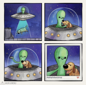
As I sketched the alien character, he naturally became a “Ben” in my mind, so I decided to call this “Ben’s Late Night Sky Chromatics”.

The part of the code that I’m most proud of is the spaceship class.

//spaceship 
class Spaceship {
  constructor(x, y, bodyWidth, bodyHeight, cockpitWidth, cockpitHeight) {
    this.x = x;
    this.y = y;
    this.bodyWidth = bodyWidth;
    this.bodyHeight = bodyHeight;
    this.cockpitWidth = cockpitWidth;
    this.cockpitHeight = cockpitHeight;
    this.speed = 6; //initial speed
  }

  update() {
    this.x += this.speed; //spaceship moving across the screen

    if (this.x > width + 50) {
      this.x = -50; //continuous and seamless movement of the spaceship across the screen 
    }

    laserX = this.x;//laser moving with the spaceship
  }

  display() {
    //spaceship's body
    fill(240, 55, 55); 
    stroke(0); 
    strokeWeight(2);
    ellipse(this.x, this.y, this.bodyWidth, this.bodyHeight);

    //lights on the spaceship's body
    fill(222, 209, 29);
    circle(this.x - 16, this.y + 5, 5);
    circle(this.x, this.y + 11, 5);
    circle(this.x + 16, this.y + 5, 5);

    //cockpit
    fill(255); 
    ellipse(this.x, this.y - 20, this.cockpitWidth, this.cockpitHeight);

    //alien
    fill(69, 163, 94); 
    circle(this.x, this.y - 14, 25); //alien head
    fill(255);
    circle(this.x - 6, this.y - 15, 1); //alien eyes
    circle(this.x + 6, this.y - 15, 1);// alien eyes
    noFill();
    arc(this.x, this.y - 7, 10, 5, 0, PI); //alien mouth

    //alien ears 
    fill(0);
    line(this.x - 14, this.y - 26, this.x - 10, this.y - 10); 
    circle(this.x - 14, this.y - 26, 2);//left ear
    line(this.x + 14, this.y - 26, this.x + 10, this.y - 10); 
    circle(this.x + 14, this.y - 26, 2);//right ear

    //spaceship legs
    fill(255); 
    triangle(this.x - 47, this.y + 41, this.x - 35, this.y + 18, this.x - 30, this.y + 20); //left leg
    triangle(this.x + 46, this.y + 41, this.x + 30, this.y + 21, this.x + 35, this.y + 19); //right leg
  }
}


//mouse click to randomly change laser beam color
function mousePressed() {
  const randomIndex = int(random(colors.length)); //picking random index within the array of the laser beam color
  laserColor = colors[randomIndex]; //randomly selected color for the laser beam
}

Designing the spaceship and getting all the values just right was a bit challenging. I started by sketching the spaceship and the night sky background separately, and then I had to merge them, which required a bit of trial and error. However, after a few hours of tweaking, I managed to create a spaceship that I was pleased with. I love the way the spaceship itself and Ben turned out, as well as a bit of interactivity in how the spaceship’s beam changes color upon clicking. Despite its simplicity, I also like the part of code that randomizes the positions of the stars each time the sketch starts. I like how this subtle feature adds an element of unpredictability and liveliness to the scene.

As for future improvements, I’d like to consider adding more spaceships and perhaps introducing some of Ben’s friends to make the scene even more engaging and cute. However, overall, I’m satisfied with how this assignment has turned out so far.


Week 3 – Assignment – Reflections on a Lake

Concept

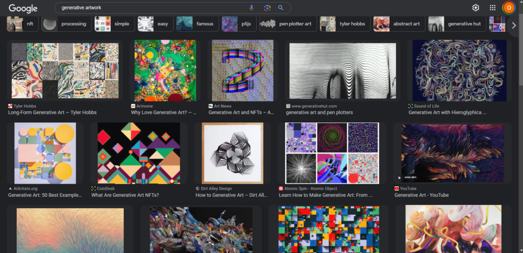
I was looking up examples of generative art to find something to be inspired by. However, I found that most generative artworks are too messy/noisy for my liking. Personally I like simpler, more calming structures than the ones seen in the picture below so I took another approach — to design something that’s relaxing to look at, instead of being chaotic.

I’ve been listening to a lot Umitaro Abe, a Japanese composer that mostly has instrumental pieces. They’re very relaxing to listen to, so I thought that I might try making a p5 work that can hold that atmosphere of peace while being entertaining enough to capture a viewer’s attention.

The sketch


The sketch is pretty much a koi pond, and the fishes will move around and leave behind temporary ripples in the water. The wave ripples remind us that most disturbances are temporary, and can sometimes even be pretty to look at. I think it’s very fun to look at while listening to some piano pieces, so the version on the p5 editor plays a song from Umitaro Abe to accompany this piece.

Proudest part

My proudest part for this project was not the code, but simply getting the sprites for the fishes to make the little animation. I couldn’t find sprites that I wanted online, but I managed to find static images of koi fishes that matches the style I wanted. I used Photoshop to edit the fishes tails to give each fish two frames of animation, but it surprisingly took more time than it should because I didn’t have much experience with creating animated sprites myself, only with using them.

Reflections

I’m proud of this one! Code could always be cleaner but I’m pretty satisfied with this piece. I might add more fish variations in the future, or maybe create a better motion path for the fishes like a curved zig-zag instead of a straight line as it is right now.

Week 3 – Reading Response

Reading “The Art of Interactivity” by Chris Crawford has definitely reshaped my understanding of interactivity. I would have initially defined interactivity as when you get to do things like click, tap, or choose, and your device responds to what you do. Crawford, however, defined this concept in a much simpler and easier way. I particularly liked how he differentiated the interactivity from the reaction and participation. Nonetheless, one particular aspect of the first chapter of the book left me wondering. Crawford briefly touched upon the misconception of dividing the design process into two distinct phases: graphic design and the interactivity step. Even though he have discussed this in the later chapter of the book, I have came up with my ideas of why the potential challenges this division can pose.

One immediate concern is the possibility of losing sight of the user experience. Design should always prioritize meeting the users’ needs and preferences. If we plunge headfirst into graphic design without considering how users will interact with our creations, we might end up with aesthetically pleasing but impractical designs, inevitably leading to user frustration. I believe that such an approach could yield inconsistencies and reduced usability, primarily due to the disconnect between graphic design and interactivity. As an aspiring designer or software developer, I understood the importance of integrating the design process with interactivity, ensuring that the two are both important for maximum effectiveness and efficiency. By doing so, the creation would not be just visually appealing interfaces but also include interactions that are intuitive and user-centric, resulting in a more harmonious and engaging user experience.

Week 3 – Aurora!

For this weeks assignment, I decided to try to recreate one of nature’s most awe-inspiring phenomena thats probably on everyone’s bucket list – the Aurora , or the Northern Lights!

Concept

I’ve been manifesting to go see this celestial marvel since forever and trying to work on this assignment has added to that. For the assignment, I used Object Oriented Programming and arrays at the very core of it, supported by a few functions. Since this wasn’t my first time using OOP and arrays, I was more curious to explore generative art and looked up for inspiration online. The most common ones I came across were using the Perlin noise. I found it a little tricky to follow this initially, using just the p5.js reference available but after looking at a lot of artworks, the essence was clear – this helps with creating harmonic and natural motion which was perfect for the northern lights.

This program has two classes – the aurora class and the star class. The Star class is a very basic one that just draws stars randomly on the canvas and a function to display. The aurora class has an update and a display function however, trying out the noise had a lot of experimentation involved. I made multiple tweaks, iterations and changes in constants till I was satisfied. While I’m not fully satisfied with how this looks (only because it doesn’t do justice to the real one), here’s my final sketch

Clicking on it adds more Auroras

The parts of the Code I like
I’ve used arrays in almost all places right from storing the northern lights color palette, to the positioning and Y – offset values for each point on the aurora. A particular part of code that I like includes both the update() and display() of the aurora class. It is the part of the artwork that makes it generative with the noise() and adds the required randomness and smoothness to each wave and creates it by calculating each x & y coordinate and joining it together using the beginShape(), endShape() function.

  update() {
    this.yOffsets = [];
    for (let x = 0; x < width; x++) {
      //noise value based on x position, frame count, and yOffset
      let noiseVal = noise(x * 0.002, frameCount * 0.005, this.yOffset * 0.01);
      //add the y offset position for the particular point in the offsets array
      let yoffset = map(noiseVal, 0, 1, -height * 0.124, height * 0.5);
      this.yOffsets.push(yoffset);
    }
  }

  display() {
    stroke(this.col.r, this.col.g, this.col.b);
    strokeWeight(3); 
    beginShape();
    for (let x = 0; x < width; x++) {
      //get x and y coordinates to join points and form the aurora
      let baseY = this.yOffset;
      let y = baseY + this.yOffsets[x];
      vertex(x, y);
    }
    endShape();
  }
}

More than all of this, the one line that I think is magical is this one.

function draw() {
  //trailing effect
  background(20, 24, 82,20);

The fourth parameter in the background function adds the fading and trailing effect in the art that makes the northern lights seem flow-y and smooth.

Reflections and future improvements

While I loved the assignment and didn’t find object oriented program as challenging, I did struggle with the concept of Perlin noise as well as how to start approaching the code once an idea is decided. Even small differences from 0.01 to 0.02 in parameters were making massive differences in the art which I could only figure out by trial and error. I want to try exploring this concept a little more to well understand how to approach these minute details and make this sketch more realistic.

References

https://p5js.org/reference/#/p5/noisehttps://techty.hatenablog.com/entry/2019/05/27/151415https://genekogan.com/code/p5js-perlin-noise/

Week 4- Creative Reading

Chapter 1 of “The Design of Everyday Things” by Donald A. Norman introduces a comprehensive perspective on design as a field that encompasses a wide array of artificial creations, including clothing, furniture, and bridges. Norman’s unique approach, particularly remarkable in the 1980s, melds three major design domains that were typically considered distinct at the time. These domains are industrial design, emphasizing the optimization of function, appearance, and value for users and manufacturers; interaction design, drawing on psychology, art, and emotion to understand how humans interact with technology; and experience design, which places a strong focus on enhancing user enjoyment.

Within this context, Norman argues that good design should be human-centered, emphasizing the crucial roles of discoverability and understanding in the usability of everyday objects. He also highlights the importance of effective communication between machines and users, emphasizing the need for products to not only perform well but also be easily interpretable. Norman’s call for designers to pay attention to situations when things go wrong underscores the significance of user satisfaction. In essence, Chapter 1 sets the tone for the book by advocating for design principles that prioritize user needs, usability, and satisfaction while integrating various design disciplines, making it a seminal work in the field of design.

Week 4- Data visualisation code

Concept

The concept for this data visualization assignment is to create a compelling and informative visualization that helps users gain insights into the global impact of coronavirus-related deaths. I used the “Coronavirus Lat/Lon Dataset” sourced from Kaggle, which provides daily data on deaths, recoveries, and confirmed cases from around the world.

Challenges I faced:

The initial challenge I encountered was finding a suitable dataset to work with. I needed a dataset that not only contained coronavirus-related data but also included longitude and latitude information for different regions or countries. Locating a dataset that met these specific criteria was a time-consuming task.

A highlight of some code that you’re particularly
proud of:

let pointX=map(longitude[x],-200,200,0,width);
   let pointY=map(latitude[x],-200,200,0,height);
   point(pointX,pointY,death_day[x]);

I am particularly proud of the code snippet where I use the map() function to transform longitude and latitude coordinates into screen coordinates. This part of my project stands out because it demonstrates my ability to convert real-world geographical data into a visually appealing representation on the canvas

Embedded sketch:

ASSIGNMENT 4: “The Design of Everyday Things”

Don Norman’s book “The Design of Everyday Things” explores some of the characteristics of good design in chapter 1, focusing on the importance of discoverability and understandability.


 When defining discoverability and understandability, Norman poses the following questions: “Is it possible to even figure out what actions are possible and where and how to perform them?…What does it all mean? How is the product supposed to be used? What do all the different controls and settings mean?”. 


Design impacts everything we do, from electronic devices to organizational systems of businesses. Norman believes that good design places importance on the interaction between people and the technology being used. When designs are not human-centered and rely too heavily on accuracy and pure logic, things tend to go awry. 


 Norman writes “It is the machine and design that are at fault. It is the duty of machines and those who design them to understand people. It is not our duty to understand the arbitrary, meaningless dictates of machines.”. I couldn’t agree more with this sentiment. If engineers and those capable of creating these machines are the only ones who understand how to use these machines then what exactly is the point of creating these products? This surely cannot be classified as universally “good” design.


 In fact, I would classify this as a more niche or exclusive design, since it leaves out a large demographic of the population. According to Norman’s writing, great design must be simple, straightforward, and allow for some nuance. Whether it’s nuance in the type of person using the product or nuance in how the product is designed.

Reading Reflection – Week 3

The Art of Interactive Design offered me deep insights into the world of interactivity. Before reading this text, I had never stopped to think about the definition of interactivity or the steps necessary to consider something interactive, even though it is a core idea of computing. Nonetheless, I have found that the text managed to put into words almost all of my beliefs on the topic, and even the aspects that I do not agree with ended up intriguing me. For instance, the author argues that movies are not interactive because they fail to utilize two principles of interactivity: thinking and listening. He goes even further by saying that we should “appreciate them for what they are good at instead of press-ganging them into something they’re terrible at”. I found this passage to be interesting because nowadays we do have interactive movies, one example is “Black Mirror: Bandersnatch”, which gives the option for the viewer to change the story depending on their choices. To me, it is amusing to come across an example of an outdated perspective and compare it with the forms of media that we have nowadays. Moreover, even though interactive movies did not exist back when the book was written, I still found his previously mentioned statement to be quite harsh. For someone who argues so much in favor of innovation, I did not expect him to reject the possibility of interactive movies in the future so easily. Sure, interactive movies are not that popular, but they are still appreciated for how entertaining and creative they are.

On a different note, I completely agree with his definition of interactivity, and I found his idea of a degree to be extremely useful. As he argued, the definition of interactivity is quite subjective. The lights of a refrigerator that turn on and off when a door is opened and closed are not interactive with adults, but they could be with children. In that case, how would we define whether refrigerators are interactive or not? With the interactivity scale, we can argue that they are indeed interactive, although lowly, because they barely interact with the user. Following that notion and the three principles of interactivity given by him (listening, thinking, speaking), I would like to give my own damn definition of interactivity. To me, one definition of interactivity could be: “A form of medium that connects two or more agents through active listening, thinking, and speaking”. The same idea, but written more clearly to me. Still, I deeply admire and respect the author’s arguments on such a modern concept.

The Impact of the Negatives

Concept:

My project, originally named ‘The Raining Texts’, has grown beyond its initial idea. In this artwork, you’ll see blue words, which represent positivity, falling quickly down the screen. They come and go swiftly. On the other hand, red words, representing negativity, descend slowly and stay on the screen. Think of the screen as our minds. The words mirror what people say about us. Positive words are like passing clouds, they come and go. Negative words, however, linger. They stick with us, becoming a burden. Even though this project isn’t grand, it carries a strong message. It shows how negative words can stay with us, while positive ones quickly fade. This idea came from a YouTube video where people talked about their best and worst memories. Surprisingly, they remembered the worst ones very clearly, while good memories seemed to fade away. This shows how much negativity can affect us. That’s what I’ve tried to capture in this simple artwork.


Link:https://editor.p5js.org/Nasar/sketches/Nv_4YVOUy

 Code Highlight:

 //Split the strings in CSV Filles and store into words/words2 array
  words = split(PositiveWords[int (random(PositiveWords.length))], ',');
  words2 = split(NegativeWords[int (random(NegativeWords.length))], ',');
  
  //initialize for loops that keep storing and creating letter objects and store words1/words2 arrays into their constructor
  for (let i = 0; i < words.length; i++) {
    let randomWord = random(words);
    letters.push(new Letter(randomWord));
  }
  for (let i = 0; i < words2.length; i++) {
    let randomWord2 = random(words2);
    letters2.push(new Letter(randomWord2));
  }
}

I found this section of the code particularly challenging. At first, it wasn’t accepting a string input. Then, even when it did, the letters class wasn’t cooperating. It took me a while, but I eventually managed to work it out. It was a bit frustrating, but I got there in the end.

Reflections/comments:

Though the code may appear simple, it actually took me quite a while to set up. It involves several different concepts we’ve learned, from arrays and classes to functions, as well as working with CSV files and incorporating their data into the letter class. The process was lengthy, even though the final outcome may not seem that way. I’ve gained a solid grasp of both new and previously learned concepts, clearing up any lingering doubts I had. Initially, I had envisioned the negative words stacking up at the bottom of the canvas, forming a tower. I spent hours scouring social media and experimenting, but eventually, I had to concede and opted for the letters flowing down, repositioning slightly upward, and then repeating in a loop. All in all, I’m quite proud of the effort I’ve invested in this project.