The world we live in is designed. We interact with many things in our day-to-day life, from doors to mugs, to the screen you’re reading this off of right now.
Great design is something that often blends in with our lives so well that we don’t realize how well these things are designed. Take an ordinary pair of scissors for example. When you pick one up, you know where your fingers have to go. When you open and close the scissors, you have an intuition about its purpose. How is this information communicated to us? Do we all have an innate understanding of what a scissor is?
The answer lies in great design. In chapter 1 of “The Design of Everyday Things”, Don Norman highlights some concepts that come together to explain what makes a design great. These include affordances, which are the types of relations between two entities that are possible. Paper affords cutting for a pair of scissors, but for the same scissors a chunk of metal does not afford cutting. Another concept that is important is that of signifiers. These are indicators that signify where an action is supposed to take place.
Lastly, feedback is another aspect of design that—if implemented correctly—can help a person understand how to use something. There are two examples of machines with feedback, one good and one bad, that I use in my daily life. One is an electronic toothbrush that beeps violently when I apply too much pressure. I didn’t have to use any manuals to understand what it was telling me. Whenever I brushed too hard, it beeps to let me know that I’m being a bit harsh. On the other hand, I have an espresso machine that has three buttons: two for espresso and one for steaming milk. The milk-steaming button has been blinking orange for a while. I didn’t notice it until a friend who owns the same machine saw it and told me that the machine needs descaling. How would I have known that? The toothbrush is an example of good design, where the feedback is conveyed without needing a manual. On the other hand, my espresso machine has a poorer feedback design.
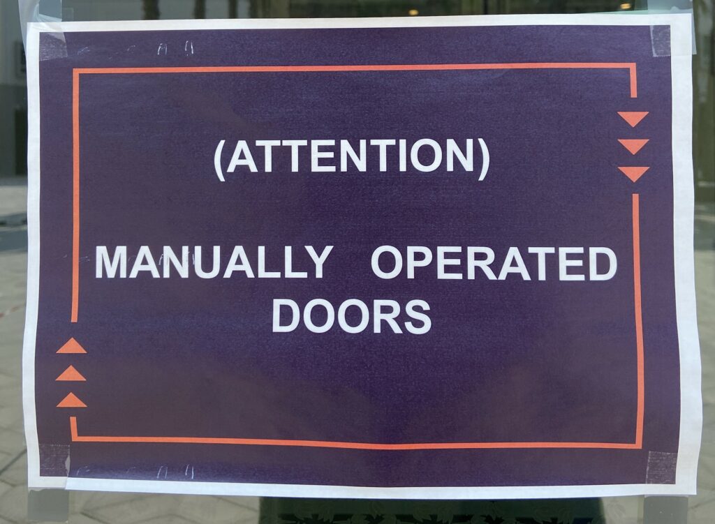
After reading this chapter, I instantly thought of the doors that we have installed on campus. The automatic doors that should open when a sensor detects a person, and they usually do. Except when they stop working:
Which happens more often than it should. But that’s fine, machines break. After seeing these signs so often, I’ve made it a habit of using every door manually. You would expect that to work all the time, but something weird happens with the automatic doors that we have on campus. When I push on a “functional” automatic door, it decides to resist. It will not move until I stop pushing, even if it was perfectly keen on doing so before. What does this feedback even mean? Is the door saying that I should let it do its job?

Then why are the handles and push bars there? They handles are affordances—they allow me to pull on the door, and also signifiers as they tell me where to pull on. Yet when I listen to the design, I am misled; I am met with resistance that leaves me confused. Why call to me to be pulled and then push against me as if telling me that I never should have pulled. It is deception. Bad design is deception.

