TO PLAY THE GAME CLICK HERE!
If you are a professor and you want to see the code click here!
GAME CONCEPT
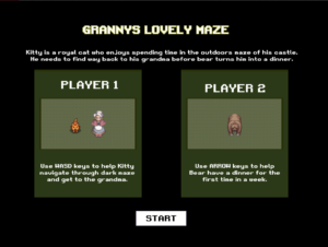
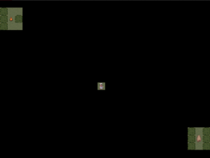
Grannys Lovely Maze is a 2-player maze chase game. Kitty (PLAYER 1) is a royal cat who enjoys spending time in the outdoor maze of his castle. He needs to find a way back to his grandma before the Bear (PLAYER 2) turns him into a dinner. The maze is set in the nighttime, meaning that neither the Kitty nor the Bear can see the full maze. Each player is spotlighted to only see the closest surrounding. This feature is the distinguishing point of this game, which adds some uniqueness as well as makes the game more challenging.
The game itself consists of 3 maps. If one of the players scores 2 consecutive wins, while the other player scores 0, the third map is not played and the game ends. Scores are not displayed during the game because I feel like with how short the game is there is no real need for a visual element on the screen that could potentially distract the players from the game.
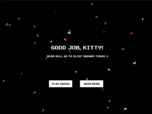
Below are the screenshots from each of the screens.
IMPLEMENTATION
My project consists of three screens: start (instructions), game, and end. In designing each screen I have tried to be consistent with the sizes, shapes, and colors that I use. The overall visual concept can be probably described as an 8-bit pixel-style arcade. This is a style that I adore and used previously in personal and class projects. I have done some images myself (ground and bushes textures in the maze) as I couldn’t find what I was looking for online. I have sourced the sprites, the music, and the font to match online.
To create some order and organization, I have created 5 classes: Game (connects every class and controls the game logic), Cell (map display), Player (players display), Door (granny display), and Confetti (confetti display). I have used the gameState variable inspired by professor Mang’s example to switch between game screens. There is also a separate file that stores three available maps as arrays.
To create the spotlight effect and display only a part of the maze surrounding the players I have created a function inside of the Player class that uses an if statement to check if the cells around the player position are within the boundaries of the spotlight. I am no mathematician so I didn’t figure out how to make so that the spotlight round instead of boxy. However, I feel like it fits the pixel aesthetics of the game and doesn’t take away from the experience.
inSpot(other) {
    if (
      other.x < this.x * cellWidth + this.spotlight * cellWidth &&
      other.x > this.x * cellWidth - this.spotlight * cellWidth &&
      other.y > this.y * cellWidth - this.spotlight * cellWidth &&
      other.y < this.y * cellWidth + this.spotlight * cellWidth
    ) {
      return true;
    }
    return false;
  }
To add some aspect of celebration to the end screen and make it less plain I have added the Confetti class. It creates a list with randomly colored rectangles that both rotate and move vertically at random speeds. If the position of a rectangle is beyond the height of the screen, the rectangle is deleted from the list using the splice function. I am proud of this little feature. I think it adds some character and adds to the experience.
class Confetti {
  constructor() {
    this.x = random(width);
    this.y = -10;
    this.diameter = random(10, 20);
    this.color = color(random(255), random(255), random(255));
    this.speed = random(1, 5);
    this.rotation = 0;
    this.rotationSpeed = random(-0.05, 0.05);
  }

  update() {
    this.y += this.speed;
    this.rotation += this.rotationSpeed;
  }

  display() {
    push();
    translate(this.x, this.y);
    rotate(this.rotation);
    rectMode(CENTER);
    noStroke();
    fill(this.color);
    rect(0, 0, this.diameter, this.diameter/2);
    pop();
  }

  isOffScreen() {
    return this.y > height + this.diameter;
  }
}
Another part of the implementation I like is the display of the granny (exit point). I found a beautiful spritesheet online. To make her more dynamic, she is looking around before Kitty reaches her. She inherits her spotlight function from the Player class.
class Door extends Player {
  constructor(i, j, type) {
    super(i, j, type);
    this.spotlight = 3;
  }

  // MAKE THE SPRITE CHANGE EVERY SECOND
  update() {
    if (frameCount % 60 == 0) {
      this.sprite++;
      this.sprite %= 6;
    }
  }
  // DISPLAY
  draw() {
    this.update();
    image(
      oldladyImg,
      this.x * cellWidth,
      this.y * cellWidth,
      cellWidth,
      cellWidth,
      40 * this.sprite,
      0,
      40,
      54
    );
  }
}
CHALLENGES
In the implementation of my project, I have run into some problems, most of which were resolved. Main problems that I have tackled include:
-
-
-
- Maze Building – initially I planned to implement an algorithm that would build random solvable mazes. I did have an algorithm, however, I then realized that I wouldn’t be able to correctly assign player and maze exit positions. In such a way that players can each reach one another and exit using multiple ways, and player 1 is as close to the exit as player 2 is close to player 1 (to make it equally possible for players to win in each round). A solution I found was building the maze from pre-existing maps. As a full maze is not shown to the players anyways, there is not as much need in generating new maze maps each time players want to play the game as they will have a harder time memorizing the map that they can’t fully see. I used the algorithm to show me possible map designs, which I slightly modified to increase the number of possible passages to the exit. For each of the maps, I store a list of starting positions for each player and the exit point.
- Button Font – I use a custom font loaded as a file for my game. Initially, I loaded it and declared it as a variable in the javascript file. I used
textFont("retroGaming");the setup function to set the font of the body to the custom font, however, it didn’t work for the buttons. I have tried usingbutton.style("font-family","retroGaming");but it didn’t work either. After lots of thinking and searching, I realized that I can set button properties and load font in CSS, which was the solution to my problem. - Players Display – the sprites, though proportional to each other and their surroundings looked tiny in the 47*37 maze. I have recognized that this is an issue only at the very end of developing my project as I left sprite sheets for the very last. Changing canvas size didn’t make the players more visible and also made other screens look disproportionate, so I decided to find another solution, which was decreasing the size of the maze. I believe that this has made the maze less complicated to go through, which I am not happy about. On the other hand, with bigger-sized maps I didn’t use the entirety of the map useful for going through a level, meaning that usually a corner or 2 would be left untouched. If I had a chance to redo this project, I’d try making it so that the size of the map that each player sees is scaled up, so they don’t actually know if they are close to each other or to the exit until there are very few cells left between them and the two viewports merge. I think it would make the game more exciting but at the moment I have no idea how I would implement that.
-
-


