
Overview
In this technologically and scientifically advanced era, there is no shortage of data of any sort, for most cases. For this production assignment, I used a online available database of the world’s cities and towns. It has been built from the ground up using authoritative sources such as the NGIA, US Geological Survey, US Census Bureau, and NASA. (https://simplemaps.com/data/world-cities)
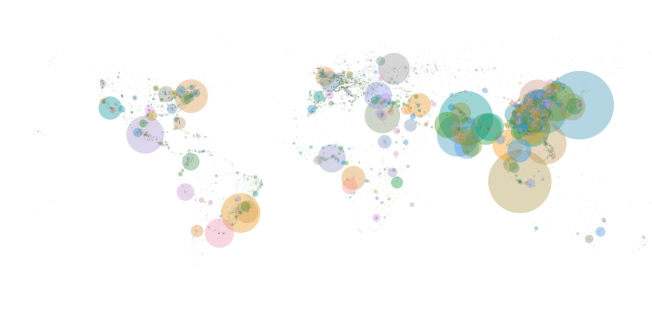
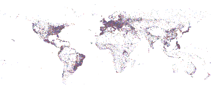
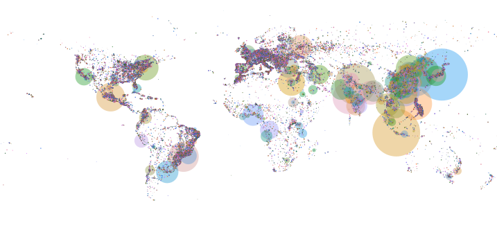
Using the information mentioned in the database about 41001 cities, I created a world map on Processing. It creates two maps: based on total population size and one solely based on location. Initially, when it loads, the user might be able to only understand it as a random placement of randomly sized circles that are a bit wobbly but when the mouse pressed the other map that marks the location of all 41001 cities, an evident world map forms.
Here’s a quick video overview
Production
Initially, I had no clue what sort of data visualization project I want to create. While randomly browsing large datasets available online, I came across this database and thought of using it to create the world map. I used the latitude and longitude values of a city to manipulate their position on the canvas in terms of y and x respectively.
For a long while, I stared at my blank screen wondering what went wrong when only a few locations would appear. It took me a lot of trial and error and maths and geography of course to understand the mapping of longitude and latitude values to cartesian values. After identifying a pattern, I formed pretty simple mathematical equations for this, and there you go, the world map appears.
To add more clarity and interactivity, I allowed the user to hold the mouse and see the whole world map. For this implementation, I created two arrays for city circle objects. Each city circle object has a Pvector to store its x and y values, its randomly decided color and transparency, and its size. The only difference in both arrays is the size of the circles. The first array that displays on canvas has size-dependent on population size (total population / 700000) and the other one has a fixed size of 1px to allow for visibility of all. The wobbly movement is achieved by using random() on the size of the circle. Additionally, the user can see both maps together by pressing the SHIFT key.
Heres the code
//global variables
CityCircle[] cities;
CityCircle[] all;
Table world_cities;
boolean together = false;


void setup(){
  size(720,360);
  frameRate(10);
  noStroke();
  loadData();
}

void draw(){
  background(255);
  for(int i=0; i<cities.length; i++){
    cities[i].display();
  }

  //appear entire world map on mouse press
  if (mousePressed){
    background(255);
    for(int i=0; i<cities.length; i++){
      all[i].display();
    }
  }

  //appear together
  if (together==true){
    for(int i=0; i<cities.length; i++){
      all[i].display();
    }
  }

  if (keyPressed && keyCode==SHIFT){
    together = true;
  }


}

void loadData(){
  //loading csv file and skipping header
  world_cities = loadTable("worldcities.csv", "header");

  //initializing the arrays
  cities = new CityCircle[world_cities.getRowCount()];
  all = new CityCircle[world_cities.getRowCount()];

  //intialize values of each city object
  for (int i = 0; i < world_cities.getRowCount(); i++) {
    TableRow row = world_cities.getRow(i);

    //Acessing the fields via their column name
    String n = row.getString("city");
    float y = row.getFloat("lat");
    float x = row.getFloat("lng");
    float s = row.getFloat("population");

    // Make a Circle object out of the data read
    PVector p = new PVector(360 + x*2,180-y*2);
    //colour for first array
    color c = color(random(255),150,random(255),100);
    cities[i] = new CityCircle(p,n,s/500000,c);
    //color for second array
    color c2= color(random(255),100,random(255),200);
    all[i] = new CityCircle(p,n,1,c2);
  }

}

//Object class
class CityCircle{
  PVector position;
  String name;
  float size;
  color colour;

  CityCircle(PVector p, String n, float s, color c){
    position = p;
    name = n;
    size = s;
    colour = c;
  }

  void display(){
    fill(colour);
    circle(position.x,position.y,random(size-.75,size+.75));
  }

}
Nice job getting these coordinates mapped on the screen! Great to have the two maps too. I wonder if the random movement is necessary? If you want movement what can it add symbolically or informationally? Is there a particular reason to have it? What kind of movement would be appropriate for what you’re trying to communicate?
Thank you for the comments. The movement is mainly added as a design element in the second map and in first one to symbolize how the population values fluctuate sort of proportional to each other (new deaths and births). Giving a real time information perception. That was the idea, I think should have added other elements to support the concept. I hope that clarifies.