Week 2: Hue and Eye (Loop-y Art)

I swear, this title was my friend’s idea. I was going to go with “A R-eye-ot of Colours”. Which in hindsight (*sigh*), isn’t that much better.

This week, we were supposed to take inspiration from some old computer graphics magazines and make use of loops. I decided on this page:

Expectations

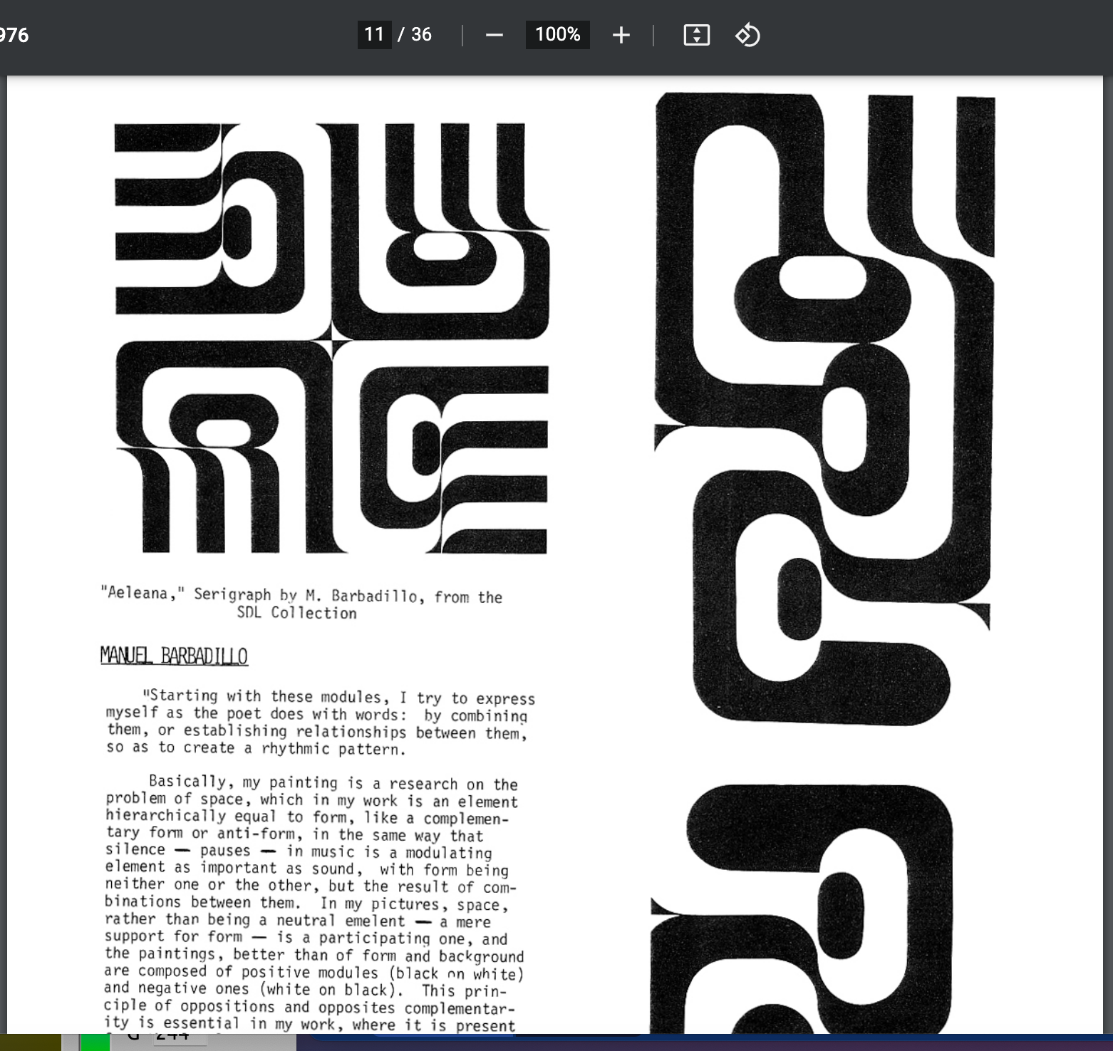
I liked the funky graphics vibe it gave. But once I started trying to recreate it, I ran into some problems. Namely, it was hard to make a loop for all 4 quadrants and use translate() while also rotating the design each time. Eventually, I ended up experimenting with shapes which would only require a vertical-horizontal shift.

I have used the ternary operator in this program. So much. And translate() in the Processing library saved me when I thought making quadrants wouldn’t be possible, and so did pushMatrix() and popMatrix() which had been mentioned in class by name. But after fooling around and using loops in multiple places, I had a design which seemed vaguely decent to my eyes (*siiiigh*).

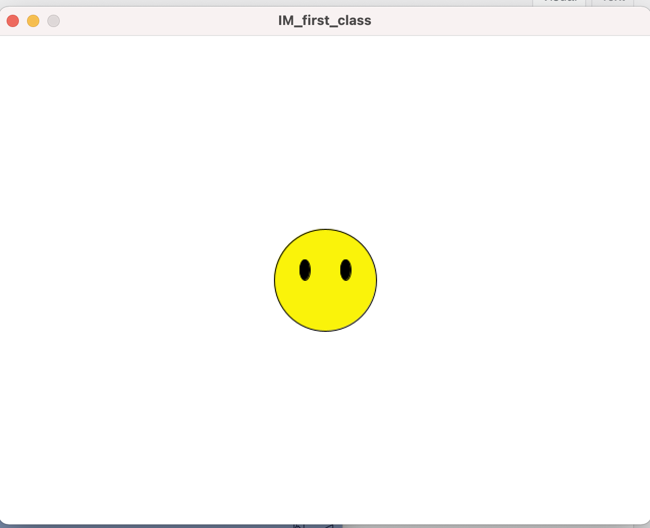
If you do a very deep interpretation of my reference art, it could look like eyes with eyelashes drawn in block style. I tried.

I’m watching you, Intro to IM website. Always watching.

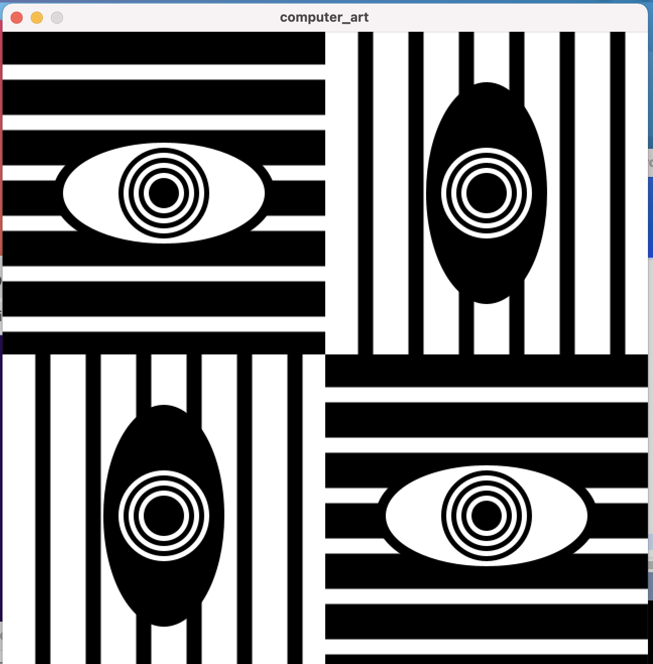
Now you know where all the eye puns are coming from. These had initially been without the black borders, and I thought I should try to make it more artistic and add accents. So I added the borders by making one more ellipse underneath the original ones, and trying out random colours. I decided the “pupil” of the eye also looked better with the same colour filled in.

Trying different colours for the aesthetic.

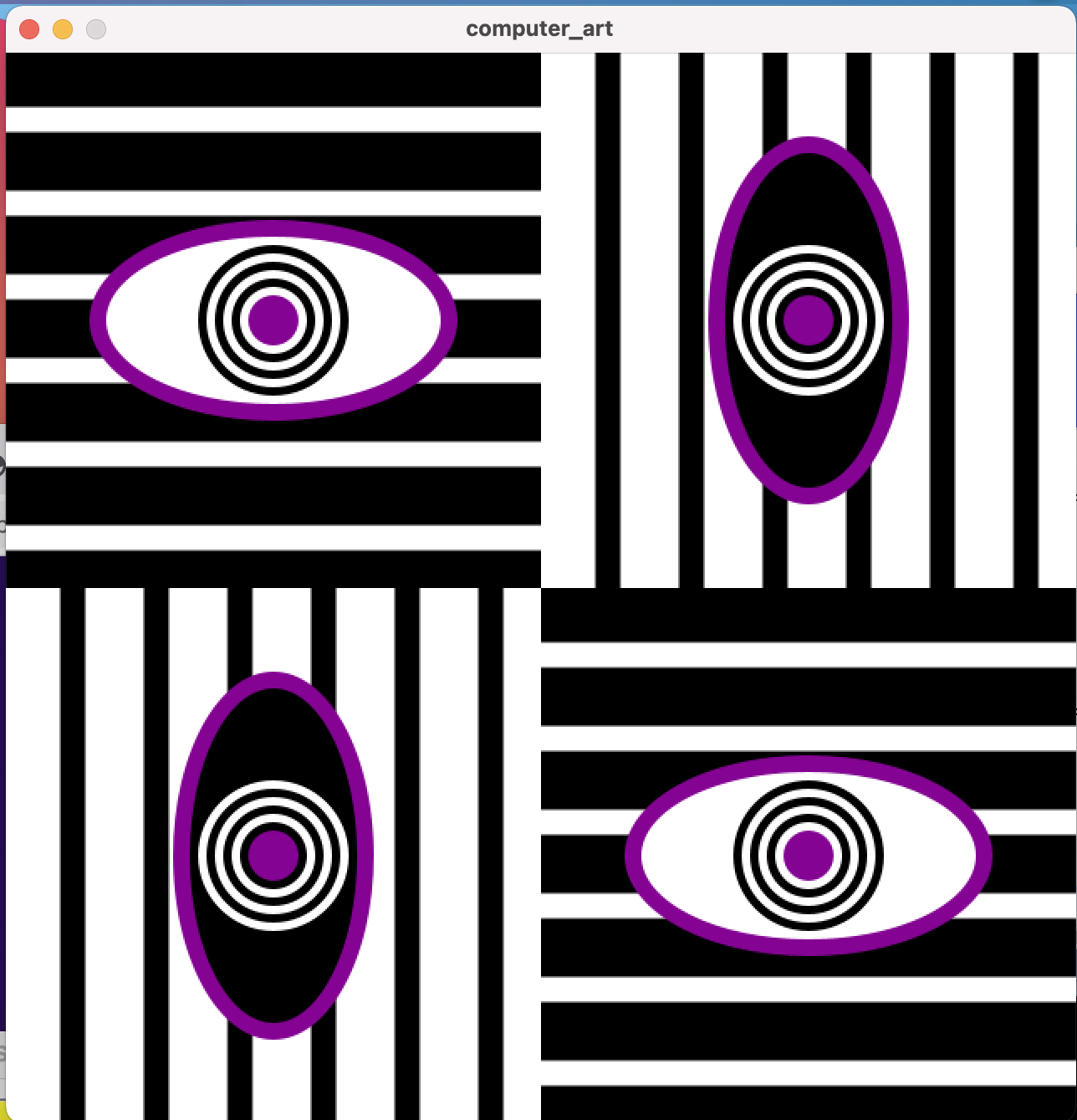
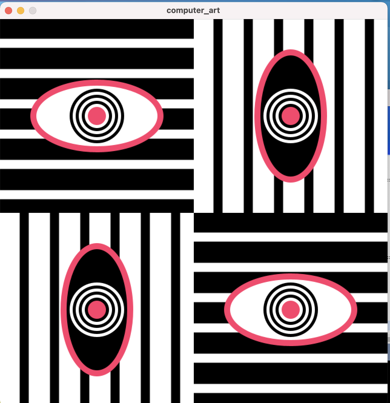
I had previously also experimented with keeping all the ellipses horizontal, but decided that this one was truer to the original and had more flare. However, I couldn’t decide on one colour to use for the final version. This indecisiveness gave rise to a better idea though: I could just add a lot of colours and program it to change on every mouse click. We had done everything required for this in class, and from my previous knowledge of Java I decided to use switch case to make my work easier. So, I decided that I would try to recreate a VIBGYOR palette, but with more colours of the spectrum. I used a counter variable to count the number of mouse clicks, and by using the % operator I made sure the colours would be in the same order each time.

This is what the final code looked like:

color col = color(0);
int ctr = 0;
int squareWidth = 320;

void setup(){
  size(640, 640);
  rectMode(CENTER);
}

void draw(){  
  background(255);
  
  //repeating the processes in each counter
  for(int i=0; i<4; i++)
  {
    //base colours (black/white)
    fill(i==0 || i==3? 0: 255);   
    rect(i%2==0? squareWidth/2: squareWidth+squareWidth/2, i<2? squareWidth/2: squareWidth+squareWidth/2, squareWidth, squareWidth);
    
    pushMatrix();
    
    translate(i%2==0? 0: squareWidth, i<2? 0: squareWidth); //to shift to the next quadrant
    fill(i==0 || i==3? 255: 0);
    noStroke();
    for(int j=0; j<6; j++)
    {
      if(i==0 || i==3)
        rect(squareWidth/2, 40+50*j, squareWidth, 15);
      else
        rect(40+50*j, squareWidth/2, 15, squareWidth);
    }
    
    fill(col); //for the coloured boundaries
    ellipse(squareWidth/2, squareWidth/2, i==0 || i==3? 220: 120, i==0 || i==3? 120: 220);
    
    color prev = color(i==0 || i==3? 255: 0);
    fill(prev);
    ellipse(squareWidth/2, squareWidth/2, i==0 || i==3? 200: 100, i==0 || i==3? 100: 200);
    
    for(int j = 0; j<7; j++)
    {
      if(j==6) //because we want the innermost circle to be coloured
        fill(col);
      else
        fill(prev==color(255)?0:255);
      circle(squareWidth/2, squareWidth/2, 90-j*10);
      if(prev==color(255))
        prev = color(0);
      else
        prev = color(255);
    }
    popMatrix(); //this ensures that the next translation will start from scratch   
  }
}

void mousePressed(){
  
  int num = ctr%10; //depending on number of colours we have
  switch(num) //order of the colours
  {
    case 0: col = color(0);
            break;
    case 1: col = color(132, 3, 147);
            break;
    case 2: col = color(114, 91, 250);
            break;
    case 3: col = color(91, 201, 250);
            break;
    case 4: col = color(59, 234, 198);
            break;
    case 5: col = color(202, 234, 59);
            break;
    case 6: col = color(250, 244, 63);//(250, 250, 149); a previous shade for keepsake
            break;
    case 7: col = color(252, 154, 74);
            break;
    case 8: col = color(237, 77, 109);
            break;
    case 9: col = color(227, 48, 51);
            break;
  }
  ctr++;  
}

Now you’re going to see why the colour puns are there. I am actually quite surprised by the pulsing effect the colours seem to have and how they transition smoothly into each other, it is quite pleasing to the eye (hue hue hue?).

Although I am quite happy with this result, I realised after seeing other posts that I could have used frameCount to make this a continuous animation too. But this was made for indecisive people like me, so that we can stop on whichever colour we like best. And I think it serves that purpose well.

On this note, I don’t think I have much more to add here. I know I promised I would try to be less loopy in these posts, but oh well. Now you see me, now you don’t.

B-eye! 🙂

Week 1: Vicka Through the Looking Class (Self-Portrait)

No, that is not a typo. Yes, I used a nickname so that my name would have the same number of syllables as ‘Alice’ and this is a pun on Through the Looking Glass, which really would have worked better if there had actually been any classes involved in this assignment but please, cut me (and my long sentences) some slack (Slack, hehe). It’s hard to think of any new puns after the first idea gets stuck in your head, as terrible as it might be.

This week’s assignment was to make a self-portrait using Processing’s basic shape tools and other functions. Being a little bit familiar with Processing, I had thought that this could be done fairly quickly– boy was I wrong. It took me two long sessions to get everything looking a way I was satisfied with. I had underestimated my ability to keep changing things infinitesimally to see what was better, and I had not realised the depth of Processing’s library, never really having worked much with it before.

I was blessed with a lot of tools to make my work easier – for example, I discovered that the rect() function allows you to add angle parameters at the end if you want curved corners. So instead of making a normal rectangle and then an arc below it for the neck, I simply made it a rectangle with very rounded corners, and it helped give my hair shape too (but you can barely see it because it’s hidden behind the shirt). The point() function was perfect for drawing my birthmarks, and the alpha parameter for changing opacity which we discussed in class helped me make my glass lenses look like, well, glass.

When we had been asked to attempt to draw a face in class, I had been making an emoji smiley but had been stumped when it came to the smile. That’s when Professor (I’m sorry, it’s hard to unlearn years of cultural traditions in a week) had talked about the arc() function, and it took me some time to wrap my head around it but I was finally able to figure out how to work it and start incorporating it in my code. This is also a good time to mention that I have copied a lot of variable names and some code verbatim from the face example we had discussed in class, it helped a lot.

Emoji guy without a smile

But, now that I had learnt how a lot of functions worked through trial and error, it was time to start making a resemblance of my face. I had been going through a lot of random past students’ blogs from the first day out of excitement for this course, so I had some sort of idea of which features I would like to draw which way: for example I knew I would like to use triangles for my eyebrows instead of arches and an ellipse for my face. But because of these mental images, I never really ended up drawing any physical sketch so the end result was sort of a surprise to me too.

Something I hadn’t seen anyone draw was straight, long hair and I spent a lot of time trying to get it right. Since I usually end up wearing it in a middle-partition, the symmetry part was easy but it required a lot of adjustments and a combination of the rounded rectangle, two quadrilaterals and a circle which rather looks like a halo in the sketch. My face had been looking rather, to put it mildly, pensive, so I knew I had to make a smile somehow, but just drawing an arc didn’t fit in with the level of “realism” I had for the rest of my sketch. I was going to go through a long process of drawing arcs on the top and bottom, but then I realised that an ellipse with a line through it should do the trick too. I had almost given up on drawing my glasses because the eyes section was looking too crowded, but then I thought that I really can’t lie to myself and the world about this, I need those glasses. So I ended up adjusting the eye spacing and going through with them, and I’m glad I did.

My not-so-godly sketch

It was still a bit messy, but it had to do. Then I chose one of my favourite shades of aqua for the background and a shade of violet for the top because I’d like to think I’m wearing some NYU merch here, and after using varying strokeWeights for my “hipster” glasses I was done. This is the final code with some of the small details written in comments:

int faceHeight = 265;
int faceWidth = 175;
int eyeSpacing = 37;
int eyeWidth = 40;
int eyeHeight = 20;
int eyeOffset = 37;
int noseOffset = 30;
int noseHeight = 25;
int noseWidth = 20;
float earSpacing = 90.5;
int earHeight = 60;
int earWidth = 20;
int mouthOffset = 65;
int x, y;

void setup(){
  size(640, 480);
  x = width/2;
  y = height/2;
}

void draw(){
  background(148, 243, 252);
  
  //hair length
  fill(0);
  rectMode(CENTER);
  rect(x, y+noseHeight+40, 220, 350, 80);
  circle(x, y-eyeOffset, 220);
  
  //ears and earrings
  fill(245, 182, 133);
  ellipse(x-earSpacing, y-eyeOffset+25, earWidth, earHeight);
  ellipse(x+earSpacing, y-eyeOffset+25, earWidth, earHeight);
  fill(227, 238, 240);
  circle(x-earSpacing-2, y+5, 5);
  circle(x+earSpacing+2, y+5, 5);
  
  //t-shirt
  fill(71, 1, 147);
  ellipse(x, y*2+15, 300, 175);
  
  //neck
  fill(245, 182, 133);
  rectMode(CORNER);
  rect(x-noseWidth-15, y, noseWidth*2+30, 200, 0, 0, 70, 70);
  
  //head
  ellipse(x, y, faceWidth, faceHeight);
  strokeWeight(3); //for the moles to be visible
  point(x-noseWidth-5, y+15);
  point(x-50, y+40);
  strokeWeight(1);
 
  //hair parting
  fill(0);
  quad(x-1, y-faceHeight/2-16, x-1, y-faceHeight/2+25, x-faceWidth/2-10, y-eyeOffset, x-faceWidth/2-10, y-eyeOffset-35);
  quad(x+1, y-faceHeight/2-16, x+1, y-faceHeight/2+25, x+faceWidth/2+10, y-eyeOffset, x+faceWidth/2+10, y-eyeOffset-35);
  
  //eyebrows
  triangle(x-eyeSpacing+eyeWidth/2+4, y-(eyeOffset+3)-eyeHeight, x-eyeSpacing+eyeWidth/2+3, y-(eyeOffset+3)-eyeHeight/2-3, x-eyeSpacing-eyeWidth/2-3, y-(eyeOffset+3)-eyeHeight/2-8);
  triangle(x+eyeSpacing-eyeWidth/2-4, y-(eyeOffset+3)-eyeHeight, x+eyeSpacing-eyeWidth/2-3, y-(eyeOffset+3)-eyeHeight/2-3, x+eyeSpacing+eyeWidth/2+3, y-(eyeOffset+3)-eyeHeight/2-8);
  //discarded idea for the ends of the eyebrows
  //strokeWeight(2);
  //line(x-eyeSpacing-eyeWidth/2-3, y-eyeOffset-eyeHeight/2-8, x-eyeSpacing-eyeWidth/2-10, y-eyeOffset-2);
  //strokeWeight(1);
  triangle(x-eyeSpacing-eyeWidth/2-3, y-(eyeOffset+3)-eyeHeight/2-8, x-eyeSpacing-eyeWidth/2-10, y-(eyeOffset+3)-2, x-eyeSpacing-eyeWidth/2+2, y-(eyeOffset+3)-eyeHeight/2-8);
  triangle(x+eyeSpacing+eyeWidth/2+3, y-(eyeOffset+3)-eyeHeight/2-8, x+eyeSpacing+eyeWidth/2+10, y-(eyeOffset+3)-2, x+eyeSpacing+eyeWidth/2-2, y-(eyeOffset+3)-eyeHeight/2-8);
  
  //eyes
  fill(255);
  ellipse(x-eyeSpacing, y-eyeOffset, eyeWidth, eyeHeight);
  ellipse(x+eyeSpacing, y-eyeOffset, eyeWidth, eyeHeight);
  strokeWeight(3); //for the eyelashes
  arc(x-eyeSpacing, y-eyeOffset, eyeWidth, eyeHeight, PI, TWO_PI);
  arc(x+eyeSpacing, y-eyeOffset, eyeWidth, eyeHeight, PI, TWO_PI);
  strokeWeight(1);
  fill(49,0,7); //iris
  circle(x-eyeSpacing, y-eyeOffset, 20);
  circle(x+eyeSpacing, y-eyeOffset, 20);
  fill(0); //pupil
  circle(x-eyeSpacing, y-eyeOffset, 10);
  circle(x+eyeSpacing, y-eyeOffset, 10);
  fill(255); //highlights
  circle(x-eyeSpacing+3.5, y-eyeOffset-3, 5);
  circle(x+eyeSpacing+3.5, y-eyeOffset-3, 5);
 
  //nose
  //discarded original shape
  //triangle(x, y-noseOffset, x-(noseWidth/2), y+noseHeight, x+(noseWidth/2), y+noseHeight);
  line(x, y-noseOffset, x+(noseWidth/2), y+noseHeight);
  line(x-(noseWidth/2), y+noseHeight, x+(noseWidth/2), y+noseHeight);
  
  //glasses
  strokeWeight(3);
  stroke(103, 22, 22);
  //stroke(77, 224, 211); the colour of one of my old glasses
  line(x-noseWidth/2+1, y-eyeOffset-eyeHeight/2-2.5, x-noseWidth-eyeWidth-4, y-eyeOffset-eyeHeight/2-2.5);
  line(x+noseWidth/2-1, y-eyeOffset-eyeHeight/2-2.5, x+noseWidth+eyeWidth+4, y-eyeOffset-eyeHeight/2-2.5);
  line(x-noseWidth-eyeWidth-4, y-eyeOffset-eyeHeight/2-2.5, x-earSpacing+4, y-eyeOffset);
  line(x+noseWidth+eyeWidth+4, y-eyeOffset-eyeHeight/2-2.5, x+earSpacing-4, y-eyeOffset);
  fill(255, 60); //glass lenses, opacity adjusted
  arc(x-eyeSpacing, y-eyeOffset-10, eyeWidth+18, eyeWidth+35, 0, PI);
  arc(x+eyeSpacing, y-eyeOffset-10, eyeWidth+18, eyeWidth+35, 0, PI);
  noFill();
  arc(x, y-noseOffset-1, 17, 5, PI, TWO_PI);
  strokeWeight(1);
  stroke(0);
  
  //mouth
  fill(240, 90, 112);
  ellipse(x, y+mouthOffset+5, noseWidth*2+20, 15);
  noFill();
  arc(x, y+mouthOffset-5, noseWidth*2+40, 20, 0, PI);
}

I know a lot of stuff is hard-coded despite me using a lot of variables, but that’s just how it came down to in the end because of trial and error and I would like to change that in the future. This was plain drawing so I didn’t think of using methods for everything either, but maybe I should have.

But voila! Here we have it, the results of this piece of code, a little bad in image quality:

It’s me! (sort of)

I know it ended up quite simplistic, but I’m content with the small details I worked on. It probably looks like a nicer version of me in real life. And hey, this is the most realistic photo you’re going to get from a photo averse person!

In conclusion, I am so so sorry for making this blog post the ramble it was, and will definitely try to keep it shorter and maybe more succinct in the future. I really don’t know what got into me when I started this. But, I’m looking forward to the future assignments, and hopefully I’ll have figured out how to make WordPress not reduce the quality of photos so much by next time.

For anyone who has made it till the end, I’ll now let y’all go from this post so that your brains can recover and start processing (ba dum tss, sorry I already had this planned when I was in the middle of writing the blog, I’ll actually go now, peace).