INTRO
What makes something an instrument? I’d like to borrow a concept from Rehding 2016, Three Music-Theory Lessons: ‘epistemic things,’ things that we use to practice knowledge while themselves are the knowledge in terms of how knowledge is generated. Aside from the extent to which a person can easily make acoustically pleasant sound waves out of an installation, what constitutes an instrument is that itself is an epistemic thing—having connections with and making it feasible to practice our common musical knowledge on while embodying a distinct system that generates/contributes to musical knowledge/practice.
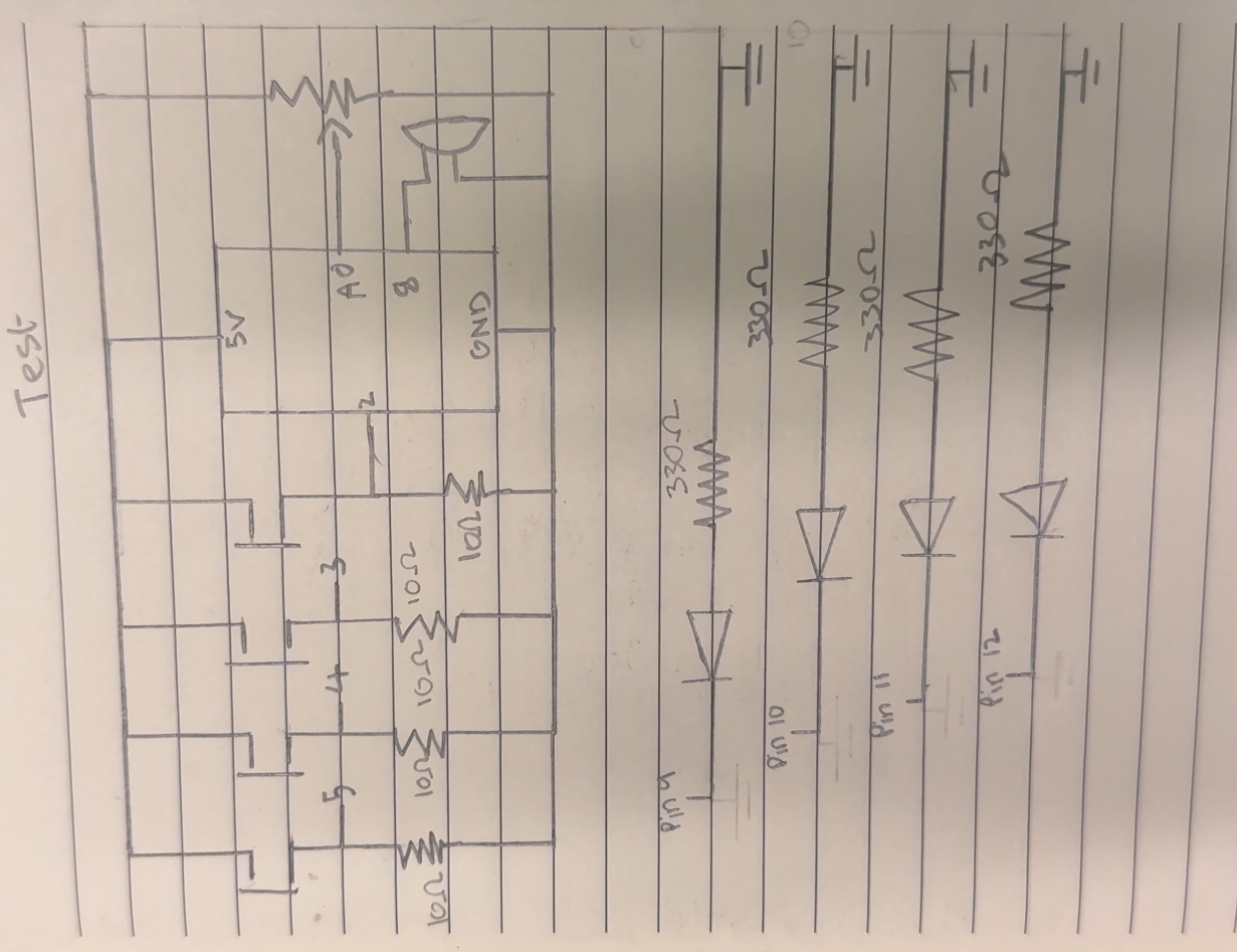
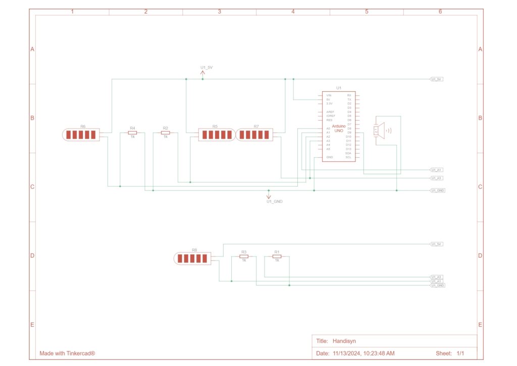
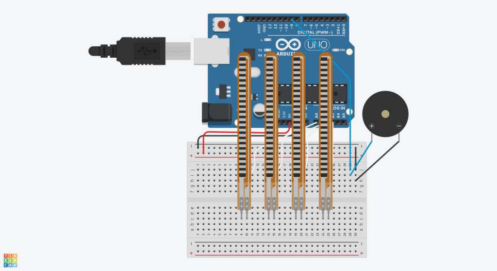
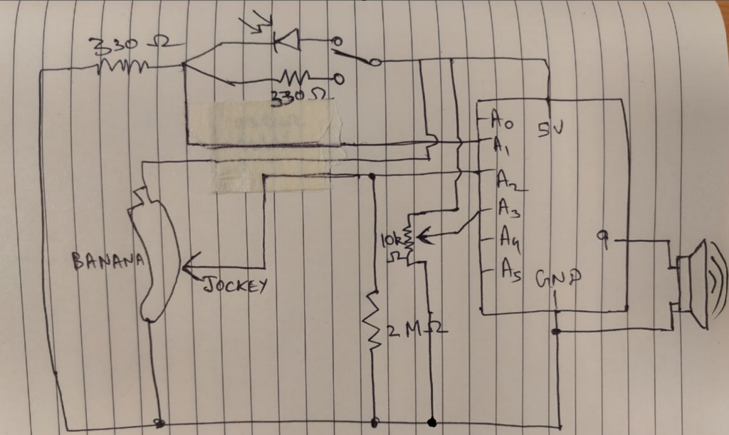
That being said, how we divided our work is basically mapping the two sides (and the two stage of the development) to the two of us—the music and the interface, the backend and the frontend, the soft and the hard, etc. On my side, I had the Arduino and the speaker to start up a very basic synthesizer consisting of two audio oscillators and two control oscillators.
Process
In a nutshell, what I tried to realize is a simple cosine wave oscillator frequency modulated according to the four input parameters that control root frequency: intensity (the extent to which the root signal is modulated to the target frequency), vibrato speed (the rate at which the modulation is automatically carried on), and modulation ratio (the multiple to determine the target frequency from the root).
#include <Mozzi.h>
#include <Oscil.h> // oscillator
#include <tables/cos2048_int8.h> // table for Oscils to play
#include <Smooth.h>
#include <AutoMap.h>

// desired carrier frequency max and min, for AutoMap
const int MIN_CARRIER_FREQ = 22;
const int MAX_CARRIER_FREQ = 440;

// desired intensity max and min, for AutoMap, inverted for reverse dynamics
const int MIN_INTENSITY = 10;
const int MAX_INTENSITY = 1000;

// desired modulation ratio max and min
const int MIN_MODRATIO = 5;
const int MAX_MODRATIO = 2;

// desired mod speed max and min, for AutoMap, note they're inverted for reverse dynamics
const int MIN_MOD_SPEED = 10000;
const int MAX_MOD_SPEED = 1;

AutoMap kMapCarrierFreq(400,700,MIN_CARRIER_FREQ,MAX_CARRIER_FREQ);
AutoMap kMapIntensity(400,700,MIN_INTENSITY,MAX_INTENSITY);
AutoMap kMapModRatio(400,700,MIN_MODRATIO,MAX_MODRATIO);
AutoMap kMapModSpeed(400,700,MIN_MOD_SPEED,MAX_MOD_SPEED);

const int FREQ_PIN = 0;
const int MOD_PIN = 1;
const int RATIO_PIN = 3;
const int SPEED_PIN = 2;

Oscil<COS2048_NUM_CELLS, MOZZI_AUDIO_RATE> aCarrier(COS2048_DATA);
Oscil<COS2048_NUM_CELLS, MOZZI_CONTROL_RATE> kIntensityMod(COS2048_DATA);
Oscil<COS2048_NUM_CELLS, MOZZI_AUDIO_RATE> aModulator(COS2048_DATA);

int mod_ratio; // harmonics
long fm_intensity; // carries control info from updateControl() to updateAudio()

// smoothing for intensity to remove clicks on transitions
float smoothness = 0.95f;
Smooth <long> aSmoothIntensity(smoothness);

void setup(){
  Serial.begin(115200); // set up the Serial output for debugging
  startMozzi();
}

void updateControl(){
  // read the freq
  int freq_value = mozziAnalogRead<10>(FREQ_PIN); // value is 0-1023

  // map the input to carrier frequency
  int carrier_freq = kMapCarrierFreq(freq_value);

  // read the ratio
  int ratio_value = mozziAnalogRead<10>(RATIO_PIN);

  // map the input to ratio
  mod_ratio = kMapModRatio(ratio_value);

  //calculate the modulation frequency to stay in ratio
  int mod_freq = carrier_freq * mod_ratio;

  // set the FM oscillator frequencies to the calculated values
  aCarrier.setFreq(carrier_freq);
  aModulator.setFreq(mod_freq);

  // calculate the fm_intensity
  int mod_level= mozziAnalogRead<10>(MOD_PIN); // value is 0-1023
  fm_intensity = ((long)mod_level * (kIntensityMod.next()+128))>>8;

  // use a float here for low frequencies
  int speed_value = mozziAnalogRead<10>(SPEED_PIN);
  float mod_speed = (float)kMapModSpeed(speed_value)/1000;
  kIntensityMod.setFreq(mod_speed);
}

AudioOutput updateAudio(){
  long modulation = aSmoothIntensity.next(fm_intensity) * aModulator.next();
  return MonoOutput::from8Bit(aCarrier.phMod(modulation)); // phMod does the FM
}

void loop(){
  audioHook();
}


THE GLOVE
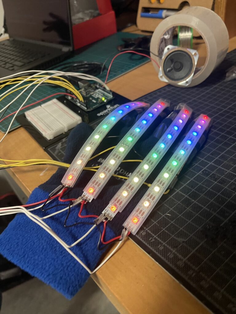
Zavier here, now it’s my turn! So after testing the circuit and code (huge thanks to Xiaotian for the awesome sound control!), I began working on attaching it to the glove, which was… painful. I first just measured out and positioned things, then I started attaching them with my small transparent tape (which isn’t the ideal way (sowing it would be better), and besides my tape wasn’t strong at all). After asking a friend for help, I got the sensors attached. Ok, the easy part done. Now the troubles begin. You see, I obviously had to connect the flex sensors to the Arduino. I thought I could I just use the female-male wires, but nope! The pins on the flex sensors were too small, so it was far too lose :(. I tried thinking of a few other options, but in the end, I had to do what I was trying to avoid, soldering. To be honest, I didn’t even mind it that much before (past me talking), and thought it would take a few fun minutes, but boy oh boy. I don’t know what it is about these solders (maybe they’re dirty?), but only a very tiny bit of the tip is actually going to melt the solder, so a lot of time was spent just moving and rotating the tip. Also, I shouldn’t have attached the flex sensors already. It was a huge pain to get them soldered. Now admittedly, (probably a large) part of that is because I’ve hardly soldered before, but also (in addition to the tip issue), I was making these 3 point connections (such as connecting the ground of one the flex sensors, to the ground of the adjacent ones), so whenever I tried soldering, it would just release the other 2!
Anyways, after some work, I finally got the flex sensors wired up, and it was finally working. Great! Ok, we’re done… we’re done?…. right?. Haha, nope. I thought it would be a good idea to add neopixels (addressable LED strips) to the gloves too. After testing a strip, I didn’t repeat my mistake, and this time I soldered together the strips first, before attaching them. This went a lot smoother (also thanks to just having some experience doing it for the flex sensors), but it still took sooo long. Unfortunately, since I soldered it first, the connections weren’t the right length 🙂. Luckily, I had expected them not to be precisely correct (and besides the distance between the strips would change a bit as the hand was flexed and relaxed), and so kept it a bit longer, so that the length could be adjusted as needed. This unintentionally also ended up creating a nice pattern 😅.
While it was a lot of work, it definitely made things a LOT cooler, and also provided a way to give some info to the user visually.
Final Product

Demo (note: the sound is very distorted in the recording)
Code:
// Configuring Mozzi's options
#include <MozziConfigValues.h>
#define MOZZI_ANALOG_READ_RESOLUTION 10 // Not strictly necessary, as Mozzi will automatically use the default resolution of the hardware (eg. 10 for the Arduino Uno), but they recommend setting it (either here globally, or on each call)

#include <Mozzi.h>
#include <Oscil.h> // oscillator
#include <tables/cos2048_int8.h> // table for Oscils to play
#include <Smooth.h>
#include <AutoMap.h>

#include <FastLED.h>


// Flex sensor stuff

// Define flex sensor pins (these have to be analog)
const int FREQ_SENSOR_PIN = A0;
const int MOD_SENSOR_PIN = A1;
const int SPEED_SENSOR_PIN = A2;
const int RATIO_SENSOR_PIN = A3;

// Smoothening for each pin (was previously using rolling averages)
Smooth<unsigned int> smoothFreq(0.8f);
Smooth<unsigned int> smoothMod(0.5f);
Smooth<unsigned int> smoothSpeed(0.75f);
Smooth<unsigned int> smoothRatio(0.5f);

// Input ranges for flex sensors (will be calibrated)
unsigned int freqInputMin = 1000; // Just FYI, the flex sensors in our setup roughly output in the range of ~ 200 - 650
unsigned int freqInputMax = 0;
unsigned int modInputMin = 1000;
unsigned int modInputMax = 0;
unsigned int speedInputMin = 1000;
unsigned int speedInputMax = 0;
unsigned int ratioInputMin = 1000;
unsigned int ratioInputMax = 0;


// Neopixel (addressable LED strip) stuff

// Define neopixel pins
const int FREQ_NEOPIXEL_PIN = 2;
const int MOD_NEOPIXEL_PIN = 3;
const int SPEED_NEOPIXEL_PIN = 4;
const int RATIO_NEOPIXEL_PIN = 5;

// Number of LEDs in each strip
const int NEOPIXEL_NUM_LEDS = 11;

// Define the array of leds
CRGB freqLEDs[NEOPIXEL_NUM_LEDS];
CRGB modLEDs[NEOPIXEL_NUM_LEDS];
CRGB speedLEDs[NEOPIXEL_NUM_LEDS];
CRGB ratioLEDs[NEOPIXEL_NUM_LEDS];


// Sound stuff

// desired carrier frequency max and min, for AutoMap
const int MIN_CARRIER_FREQ = 22;
const int MAX_CARRIER_FREQ = 440;

// desired intensity max and min, for AutoMap, inverted for reverse dynamics
const int MIN_INTENSITY = 10;
const int MAX_INTENSITY = 1000;

// desired modulation ratio max and min
const int MIN_MOD_RATIO = 5;
const int MAX_MOD_RATIO = 2;

// desired mod speed max and min, for AutoMap, note they're inverted for reverse dynamics
const int MIN_MOD_SPEED = 10000;
const int MAX_MOD_SPEED = 1;

Oscil<COS2048_NUM_CELLS, MOZZI_AUDIO_RATE> aCarrier(COS2048_DATA);
Oscil<COS2048_NUM_CELLS, MOZZI_CONTROL_RATE> kIntensityMod(COS2048_DATA);
Oscil<COS2048_NUM_CELLS, MOZZI_AUDIO_RATE> aModulator(COS2048_DATA);

int mod_ratio; // harmonics
long fm_intensity; // carries control info from updateControl() to updateAudio()

// smoothing for intensity to remove clicks on transitions
float smoothness = 0.95f;
Smooth<long> aSmoothIntensity(smoothness);


void setup(){
  Serial.begin(9600); // set up the Serial output for debugging

  // Set the flex sensor pins
  pinMode( FREQ_SENSOR_PIN, INPUT_PULLUP);
  pinMode(  MOD_SENSOR_PIN, INPUT_PULLUP);
  pinMode(SPEED_SENSOR_PIN, INPUT_PULLUP);
  pinMode(RATIO_SENSOR_PIN, INPUT_PULLUP);

  // Setup the neopixels
	FastLED.addLeds<NEOPIXEL, FREQ_NEOPIXEL_PIN>(freqLEDs, NEOPIXEL_NUM_LEDS);
	FastLED.addLeds<NEOPIXEL, MOD_NEOPIXEL_PIN>(modLEDs, NEOPIXEL_NUM_LEDS);
	FastLED.addLeds<NEOPIXEL, SPEED_NEOPIXEL_PIN>(speedLEDs, NEOPIXEL_NUM_LEDS);
	FastLED.addLeds<NEOPIXEL, RATIO_NEOPIXEL_PIN>(ratioLEDs, NEOPIXEL_NUM_LEDS);
	FastLED.setBrightness(32); // 0 - 255

  // Feed/prime/initialise the smoothing function to get a stable output from the first read (to ensure the calibration isn't messed up). A value of 1630 was chosen by trial and error (divide and conquer), and seems to work best (at least for our setup)
  smoothFreq.next(1630);
  smoothMod.next(1630);
  smoothSpeed.next(1630);
  smoothRatio.next(1630);

  startMozzi();
}


// Basically our actual traditional loop in Mozzi (but still needs to kept reasonably lean and fast)
void updateControl(){

  // Read the smoothened freq
  int freqValue = smoothFreq.next(mozziAnalogRead(FREQ_SENSOR_PIN - 14)); // value is 0-1023, -14 since mozzi just takes a number (eg. 0 instead of A0), and the analog ones are 14 onwards

  // Calibrate the mapping if needed
  if (freqValue < freqInputMin) freqInputMin = freqValue;
  if (freqValue > freqInputMax) freqInputMax = freqValue;

  // Map the input to the carrier frequency
  int carrier_freq = map(freqValue, freqInputMin, freqInputMax, MIN_CARRIER_FREQ, MAX_CARRIER_FREQ);


  // Read the smoothened ratio
  int ratioValue = smoothRatio.next(mozziAnalogRead(RATIO_SENSOR_PIN - 14));

  // Calibrate the mapping if needed
  if (ratioValue < ratioInputMin) ratioInputMin = ratioValue;
  if (ratioValue > ratioInputMax) ratioInputMax = ratioValue;

  // Map the input to the ratio
  mod_ratio = map(ratioValue, ratioInputMin, ratioInputMax, MIN_MOD_RATIO, MAX_MOD_RATIO);


  // calculate the modulation frequency to stay in ratio
  int mod_freq = carrier_freq * mod_ratio;

  // set the FM oscillator frequencies to the calculated values
  aCarrier.setFreq(carrier_freq);
  aModulator.setFreq(mod_freq);


  // Read the smoothened mod
  int modValue = smoothMod.next(mozziAnalogRead(MOD_SENSOR_PIN - 14));

  // Calibrate the mapping if needed
  if (modValue < modInputMin) modInputMin = modValue;
  if (modValue > modInputMax) modInputMax = modValue;

  // Calculate the fm_intensity
  fm_intensity = ((long)modValue * (kIntensityMod.next()+128))>>8;


  // Read the smoothened speed
  int speedValue = smoothSpeed.next(mozziAnalogRead(SPEED_SENSOR_PIN - 14));

  // Calibrate the mapping if needed
  if (speedValue < speedInputMin) speedInputMin = speedValue;
  if (speedValue > speedInputMax) speedInputMax = speedValue;

  // use a float here for low frequencies
  float mod_speed = (float)map(speedValue, speedInputMin, speedInputMax, MIN_MOD_SPEED, MAX_MOD_SPEED) / 1000;
  kIntensityMod.setFreq(mod_speed);


  // Set the leds

  FastLED.clear(); // Resets them

  // The frequency controls how many of the LEDs are light up (in a rainbow colour)
  int freqLEDAmount = map(freqValue, freqInputMin, freqInputMax, 0, NEOPIXEL_NUM_LEDS);
  fill_rainbow(&freqLEDs[NEOPIXEL_NUM_LEDS - freqLEDAmount], freqLEDAmount, CRGB::White, 25); // &...LEDs[i] to start lighting from there, allowing us to light them in reverse

  // For the mod, show a meter (blue - deep pink) showing the mix level of the 2 sounds
  int modLEDAmount = map(modValue, modInputMin, modInputMax, 0, NEOPIXEL_NUM_LEDS);
  fill_solid(modLEDs, NEOPIXEL_NUM_LEDS, CRGB::Blue);
  fill_solid(&modLEDs[NEOPIXEL_NUM_LEDS - modLEDAmount], modLEDAmount, CRGB::DeepPink);

  // The speed controls the blinking rate of its LEDs (between 1/2 to 3 seconds per blink cycle)
  int speedLEDBlinkRate = map(speedValue, speedInputMin, speedInputMax, 500, 3000);
  if (millis() % speedLEDBlinkRate < speedLEDBlinkRate/2)
	fill_rainbow(speedLEDs, NEOPIXEL_NUM_LEDS, CRGB::White, 25);

  // The ratio controls the hue of its LEDs
  int ratioLEDHue = map(ratioValue, ratioInputMin, ratioInputMax, 0, 360);
  fill_solid(ratioLEDs, NEOPIXEL_NUM_LEDS, CHSV(ratioLEDHue, 100, 50));
  // We could also blend between 2 colours based on the ratio, pick the one you prefer
  // fract8 ratioLEDFraction = map(ratioValue, ratioInputMin, ratioInputMax, 0, 255);
  // fill_solid(ratioLEDs, NEOPIXEL_NUM_LEDS, blend(CRGB::Blue, CRGB::DeepPink, ratioLEDFraction));

  FastLED.show(); // Shows them
}


// Mozzi's function for getting the sound. Must be as light and quick as possible to ensure the sound buffer is adequently filled
AudioOutput updateAudio() {
  long modulation = aSmoothIntensity.next(fm_intensity) * aModulator.next();
  return MonoOutput::from8Bit(aCarrier.phMod(modulation)); // phMod does the FM
}


// Since we're using Mozzi, we just call its hook
void loop() {
  audioHook();
}

