Post About Physical Computing’s Greatest Hits (and misses)


This article is a summary of technologies and tools that are commonly used in Physical computing but still have great potential to be innovated.

The second paragraph describes accurately one of my biggest strugglings in this class so far. Every time that I have to choose a project always the fear of not being original shows up and make my overthink and discard my ideas.

I found this article extremely helpful for two reasons: 1. It works as a guide of technologies that I can innovate in future projects. 2. It makes me realize that there more than one way to develop technologies and that there are big opportunities for innovation and creativity that can still be explored.

Post About “Making Interactive Art: Set the stage, then Shut up and Listen”

The article is a comparison between interactive work and interactive artwork. The main differences explained by the author are that interactive work is an experience or device made with the purpose of having a conversation with the user, in other words, the creator looks for a specific action of the user. In the other hand, Interactive artwork is about letting the users explore and interpret the experience and the artist should focus on the user’s reaction to his art.

My takeaway of this article is that I learned to differentiate between interactive artwork and interactive work. Several times, during this course, I have build machines without not even knowing what I want from the user. This has caused some of my projects ended up having an ambiguous interaction. Now,  the first question  that I am going to ask myself before starting assignment will be ” Is this interactive work or interactive artwork?”

Response to “Physical Computing’s Greatest Hits (and misses)”

This was very entertaining to read (the LED Fetishism category was my favourite)- as I was scrolling down the individual projects, I could find so many similarities with the projects that have been done in the class already (I am guilty of the gloves and dancing mat). And reading a line “What took me several weeks when I made it in 1999, could be done in about an hour today” also made very grateful for the technology that enables us to create, so much faster and push the boundaries further.

However, it’s so easy to slip into thinking that when we get an idea, we are the first ones ever to get it. And unless it’s original, we should not do it. At this point, creating something completely original and from scratch is close to impossible. It’s not shameful to make a thing that was already made before- the problem is not adding anything new and unique to it. Though the essence of an idea stays the same, there are limitless possibilities of how to implement it – yet, the balance between originality and plagiarism is again very fragile.

I was also pleasantly surprised by the consideration of inclusivity – and how flat black screen does not provide any feedback whatsoever to a blind person, as well as inclusivity in “the body-as-cursor” section. This is not a topic that I would find often in relation to arts. Designers are more inclined to be more inclusive when it comes designing interaction of everyday objects and technology. Yet for interactive art, which heavily relies on a typical anatomy of human bodies without any challenges, it’s an implication that is often not considered. It really made me think whether is it even possible to be inclusive for all within one interaction and how to keep this in mind when designing.


Reading response 6 – Physical Computing’s Greatest Hits (and misses)

I feel both the blog posts for this week were very relevant to our current stage in the class. This post talked about how most project we think about have already done, but we shouldn’t let this stop or discourage us. I am completely new to interactive media and physical computing, and I feel like this was very relevant to me because I think a lot about how to make something unique.

In terms of the ideas, I think the video mirrors are quite cool, and I love the mechanical pixels idea. I also think the Scooby-doo idea would be cool to do, maybe with one of my drawings…

Interactive Art & Physical Computing

Making Interactive Art: Set the Stage, Then Shut Up and Listen

I thought this reading was incredibly central to the endless debate surrounding defining or redefining interactivity, and the art of interaction between human and what is seemingly non-human or digital. I have always been a supporter of the notion of allowing the audience to formulate their own perceptions about a certain artwork, rather than presenting them with a binary view of how a work of art should be interpreted.

In terms of the interactivity, I also believe that the artist or the artwork has an obligation to engage its audience in an intricate conversation. Hence, if the purpose and methods of the object or work of art were to be clearly communicated, that would take away from the authenticity of the audience’s response. Engaging in a conversation just isn’t as effective if one of the parties were to impose or dictate how the other should think or respond. Several contemporary video games, virtual reality experiences, and performances (as well as numerous other artworks), are known to be successful due to their ability to challenge the user/viewer and allude to ways of understanding the overall message or goal of the artwork, rather than readily presenting it.

Physical Computing’s Greatest Hits (and misses)

The article really struck a chord with me when the author brought up the notion or ‘originality’, and the ability to produce something truly unique amidst rapid technological advancement definitely came into question. More often than not, the ideation stage is the most challenging part of any project for me. I often struggle with coming up with a concept that is not only classifiable as different and original, but also executed in the best way possible.

This reading helped me realize that the world of physical computing is truly vast, and to see that we have already engaged with and used some of the technology employed in the variety of instruments, eased the pressure a little bit. It was also really interesting to see how most of the instruments depicted by the author focused on engaging with or heightening the senses of the user – not manifest something out of this world, and some of them were just created for the purpose of entertainment. One that really stood out to me, was the body-as-cursor project, mostly because I am invested in the idea of visual and audio extensions of the human body, but also because it provides a variety of experiences (art, interaction, performance, etc.).

Reading response 5 – Making Interactive Art: Set the Stage, Then Shut Up and Listen

The ideas presented in this blog post make a lot of sense to me, but they are also difficult for me to get used to. Reading the explanation the blog post gave about the importance of looking at interactive art as a performance, rather than a finished painting was very interesting to me, because as a visual artist, that’s how I’ve been looking at it, and trying to explain the concept and inspiration behind my work the same way I would have with one of my paintings. I think having read this, I’ll try to keep reminding myself to not explain myself or my work, and instead just present it and let the audience explore and interpret it.

Response to “Making Interactive Art: Set the Stage, Then Shut Up and Listen”

The article written by Tigoe was very short, but consisted of very crucial points. When I saw the title, I got a little scared because I get easily irritated by meaningless debates about what is art and what is not, yet this one offered a good insight into the world of Interactive Art.

I loved the analogy to theatre and the working process between an actor and a director – though I had some directing experience, it never occurred to me that the nature of such interaction can be so easily projected to designing an interaction and made me think of the process a little differently. You can suggest through various hints, but you cannot tell them what exactly are they supposed to feel, do and experience (in both theatre and interactive art).

What I also agree with is Tigoe’s argument of giving hints, and proving basic context for the user to get them started. This should eventually made the user actively listen, start and successfully continue the conversation without a designer’s intervention . Yet this is communicated very simplistically, as if it was implying that the process of making interactive art is simple and black and white: either done right or done wrong. Yet the lines between what is a sufficient of a hint enough are very blurry and thin. This applies also to providing “basic context” which differs significantly from person to person, consequently making it very difficult to establish such hints and context that would work perfectly for every single user. User testing, adjustment and compromises are needed along the way. This, however, is not a critique- it’s more of an implication that I missed in the article, which does not contradict the argument whatsoever, but rather extends it.

Midterm Post – In the end I think it was just messing with me…

Yeah soooo my midterm didn’t turn out as well as I’d hoped.

I had this beautiful idea in mind of an interactive stage where you could control the lights and play with different designs and lighting choices. It would be a way that kids could discover the magic of lighting design and be a new outlet into the world of technical theater.

In reality, it ended up being two weeks of pure frustration and sleepless nights. In the end, I’m not very proud of the product, but I am proud of the process.

It started very big. I wanted to include both set and lighting: the lighting would change color and intensity and the set would move around a little model stage. Whoa! Slow down! So once I realized how impractical that was, I decided to focus in on the lighting aspect.

I split it into three categories 1. White Lights 2. Patterned Set Lights 3. Moving Servo Lights

The white lights would be immobile and would turn on and off with just the push of a button.

The patterned set lights were originally going to turn on and off and blink to a pattern with a button, but then I decided to just make them blink for simplicity’s sake.

Finally, the servo lights would be a bit more difficult to pull off. They would be attached to a servo, which could move up to 180 degrees, controlled by a potentiometer, and would also be able to change color, which is also controlled by a potentiometer. In total, there would be two servos and two common LEDs (Stage Left and Stage Right).

While the end product ended up not really working the way I wanted it to, the process of getting to this end product was extremely beneficial as a beginner IM student. I learned valuable skills like using sketches of circuits and breadboards, both solderable and solderless, to limit mistakes made and organize your work so you don’t get your wires confused.

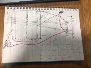
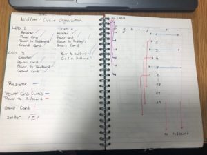
One of my biggest challenges was the organization of the Control Board, which was at the front of the stage, and its connection to my redBoard, which was at the back of the stage. I didn’t know how to tell which wire went to which appliance as my color coding system was flawed (Red for power, black for ground, other colors to separate the appliances, but that didn’t really work).

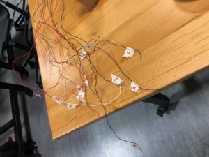
My solution came in the form of masking tape and four wooden blocks. My first step was to elevate the stage so the wires could slide underneath it, rather than having to wrap them around the sides. This helped me use less wire and also made the connections more direct. The next step was to draw a little diagram in my notebook that labelled each appliance I was using from #1-#6.

Then, I followed t
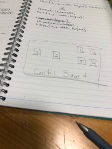
he wires and put a little masking tape label on the end of it, dictating which # appliance it corresponded to. This helped me keep the wires organized. I could then put the control board where it resided, at the front of the stage, and plug in all the wires without having to ch

eck and make sure I had the right wire, which greatly reduced
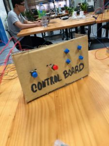
the time needed to install the buttons and potentiometers.

In the end, I got frustrated and I think I fried my redBoard a bit because weird things started happening. Potentiometers would do things they weren’t supposed to, lights would turn on and off randomly. Maybe I got a Phantom of the Model Stage…
 

Response: “Making Interactive Art: Set the Stage, Then Shut Up and Listen”

In interactive art, I feel like the artist plays the dual role of artist and curator. When creating an interactive piece, you’re also responsible for “setting the stage” and guiding the viewer’s movement–however, this is where the challenge lies because as the author suggests, you can’t dictate these movements and interactions too much. It can be difficult to draw the line between the interactive piece and the viewer when designing interactions. What components of an interactive piece should be dictated by the artist, and which ones should be a result of the interaction? How do you “set the stage” without guiding the viewer too much on how they should act within it? The author seems to claim that the artist is only responsible for creating the work, and the rest should be left to the viewer’s discoveries and senses. However, this can raise issues about the importance of interaction clarity as well (clarity of indicators, affordances, etc.). In creating an interactive piece, you have to let go of your own interpretations, objectives, and agendas. Instead, you should leave the interpretation to the viewer, as the meaning of the piece is not solely related to the “physical” product, but rather the reactions and conversations it attracts.


Response: “Physical Computing’s Greatest Hits (and misses)”

I think this blog post perfectly captures the dilemma many of us face before a project deadline and helps us come to terms with the fact that many of the things we create have been created before in one form or another, which is not always a bad thing. Having an idea of something that has been made before allows us to reappropriate it and introduce new features and new perspectives. I’ve found that assembling something that has been done before is a great way of processing the way it works, the way it is made, and how you can make similar things using the same logic, especially with regards to the field of physical computing where you learn more from a hands-on application rather than theory.

As someone who is new to physical computing,  I’ve found that regenerating old ideas not only helps me apply what I’m learning from said ideas, but also works as somewhat of a starting point from which I can then go on to explore my own ideas, and create works that align with my own interests using themes that have been explored and experimented with by many others before.