The concept that “attractive things work better” suggests that when users find an object attractive, they tend to perceive it as more user-friendly, which can enhance their overall interaction with it. It argues for a balance between functionality and beauty in design, suggesting that products should not only be practical and easy to use but also evoke positive emotions to enhance user experience. The reflection on personal experiences with teapots suggests a deeper, perhaps unspoken critique: that the essence of design transcends its physical form or function, tapping into the user’s emotional and situational contexts. This perspective invites us to reconsider the role of affect in design, not as a secondary aspect but as a central component of usability.
The narrative around three distinct teapots illustrates varied design priorities — usability, aesthetics, and practicality — and how these elements impact user preference depending on context and mood. It raises implicit questions about the prevailing biases in design philosophy — do we undervalue the emotional impact of aesthetics due to a hyperfocus on functionality? This challenges us to think beyond traditional design paradigms, advocating for a more nuanced approach that incorporates affect as a fundamental aspect of design thinking.
The second reading of Margaret Hamilton’s journey from a young MIT programmer to a pioneer of software engineering for the Apollo missions encapsulates a story of groundbreaking achievement amidst societal and professional challenges. Her innovative work in developing flight software was pivotal in landing men on the moon, highlighting her role in transforming software development into a critical component of modern technological endeavors. Hamilton’s perseverance and ingenuity not only broke gender barriers in a male-dominated field but also laid the foundational principles of software engineering, influencing countless future innovations and establishing her legacy as a trailblazer in both technology and gender equality in STEM.
Written on my dorm wall, there is a manifesto that reads “Aesthetical Practicality Manifesto…There is no right or wrong, only what is practical and what is not…Anything which is not of utmost practicality, intense beauty, or ideally, a blend of both, is bullshit, and must be always avoided.”
Reading through Norman’s “Emotion & Design: Attractive things work better,” to me, was like I heard a harmonic echo of my thoughts. Juxtaposition by Norman to show the weaving of practicality and aesthetics in design, is what I so strongly support. In short, my life is super simple. I just follow the following with almost everything in my life.
First up, Norman’s opening on affect and design captures a simple truth: “Advances in our understanding of emotion and affect have implications for the science of design.” This one has always resonated with me. In my quest to blend the roles of a engineer with an artist, I understood that emotion is not a byproduct but the guiding force in the process. Norman words that nicely, “Positive affect can make complex tasks feel easier; negative affect does the opposite. His story of the color displays in computers, which was once thought to be superfluous but later turning out to be very necessary and practical, though not making any practical benefit at all, was absolutely representative of this principle. I still think about his words whenever I try to beautify my computer terminals with themes and eveything, while in reality, there is nothing of practical value… but having a Batman/Ironman like computer User Interface improves my motivation to work by hundredfold.
Norman’s teapot examples are a treasure trove of insights. The pot by Carelman, unus unusable teapot by Nanna, and a tilting pot by Ronnefeldt represent, in a nutshell, the whole spectrum of design philosophies: from functionally unpractical, through aesthetically awkward and unwieldy but serving its purpose, all the way to functional sophistication. Just the way Norman believes, I think form is function.
I do not see aesthetics and usability in opposition but as dance partners. One reinforces the other’s strength. When Norman poses, “Why not beauty and brains, pleasure and usability?” I find myself nodding in agreement. This mirrors the core tenet of my manifestoᅳthat of the achievement of practicality so palpable but in the most beautiful aesthetic way possible. Such is very key in my work at the intersection between technology and art. For example, take the development in software engineering for user interfaces. A visually appealing interface that confounds the user is as ineffective as a drab but functional one.
We really need interfaces that are pleasant to the eyes, at the same time taking the user around effectivelyᅳbasically, nice skeuomorphic designs that I have always admired.
Another very deep reflection I like is Norman’s argument about affect in design. He shows how our emotions and fears make us change our minds altogether about the difficulty of the task, using the example of the plank at different heights. In the professional world, I have seen firsthand that the right emotional design can make the use of even a complex piece of software feel approachableᅳor perhaps even actually fun. Norman’s statement, “Positive affect can make it easier to do difficult tasks,” exactly supports my belief in the attractive design improving the interaction with the product and hence letting the difficulty of the task be gone. But if anything, that’s a critique I might level against Norman: It would be how he treats the friction of usability against aesthetics. While he does fully grasp said friction, I think there’s leeway for a much more intricate exploration of how the two can be married together more cohesively in the design process.
My manifesto demands that once tangible practicality is demonstrated, achieving aesthetics is paramount.
This is where the art of design truly lies – in not just balancing but synthesizing function and form. Norman reflecting on the importance of good human-centered design in stressful situations is something I absolutely agree with. He underscores the importance of empathetic designs that take into account the emotional state of the user. This principle can be transferred from physical products to digital interfaces, where ease and clarity in navigation can do a lot not to stress users. In summary, the discourse of Norman reinstated to me what I had believed all along: aesthetic and practicality is basically a conglomeration.
Before purchasing my current laptop, I spoke with a computer expert about which gadget I should purchase. He informed me that if I want it look nice, I should purchase a MacBook, but if I care about the “inside” of it, I should get something different. This is the same idea that the author discusses in this reading. Sometimes we choose things just for aesthetic purposes.
I think we can all remember the dispute between Android and iOS users. Even today I see people arguing about who can take the prettier picture of the moon and often times the android users are better at it. However, iOS still wins with most sales. Why? Because they have a prettier design .
This concept of design is called “Attractiveness Bias” which means that people tend to assume that people/objects who are physically attractive/ appealing, based on social beauty standards, also possess other desirable traits.
Overall, I believe that design is truly a “make or breake” factor that influences the user experience a lot. I think that creators should think about that in advance in order for it to be successfull.
For me, as a design oriented person, I will always choose the aesthetically pleasing products.
(here I attached two pictures: the first one is an Asus ZenBook and the other one is a MacBook Pro)
In my reflection, when reading “attractive things work better” I understood how design is more than just about making things work well or look good. It’s about bringing these aspects together to enhance our experiences with technology, as our emotional reactions to a design are as important as its functionality. This broader view makes me appreciate how both practicality and our emotional responses matter in design.
When reading, I stumbled across a certain idea, where I was thinking that the color of a smartphone is a big deal when people decide what to buy. In general, black or white phones might look professional or classic, but a phone in a bright color like blue or red can make one feel excited or bold. These colors can attract customers who want to show their personality through their devices.
Personally, my phone is blue because that’s my favorite color. When I was choosing, the blue phone immediately stood out to me.
This experience shows how crucial emotional aspects, like color preferences, are in design. They can make technology more enjoyable and meaningful for us every day. By considering both function and emotion, design can really enrich our daily technology use, making it more satisfying and personal.
While reading, I noticed that the author was creating a symbiosis between the design’s appearance, utility, and the emotional response associated with it. It was interesting to see how the author defined the balance between these aspects, and I believe it is a healthy way for them to exist. I have always thought that utility should take precedence over design, which I believe is a practical approach. However, the author appears to infer that good effects in design can improve usability and problem solving. Although I believe in the value of good design, here’s another perspective: if we have a problem and are designing a tool to help us solve it, why go the extra mile to make it attractive or visually appealing? While answering this question, I came to the conclusion that an aesthetically pleasing design is the result of properly implementing all of the necessary functionality in the tool.
I think it can be best explained with the modern kitchen designs. Consider the trend of open-plan kitchens that blend effortlessly with living spaces. This design choice is not purely aesthetic; it stems from the functionality of wanting a kitchen that supports not just cooking, but also social interaction and entertainment. The central kitchen island often serves multiple purposes: it is a prep area, a dining table, and a social hub, all in one. Its design—sleek, with clean lines and often featuring visually appealing materials like marble or polished wood—enhances the kitchen’s utility by making it a more inviting space. The aesthetics of the island, from its material to its positioning, are integrated with its function, creating a space that is both beautiful and highly functional. By contemplating this — approach to kitchen design, I mean that aesthetics and utility go hand in hand.
Thinking about the document’s ideas in a broader context, I’m drawn to look into how they relate to digital interfaces and even services. In a society increasingly mediated by screens, the emotional impact of design aesthetics on usability is even more important. I’ve experienced websites and apps whose gorgeous design increased my patience while navigating difficult functionality. This notion is supported by the document’s explanation that ‘Positive affect broadens the thought processes making it more easily distractible,’ which validates my experiences with digital interfaces. The emotional impact of design aesthetics on usability is critical, especially in our increasingly screen-mediated society. However, the document’s emphasis on the universal benefits of good effect in design fails to account for individual and cultural variations in aesthetic tastes. This error makes me think about the worldwide nature of design work nowadays. Products and interfaces developed in one cultural context may not elicit the same emotional responses in another, thereby affecting usability across user groups. This intricacy adds to the difficulty of attaining truly universal design—a goal that appears to be becoming increasingly relevant in our interconnected society.
Now about Margaret Hamilton, I believe her story shows how individual determination and intellectual bravery can redefine the possible, even against the backdrop of societal and professional norms. In a time when the professional landscape marked differently for women, bringing her daughter to work at the MIT lab is a powerful moment. It shows us how she balanced being a mom and working on the Apollo missions at a time when most people didn’t expect women to do such jobs. This story is special because it’s about more than just making software for the moon landing. It’s also about Hamilton showing that women can be both caring mothers and brilliant scientists. She didn’t let the rules of her time stop her from doing great things in technology. It also made me think about how personal life and big achievements can mix together. Hamilton’s story is really inspiring because it shows that, how anyone can break barriers and make a big difference, no matter what others might expect.
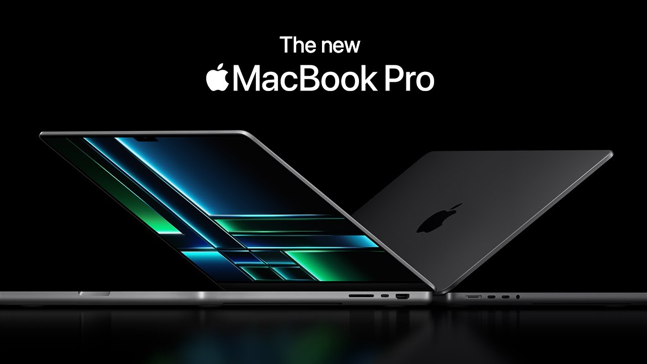
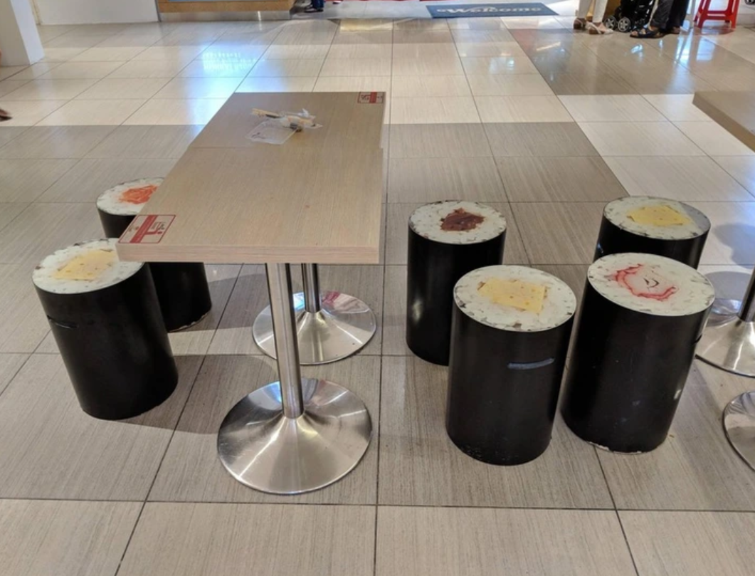
Often times we can see beautiful designs which overwhelm us, which don’t really have any practicality or are not usable at all. At the same time we can often see practical and useful designs being ugly and really not pleasing to the human eye. Let me show you some examples:
Disco Truck? What do discos and cement-trucks have in common? Looks cool though.
Sushi Chairs….Okay they have the usability of a chair, I’ll give them that but the design man, it doesn’t add anything.
There are many other examples like this which we can see in our everyday life. A really good one is USB Sticks. I always have a problem with USB sticks, I try to put the stick into the port, doesn’t go in, okay, let’s try the other side, doesn’t go in again, wait what? I try the first side again, IT WORKS, how? magic! Jokes aside, USB sticks are just very weird, at least for me.
A design I really really like is Water Taps with sensors. They just save so much time, are much more hygienic and much better for the environment. Triple the benefit!!
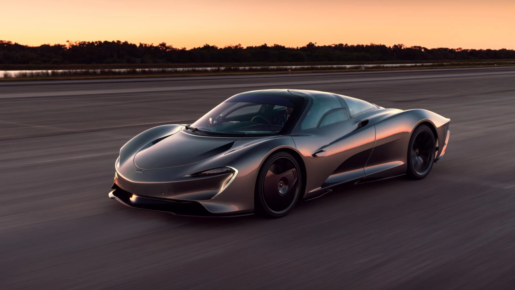
Cars! Cars are a thing I love. As a young person that is transitioning from a teenager to a young man in his twenties, everyday I get more and more interested into cars. Let me show you my favorite design in a car. It offers amazing design and at the same time, it is one of the most aerodynamic cars in the world.
Say hi to the McLaren Speedtail. The speedtail is a perfect example of what happens when we combine beauty and usability (and a lot of money).
All in all, as the heading says, the best combination of beauty and usability (usually when they’re both balanced) will result in something we like to call “Good Design”.
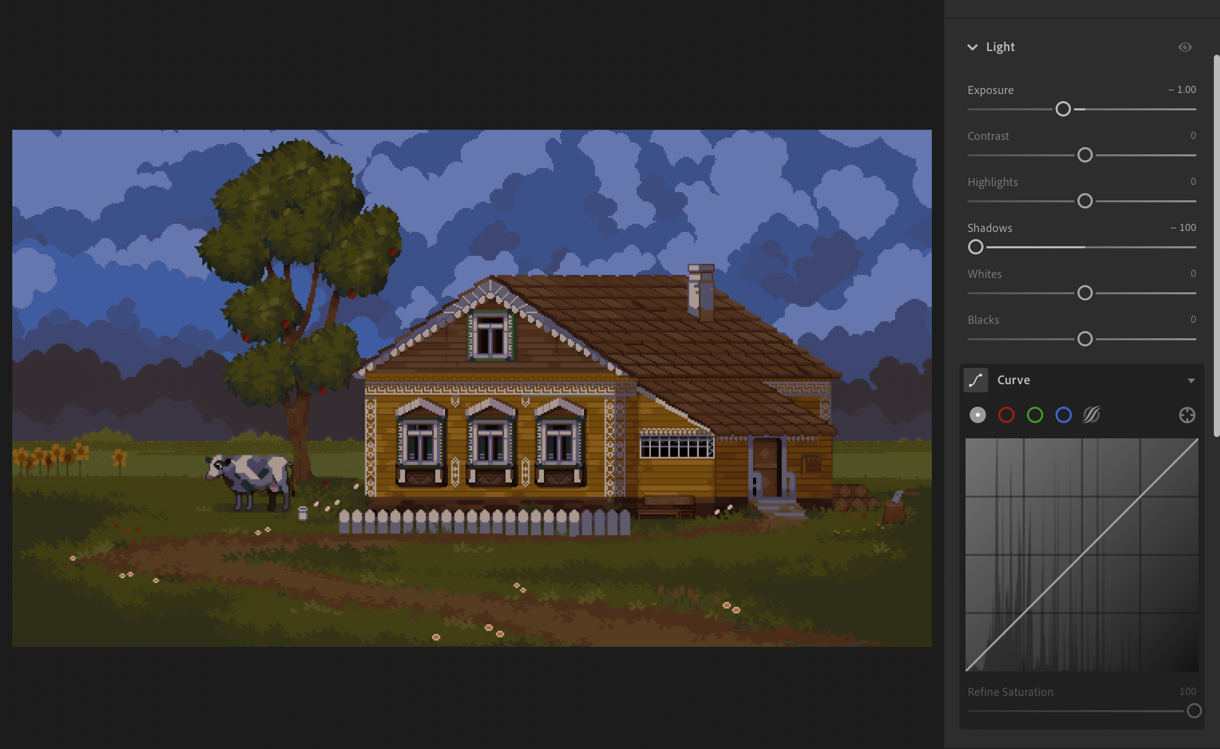
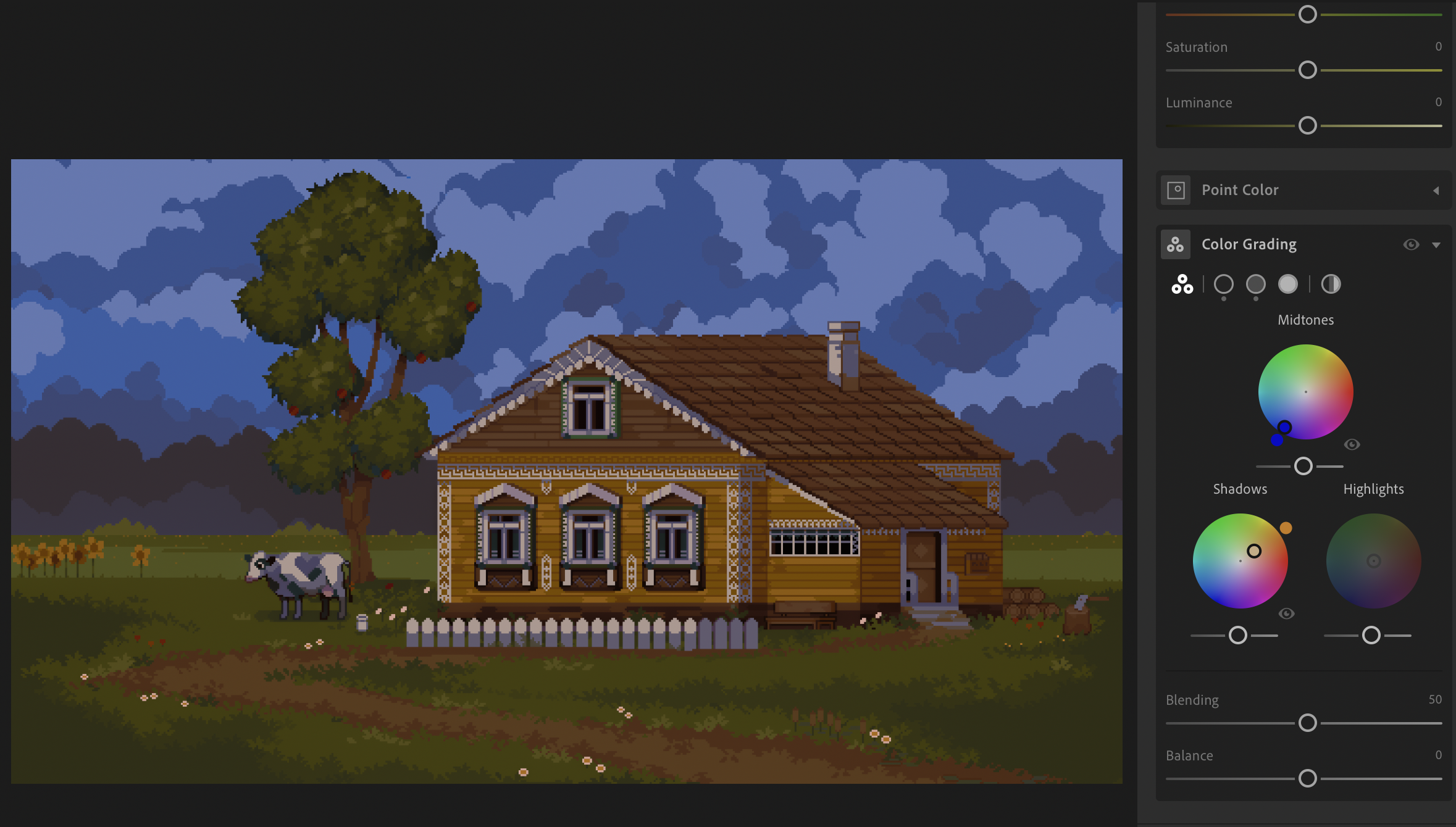
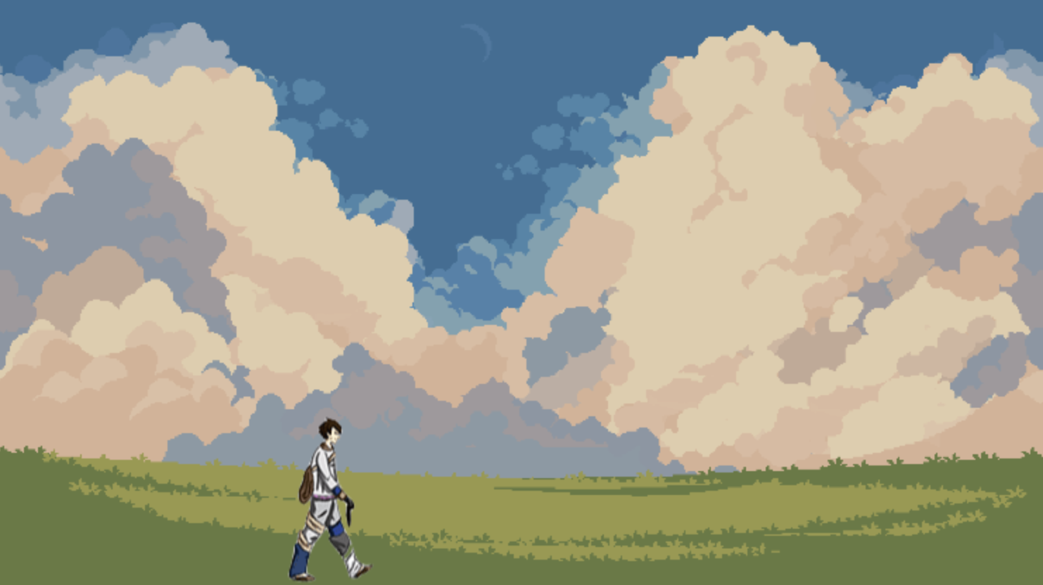
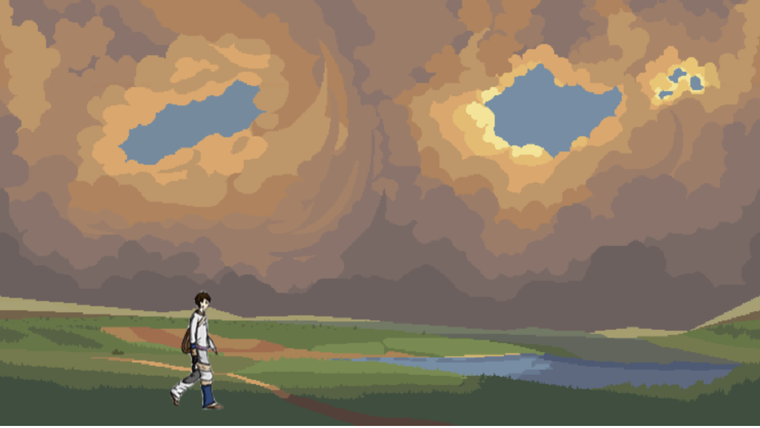
For my midterm project I created a simple interactive piece which focuses on the importance of mindfulness, slowing down and taking a break. The piece features a character that can be controlled by the user to walk left and right with the arrow keys. By walking (or ‘wandering’), the user progresses through a series of different scenic environments ranging from grass fields to mountain ranges. The user is then prompted to ‘think’ at given points (improper functionality explained later) before finally returning home. I have sequenced the images (sourced from craftpix) to convey the passage of time with the exception of the last image which I edited in Lightroom to create a ‘blue hour’ color palette. The link to the sketch is below. For the best experience, open your window in full screen:
In terms of technical application, I am happy that I was able to incorporate an intuitive transition from background to background for the user through my updateBackground functions. I found it challenging to wrap my head around how exactly to include this functionally. An issue that I had early on was that the background would always change to the next image regardless of whether the user walked off-screen to the left or right. I was able to resolve this by adding an else if statement and simply subtracting 1 rather than adding 1. I feel that doing so helped create an immersive environment for the user as it more accurately reflected the development of the character’s ‘wandering’ journey. The source code for the background transitions is included below:
function updateBackground() {
  // Cycle through the backgrounds
  currentBackground = (currentBackground % 14) + 1;
}
function updateBackground2() {
  // Cycle through the backgrounds
  currentBackground = (currentBackground % 14) - 1;
}
Building upon this, I feel that another strength of this project is its continuity which applies to both aesthetic and narrative. While I initially wanted a basic silhouette sprite sheet to make the experience more universal and relatable, the pixelated design style of the character matches with the similar style of the background images. Additionally, the visual aesthetic of the background images is consistent despite being sourced from different asset folders on craftpix. In terms of narrative, I was conscious, as mentioned previously, of sequencing the images to reflect both the passage of time but also a sense of space. While I do not repeat images (except for the scene of the character’s home), I consciously chose to include scenes featuring mountains as the character nears returning home in correspondence to the scene of the mountain which appears at the beginning of the journey. The intention behind this was to subtly present to the user that the journey is nearing its end as (based on the sequencing) they can infer that the character’s home is located near mountains.
Unfortunately, I have several issues in this project which I repeatedly tried to resolve but ultimately could not figure out. The first, which will be apparent to users unless they engage with the piece in the p5 editor while the window is in full screen, is that I could not properly situate my character and text into a fixed position relative to the backgrounds. This is likely due to the fact that I used ‘innerWidth’ and ‘innerHeight’ for the canvas dimensions with background images that do not take up this entire space. I tried to place the y-position of my character relative to the height of the images (using summer1 as a reference) but that did not accomplish the adaptive positioning that I wanted it to.
Another technical shortcoming was my inability to successfully add a simple audio track to help create a sense of atmosphere. Despite being a straightforward incorporation which I am familiar with, I was unable to successfully have an audio track play once. When the audio did play, it would be called to play every frame and eventually cause the sketch to crash. I looked to the examples provided in the class notes, researched the references on the p5 website and asked more experienced colleagues but could still not figure out how to do it.
Finally, an issue that I am deeply upset about was the lack of functionality in the ‘press ENTER to think’ prompt. To begin with, I was able to get the ‘think’ prompt to work momentarily. However, when it was working, my sprite sheet was not entirely functional as it would move across the screen without being animated. I suspect that the ‘keyPressed’/’keyCode’ functions were interfering with one another but I could figure out how to resolve it. I am especially upset that this element did not work as I feel that it would have elevated my project on many levels. First, it would have simply added another level of interactivity besides the basic movement, thus making the piece more engaging. Second, I feel that it very succinctly relates to the intention behind this work by prompting the user to physically stop progressing and to focus on the digital scenery in front of them. Moreover, the text which that appeared on-screen when this element was functional (still in the source code) added a much-needed personal touch and sense of character to the work which I feel is lacking currently.
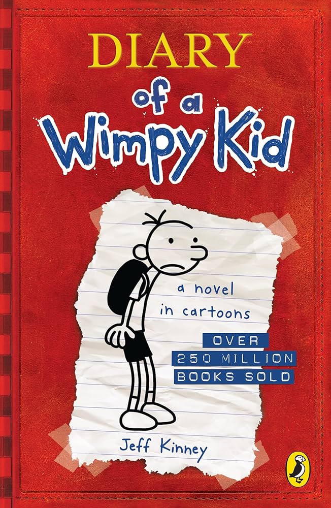
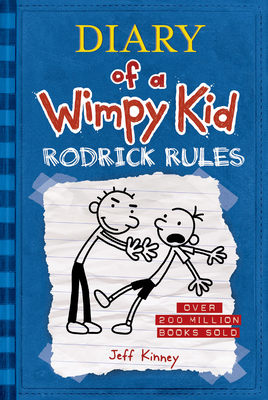
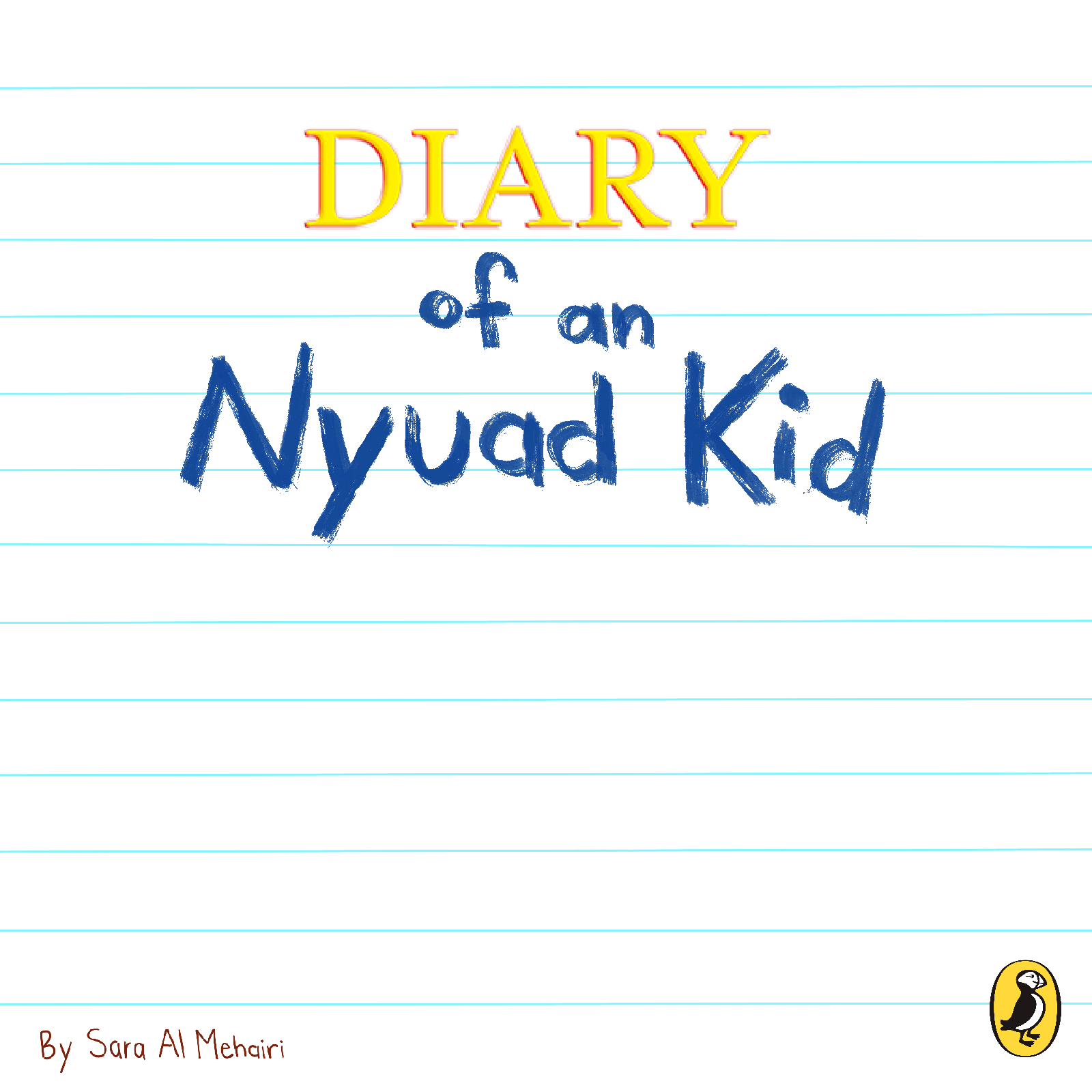
I couldn’t recall the exact moment of picking up a copy of “Diary of a Wimpy Kid,” but it has simply always been a part of my childhood. First and foremost, allow me to introduce the author of this masterpiece, Jeff Kinney. Kinney’s unique style breaks the norms of traditional literature/books. Unlike typical novels, his books use a diary format with personal writing and illustrations. The use of lined paper, childlike font, and unconventional chapter structure sets his work apart and thats what makes it so memorable. (source)
That being said, Inspired by the “Diary of a Wimpy Kid” books, I wanted my project to bring back those nostalgic feelings, with simple drawings and everything in black & white. My goal was to involve the user in the diary and make the project interactive, allowing them to feel like they were part of the story. So, I titled it “Diary of an NYUAD Kid” to grasp that mix of memories & relatable experiences. In creating my project, I initially planned to develop four games inspired by various elements of the “Diary of a Wimpy Kid” series, with an NYUAD twist. However, I narrowed down my focus to three main games: “Elevator Rush,” “Cheese Touch,” and “My Diary.”
Game Details
1. Menu
Despite my initial attempts, I encountered challenges in embedding the menu screen above. At some point, I managed to make it work with a few bugs, but ultimately, it didn’t function as intended (discussed in detail in another section below). Further, the design of the main menu page draws inspiration from the cover page of the “Diary of a Wimpy Kid” books. Clicking the “i” button reveals instructions for each game.
2. Elevator Rush
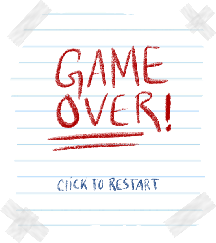
“Elevator Rush” is a game born from the frustration of waiting for elevators, especially during busy times like the 10-minute rush between classes in the C2 Building. You know, maybe the delays are intentional to nudge students towards taking the stairs, was this their plan all along? In the game, you control the elevator using the UP & DOWN keys, hurrying to pick up students so they’re not late for class. Every time a passenger gets picked up, a sound plays to signify success. The background music is the classic “elevator music” sourced from YouTube. With every student you pick up, you earn one point, but if you miss a student, you lose a point. To add difficulty, students appear and disappear quickly, and they are NOT patient. The game ends when the time runs out or if your score drops to -3. Upon game over, a screen pops up with the option to click to restart.
3. Cheese Touch
In the “Cheese Touch” game, inspired by the popular game played at Westmore Middle School in “Diary of a Wimpy Kid,” players aim to gather as many candies as possible while avoiding the dreaded Cheese Touch. In the original story, having the Cheese Touch makes someone a social outcast until they pass it on to someone else by touching them (source). Using the LEFT and RIGHT keys, the player must navigate the area while trying to gather candies and avoid the Cheese Touch. Additionally, when a player successfully collects candy, a cheerful audio plays to signify their success (+1 point). Conversely, if a player encounters the Cheese Touch, a sticky audio plays to indicate their loss (-1 point). The game continues until the time runs out or if a player’s score drops to -3, indicating they’ve had too many encounters with the Cheese Touch. Upon game over, a screen pops up with the option to click to restart.
4. My Diary
In the final somewhat game, titled “My Diary,” I wanted to capture the idea of doodling and scribbling found in “Diary of a Wimpy Kid.” This option allows users to paint on a canvas using colors inspired by the books. They can also change the brush size, erase the canvas, and save their artwork as a PNG file. To enhance the experience, each button plays a sound when clicked. Moreover, the save button triggers a different audio to signify that the image has been saved successfully. To further simulate the feel of real paper, I incorporated the sound of scribbles each time the user draws on the canvas. The main idea behind this “game” was to use audio cues to create a realistic experience for the users. Below are some of the images I have saved during the debugging process:
Visuals, Audios, & Resources
1. Menu
Background: by me using Procreate Penguin Logo source
2. Elevator Rush
Background music source Remaining audio source Background: by me using Procreate, inspired by NYUAD Characters: Diary of a Wimpy Kid
Chatgpt debugging: draw function (passenger spawn interval, passenger spawn, time) & Passenger class
3. Cheese Touch
Audio source Cheese image source Candy image source Face image source
Game over image: by me using Procreate
All audio source Background: by me using Procreate Colors: inspired by the “Diary of a Wimpy Kid” books
Chatgpt debugging: button effect & draw function
Challenges & Areas of improvement
One of my biggest challenges was attempting to merge all three games into a single JavaScript file, given that I have worked on them separately. Despite my best attempts, the complexities of combining multiple game modes within one file led to organizational/functional issues that remained unresolved. At some point it functioned with some issues, but my attempts to fix these problems led to further complications.
function draw() {
  if (scene == "main") {
    drawMenu();
  } else if (scene == "game 1") {
    drawGame1();
  } else if (scene == "game 2") {
    drawGame2();
  } else if (scene == "game 3") {
    drawGame3();
  }
}
For “Elevator Rush,” I encountered several challenges, particularly in managing the spawning of passengers at specific intervals and ensuring they appeared on random floors, excluding the floor where the elevator was located (it did not look visually appealing, as if the passenger was already in the elevator, caused some quick flashes). Implementing this required generating random floor numbers while avoiding duplication with the elevator’s current floor. Additionally, I had to adjust the spawn intervals to balance between keeping the game challenging and preventing overwhelming/underwhelming spawns.
//spawn passengers
  if (millis() - lastSpawnTime > spawnInterval) {
    let floorToSpawn = floor(random(4));
    if (floorToSpawn !== currentFloor) {
      passengers.push(new Passenger(floorToSpawn));
      lastSpawnTime = millis();
    }
  }
Another challenge came about when measuring the game screen and drawing assets in Procreate. Despite using Procreate’s grid assist feature, ensuring the correct proportions for each floor was pretty tricky. Moreover, this caused the elevator to appear either too small or too large on certain floors, hence I adjusted the elevator’s dimensions until it fit within each floor’s layout.
//draw elevator
    let elevatorWidth = 55;
    let elevatorHeight = floorHeight - 2;
    let elevatorX = width / 2;
    image(elevatorImage, elevatorX - elevatorWidth / 2, elevatorY - elevatorHeight / 2, elevatorWidth, elevatorHeight);
As for “Cheese Touch,” one of the challenges was precisely detecting the cheese touch and candy, which relied heavily on precise x and y coordinate calculations, leading to many trials & errors to create accurate collision detection.
Additionally, initial attempts to use a notepad background encountered a persistent issue where the screen froze upon game restart attempts, despite multiple efforts to solve the problem through redraws. This issue likely stemmed from an error in managing the background image or memory management concerns. Consequently, I resorted to using a white background instead.
Overall, I faced many challenges and made some mistakes along the way. Looking back, I realize there are ways I could have done better. For example, I worked on each game mode separately, but when I tried to put them all together, they didn’t work well. Perhaps it wasn’t the best idea to start working in separate JavaScript files. In terms of the games, I also could have added extra obstacles to make each game more challenging (due to the simplicity, I resorted to creating more than one game.). For instance, in the “Cheese Touch” game, I could have added bonus elements that had power-ups. And in all the games, I could have included a leaderboard, using CSV files, to track score.
Conclusion
All in all, developing this project based on “Diary of a Wimpy Kid” presented a lot of challenges…integrating the menu screen with other screens was difficult, and attempts to merge all games into one JavaScript file were unfortunately unsuccessful. However, I managed to incorporate at least one shape, one image, one sound, on-screen text, and Object-Oriented Programming into the project. The menu screen initially provided instructions when the “i” button was clicked, but there were issues directing to the games (yet, each game did have a start & restart option). After completing each game experience, a restart option was available by clicking the screen without restarting the sketch, except for the last game, where users needed to click “erase.” Safe to say that I’m proud of my project, the visuals, and the menu design for being accurate & fulfilling my vision, especially in the elevator game, which initially seemed ambitious.
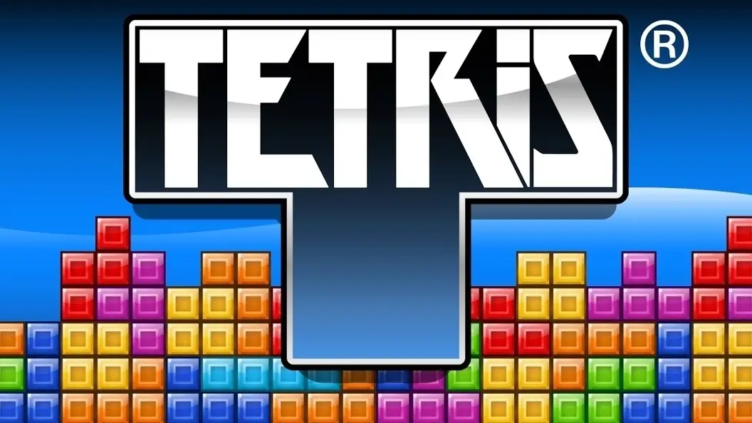
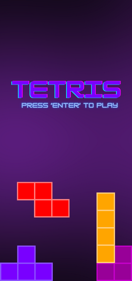
For my Midterm I had my take on the Tetris game which I’ve been a fan of for years. I want to maintain the arcade/video game feel to it so I kept that in mind while creating my game. It consists of various components including shapes, grids, timers, and user input handling. The game aims to control the falling tetrominoes, rotating and moving them to form complete horizontal lines to clear rows. Once 5 rows have been cleared, the game levels up and the tetrominoes fall faster giving the player less time to find a good fit to clear the rows.
How It Works and Highlights
The project leverages object-oriented programming principles to organize code into manageable classes such as Tetris, Timer, and T-Grid. This modular approach enhances code readability and maintainability. The game mechanics are well-implemented, with smooth tetromino movement, collision detection, and row-clearing functionality. The user interface is intuitive, providing clear visual feedback through colorful shapes and text. The inclusion of background music and sound effects enhances the overall gaming experience. I created the background image and the first-page using elements on Canva.
displayGrid(pg, x, y, w, h, pallette) {
    var nx = this.tGrid.nx;
    var ny = this.tGrid.ny;
    var cw = w / nx;
    var ch = h / ny;

    // Render background
    for (var gy = 0; gy < ny; gy++) {
        for (var gx = 0; gx < nx; gx++) {
            var cx = x + gx * cw;
            var cy = y + gy * ch;
            pg.stroke(210);
            if ((gx & 1) == 1) {
                pg.fill(250);
            } else {
                pg.fill(240);
            }
            pg.rect(cx, cy, cw, ch);
        }
    }

    // Render foreground (tetrominoes)
    for (var gy = 0; gy < ny; gy++) {
        for (var gx = 0; gx < nx; gx++) {
            var cx = x + gx * cw;
            var cy = y + gy * ch;
            var valGrid = this.tGrid.getGridVal(gx, gy);
            if (valGrid > 0) {
                pg.stroke(0);
                var rgb = pallette[valGrid % pallette.length];
                pg.fill(rgb[0], rgb[1], rgb[2]);
                pg.rect(cx, cy, cw, ch);
            }
        }
    }

    // Render active tetromino shape
    var ks = this.tGrid.shapeSize;
    var kr = ceil(this.tGrid.shapeSize / 2.0);
    for (var ky = 0; ky < ks; ky++) {
        for (var kx = 0; kx < ks; kx++) {
            var gx = this.tGrid.sx + kx - kr;
            var gy = this.tGrid.sy + ky - kr;
            var cx = x + gx * cw;
            var cy = y + gy * ch;
            var valShape = this.tGrid.getShapeVal(kx, ky);
            if (valShape != 0) {
                pg.stroke(0);
                var rgb = pallette[valShape % pallette.length];
                pg.fill(rgb[0], rgb[1], rgb[2]);
                pg.rect(cx, cy, cw, ch);
            }
        }
    }
}
One really cool part of the code is how it draws the game grid. It splits the screen into smaller squares to represent each cell of the grid. Then, it fills these squares with colors to show the background, the falling shapes, and the shapes that have already landed. It does this by going through each cell of the grid and deciding what color it should be based on the game’s state. This method makes sure everything looks neat and organized on the screen, giving players a clear view of the game.
Areas for Improvement and Challenges
One area for improvement could be enhancing the visual appeal of the game by adding animations for tetromino movements and row clearing. Additionally, implementing more advanced gameplay features such as different game modes, power-ups, or multiplayer functionality could increase player engagement. Some challenges were adding a sound effect once every tetromino lands but I had several issues with it, also I was not able to get the tetromino count to stop once the game was over.
Design Inspiration
I took inspiration from EA’s Tetris mobile app game, here’s how it looks:
When I first started working on my midterm project, I really wanted to make a game about planting flowers. It sounded fun and I thought it would be something different. But as I kept working on it and thinking more about how it would work, it started to feel less like a game and more like a simulator for planting. It wasn’t as fun as I had hoped it would be, and that was really important to me. So, I decided to change it.
I switched my idea to “Back and Forth.” At first, I thought about making a volleyball game. It seemed like a good idea because it was about moving back and forth, which is what I wanted. But the more I thought about it, the more I realized that making it feel realistic and fun at the same time was going to be really hard. So, I started looking for something similar but a bit simpler, and that’s when I landed on a ping-pong game. Ping-pong still had that back and forth action which I liked, but it felt more doable and still really fun. That’s how I ended up with the idea for my project.
Challenges:
The tricky part was figuring out how to make the ball start from the center of the screen. But then I remembered the width /2 and height/2 that we used to center things and I used that to position the ball at the center whenever it went out of the screen: