CONCEPT:
The Punching Bag Game is an interactive project that combines physical activity with a digital arcade experience. The concept revolves around using a punching bag equipped with a sensor to detect punches and display real-time scores. It’s designed to bring the excitement of a classic arcade game into a physical activity, which inspired me in the first place. The game includes features like score tracking, a fuel bar, sound effects, and a visually engaging gamescreen that responds to the user’s actions. The goal is to create an immersive experience where users can engage physically while enjoying a fun and competitive game.
user testing video
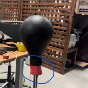
Here is where I placed the sensor on the punching bag:
How Does the Implementation Work?
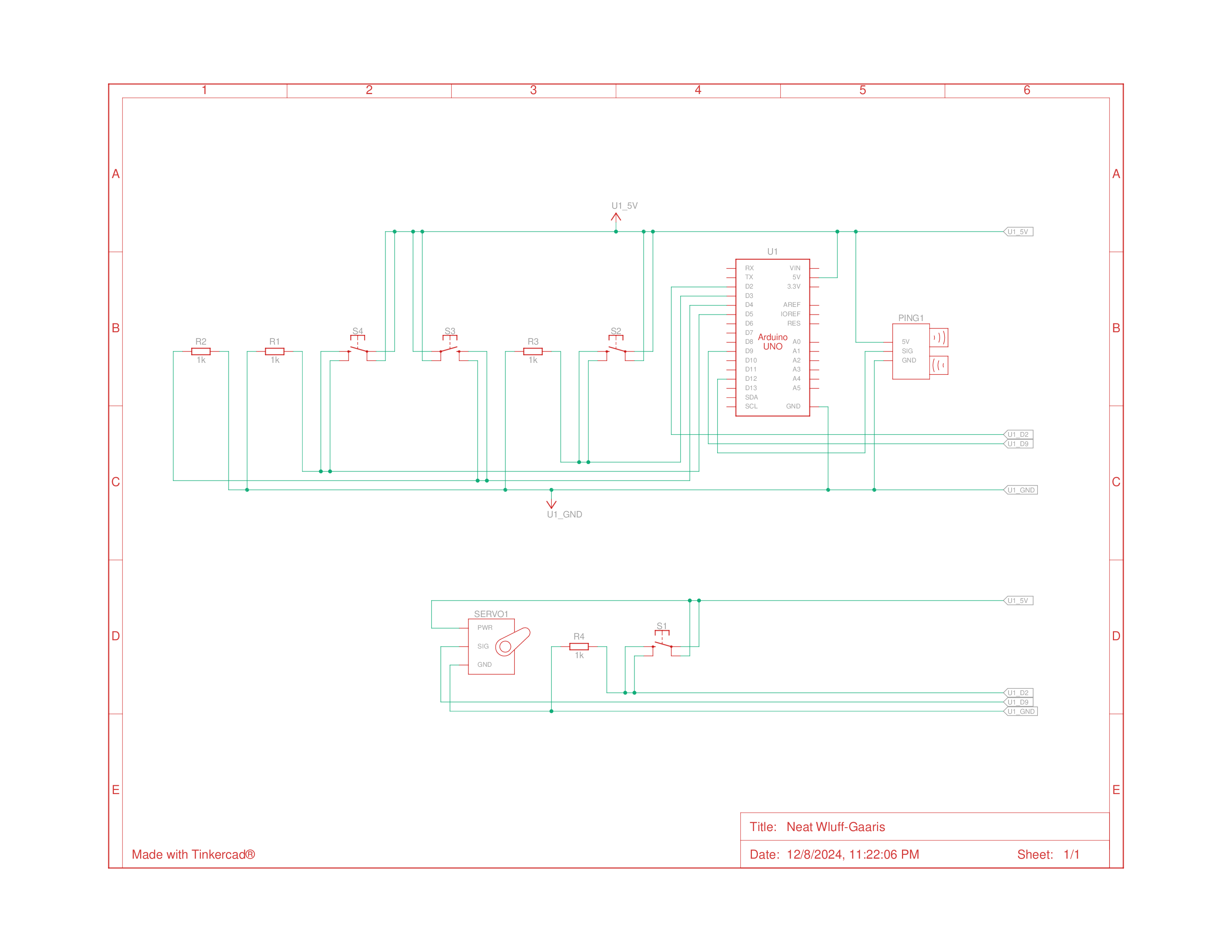
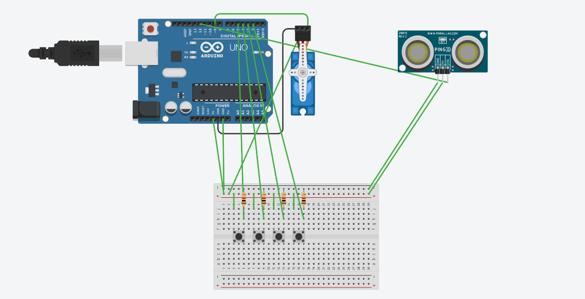
The project integrates hardware (Arduino) and software (p5.js) to create a seamless interactive system:
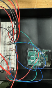
Hardware (Arduino):
- An ADXL335 accelerometer attached to the punching bag detects the magnitude of punches.
- An arcade button starts and restarts the game.
- The Arduino processes the sensor data and sends it to p5.js as a formatted packet.
Software (p5.js):
- Displays the title screen, instructions, and gameplay.
- Dynamically updates the score, best score, and fuel bar based on incoming data.
- Plays sound effects and animates the punching bag for a realistic experience.
Description of Interaction Design
1. Title Screen
Features:
-
- The game title (“The Punching Bag”) in an arcade-style font.
- An “Instructions” button leads to a detailed instruction page.
- A prompt directs users to press the arcade button to start the game.
Design Choices:
-
-
- I used bold, retro fonts and a simple overall design to mimic an actual arcade game.
2. Gameplay
- User Interaction:
- Players punch the bag, and the accelerometer calculates the strength.
- Scores are displayed dynamically, increasing gradually like in classic arcade games.
- A fuel bar at the bottom fills based on the user’s performance.
- Sound effects play after each punch.
- Visual Elements:
- The punching bag vibrates after each punch, mimicking the actual punching bag
- A restart button allows players to reset the game and try again.
3. Restart Button
- After the game ends, users can press the restart button to reset the game and clear all scores, unlocking the ability to punch again.
Description of Arduino Code
The Arduino is responsible for detecting punches, processing the sensor data, and communicating with p5.js.
How It Works:
- Punch Detection:
- The ADXL335 accelerometer calculates the acceleration magnitude of each punch.
- If the magnitude exceeds a set threshold, it’s mapped to a score value.
- Data Transmission:
- The Arduino sends a data packet in the format
,:<value> to p5.js via serial communication.
- Button Functionality:
- The arcade button sends a “START” signal to p5.js to initiate gameplay.
void handleAccelerometer() {
  int xRaw = analogRead(xPin);
  int yRaw = analogRead(yPin);
  int zRaw = analogRead(zPin);

  float magnitudeG = calculateMagnitude(xRaw, yRaw, zRaw);

  if (magnitudeG > impactThreshold) {
    int punchValue = map(magnitudeG, impactThreshold, impactThreshold + 10, 0, 2000);
    Serial.print(",:");
    Serial.println(punchValue);
    delay(200);
  }
}
GITHUB
Description of p5.js Code
The p5.js sketch displays the visuals and processes incoming data from the Arduino to create a responsive and interactive experience.
Key Features:
- Dynamic Visuals:
- Real-time updates to the score and fuel bar.
- Vibration animation for the punching bag.
- Audio Feedback:
- Plays sound effects after each punch.
- Serial Data Handling:
- receives incoming data and updates the game state.
function handleSerialData(data) {
  serialBuffer += data; // Add incoming data to the buffer

  // Check for complete packets
  let startMarker = serialBuffer.indexOf("<");
  let endMarker = serialBuffer.indexOf(">");
  if (startMarker !== -1 && endMarker > startMarker) {
    let packet = serialBuffer.substring(startMarker + 1, endMarker); // Extract packet
    serialBuffer = serialBuffer.substring(endMarker + 1); // Remove processed packet

    // Process the packet
    if (packet.startsWith(",:")) {
      let scoreValue = parseInt(packet.substring(2)); // Extract score value
      if (!isNaN(scoreValue)) {
        console.log("Score received:", scoreValue);
        if (!scoreLocked) {
          score = scoreValue;
          fuel = constrain(fuel + scoreValue / 10, 0, 100);
          bestScore = max(bestScore, score);
          scoreLocked = true;
           isVibrating = true;
        vibrationTimer = 80;

        // Play punch sound
        if (roundEndSound.isPlaying()) {
         roundEndSound.stop();
        }
      roundEndSound.play();
        }
      }
    } else if (packet === "START") {
      gameState = "game";
    }
  }
}
COMMUNICATION BETWEEN ARDUINO AND P5.JS:
he communication between Arduino and p5.js is essential for the game to function properly, allowing the physical punches on the bag to reflect accurately in the digital interface. When the punching bag is hit, the ADXL335 sensor attached to it measures the force of the punch in terms of acceleration along the x, y, and z axes. The Arduino processes these raw sensor values and calculates the overall magnitude of the punch. If the punch strength exceeds a preset threshold, the Arduino sends a data packet to p5.js in the format ,:<value>, where <value> is the calculated punch strength mapped to a score range which was 2500. In addition to handling the punches, the Arduino also manages the arcade button. When the button is pressed, it sends a “START” command to p5.js. On the title screen, this command transitions the game to the gameplay state, and during gameplay, it acts as a reset function, clearing the scores and unlocking the ability to punch again. On the p5.js side, the sketch listens for incoming data through serial communication. When data is received, it first checks if it matches the format to avoid any invalid or incomplete packets. Once validated, p5.js takes the score from the data and updates the game elements, such as the score display, fuel bar, and sound effects. To prevent multiple scores from being processed for a single punch, p5.js locks the score after the first valid data packet and ignores any further updates until the game is restarted.
CHALLENGING ASPECTS AND WHAT IM PROUD OF:
Getting the communication between Arduino and p5.js to work was one of the biggest challenges, but I got it to work in the end woohooo!. At first, the Arduino sent multiple data packets for a single punch, causing issues in p5.js, but I fixed this by adding a debounce delay and structuring the data packets. Soldering was also frustrating at first as it was my first time, and the wires kept coming loose. After several attempts, I managed to secure the connections, ensuring the sensor and button worked properly.
AREAS FOR FUTURE IMPROVEMENT:
I believe I could have maybe made the game more interactive by adding different game modes, maybe like a mode where there’s a timer and the user has to keep punching to fill up the fuel bar within that certain time. So in general, adding more features to the game would have been great.
IM SHOW