Week 4 – Text Waterfall

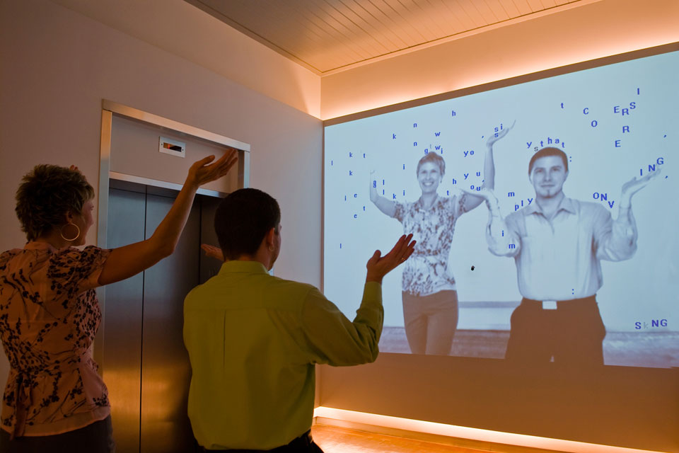
My inspiration for this project came from the art piece called “Text Rain” made by Camille Utterback in 1999 where on a projected screen, letters from the alphabet were falling randomly. Only, in Camille’s piece, people could stand in front of the projector and “catch” the letters in order to try and make a word.

Below you can find my own project:

and below you can find the code for this project:

let letters = []; // array to store falling letters
let slider; // slider to control letter frequency

function setup() {
  createCanvas(600, 600);
  slider = createSlider(0, 50, 10); // create slider with range from 0 to 50 and default value of 10
  slider.position(10, height + 10); // position slider below canvas
}

function draw() {
  background(220);
  // generate new letters based on slider value
  for (let i = 0; i < slider.value(); i++) {
    letters.push(new Letter(random(width), -20, random(65, 91))); // add new letter with random position and uppercase letter code
  }
  // draw and update all letters
  for (let letter of letters) {
    letter.draw();
    letter.update();
  }
}

class Letter {
  constructor(x, y, code) {
    this.x = x;
    this.y = y;
    this.code = code;
    this.speed = random(1, 5);
  }
  
  draw() {
    text(String.fromCharCode(this.code), this.x, this.y); // draw letter at current position
  }
  
  update() {
    this.y += this.speed; // move letter down based on speed
    if (this.y > height) {
      // remove letter from array when it goes off screen
      let index = letters.indexOf(this);
      letters.splice(index, 1);
    }
  }
}

While obviously I am nowhere near the level to add Camille’s interactivity nor do I have the resources to do so, I took inspiration from this piece and tried to recreate it on my own. While her letters are a bit more scattered in order to make them easier to catch, I wasn’t limited by this feature and so tried to create a waterfall like effect in order to create a bombardment of letters. My reason for this is because one day in class, professor Mang mentioned something interesting about randomness and infinity in where say if letters keep falling randomly and for an infinite amount of time, eventually, they will end up spelling out a word. The thought of such a possibility intrigued hence why I wanted to create a waterfall in order to try and maximize that chance.

I’m especially proud of my implementation with the slider allowing the user to control how many letters should fell if it feels over or underwhelming for them. You can turn the slider to 0 if you are tired of the letters or max it out though I wouldn’t maybe recommend that if you have an especially old laptop.

I could definitely improve on this by adding more color to the background or adding some audio such as maybe a waterfall audio or such. It would add more personality and touch to the project though I guess you could say the simplicity if this project adds to it as well.

Weekly Assignment 4

Concept:

Initially I had some difficulty in choosing the data because I wasn’t sure what kind of data I should look for. Eventually, for my dataset, I chose a csv file that contained data regarding stars. The information contained in the csv are: temperature, luminosity, radius, absolute magnitude, star type, star color, and the spectral class. Of these categories, I used the radius, star type, and star color. Even after I chose my dataset, I wasn’t sure how to exactly visualize it since there wasn’t a category that specifically translated into x and y axis positions. So in the end I just ended up arranging the stars in order they had from the csv but separated by their type.

Coding:

My project consists of 6 different windows that can be navigated by the buttons on the top where each button switches the canvas to show the corresponding star type. The stars are aligned in the center and are arranged in order of the csv data and dare drawn by the color according to the data stored in the csv. Determining the radius of the stars was a bit tricky because the discrepancy between the smallest and the largest radius was too huge so I had to scale the radius for bigger and smaller stars.

switch(int(this.starType)){
      case 0:
        this.radius *= 100;
        break;
      case 1:
        this.radius *= 50;
        break;
      case 2:
        this.radius *= 1000;
        break;
      case 3:
        this.radius *= 20;
        break;
      case 4:
        this.radius *= 1;
        break;
      case 5:
        this.radius /= 10;
        break;
    }

So this is how I scaled the star sizes. For the bigger stars, since the radius is greater than the distance between the stars, the stars overlap and create a shape which is what I somewhat expected/aimed to achieve to create some sort of art. For the switching menus, I just created a separate drawing function that ignored all the stars that are not the current target to be drawn on the canvas.

Challenge:

My initial challenge for this assignment was deciding what kind of data to be used and how to visualize the chosen data. I couldn’t find an appropriate data and be creative with the data I have chosen so I basically had to compromise with what I found. Once I was working with the data set for my current final project, a challenge I ran into was that the data for each stars weren’t arranged by their types. So for example, after 10 type 0 stars, there would be 10 type 1 stars and later on after cycling through all the types there would be 10 type 0 stars again and so on. This was a problem for me since I wanted to arrange the stars based on the star types and align them in order. So I came up with a mechanism where I literally stored the x coordinates for all the stars in a 2d array where the columns were the star types and the rows are the arrays for actual x coordinates. And then in the instantiation of the star instances, for each star that is being instantiated, the counter for that star’s type will be increased and therefore the star’s x coordinate will be directed to the according x coordinate being stored in the 2d array. I know I could’ve took a different approach by sorting the array in a certain format, but I feel particularly proud with my problem solving skills even though it may not be the most efficient method.

let xCoArr = []
let xCoCounterArr = [0, 0, 0, 0, 0, 0];
   
... 

for(let i = 0; i < 6; i++){
  let xCo = 10; //the first x coordinate
  for(let j = 0; j < 40; j++){
    xCoRow.push(xCo); //Stores the x coordinate positions in the array
    xCo += 17; //the distance between the stars
  }
  xCoArr.push(xCoRow); //pushes each x coordinate array per star type
}

...

this.xCo = xCoArr[this.starType][xCoCounterArr[this.starType]];
xCoCounterArr[this.starType]++;


Reflection:

This wasn’t my particular favorite nor best assignment because I was really not sure what exactly to do till the last minute, but it still was a good experience in dealing with csv and using it to visualize through p5js. I think my best takeaway from this assignment is the problem solving experience with the arranging of the stars.

Assignment – Data Visualization

Concept

For this assignment, I selected the data from the London DataStore by King’s College London about “London Average Air Quality Levels”. The data shows background average readings for Nitric Oxide, Nitrogen Dioxide, Oxides of Nitrogen, Ozone, Particulate Matter (PM10 and PM2.5), and Sulphur Dioxide over the course of 9 years, from January 2010 to Aug 2019. I wanted to represent the readings in the form of particles of varying sizes and colors with a background color of sky to show how these air pollutants exist around us and the level of impact they make. 

Code

I started off by representing the pollutants’ readings using points on the normal canvas size but as the number of categories for pollutants compared to the number of months(rows) was small, I used map( ) to space out the particles across the y and x axis. I used ±random(1, -1) to cause a vibrating impact for the particles to kind of show them as molecules vibrating in the air. I also used map( ) to set the size of particles according to their recorded quantity in the air. For the other display, I displayed data as a continuous vertex which formed a diagonal line in the middle to display the net decrease in the quantity of pollutants in the air.

[Click mouse to change data representation and move mouse for date display]

The values increase top to bottom and that’s why the size of particles at the bottom is greater than that at the top. The size of particles depicts the magnitude of the readings, larger particles represent more quantity of a certain pollutant in the air. All seven pollutants that are recorded have different colors as well. The month and year is displayed along the bottom when the mouse moves within the column range of one data value.

Reflection

This particular assignment was fairly easy to work with because the majority of the tasks were performed by already existing table functions. It was interesting to see how simple data could be used to create such visual representations and experimenting with the same data caused different results. I think I would want to make the display more aesthetically pleasing and interactive next time.

Week 4 – Text and Data Visualization

Concept

I wanted to combine both text and data visualization for this assignment so I decided to import a dataset containing countries with their respective latitude and longitudes. After importing these, I split each row of information by commas and saved the country name, longitude, and latitude in variables. I then used these variables to create objects for each country and saved their name along with their x and y positions. The initial x and y positions are the country’s longitude and latitude mapped onto the canvas and then these countries are made to move along the canvas while their original locations (represented by blinking points) stay static. The background is an image of the world map.

This piece represents the dynamism that exists between countries today. The world is super interlinked with countries staying connected, be it through trade, technology, or politics. Thus, this piece aims to represent our dynamic, ever-evolving, globalized world. Moreover, for interactivity, the mouse can be pressed to pause and play the motion of the countries.

Sketch and Code

For this sketch, I used the following as can be seen in my code:

  • Image
  • Data visualization (country dataset)
  • Text
  • OOP to create country objects
  • Mapping
  • Loops
  • Randomization
//declare global variables
let img;
let lat;
let lon;
let country;
let countries =[];
let minSpeedX =-1;
let maxSpeedX =1;
let minSpeedY =-2;
let maxSpeedY = 2;
let updateScreen =true;

//preload images and csv data to avoid errors/undefined values
function preload() {
  img = loadImage('image/3.png');//2
  // The text from the file is loaded into an array.
  strings = loadStrings("world.csv");
}

//set up a canvas
function setup() {
    createCanvas(600, 500);
    smooth();
    background(220);  
    image(img, 0, 0);
    //frameRate(50);
  // Top-left corner of the img is at (0, 0)
  // Width and height are the img's original width and height
  
  if (strings == null) {
    print("failed to load the file, stopping here");
    // this is an endless loop; it's a common way
    // to prevent a program from continuing when
    // something is so wrong that there is no sense
    // in continuing
    while (true) {}
  }
  print(
    "strings loaded from file successfully, read " + strings.length + " lines"
  );
  
  //use countries data from csv to find name, latitude, and longitude of each country and save each into country objects
  findcountryLocation();
 
}
function draw()
{
  //user can press mouse to pause and play the motion of the country names
   if(mouseIsPressed){
  if (updateScreen == true)
    {
      updateScreen = false;
    }
     else {
       if (updateScreen == false)
         {
           updateScreen = true;
         }
     }
}
  //whenever update screen is true, allow the countries to update/move
  if (updateScreen==true){
     image(img, 0, 0);
    for (let i = 0; i < countries.length; i++)
    {
      countries[i].update();
    
    }
  }
}
  //use countries data from csv to find name, latitude, and longitude of each country and save each into country objects
function findcountryLocation(){
  let row =[];
  // loop over each row in the file
  for (let csvRowNumber = 1; csvRowNumber < strings.length; csvRowNumber++) {
    // get a single row and split that row
    // into individual words
    row = split(strings[csvRowNumber], ",");
    lat = row[1];
    lon = row[2];
    country = row[3];
    //print(country, ' ', lat,' ', lon);
  
    //map the country's longitude and latitude within the limits of our canvas
    ypos = map(lat, -90, 90, 0, height);
    xpos = map(lon, -180,180, 0, width);
    
    //create country object to save name, x and y position in an array of countries
    newCountry = new my_country(country, xpos, ypos, random(minSpeedX, maxSpeedX), random(minSpeedY, maxSpeedY));
    countries.push(newCountry);
  } 
}
//class to save data of countries
class my_country {
  constructor(country, x, y, speedX, speedY){
    this.country = country;
    this.x = x;
    this.y = y; 
    this.speedX=speedX;
    this.speedY=speedY;
    this.pointX =x;
    this.pointY =y;
  }
  
  //function to move the country names
  update(){
    //move/translate the blinking points to center them on canvas
    push();
    translate(0,-80);
    fill(random(255));
    noStroke();
    ellipse(this.pointX,this.pointY,3,3);
    pop();
    
    //write the country name at x and y and update x and y to move the names
    //if the names touch the canvas boundary, change their direction so they bounce back
    fill('white');
    textSize(8)
    text(this.country, this.x, this.y);
    this.x+=this.speedX;
    this.y+=this.speedY;
    if (this.x > width || this.x < 0){
      this.speedX = -this.speedX
    }
    if (this.y > height || this.y < 0)
      {
        this.speedY = -this.speedY
      }
  }
}

Reflection and Further Improvements

I had a lot of fun working with both text and datasets as I loved how such a simple data import allowed for a random and intricate design to be created. I also enjoyed representing our world and its dynamism through this piece and something I realized that this type of art can help us do is convey a message or raise awareness. In future works, I would love to use other data sets to represent a problem in our world such as carbon emissions data or poverty rates, or convey a message/concept as I did for this piece. Something I can improve is the mapping of longitudes and latitudes as I felt the points did not perfectly map on the image and this is something I can further look into to improve.

Week 4: Data Visualisation (Udemy Course Data)

Concept

I found a dataset on Udemy courses on the Kaggle database, which stored the data such as course rating, course duration, course price, and many more. However, I was focused on three of these variables. I quickly browsed through the data and decided to use it to create a scatterplot or three variables. One of them would represent the x-axis, while another one would populate the y-axis, and for the third variable, it would be plotted as the size of the point. This would essentially create a 3-dimensional scatter plot in a 2D graph.

The scatter plot can then be used to find correlation between the three variables and all the six combinations of two variables from three. Some of the observations that can be made from this data visualisation is discussed below.

Procedure

There are a series of steps I followed to reach my end result. Note that: Each blob is an object and has its own attributes.

  1. Data Collection/Retrieval: I got the data set titled “Udemy Courses – Top 5000 Course 2022” from Kaggle. However, I only used about 2000 rows of data as it was faster to load, the code can be scaled to utilise all 5000 rows of data, if necessary.
  2. Data Cleaning: In this phase, I looked at the columns of data that the plot would concern with, namely reviews_avg (course rating), course_duration, and main_price. All of theses columns were in a string format with embedded numbers in them. For instance, the course rating was stored as “Rating: 4.6 out of 5.0“. I split each data point, and extracted the relevant number.
    function getRating(ratings) {
      // stores ratings in floating numbers
      let rating = [];
      max_rating = 0;
      
      // cleaning the data to extract numbers from strings
      for (let i = 0; i < len; i++) {
        let rating_array = ratings[i].split(" ");
        rating[i] = parseFloat(rating_array[1]);
        
        // extracting the maximum rating
        if (max_rating < rating[i]) {
          max_rating = rating[i];
        }
      }
    
      return rating;
    }
    
    function getDuration(durations) {
      // stores duration in floating numbers
      let duration = [];
      max_duration = 0;
      
      // cleaning the data to extract numbers from strings
      for (let i = 0; i < len; i++) {
        let duration_array = durations[i].split(" ");
        duration[i] = parseFloat(duration_array[0]);
        
        // extracting the maximum duration
        if (max_duration < duration[i]) {
          max_duration = duration[i];
        }
      }
      
      return duration;
    }
    
    function getPrice(prices) {
      // stores duration in floating numbers
      let price = [];
      max_price = 0;
      
      // cleaning the data to extract numbers from strings
      for (let i = 0; i < len; i++) {
        let price_array = prices[i].split(" ");
        price[i] = price_array[2];
        
        // ignoring any values that is not present
        if (price[i] == undefined) {
          continue;
        }
        
        // the number in string had comma, e.g. 1,399.99. This portion removes the comma and converts the string into a floating number
        let temp = price[i].slice(2).split(",");
        if (temp.length == 2) {
          // the price was only in thousands, so there is only one comma in each price data
          price[i] = parseFloat(temp[0])*1000 + parseFloat(temp[1]);
        } else {
          price[i] = parseFloat(temp[0]);
        }
        
        // extracting the maximum price
        if (max_price < price[i]) {
          max_price = price[i];
        }
      }
    
      return price;
    }

    The above code shows how the data cleaning was done.

  3. Normalised Values: I normalised the value in each data variable to fit the canvas. This was achieved by comparing each data with its respective maximum data for each variable and multiplying by the some factor of width, height and size. The portion of the code used to normalise the values is as follows:
    // normalizing the data to fit into the canvas
        
    // Price is used on the x-axis, while rating is used on the y-axis
    let xPos = this.price / max_price * (width/1.1);
    let yPos = this.rating / max_rating * (height*2) - height*1.1;
        
    // the duration of the course determines the diameter of the circle
    let diameter = this.duration / max_duration * 200;
  4. Displaying: Notice from the above code snippet, that the prices is used as the x-coordinate, rating is used as the y-coordinate, while duration is used as the diameter for the blob/circle that would be plotted on the canvas. This decision for the axises was made with hit-and-trial as I tried various combination, and chose which appeared to be the most aesthetic.
  5. Interactivity: As part of the interactivity, I added in a hover function to the blob, such that the name, price, rating and duration of the course gets displayed when you hover over any of the blobs in the plot. I implemented this using show_description() function in the class as such:
    show_description() {
      // displays the information about the course when hovered on the blob
      if ((mouseX <= this.xPos + this.diameter/2 && mouseX >= this.xPos - this.diameter/2) && (mouseY < this.yPos + this.diameter/2 && mouseY > this.yPos - this.diameter/2)) {
        if (mouseX > width/2) {
          textAlign(RIGHT, CENTER);
          fill(123);
          rect(mouseX - 520, mouseY - 10, 520, 80);
        } else {
          textAlign(LEFT, CENTER);
          fill(123);
          rect(mouseX - 20, mouseY - 10, 520, 80);
        }
    
        fill("#eeeeee")
        text(this.name, mouseX - 10, mouseY);
        text("Price: "+this.price+ " USD", mouseX - 10, mouseY + 20);
        text("Rating: "+this.rating + "/5.0", mouseX - 10, mouseY + 40);
        text("Duration: "+this.duration + " hours", mouseX - 10, mouseY + 60);
      }
    }

Observations that can be made

There are a couple of interesting observations we can make from the data:

  1. There appears to be no apparent correlation between the price of the course and the course rating. It is interesting there is not much information to conclude that as the course rating increasing, the price increases with it, which is supposedly a common belief.
  2. Notice that the biggest blobs are mostly on the bottom right of the graph, suggesting that the course with have a longer duration also are more costly and also have a higher rating.
  3. However, most of the courses that are short have lower price and a rating that is distributed.

Future Improvements

It appears that the data set stores Udemy Courses have a high average rating which might make the observations on the data biased towards higher rated courses and might not provide definite conclusion about the entirety of Udemy course libraries. So, an improvement would be on the data collection where we can randomly sample a few thousand courses from the entire Udemy course library to maintain a proper distribution of the entire population/sample space.

Assignment 4 – Generative Text

Concept

Recently, I have been playing through the story mode of UBISOFT’s Assassin’s Creed: Valhalla. This experience, paired with the recent trip to UBISOFT, inspired me to create this piece. I decided to use the slogan of the brotherhood from the Assassin’s Creed lore, and additionally I used an online translator to convert the slogan from latin to elder futhark scripture. This was done to tribute the Viking culture and their language with respect to the game.

Code 

For this assignment, I experimented a bit with using external media such as images and sound. I would say that the biggest part of my creative process for this assignment was choosing the right image on which the text displayed would be comprehensible.

Additionally, what proved to be a challenge was determining all the relative dimensions which determined the amount of text being displayed.  In order to not hard code them, I spent quite some time defining them to get what I wanted. The main goal was to have the mouse X-coordinate control the amount of text being displayed. This was done through the following code:

textSize(32);
textAlign(CENTER, BOTTOM);
let middle1 = sourceText1.length / 2;
let left1 = middle1 - ((mouseX / width) * middle1);
let right1 = middle1 + ((mouseX / width) * middle1);
//Draw a number of characters from the string depending on the mouse X coordinate
text(
  sourceText1.substring(left1, right1+1),
  width/2, height/10.01);

Eventually I got the following sketch as the final version for this assignment:

Future Improvements

All in all, I am pretty satisfied with the way this assignment turned out for me. I was able to implement things we learnt in class and relate them to a lot of interests that I have. In the future, I would like to focus more on maybe composing an image similar to this one with OOP.


Assignment 3

Concept

For this assignment, I initially started with the idea of incorporating the polar rose (picture shown below) into the art work. It is a mathematical equation that forms a curve shaped like a flower. With the use of sin and cos, it creates varying number of petals of the flower. However, when I was experimenting with different variables for the number of petals and I chose 4 petals, it resembled more of a butterfly which prompted me to create an artwork about butterflies.

Code

It took me some time to fully understand the noise() function but after getting that sorted, I wanted to make the wings flap. This proved to be quite difficult to understand because I was dealing with two similar codes with different parameters for the upper and lower wings. Through experimenting with x-coordinate and y-coordinate values in the noise function, I was able to achieve the flapping effect by incrementing the y-coordinate through noise which caused a gradual change in the curve of the wings, making it seem as if they’re flapping. I think experimenting with the code in three dimensions for the particles falling was also a very interesting journey. I was particularly happy with the falling effect from the particles.

The butterflies appear randomly on the canvas and if you tap the canvas, a new butterfly appears with a different speed of flapping. Pressing on the same spot creates an almost layered butterfly effect which looks good.

Reflection

I think this assignment took me a lot of time to complete because I was not familiar with the noise() function and I learnt about it more through experimentation than simply reading the topic. I was able to interact with map() function and use classes for both the butterflies and the particles. Despite the prolonged time I spent for this assignment, I am happy with the outcome as I managed to make the different components of the art piece work together, such as random flapping speed, particles, song, and new butterflies when mouse is clicked. 


Assignment 3: OOP DESIGN

Concept & Inspiration:

For this assignment, I wanted to create the “Metatron’s Cube,” a sacred geometrical figure that has been used in various spiritual and mystical traditions throughout history. The figure is named after the biblical figure Metatron, who is said to have acted as a mediator between God and humanity. I wanted to use p5.Js to combine digital art with ancient spiritual wisdom. Here’s how this figure looks like:
What Is a Metatron’s Cube — and Why Is It Significant? - Symbol Sage

I didn’t expect that this figure would be really difficult to draw in p5.js. However, for the sake of this assignment and using the ideas of the object-oriented programming, I was able to draw set of nodes, represented as small circles, that move in circular orbits around the center of the canvas. Lines are drawn between nodes that are close enough together. The positions of the nodes are updated based on their angle around the center, which changes over time. Moreover, it allows user to interact by adding or removing nodes with mouse clicks or the backspace key, respectively. The current number of nodes and lines are displayed on the canvas for reference. I was able to draw some thing similar to the “Metatron’s Cube”.  Here’s how the final version look like:

Future Improvements:

Although, I couldn’t really achieve what I wanted to, this project gave me some idea how I can create an actual metatron’s cube using p5.js. So, obviously in future I’d like to create the actual figure. Moreover, I’d like to add meditating music in the background. I’d also like to improve some of the visual aspects of my work such as adding more colors and some objects in the background. Lastly, I think digital art is all about interactions and would like to add more interactivity features such as allowing users to control the speed or direction of the nodes and lines, or to change the color scheme in real-time using user inputs.


Assignment3: Creative Chaos


Inspiration:

For this project I was inspired by old TV static. Growing up I always wondered about the cause of old TV static. Through intro to Interactive media I was introduced to Perlin noise and the power of computers to produce random like graphics that seem to morph and change organically.

Concept:

In this project I attempted to recreate a noise-like graphic display that mimics a TV static but without using the NOISE() function. The piece displays moving black rectangles and switch to random colours once the the user clicks the mouse. The more frequent the clicks are, the more chaotic and static like design is.

Technicalities:

I used some of the code from the bouncing ball code from class. However, the trick was to remove the background which removes the clean cut aspect of the piece and allows the audience to see everything about the rectangles throughout time.


Yerkebulan Imanbayev – Home Work 3

Glitch in the System

Concept

For this assignment, I wanted to focus on the concepts of chaos and order that we talked about in the previous class.

I was really inspired by the work of Edward Fielding, specifically “Modern Art Square”.

This piece is very clean and organized – what we think of when we think of order. My inspiration manifested itself in the idea of opposing that and creating and artwork that draws superficial elements of the piece – squares – and turns them into complete chaos.

The code

In my artwork, I was able to code a certain number of squares using arrays and classes. This algorithm create a variety of squares, in random positions, shapes, colors, and with different borders. These appear in a glitch like manner, and due to the randomness of the algorithm, evokes a feeling of chaos. When the user presses the mouse on the canvas, the aforementioned characteristics change completely, once again creating the sensation of a glitch.

A prominent piece of code

display(){
strokeWeight(this.strokeThickness);
stroke(this.strokeR,this.strokeG,this.strokeB)
fill(this.colorR,this.colorG,this.colorB);
rect(this.rectX,this.rectY,this.rectWidth,this.rectHeight);
} //drawing the rectangles themselves

changeArtWork(){
this.rectX = random(350);
this.rectY = random(350);
this.rectWidth = random(50);
this.rectHeight = random(50);
this.strokeThickness = random(3);
this.colorR = random(255);
this.colorG = random(255);
this.colorB = random(255);
} //the function for changing the position, the parameters,the colors, the thickness of the borders, and the colors of the borders of the rectangles

This piece of code is symbolic to me of the concept of the artwork, because it’s very structured in nature but has the opposite outcome. In this code, every single numerical parameter that could have been used for a function is replaced with a variable, yet these variables are the outputted in a sequence of very chaotic rectangles.

Future

Going forward, I want to improve my work in terms of adding an element of movement to the codes that include arrays and classes. This would allow the user to explore the piece more extensively and spend more time on it.

Artwork