week 4 | reading response

Don Norman argues that poor design in everyday objects causes unnecessary frustration because they often prioritize aesthetics over functionality. One thing that annoys me is when the design does not align or make sense with the overall aesthetic or function of a website, app, power point, etc. It throws everything off and feels disjointed like the design and content are in two different worlds. It’s distracting. 

He introduces key concepts such as human centered design which emphasizes designing products to match users’ needs and abilities, making them intuitive and easy to use. He explains the importance of discoverability, understanding, affordances, signifiers, mapping, and feedback in creating user friendly designs. For applying Normans principles, I would focus on using signifiers in a subtle way. I want users to understand how to interact with the interface without me having to guide them or make it too obvious. The challenge here is creating an intuitive experience where signifiers are present but blend naturally into the design, guiding the user seamlessly without overwhelming them. Trying to be clear without being too in your face.

Week 4 – Reading Reflection

Don Norman’s The Psychopathology of Everyday Things really opened my eyes to how much bad design affects our daily lives. His discussion of doors reminded me of my experience at NYUAD. I used to end up intuitively pulling doors with vertical long handles and pushing those with horizontal bars, and it wasn’t until a few weeks after I arrived that a friend pointed out there were no push or pull signs. I hadn’t even realized I was making these distinctions based on the design alone. It’s funny how my brain just figured it out without needing instructions, which shows how good design can guide us without us being fully aware of it. Norman’s ideas made me realize that so many products we use every day could be vastly improved if designers paid more attention to human-centered design. It is not just about creating something that works, but about creating something that’s easy to understand and use without frustration. I also found it interesting how he called out the way we often end up memorizing how to use devices rather than actually understanding them. I end up doing this fairly often, especially with kitchen appliances or electronics that have overly complicated settings.

One thing that really struck me was how affordances and signifiers play such a crucial role in how we interact with objects. This is something I hadn’t thought about in such specific terms before, but now it makes perfect sense. When I encounter a badly designed interface or physical object, it is often because the designer didn’t consider how obvious the next step would be for the user. This made me think of apps or websites where I’ve been completely lost—sometimes even a simple swipe or button press isn’t clear. A specific thing that drives me crazy is the lack of intuitive design in most remote controls. They often have so many buttons with unclear labels, and I find myself guessing which one does what. I think this could be improved by better mapping, where the placement and labeling of buttons are more aligned with common usage patterns, similar to Norman’s example of how good mapping improves ease of use in car seat adjustments.

Norman’s principles could be applied to interactive media by ensuring clear affordances and signifiers when designing digital interfaces. For instance, in a web application, making interactive elements like buttons stand out visually and providing immediate feedback when clicked would improve the user experience. Interactive media can benefit so much from human-centered design because it directly affects the user experience. After reading Norman’s work, I’m now even more aware of how essential it is to design not just for function, but for human behavior and understanding.


Assignment 2: Loops – Passage of Time

Concept:

I wanted to create a piece about the movement of clouds in the sky. It is reminiscent of when I traveled with my family to Switzerland and I would always stare at the clouds from the balcony. They appear still, but when I would leave and come back, the clouds would’ve moved and changed positions and the sky would look different. The piece isn’t exactly about the Switzerland scenery I saw, of mountains covered in snow and trees, but rather a beach scene. The reason for choosing a beach scene is because there is more movement in it, of the waves and the shadows and light and birds and rain and wind. I wanted to be able to create movement using loops, so with every detail I added to the piece, I used a loop to make it more dynamic instead of being a still piece.

Code I’m proud of:

Overall, I was very proud of the clouds in the end. It was a struggle to figure out their movement and to vary their positions. I first created the clouds in the sky without thinking of their movement, and I was later going to use loops to generate them instead of creating them one by one. This was so confusing for me and I didn’t know how to do it. Moving the clouds was simple; I just had to increment their x-coordinates. What wasn’t simple was generating them at different positions with variable sizes. I used the random function to create the offset values for the clouds, slightly varying their shapes with every new iteration of the code. 

//loop through clouds to draw them at different positions 
for (let i = 0; i < 6; i++) {
  //move the cloud 
  cloudX+=2; 
  //set cloud position based on current iteration 
  if (i == 0){
    xDiff = x1;
    yDiff = y1;
  }
  else if (i == 1) { 
    xDiff = x2; 
    yDiff = y2; 
  } 
  else if (i == 2) { 
    xDiff = x3; 
    yDiff = y3; 
  } 
  else if (i == 3) { 
    xDiff = x4; 
    yDiff = y4; 
  } 
  else if (i == 4) { 
    xDiff = x5; 
    yDiff = y5; 
  } 
  else if (i == 5) {
    xDiff = x6; 
    yDiff = y6; 
  } 
  //drawing the cloud 
  ellipse(cloudX + xDiff, 75 + yDiff - 50, 100, 80);
  ellipse(cloudX - 40 + xDiff, 60 + yDiff - 50, 80, 60);
  ellipse(cloudX + 40 + xDiff, 70 + yDiff - 50, 60, 50);
  ellipse(cloudX - 20 + xDiff, 70 + yDiff - 50, 80, 60);
}

The loop runs 6 times to draw the 6 different clouds. I used if and if else statements to set the values of xDiff and yDiff. Once they were set, each cloud was drawn according to its position as stored in those variables.

What I had to also figure out was how to get the clouds to loop, meaning when they leave the frame, I wanted it to reappear again on the other side. This was confusing to do and I wasn’t sure what code to write to make it work, but in the end I figured out that I simply had to reset the cloud position. 

//reset clouds once they move off the screen
if (cloudX > width+50) {
  cloudX = -100; //reset cloud to start over from the left
}

The code checks if the cloud has moved off the canvas and resets the x-coordinate, causing the clouds to loop back to the left side of the canvas and start moving across again. 

In the night scene, I was proud of the code I wrote for the lighting. 

//lightning
if (random(1) < 0.03) { //3% chance of lightning 
  stroke(255);
  strokeWeight(3); 
  let xLightning = random(width);
  let yLightning = 0; 
  //7 lines to form the lightning
  for (let l = 0; l < 7; l++) {
    let xLightningEnd = xLightning + random(-20, 20); 
    let yLightningEnd = yLightning + random(30, 50);  
    line(xLightning, yLightning, xLightningEnd, yLightningEnd); 
    xLightning = xLightningEnd; 
    yLightning = yLightningEnd;
  }
}

The if statement at the beginning of this code segment was interesting to me because I could determine the chance that lighting would occur on the screen; I did a 3% chance of the lighting occurring. To generate the actual lighting piece, I chained 7 line segments together that varied in their x and y positions so that the lightning would occur on different parts of the screen. The lighting starts at a random x position at the top of the canvas and descends downwards (in a jagged way) based on random values for the end positions of the lines. 

Embedded sketch:  (press down to see night scene!!)

Reflection:

I was really happy with the end product. Every element of the piece required thinking, but bringing all the elements together formed a beautiful end piece. I kept adding random details which made for a coherent piece in the end. I started with the background (the sky and the sun and moon). I, then, worked on the clouds for a long time because I couldn’t figure out how to do it in the beginning. Then I added the beach scene with the moving waves and the changing grains of sand. The piece still felt empty, so I added a boat and added changing shadows and movement to make it look like the boat was swaying on the water. The scene still looked empty, so I added birds in the day and rain at night, and finally lighting because I wanted to contrast the day and night scenes more drastically. It took a long time to do this, but I eventually got a rhythm to my work, because I would focus on one element, make sure it worked before adding a new element. I didn’t add the beach until I finished the clouds and I didn’t add the boat until I finished the waves and sand, etc. 

Ideas for future work and improvements: 

For future work, I would love to play with more motion. I like the passage of time that this piece elicits. It’s as if it’s a time lapse of a boat on the water, from day to night. I want to play with more movement in different scenes, maybe like the look of building in the day and at night when all the lights are on, or when the street lamps turn on at night, illuminating the world, or when the world is so busy in the morning with cars rushing past and people trying to get to work and school and more, but the quiet of night when few cars pass on the road. I might also want to do something like this: as if you are sitting in a car and watching the view from the window, and the view is constantly changing as you drive on and on. 

For improvement, I would like to make my code more efficient. I kept changing the code, adding more and more variables to be able to iterate and change them. However, maybe if I used an array for the clouds, it would’ve been easier to do, or if I made the cloud an object in and of itself. Maybe I’d also want to use classes to encapsulate the behaviors of the different elements I have in the scene, of the clouds, the birds, the lighting, etc. 

ASSIGNMENT 3

Concept:

For this assignment my main inspiration came from my niece, actually, during family lunch, she was playing around with a kaleidoscope, and i remembered how as a kid, I was so intrigued by them. I searched up inspirations and patterns online and i definitely wanted to try and create a design similar to a kaleidoscope. So i created jittery, dot shape that turns into this, flowy dot when you click on the mouse, just as how the shapes change when you rotate a kaleidoscope.

Reflection:

Honestly the code wasn’t as complex and was made up of mostly arrays, OOPS what we did in class mostly, and maybe next time i should try and be more complex with it and try new codes not taken in class, but I’m still very proud of the outcome. However, I did try sin and cos to create the waviness and jitter movements with the shape , which i got inspired from Amna’s previous code last week, and I’d say that’s the code I’m most proud of as it was something new to me that took some time to get right, but after reading about it on the P5 website, I figured it out, turns out it was just coordinates and using the function random to create those flowy movements, and this is the code that allows for the dots to then turn into wavy dots so it can then look like those squares when u click/toggle on the mouse, hence if I remove it the dots would just flow up and down or side to side instead of creating the square trail.

here is code im most proud of:

// Function to move the dot
move() {
  // Create two different movement patterns based on `flowDirection`
  if (flowDirection === 0) {
    this.x += random(-2, 2); // Random jitter in the x direction
    this.y += random(-2, 2); // Random jitter in the y direction
  } else {
    this.x += sin(this.y * 0.05) * 2; // Wavy movement based on the y-coordinate
    this.y += cos(this.x * 0.05) * 2; // Wavy movement based on the x-coordinate
  }

here is my sketch:

Assignment #3: Non-Ugly Ducklings


Concept & Inspiration.

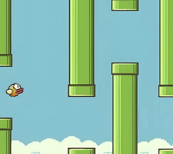
My primary inspiration comes from the game Flappy Bird, which I used to play on my phone as a child. While reflecting on it, I didn’t intend to fully replicate the game, but rather merge its concept with something else. I then remembered the children’s book The Ugly Duckling and thought about incorporating that theme. One duckling may be considered ugly, but what if there were an endless number of them? Would they still seem as ugly?

With this idea in mind, I decided to write code using classes, and through careful use of color, I aimed to show that a whole flock of supposedly ugly ducklings might not look so ugly after all.

Highlights.

For this project, I created a class and made it an array birds[] so that the user can add endless number of ducklings on canvas. Moreover, I used the .push and .pop functions for adding and removing the ducklings. Even though it took me a while to understand how to flip the bird horizontally after bouncing, I eventually implemented it in my code by creating the facingRight variable inside the class.

// Flip the bird after bouncing
if (this.x > width - 60 || this.x < 0) {
  this.xspeed *= -1;
  this.facingRight = !this.facingRight;
}

It was also the first project where I worked with text() (which was relatively easy) and some of the text-related functions.

 if (birds.length === 0) {
  fill(255);
  textSize(24);
  textAlign(CENTER);
  textStyle(BOLD);
  textFont("Helvetica");
  text("mouse click to add a duckling", width / 2, height / 2);
}

Reflection.

I am proud of this project, as I was able to implement almost all the new functions we learned in class this week. Additionally, I experimented with incorporating text for the first time. One challenge I faced was with the ducklings near the right corner, which glitch after a mouse click. I attempted to solve this issue using generative AI, but unfortunately, I wasn’t successful.

Overall, I believe the project achieved its intended purpose. In the future, I hope to create a more detailed background for the canvas, as I didn’t have enough time to include that in this version.

Embedded Sketch.

Mouse click to add a new duckling & click any key to remove the last one.

Assignment 3: Apa itu Buah Kawung? (What is Buah Kawung?)

Concept

Batik is an Indonesian pattern. Batik-making is a traditional art that uses wax to create Batik patterns on a fabric. I wanted to recreate a Batik pattern for this assignment. The main pattern that serves as my inspiration is the Batik Kawung pattern, which I incorporated into my work as the background.

Initially I didn’t know what Kawung meant, but after researching, Kawung is a fruit (Sugar Palm fruit) and this fruit is the inspiration behind the Batik Pattern. I also incorporated this fruit into my piece as the inspiration behind the floating yellow flowers that appear when the mouse is clicked anywhere on the canvas.

My next inspiration came from the use of floral designs in many Batik textiles, so I went onto Pinterest to look for a specific color scheme as well as flower designs. I love the look of a soft color palette, especially pinks and greens, so I went with this specific Pin as my main inspiration for the objects in my work.

 Highllight

My favorite part of the code has to be the functions I made for the main central flower. I learnt how to use the rotate function to create the petals of the flower, and I’m proud of myself for figuring out how to create the line details on the petals (with increasing and decreasing lengths) using for() loops because it took me quite a while to get it right since I kept messing up the angle of rotation between each repetition. I challenged myself further by making a spin() function in my Flower() class so that whenever the mouse touches the flower, the flower will start spinning.

show() {
  angleMode(DEGREES);
  translate(200, 200);
  rotate(this.angleSpeed);

  // outer flower
  stroke("rgb(245,235,216)");
  fill("#65180b");
  for (this.petal = 0; this.petal <= 7; this.petal += 1) {
    ellipse(0, 50, 60, 80);
    rotate(45);
  }

  // line detail
  for (this.petal = 0; this.petal <= 7; this.petal += 1) {
    for (this.i = 0; this.i <= 10; this.i += 5) {
      line(0, 0, 0, 60 - this.i);
      rotate(7.5);
    }

    for (this.i = 0; this.i <= 10; this.i += 5) {
      line(0, 0, 0, 45 + this.i);
      rotate(7.5);
    }
  }

  // inner flower
  stroke("#65180B");
  fill("#df8d7b");
  for (this.petal = 0; this.petal <= 7; this.petal += 1) {
    rotate(45);
    ellipse(0, 20, 30, 40);
  }
}

spin(){
  // spin flower
  this.angleSpeed += 2
}


Sketch

Hover over the central flower to see it spin and click on any part of the canvas to add more designs onto the piece!

Reflection

In this project I got to learn more about the history of Batik patterns as well as the origins behind them. In terms of technicalities, I see the appeal of using Objects; it made this project so much neater and more organized than my previous ones. Incorporating my culture into making this project is something I would definitely think about for future projects.

Assignment 3 – Celestial Drift

Inspiration

For this project, the task was to create a generative art piece. I decided I wanted to create something that captured the beauty of natural randomness, yet felt interactive and personal. I really love stargazing so this idea was immediately accompanied by a desire to incorporate stars (in a night sky setting) in some way. I thought it would be interesting to also use the stars to make randomly generated constellations. Initially, most of my ideas were all over the place and ended up progressing along with different stages of project.

Concept

After combining all of these concepts and also trying to add an element of interactivity, I arrived at a more cohesive idea. This piece essentially generates stars that slowly drift across the canvas and form constellations by connecting with nearby stars. These connections fade as the stars move farther apart, creating an ever-changing night sky. By clicking on the canvas, users can add new stars, and hovering the mouse near existing stars creates connections with the mouse pointer, making the viewer an active part of the art. I tried to replicate a portion of the night sky by creating a background gradient, which shifts from dark blue to a purplish hue.

Implementation

Here’s what it looks like!

The core of the project focuses on the generative placement and connection of stars, while other features such as mouse interactions and background gradients enhance the experience.

Most of the functionality of the code resides in the Star() class. I also initially created a global variable numStars which controls the initial number of stars that appear on the canvas (currently set to 70). However, more stars can be added when the user clicks on the screen.

Here are important aspects of the code that I’m proud of :))

1. Generating Stars and Constellations

The star generation begins by randomly placing stars across the canvas. Each star drifts slowly, giving the impression of a calm, subtly changing night sky. The stars are connected by lines if they are within a specific distance from each other, creating constellations. These lines fade with increasing distance between the stars they connect and disappear completely once they cross a certain threshold. The distance threshold is adjustable (maxDistance), allowing for varying constellations as stars drift closer or further from one another.

/ Connecting stars that are within a certain distance
  connect(stars) {
    for (let i = 0; i < stars.length; i++) {
      let d = dist(this.x, this.y, stars[i].x, stars[i].y);
      if (d < maxDistance) {
        stroke(255, 255, 255, map(d, 0, maxDistance, 255, 0)); // making line fade as distance increases
        line(this.x, this.y, stars[i].x, stars[i].y);
      }
    }
  }

2. User Interaction

User interaction is a key feature of the project. Clicking anywhere on the canvas creates a new star at the mouse’s location.

// Adding a new star at the mouse position when the mouse is clicked
function mousePressed() {
  let size = random(2, 5); // the star created has a randomized size
  stars.push(new Star(mouseX, mouseY, size)); // creating a new star at the mouse position (with given size)
}

In addition to adding stars, the mouse also exerts an influence on the stars already in place. When the mouse hovers near a star, stronger and thicker connections are drawn between the star and the mouse, creating a sense of gravitational pull. This connection changes based on the distance between the mouse and the stars, offering a layered sense of interactivity.

// Connecting stars according to mouse position
  mouseConnect() {
    let mouseDist = dist(this.x, this.y, mouseX, mouseY);
    
    // If the star is within the influence of the mouse, create more prominent connections
    if (mouseDist < mouseInfluenceDistance) {
      stroke(233, 217, 255, map(mouseDist, 0, mouseInfluenceDistance, 255, 50)); // Stronger lines with mouse
      strokeWeight(map(mouseDist, 0, mouseInfluenceDistance, 2, 0.5)); // Thicker lines near the mouse
      line(this.x, this.y, mouseX, mouseY); // Draw line to the mouse position
    }
  }

3. Gradient Background

The background gradient is crucial to creating a more realistic cosmic atmosphere. A vertical gradient transitions from a deep, dark blue at the top to a lighter, purplish hue at the bottom, simulating the natural gradient of a night sky fading into early dawn. This gradient creates a contrast to the white stars and their connections, making the work feel more immersive. In creating this gradient, I learnt how to use lerpColor(), which allowed me to smoothly blend two colors based on a transition value. By mapping the vertical position of each line to a gradient value, I was able to simulate the soft shift from night to early morning. The setGradient() function essentially draws horizontal lines from the top to the bottom of the canvas (slightly changing the color each time to create a smooth gradient).

// Creating a vertical gradient
function setGradient(x, y, w, h, c1, c2) {
  for (let i = y; i <= y + h; i++) {
    let inter = map(i, y, y + h, 0, 1); 
    let c = lerpColor(c1, c2, inter); // when inter is 0,  the colour is c1 and when inter is 1, the colour is c2 (for any other value it is a mix of c1 and c2)
    stroke(c);
    line(x, i, x + w, i); // drawing a line across the width of the gradient area
  }
}

Reflections and Further Improvements

This assignment gave me the chance to play around with randomness and interactivity in a simple yet engaging way. I enjoyed seeing how small things like mouse movement and clicks could bring the stars to life and create an immersive atmosphere. The project feels peaceful yet active, and I’m happy with how the core mechanics came together.

Looking ahead, I’d like to add more depth to the stars—maybe a twinkling effect or layered constellations with different star types. It could also be interesting to introduce sound, where each star interaction triggers a soft note, giving the project an audio element. Another idea is to have the background gradient shift gradually over time, mimicking the change from night to dawn for added realism. I could maybe also experiment with adding other celestial bodies like planets and nebulae.

Overall, I am pretty proud of how this turned out and look forward to making more advanced projects :))

Week 3 reading


A significant part of the reading that stood out to me was where Crawford uses the example of a person dodging a tree branch to describe the difference between reactive and interactive. When I think of interactive elements within my programs, I would consider whatever happens on screen as a result my input counts as interactive. However, what the author is arguing is that this reactive element only becomes interactive, if it does something meaningful. The author defines interactivity through a metaphor of conversation, consisting of listening,thinking and speaking. 

I believe that the author’s metaphor works quite well in describing what we would want to see within an interactive system. For example, the user interface of the system must be easy to understand and use, as opposed to being filled with technical jargon, which may hinder your experience with the system. I believe another important aspect of interactivity is the response we get from the system or computer following an input from the user. Interactivity is undermined when the response doesn’t match well or isn’t suitable for what the user inputted. 

To improve my interactivity within my future p5 sketches, I want to incorporate more meaningful interactive elements, but more importantly, I should try to improve the aesthetics of my interactive elements. Currently, all my descriptions of interactivity are not within my sketch, which could be difficult if there wasn’t a guide to the interactive elements of my sketches. 

Assignment 3 – An array of Memories

Concept

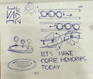
Unlike previous assignment, I was more confused on what kind of visual idea I could implement using arrays, classes and OOP. But, then I was reminded my love for Disney movies, and a complete picture came to my mind and I transferred it on paper.

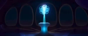
Being obsessed with Inside Out 2 movie the whole summer had its own benefits, and it gave me the idea of creating a storage of memories in my code. I struggled a couple of days, failing to implement the functions and array concept we learned in class to my own work. After watching some videos on  OOP in p5.js, I decided to implement the idea of random moving of circles in the form of “sense of self” that was present in the movie. In my vision, moving circles would symbolize the amount of experiences and emotional background the person accumulates, and with time it only expands.

Sense of Self. (n.d.). Inside Out Wiki. https://static.wikia.nocookie.net/insideout/images/b/b5/Inside_Out_2_-_Sense_Of_Self.jpeg/revision/latest?cb=20240606171333
What I’m Proud of
 function setup() {
  createCanvas(500, 500);
  
  //circle animation
  for(let i=0;i<700;i++){
    memories[i] = new Memory (250,400);
    }
}
//performing functions for an array
  for(let i=0;i<memories.length;i++){
    memories[i].display();
    memories[i].move();
  }
// creating a class for moving circles

class Memory {
  constructor (x, y) {
    this.x = x;
    this.y = y;    
  }
  
// creating a function for circles to move around randomly
  move(){
    this.x = this.x + random (-2,2);
    this.y = this.y + random (-2,2);
  }
  
// creating a function for visual of the circles
  display (){
    stroke (251, 254, 151, 80);
    strokeWeight (2);
    noFill();
    ellipse (this.x, this.y, 80, 80);
  }
}

I think exactly the “Sense of Self” thing that I implemented is the one I am most proud of, because it took me couple of days to really understand what function each element performs and what its role. So I created a class and two function for it on separate files.

First sketch

Updated version

I updated my original sketch, utilizing the concepts we covered in the class, like push(), pop(), scale () function. I created a new array to implement interactivity for changing colors of the Sense of the Self, where each color represents the  emotion from Inside Out, like ennui, sadness, fear, anger, anxiety, etc. I also moved the text line and scaled down the image of happiness to make it more aesthetically pleasing.

Reflection

Overall, I am proud of what I’ve accomplished with my code. You can see different emotions flowing into different directions, and then there is sense of self, which symbolizes character of the person and different emotional experiences. Moreover, I’ve added the sketch of the happiness image from the movie to add to the style.

However, I would like to work more the interactivity of my project. Currently, there is only way you can interact with the sketch, which is by changing color of Sense of Self. But I have some ideas of how I could develop it, for example adding memories balls to the lines when the mouse is pressed in particular location. Moreover, maybe I would elaborate on the concept of emotions, and work on more logical ways to show how different emotions evolve, like when happiness and sadness meet, there is a new emotion of nostalgia, something like that. I would also want to work on the similarity of my project to the movie’s reality, so it could be recognized from first seconds by viewers.

Reading Reflection – Week 3: The Art of Interactive Design

After reading the text, I now understand interactivity a bit more. Initially i thought it was just a simple exchange between two parties, but now I see it more as a back and forth and continuous effort from both parties to keep the exchange going. I really like the idea of interactivity having three main components: listening, thinking and speaking. Though there is a debate on what counts as interactive or not, I do think that the three components make good factors to consider when classifying them into the degrees of interactivity.

I love how the light inside a refrigerator was mentioned, because when I was younger it really did serve as a form of entertainment to open the fridge, see the light turn on, and then slowly close it, not fully, but just enough so that I can see the light eventually turns off. Even though Crawford concluded that this system has ‘low level interactivity’, to younger me it was a fun little activity that until now, I would still occasionally do for fun; so in that sense, I would consider the lights on refrigerators to be a high level interactivity (though this is a highly biased and personal take).