Reading Reflection – Week #4

In his book “The Design of Everyday Things” Don Norman discusses complex characteristics of human-centred design – in fact, the user’s power to interfere with design is in feedback. I agree that in many cases with industrial and product design the most important thing is to be user-friendly. If the function is unclear because of the complex form, the object may become ineffective and even harmful. Furthermore, nowadays the job of interaction designers becomes more and more difficult: people indeed tend to memorise how to work with one specific interface, and then try to apply this knowledge to other machines and applications. This often results in confusion – but does it mean that all design has to become universal?

An example of something that drives me crazy in this sense is the design of the Snapchat interface.  It is very different from other social media apps, which makes it unique yet confusing for new users. When I just started using this app, I did not know about many features – for instance, that message history was not saved by default – and there was no warning or guidance. The only way to figure this out was through personal exploration, which is not always the most effective option. This could be changed by adding onboarding that would explain some unconventional functionality. 

I have read Norman’s book before, but I did not get in depth with analysing ideas about human-machine interaction. Now that I develop my own programs, I realise the importance of accepting human behaviour “the way it is, not the way we would wish it to be” (Norman, 1988). Being too logical while creating interactive media may become problematic when the user suddenly stops following the very logic.

Reading response #3: principles of design

One thing that bothers me, and is also mentioned by Norman, is unwanted feedback. The sound of a microwave notifying you that it’s done is especially annoying when you’re trying to grab a quick bite in the early morning without disturbing your roommates. While the feedback from the microwave is immediate and informative, I wish there were an option to mute the sound.

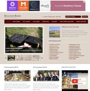
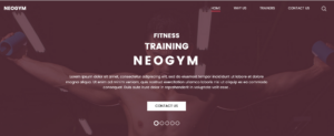
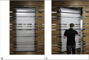
In this case, even well-intentioned feedback can become annoying if users aren’t given enough control, which drive my attention to another question: to what extent should we allow trial and error in a design? For example, the door on page 12 shows us a aesthetically pleasing but also confusing design of a door. You have to try pushing or pulling to test how it works. In this case, users are given more freedom but it might also cost more time. The same dilemma applies to minimalist website designs. Taking the following figures as examples: one that displays a lot of information and another that shows very little.

Websites today often rely on intuitive logic for users who have abundance experiences with technology, but for those without a strong foundation, minimalism can create confusion rather than clarity. This touches on Norman’s concept of the technology paradox, where increased functionality sometimes leads to a steeper learning curve. However, the technology paradox is seen less nowadays as everyone seem to have a relatively good foundation of using tech.

It’s complicated to build affordance and use signifiers, much like trying to understand the “black box” of the human mind and its thinking processes. In IM, striking this balance between clarity and aesthetics is key. One practical thing we can do is to work on a conceptual model. 


READING

After reading, my initial thought was how, in the real world today, we are always competing to make inventions that already function smoothly look fancy and aesthetically futuristic. This causes us to overlook the importance of simple designs that just work. The examples given in the text, like doors, switches, and stoves, are good examples of how, in today’s world, simple objects can become confusing when designed poorly just for the sake of appearance. In my opinion, I appreciate good design when it works easily, rather than the overcomplicated ones that frustrate me. For example, when he talked about his friend’s experience with a door, it really stood out to me because it shows how humans can take something simple and turn it into something people struggle with, which is also frustrating.

For me, it’s annoying when designers care more about how things look than how they function. It feels like they’re taking away the object’s purpose. It’s not just me who feels this way, because older generations also struggle with this. They have a hard time catching up with how the world functions now, so adding complexity to something that’s supposed to be simple just makes it harder for them. Sometimes it feels like designers expect us to admire their work without caring if we can actually use it. What’s the point of a nice-looking door if I don’t know how to open it? This applies to all kinds of things, not just objects, but whether it’s a phone app or a media project, it needs to be easy to use.

In today’s world, many products are designed with minimalism in mind. While they may look cool and modern, they often hide important functions. For example, take Kim Kardashian’s sink design in her house. The sink looks cool and ultra-modern, but it’s confusing because it doesn’t function like a regular sink. The surface is completely flat with no visible basin, and the water drains into a small slit. While the design looks unique and futuristic, it takes away from the sink’s practicality. When I saw it for the first time, my first thought was, “How does the tap work?” This is a perfect example of minimalist design taken too far, where the design hides or complicates something as simple as a sink’s basic function. The goal of making something aesthetically pleasing can actually make its usability hard and confusing.

Overall, I think the ideas of “discoverability” and “understanding” are important when it comes to the process of designing something. Discoverability helps someone figure out what to do, while understanding helps them know how it works. To me, these two concepts are essential to good design. This also applies to the media work I want to do. If something isn’t clear, the message gets lost. Good design should be so simple and natural that you don’t even think about it. That’s something I want to keep in mind for any future projects I create, whether in film, media, or design. In the end, I think it’s important not to overlook the balance between how something looks and how well it works.

ASSIGMENT #4 – GENRATIVE TEXT

CONCEPT:

For this assignment, I wanted to create generative art that involved text. While searching for inspiration, I came across Scott Garner’s work on Creative Blog, where he used p5.js to create an art piece with stars forming text against a night sky backdrop. This inspired me to explore how stars, randomness, and interaction could be combined to form dynamic, visually engaging text. For my piece, I will create stars that will scatter and form text shapes based on user interaction, blending order and randomness, just like Garner’s example. Ill also make it a space theme while exploring Gaussian distribution to add in the art background.

EMBEDDED SKETCH:

HIGHLIGHT OF MY CODE:

The best part of my code is the interactive switching feature that lets people switch between an arranged text and scattered stars. When you click on a button, this interaction starts. It’s a dynamic, responsive experience where stars move from randomly scattering to making a word. This is how the code works:

// Function to scatter the white dots randomly across the canvas
function scatterDots(canvasWidth, canvasHeight) {
  whiteDots.forEach(dot => {
    dot.currentX = random(canvasWidth);  // Set random x position within canvas width
    dot.currentY = random(canvasHeight);  // Set random y position within canvas height
  });
}

// Function to reset the white dots and stop forming the text
function resetDots() {
  formingText = false;  // Stop forming the text
  scatterDots(500, 500);  // Scatter the dots randomly across the canvas again
}

// Detect mouse presses and trigger button actions
function mousePressed() {
  buttons.forEach(button => {
    if (button.isClicked(mouseX, mouseY)) {  // Check if the button is clicked
      button.action();  // Execute the action tied to the button
    }
  });
}

In the code snippet shown above, I used three key functions to create interactivity and movement:

  1. scatterDots(): This function scatters the white dots randomly across the canvas by assigning each dot a random x and y position within the canvas width and height. It adds randomness, simulating stars in the sky.
  2.  resetDots(): This function resets the dots to scattered mode by setting ‘formingtext’ to false and calling again scatterDots().
  3. mousePressed(): This function detects mouse presses and triggers button actions when the user clicks on the canvas, adding interactivity.

I used these functions to let users switch between random scatter mode and text formation mode based on button clicks. I figured out how to implement these by looking back at class PowerPoints and just experimenting until I got it right.

REFLECTION:

When I think back on this assigment, I like how the stars and the shooting star worked together to make a lively and interactive visual experience. The way the stars scattered and formed the text was just the right mix of randomness and order, just the way I imagined it would be. It looked more real and unpredictable because the shooting star moved in a Gaussian way.

For future updates, I’d like to look into adding more complex interactions. For example, users could drag to control how the stars or shooting stars move. In addition, improving the shooting star trail could make it look more real by making it fade more smoothly over time.

REFRENCES:

Garner, S. (2016, August 10). Explore creative code with p5.js. Creative Bloq. https://www.creativebloq.com/how-to/explore-creative-code-with-p5js.


Assignment #4: Magic NYUAD 8 Ball

Concept:

  • Time management and planning are two of the most important skills a college student should have. However, I often find myself torn between needing to finish my assignments and wanting to take a step back and just relax. It is during these moments when I desperately wish for someone/something else to decide for me my plans for the day. Therefore, I decided to make a magic 8 ball that decides for what you should do, who you should do it with, where you should do it, and until when should you do it at the click of the mouse. The program will be based on the generative text exercise we did in class.

Highlight:

  • While I didn’t do anything too innovative for this project, I am proud of having incorporated elements that I’ve incorporated in my past projects. For example, I utilized the dist() function within the mousePressed() function to determine if the user clicked on the 8 ball, just as I did to determine whether players clicked on the orbs for last week’s assignment.
//click 8 ball for new day plan
function mousePressed() {
  if (dist(mouseX, mouseY, width / 2, 320) < 40) {
    loop();
  }
}

Sketch:

Click on the magic 8 ball!

Future Improvements:

  • In the future, it would be interesting to expand the list of words to be randomized in the generative sentence so that there is more variation. I would also like to explore more efficient ways to split the words, perhaps with a loop.

Reading Reflection #3: The Design of Everyday Things

Don Norman opens his book by talking about “Norman doors” — doors that are unjustifiably confusing to operate. These doors often do not have clear indicators for operation, lacking in the principle of “discoverability” that is so crucial to design. What immediately came to mind as I was reading this were NYUAD’s very own Norman doors located at the entrance of C2.

These doors have been the very bane of my existence ever since I first arrived on campus back in August 2023. Stickers plastered on their glass planes label them as automatic doors, yet they seldom sense approaching figures and only ever open after 5 seconds have already passed and I have already made the motion to grab the handles and yank the heavy doors open myself. And when the doors do open, they awkwardly thrust outwards, knocking into people who have already taken a step closer in hopes of triggering the sensor.

I think the problem with the design of C2 doors is not the lack of discoverability, but the opposite: the bright yellow “Automatic Door” stickers and the long vertical handles are inherently contradicting instructions. It becomes unclear whether these doors are truly automatic or manual, and the stiff outwards swing of the opening doors is also not ideal, as people entering often have to step back. In short, there are many problems with design of C2’s doors, and it would make much more sense to install automatic sliding glass doors as they are much more intuitive and efficient for those who do not have time to stop and examine how to operate a door.

SOLAR SYSTEM

Concept:

For this assignment, I honestly had no clue what to create, at first, I wanted to create generative text data; however, I couldn’t think of a sketch, so I decided to do visualization data instead. My concept was straightforward as I was still trying to understand the codes, so I decided to do a simple solar system, but the data wasn’t accurate it was just for the sketch and the placements in p5. I first started with a blank black background with the planets orbiting, which was too basic, so I decided to use the Lerp function, which I got my inspiration from Jheel’s assignment last week, to change the color to blue gradually. Furthermore, I added shooting stars and normal starts, to make it look more appealing.

Highlight:

The highlight of my code is the animation of the planets and setting the planets, as it was the hardest to figure out. However, the PowerPoint and previous in-class work helped a lot, and without them, I would still be trying to make it work.

// Draw and animate planets orbiting the sun
 for (let i = 0; i < planets.length; i++) {
   let planet = planets[i];

   // planet position based on orbit
   angles[i] += planet.speed;
   let x = sun.x + cos(angles[i]) * planet.distance;
   let y = sun.y + sin(angles[i]) * planet.distance;

   // Draw the orbit path
   stroke(255, 255, 255, 50);
   noFill();
   ellipse(sun.x, sun.y, planet.distance * 2);

   // Draw the planet
   noStroke();
   fill(planet.color);
   ellipse(x, y, planet.diameter);

   // Display planet name
   fill(255);
   textSize(12);
   text(planet.name, x + planet.diameter / 2 + 5, y);
 }

Reflection:

For improvements , as you can see the planet, are going out of the canavs, i tried fixing it by making the orbit smaller, but then everything look tight, so i left it as it is. Also I believe some user interaction would’ve been a great addition, as of now there isn’t any interaction, I should’ve maybe allowed the users to control the orbiting of the planets using the mouse, or maybe the shooting stars.

My design:

Reading Response 4

In Norman’s text, he argues for having a human-centered design, focusing on creating products that are simple and straightforward to use by aligning the design with what users need and can do. In context to that, one thing that drove me crazy (probably because I was really hungry) is how confusing digital appliances can be—like the air fryer I tried to use in the dorm. I expected it to be super easy, but instead, both me and Amna my sister, had to spend ages trying to figure out the functions because the instructions were just vague images and the digital display wasn’t clear. For someone who doesn’t cook often, it was frustrating to the point where I had to search TikTok to find out how to use it, and still it took ages to figure out as I had to find a similar Air fryer. To fix this, I think appliances like this should have built-in, interactive tutorials. Imagine turning on the air fryer for the first time and having it guide you step-by-step on the screen, showing you exactly how to use it. That way, you wouldn’t have to guess or waste time searching for help online.

In terms of applying Norman’s principles to interactive media, his ideas about affordances and signifiers would be super helpful. For example, in apps or websites, using clear icons or buttons that naturally show what they do would make everything easier to navigate. Also, feedback is key, like when you press a button, having a small animation or sound that lets you know the app is working on your request. It’s those little things that make the user experience smoother. Plus, having a simple design that allows users to quickly figure out how everything works without needing a tutorial, would make interactive media way more intuitive, kind of like how appliances should work right out of the box without you needing to look up instructions.

Week 4 Assignment

Concept

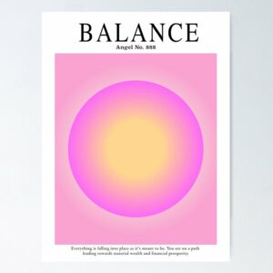
After struggling to come up with a concept/ create something I decided to look at p5.js examples to help me. I found this interactive moving circle that uses the map() function. It reminded me of those Aura Circles and so I decided to do that.

This was the Inspo

Sketch

and this is what I created..

Move the mouse around and click


Highlight

I’m happy with the look of the Circle. I think it looks fairly similar to those Aura Circles. I like the effect it gives when it’s moved.

// drawing the outer circle
fill(circleHue, 20, 100);
circle(width/ 2, height/ 2, diameter);

// drawing the inner circle
fill(circleHue, 10, 200); // Lighter color for inner circle
circle(width/ 2, height/ 2, diameter * 0.5);


Reflection

I could’ve added a lot more words, or even the descriptions that is on the Inspo picture I attached.

Maybe I could’ve also added the “Move the mouse around and click” to be part of the sketch itself.

But honestly I struggled a lot with this assignment. I think it was because I wanted to include the most I could of everything we learned so far, make it interactive, etc. while also improving every assignment. That pressure couldn’t make me work the way I wanted to. So I opted to go for something simple.


Assignment 4 – House Picker

Concept:

For this project I decided to connect it to one of my favorite movies, Harry Potter. One of the best scenes in Harry Potter is when they have just arrived to Hogwarts and the are sorted into four houses (Gryffindor, Slytherin, Ravenclaw, and Hufflepuff) by wearing the sorting hat.

So I decided to use the generative text to sort all our names into these four houses randomly.

Highlighted Code:

function mousePressed() {
  if (csvLoaded && names.length > 0 && houses.length > 0) {
    // Once the mouse is pressed and the CSV is loaded, show the castle
    showCastle = true;
    
    // Pick a random name and a random house
    let name = names[int(random(names.length))];
    let house = houses[int(random(houses.length))];
    
    // Random House picker message 
    message = name + " is in " + house + " house";
  } 
   
}

The code that I am mostly proud of is the randomized picker. So when you press the mouse, the castle and stars appear and the random name picker starts, and when you press the mouse again another name appears.

Sketch:

Future Improvements:

For the future, I want to try to let the name be picked once and a name does not repeat, for example if it chose my name it should no choose my name again.