
The Concept:
For this assignment, I want to do a data visualization sketch. After looking for various data sets and APIs, I decided to choose some data that relates to a personal interest. I decided to create a data visualization of 2016 world’s top 100 football players voting that chooses the best player of the world. It was really interesting to read some of this data as I never know these variations in voting and what makes it more interesting is that Ronaldo, my favorite player, was the best player in that year.
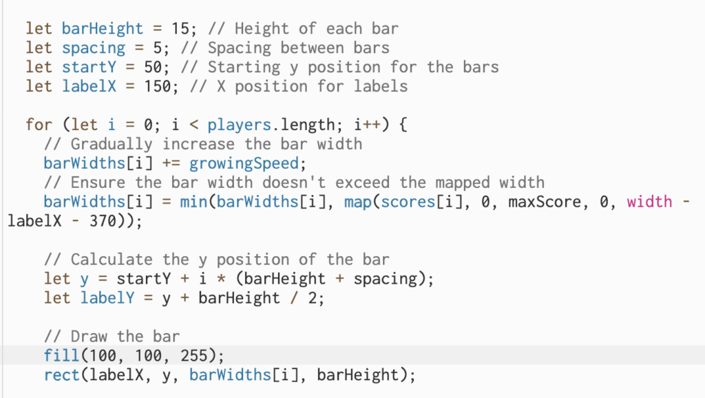
Code Highlight:
I am proud of this part of the code, mapping the voting values to the width o the bar corresponding to the value and increasing the width of the bar at the begging of the sketch display. The concept of mapping is very useful in many ways I have tried while figuring out how to draw the bars.
Sketch:
Reflection and ideas for future work or improvements:
I liked that he sketch effectively introduces a dynamic bar expansion effect, engaging viewers from the start. However, further improvements could involve adding smooth animations for a more visual transition. Additionally, considering user interactivity, such as mouse interactions for control, could enhance user engagement and exploration of the data.