Data Visualization Assignment

Overview:

I have an unhealthy obsessions with Postcards, specially those that carry a very Edgy-vintage design that looks like they were made using Paint 🙂 and since the 1st of October coincides with the World Postcard day I have decided to create a non commissioned postcards to my favorited museum ever the MoMA (Museum of Modern Arts). 

I went on Kaggle and found a dataset of with LITERALLY ( 67695 ) of MoMa artist so thought first of distinguishing the non American artist with the color grey to emphasize on the global domain of the MoMa and the scattered the name of the artist all over the screen, and then I printed at the Middle of the screen postcards from MoMA.

So the Data Visualization part is that this code distinguishes the American from the Non American Artist visually by color. which If I would have thought of creating this postcards by hand would have been a nightmare for me as a designer wen I have a dataset of 67695 artists 🙂

Embedded sketch:

Mockup Rendering:


Highlight of the code I am proud of:

This was my first time I work with Dataset and it wasn’t easy at all. So I guess I am proud of my logic of distinguishing the artists Nationality.

// Define the box parameters
 let boxX = 50;
 let boxY = 50;
 let boxWidth = width - 2 * boxX;
 let boxHeight = height - 2 * boxY;

 // Extract artist data from the CSV
 for (let i = 0; i < table.getRowCount(); i++) {
   let row = table.getRow(i);
   let artistName = row.get('Name');
   let nationality = row.get('Nationality');
   let status = row.get('Status');

   if (artistName && nationality) {
     artistData.push({ name: artistName, nationality, status, x: 0, y: 0 });
   }
 }

The above code defines the parameters for a rectangular “box” on a canvas, specifying its position and dimensions. It then iterates through rows of a CSV file, extracting artist data such as name, nationality, and status. If both the name and nationality exist, this data is stored in an object and added to the artistData array. This process prepares the artist data for subsequent display within the specified box on the canvas.

Reflection:

This was my hardest Assignment yet as that finding a dataset and thinking of an idea to model the dataset was not easy at all however, I am very happy with the end result as that If I found that on the shelf of the MoMA I would love to have that postcards that keeps all the names of the artist I was impressed by their work closer to me, so that I would take the opportunity to google the artist that my eye falls into. And I am writing an email to MoMA perhaps they are interested to take this into their postcards collection :0.

Future improvements: 

If I would have attempted this assignment once again I would:

  • Enhanced User Interaction: The inclusion of interactive elements, such as mouse-based actions or keyboard input, can empower users to explore the artist data interactively. This might involve enabling users to filter artists based on specific criteria or offering additional information upon clicking an artist’s name.
  • Responsive Design: Implementing a responsive design approach ensures that the project can adapt seamlessly to various screen dimensions and orientations, guaranteeing an optimal user experience across different devices.
  • Informational Overlays: Providing informative overlays or tooltips that furnish users with supplementary details about each artist when they hover over or click on an artist’s name can enhance the user’s understanding of the data.
  • Dynamic Animations: The addition of fluid animations for transitions, color alterations, and text movements injects dynamism into the visualization, thereby engaging users more effectively.
  • Search Functionality: Incorporating a search feature empowers users to search for particular artists or filter data based on various attributes, thereby enhancing usability.
  • Sorting Mechanisms: Offering sorting options for the artist list, permitting users to sort by attributes such as name, nationality, or status, enhances the user’s ability to explore and comprehend the data.
  • Data Updates: By enabling real-time data updates through either connecting to a live dataset or facilitating the upload of new CSV files, the project can remain current and relevant.

code:

//Batool Al Tameemi, Intro To Im 
//Assignment 5: Datasets and visualization 
let table; // Declare a variable to hold the CSV data
let artistData = []; // Initialize an array to store artist data

function preload() {
  // Load your CSV file
  table = loadTable('artists.csv', 'csv', 'header');
}

function setup() {
  createCanvas(800, 600);
  noLoop();

  // Define the box parameters
  let boxX = 50;
  let boxY = 50;
  let boxWidth = width - 2 * boxX;
  let boxHeight = height - 2 * boxY;

  // Extract artist data from the CSV
  for (let i = 0; i < table.getRowCount(); i++) {
    let row = table.getRow(i);
    let artistName = row.get('Name');
    let nationality = row.get('Nationality');
    let status = row.get('Status');

    if (artistName && nationality) {
      artistData.push({ name: artistName, nationality, status, x: 0, y: 0 });
    }
  }

  // Draw a box
  noFill();
  stroke(0);
  rect(boxX, boxY, boxWidth, boxHeight);

  // Display artist names with the specified conditions
  textSize(12);
  textAlign(LEFT, TOP);

  for (let artist of artistData) {
    let x = random(boxX, boxX + boxWidth - textWidth(artist.name));
    let y = random(boxY, boxY + boxHeight - textAscent());

    // Check for overlap with existing text
    let overlapping = false;
    for (let existing of artistData) {
      if (artist !== existing) {
        let d = dist(x, y, existing.x, existing.y);
        if (d < 20) {
          overlapping = true;
          break;
        }
      }
    }

    // Set text color based on conditions
    if (artist.nationality !== 'American') {
      fill(192, 192, 192); // Silver
    } else if (artist.status === 'Dead') {
      fill(255, 215, 0); // Gold
    } else {
      fill(0); // Default text color
    }

    // If not overlapping, display the text
    if (!overlapping) {
      text(artist.name, x, y);
      artist.x = x;
      artist.y = y;
    }
  }

}


function draw() {
 textSize(30);
  textAlign(CENTER, CENTER);
  fill(random(0,255)); // Set text color to black

  // Set the built-in font
  textFont("Georgia"); 
  stroke(color(255));
  // Calculate the center of the canvas
 let centerX = width / 2;
  let centerY = height / 2;

  // Use frameCount to create a continuously changing color
  let hue = (frameCount * 2) % 360; // Adjust the factor for color speed
  let textColor = color(0);
  fill(textColor);

  // Display the text at the center of the screen
  text("Postcards from ", centerX, centerY - 90);
  textSize(160);
  text("MoMA", centerX, centerY);


}


Week 4- Data Visualization

The World’s Best Countries For Women, 2021

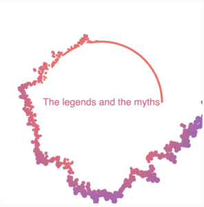
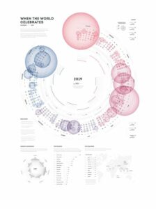
My concept: While scrolling through Kaggle, I found an article with an interesting title “The World’s Best Countries For Women”. I wanted to know the ranking of the countries and on which categories they were assessed such as women’s employability, women’s rights, women’s literacy rate, etc. Although the article doesn’t exhaustively describe these aspects, the visualization of this data was particularly interesting for me. I have been inspired by the image attached below in Fig. 1, meaning that the circles representing the countries needed to align on a circular path. Additionally, the circles should demonstrate a visible differentiation of the score of the overall assessment of each country’s performance, which could be achieved by the different radius of circles corresponding to the specific countries: the higher the score, the bigger the radius. During the coding, I decided to give a more interesting shape for the data visualization, so the circles would be in a more spiral path. Last but not least, the array of the shades of the purple colors was created because it is believed that purple is a color of feminism. I wanted to raise awareness of women’s conditions and opportunities in different countries through this data visualization. 

Fig 1. The data visualization I was inspired by.

A highlight of the code I am proud of is the for loop because it incorporates many functions and steps such as naming each variable in the data set, giving the size of circles to corresponding countries based on score, and the path of the spiral path according to the ranking. More specifically, I am proud of the function of the x and y coordinates of each circle because the formula used for that creates a perfectly drawn 2D spiral path I was looking for. 

 for(let r=0; r<table.getRowCount();r++) {
    const name = table.getString(r, "Country");
    const rank= table.getNum(r, "Rank");
    const score = table.getNum(r, "Score");
//calculating the positions x, y of the ellipses based on the rank of each country.
    const x = 2*(180-rank)*cos(rank*5)+width/2;
    const y = 2*(180-rank)*sin(rank*5)+height/2;
//scaling the score range of (0,100) to fit the range of (0, 30) to control the size of the ellipses, so they could fit the canva.
    const scoremap = map(score, 0, 100, 0, 30);
    ellipse(x, y, scoremap);
    fill(0);

//calculating the positions of x, y of the names of the countries  based on the rank of each country.
    let xtext=2.5*(180-rank)*cos(rank*5)+width/2-19;
    let ytext=2.5*(180-rank)*sin(rank*5)+height/2;
//changing the x position of the names of the countries to specific countries in order to avoid overlapping of the names with the ellipses.
    if (rank>=97 && rank<=116){
      xtext = 2.5*(180-rank)*cos(rank*5)+width/2-35; 
    }
    if (rank>=136) {
      xtext = 2.5*(180-rank)*cos(rank*5)+width/2+5;
    }
//checking the distance between the mouse and the ellipse. 
    let d = dist(mouseX, mouseY, x, y);
//if the mouse is on the ellipse, the name of the country and the ellipse corresponding to that country is filled is orange color. 
  if (d < scoremap/2) {
    fill(255, 95, 31);
    text(name, xtext, ytext);
    ellipse(x, y, scoremap);
  } else {
    fill(0);
    text(name, xtext, ytext);
    fill(random(colors));
    ellipse(x, y, scoremap);
    }
  }

Embedded sketch

MOVE YOUR MOUSE OVER ANY CIRCLE TO SEE WHICH COUNTRY IS REPRESENTED

Reflection and ideas for future work or improvements: Because of the small distance between the countries, some of the names overlap. Hence, it is better to resize the canvas or make the changes in a space for each of the country names so that one is closer to the circle, while the other is a bit in a distance. Additionally, for aesthetic purposes, it would be great to add more details to the sketch such as Perlin noise which appears when the mouse is clicked, or the line of the small circles going from the country circles to the center.

Week 4 | Data Visualization Assignment

The Concept:
For this assignment, I want to do a data visualization sketch. After looking for various data sets and APIs, I decided to choose some data that relates to a personal interest. I decided to create a data visualization of 2016 world’s top 100 football players voting that chooses the best player of the world. It was really interesting to read some of this data as I never know these variations in voting and what makes it more interesting is that Ronaldo, my favorite player, was the best player in that year.

Code Highlight:
I am proud of this part of the code, mapping the voting values to the width o the bar corresponding to the value and increasing the width of the bar at the begging of the sketch display. The concept of mapping is very useful in many ways I have tried while figuring out how to draw the bars.

Sketch:
Reflection and ideas for future work or improvements:
I liked that he sketch effectively introduces a dynamic bar expansion effect, engaging viewers from the start. However, further improvements could involve adding smooth animations for a more visual transition. Additionally, considering user interactivity, such as mouse interactions for control, could enhance user engagement and exploration of the data.

Week 4 | Reading Reflection

In the first chapter of The Design of Everyday Things, Don Norman delves into our interaction with commonplace items and how the fundamental principles of design shape this interaction. He also explores the concept of design and how everyday objects can create usability problems and frustrations for users. Reading about two of the most important characteristics of good design which are discoverability and understanding made me much more aware of the design of everyday objects that I encounter. Discoverability is about making it clear, often at first glance, what actions are possible with a product or interface. In my experience, a good example of easily discoverable designs that I deal with every day is well-designed mobile apps often have easily recognizable icons and intuitive gestures, enhancing discoverability. Don Norman also discussed a common problem that I faced personally in my first days in the university, which is the confusing doors. Dealing with doors is actually a common example that demonstrates the importance of user experience in the design process.

Another part of the reading that was really interesting is the paradox of technology, especially because it relates to the content of this course. Norman illustrates the trade-off between the convenience that technology brings and the increasing complexity it introduces. This resonates with my experience of using various applications where the initial excitement of features can sometimes be overshadowed by the challenges of mastering them.

Reading Reflection – Week 4

The Psychopathology of Everyday Things was quite a fun and informative chapter to read. The author’s descriptions of his experiences with products that have ineffective designs were pretty relatable, which helped me to understand the importance of good design in my mind. The topic of how engineers build products that are overly logical while expecting unrealistic outcomes was also amusing. I have heard so many developers complaining about users because they cannot grasp their interfaces, but they have never stopped to think that not everyone has the same knowledge that they do, or that they have a completely social lack of communication. Worse yet is when some products are so annoying that it feels like the designers behind them did it on purpose. I have seen washing machines that had the most excruciating beeping sounds that had no indication of how to make them stop, and that is precisely what the author talks about when he mentions the problem of too much feedback.

Moreover, I do not think the reading changed any of my beliefs, although it definitely made the importance of psychology and communication in technology more clear to me. However, the concept of mapping could have been more explored in my opinion. For instance, I would have liked to see more examples of good and bad mapping in digital technology, and how we could take into consideration factors such as cultural differences in order to improve mapping.

Week 4 – Reading Response

Don Norman’s observations regarding the design of everyday objects, such as doors, were so interesting for me to read as they raise the issue in technology: engineers and designers sometimes get so caught up in logical thinking that they forget about the end user’s perspective. I liked how this idea can actually relate to what we read last week about Crawford’s idea of “interactivity” as a conversation. It’s almost like technology and users speaking a different language, and this disconnect can lead to a host of problems. In a good conversation, it’s not just about speaking; it’s about listening, understanding, and responding thoughtfully. This same principle applies to human-machine interactions. Users need to “listen” to the machine by deciphering its controls and understanding how it works, while the machine must “listen” to the user’s commands and respond appropriately. When there’s a breakdown in this dialogue, things can quickly go awry.

What particularly interested me is how the difficulty users face in comprehending a machine’s interface can be likened to the “listening” aspect of interactivity. Users struggle to figure out how a machine functions, which makes it harder for them to effectively communicate with it. This can result in the machine misinterpreting their intentions or causing confusion, essentially a conversation that’s gone off the rails. So, my take on this connection between Norman and Crawford is that intuitive and straightforward design is non-negotiable for fostering better interactivity. It’s about designing technology that speaks the user’s language, aligning with their mental model and expectations. But it’s also about making sure the machine can “listen” and understand the user’s commands without any issues.

With all of this, I realized the critical importance of UX design: considering the end user when creating technology. We can’t simply assume that users will figure things out the way we do; we need to empathize with their needs, thought processes, and limitations. And user experience and user testing must be a part of my work when I start working on my midterm project.

Week 4 – Data Viz Wind Turbines

Concept:
During class on Wednesday, one of the example datasets that was brought up in class was wind data as the professor played with the globe data visualization. When I saw the wind data, I immediately thought of drawing wind turbines that matched the wind speed data, and that’s what I ended up doing for this project.

Sketch:

While in the planning phase, I thought that this project would be just fun to look at and not a data-focused piece, but this had the unexpected result of being surprisingly insightful about wind speeds during the day. The wind is strongest during the day at about 14:00-17:00, and weakest around midnight to late morning.

Code: 
I was proud of my day/ night cycle code, as I thought it was clever. I drew a black box over the entire screen, and the opacity changes depending on the time of day so it is able to give off a feeling of ‘darkness’ during midnight hours, and it is fully transparent during the daytime.

// opacity of black screen over the screen to give illusion of day/night cycle
const darknessLevel = mapOfHourToDarkness[curHour - 1]
push()
fill(0, 0, 0, darknessLevel * 5)
square(0, 0, 400)
pop()

// complex math -- basically calculates the curSkyColor as an average of darkSky and brightSky, weighted towards darkSky based on the current darknessLevel
curSkyColor = p5.Vector.add(p5.Vector.mult(darkSkyColor, darknessLevel), p5.Vector.mult(brightSkyColor, 10 - darknessLevel)).div(10)

Improvements
There was more data in my .CSV file including wind direction, but I couldn’t think of a good way to implement but it would’ve been nice. I was also not able to find a free API for UAE wind data, and I had to manually scrape the data for a certain day. It would have been fun to be able to visualize the wind speeds of the current/previous day instead of being stuck on 27 Sept 2023.

Data Visualization

This is the visualization of the data about the popularity of a set of popular songs in 2023. The red line stands for the number of times it was streamed, the green line stands for the number of Spotify playlists it was included, and the blue line stands for the number of Apple playlists it was included. I couldn’t find any WEBGL fonts, and it was almost impossible to detect which ball was clicked in WEBGL (at least for my Javascript abilities), so I couldn’t label the axis nor display information of the song when its representative ball was clicked.

Week 4- Reading Reflection

The Design of Everyday Things, The Psychopathology of Everyday Things

While reading the text, so many real-life examples of me having trouble with the designs of the things came to my mind. Just taking the example of our campus, the heavy automatic doors in the entrance of the buildings, which open to one side only, or the design of the grass in front of the D2, which makes people bypass them instead of walking straight (although some people just step on the grass instead of bypassing it), or the lighting in the huge study rooms which turn off by itself if no movement is detected under some unlogically built detectors. By providing these examples, I am suggesting that I support the author’s position about the abundance of user-unfriendly everyday things. 

I would like to extend the author’s idea by claiming that the difficulty of understanding the design isn’t the only issue. The main issue is having a continuous uncomfortable experience while using the devices because of poor design. Once you understand how things work, it becomes easier to manage. However, if the thing is itself unfriendly, the difficulties with the utilization of the object continue. For instance, taking the same example of the study rooms, it might be hard in the beginning to understand how to open the door. For those who don’t know, the button on the wall (separated from the door) should be pressed in order to open the door. However, by doing the same thing over and over again, this aspect becomes like a habit so the people intuitively start pressing the button before opening the door. However, the issue of lamps turning off when the movement isn’t detected continues to make the uncomfortable experience in study rooms. Usually, the detectors of movements are placed at the entrance, so the lights will be turned on when the people enter. However, no one sits in front of the entrance door. Because of the lack of detectors on top of the chairs or putting them in random spots, the light turns off being unable to recognize that someone is really sitting in the room. This is the reason for terminating my presence in the study rooms. 

This reading really gave a feeling of satisfaction as if the author really raised the voice of all the users. As the author mentioned, the design of the objects should rely on common knowledge rather than logical explanations as people are the way they are, not the way the engineers expect them to be. Here raises the question of the range of the common knowledge. To what extent we can simplify things to common knowledge without sacrificing the functionality of things? For instance, is it better to have many functionalities in the washing machine with detailed instructions to them or is it better to limit the washing machine design to several buttons with the most obvious functions, so the instructions paper is not needed? 

Reading Reflection – Week 3

Before delving into the first chapter of Chris Crawford’s “The Art of Interactive Design”, my understanding of “interaction” was rather straightforward—I saw it as any form of engagement that elicited a response. However, learning about Crawford’s comprehensive criteria,  which highlight the significance of cyclically reciprocal actions such as active listening, speaking, and thinking, has expanded my viewpoint. His idea allows for evaluation of the depth of interactivity in different mediums, which challenged my previous idea that something either is interactive or not.

Another idea that caught my attention was that interactivity is in fact subjective. This thought makes complete sense, as different users have different expectations, levels of interest, motivation and personal preferences. For instance, someone who prefers a more passive form of engagement and somebody who strikes for a more immersive experience will most likely not find something like the YouTube algorithm interactive on the same level. Another factor I considered after the reading is that interactivity can be staged; in other words, it is not difficult to make something appear interactive when, in fact, it is not. This issue arises for several reasons. First, there is often a false overuse of the term “interactive”, leading to a dilution of its meaning. This aligns with the misconception with which Crawford opens the first chapter, highlighting the need for a more precise understanding and definition of true interactivity. Second, there seems to be a common tendency to mistake participation and reaction as true interaction. While these elements are integral to many interactive experiences, they lack the deep, cyclically reciprocal engagement that Crawford’s definition of interactivity highlights.

An example that comes to mind is gamification, which involves applying game-like elements, such as points, badges, leaderboards, and rewards, to non-game activities to make them more engaging and interactive. Such strategy is often used in various apps, for example, educational applications such as Duolingo. Duolingo gained its popularity since it was perceived as highly interactive due to the visual feedback and competitive elements, but that is more or less only the surface of the application. Upon closer examination, one may realize that the core learning experience remains passive and one-directional, with limited opportunities for genuine engagement, discussion, or deep understanding of the subject matter.