Week 8: Reading Response

In the first reading by Norman, “Emotion & Design: Attractive things work better,” I found his exploration of the emotional aspect of design very interesting. Indeed, good design isn’t just about aesthetics or functionality; it’s also about how we feel when interacting with the product. Norman’s emphasis on the importance of considering users’ emotions and needs, particularly in high-stress situations, highlighted the human-centered nature of design. I particularly appreciated his vision for the future: “Let the future of everyday things be ones that do their job, that are easy to use, and that provide enjoyment and pleasure”. This statement is a good reminder of how important the design itself is depending on the emotion and the situation in which the user is under and what kind of experience we, as developers, want to give the users.

The second reading, “Her Code Got Humans on the Moon,” further illustrated the idea that “we should not solely rely on users when designing technology.” Users can sometimes behave unpredictably, especially in high-pressure contexts like space missions. The story of Margaret Hamilton serves as a compelling example of how careful and well-planned design is vital for the success and reliability of complex systems. This reading reinforced my belief in the importance of meticulous design and efficient code to create technology that is not only robust but also user-friendly. It also highlights the need for proactive problem-solving and consideration of user behavior to achieve success in complex projects.

week 8 – reading response

I think it’s especially interesting how wide the breadth of psychology, which is profoundly underpinned by Norman’s “Emotion and Design: Attractive Things Work Better”, really is. Norman’s emphasis on emotions highlights the significance of aesthetics in enhancing user functionality, and this is all the more important to note is since such a concept really challenges the conventional belief that aesthetics should take a backseat to functionality in design. Her specific delineation regarding affect, aesthetics and functionality makes sense and the reason why it was illuminating was because this wasn’t something I consciously and actively thought about when handling a product. It’s completely natural for positive affect to increase tolerance for minor flaws in user functionality because we are in a more forgiving headspace for such a situation. However, negative affects eliminate this state of mind, hence it makes more sense to prioritise user functionality over aesthetics in products that warrant negative affects.
This same concept can be applied to Margaret Hamilton’s groundbreaking work as exemplified in the second reading whereby it highlights the clear intersection between psychology and user functionality in high-stake situations. Her meticulous software development for the Apollo mission integrated rigorous testing and fault tolerance to ensure usability under extreme conditions i.e., conditions that are prone to evoking negative affects. This ultimately aligns with the psychological principles discussed in Norman’s text, illustrating that the design of critical systems must consider users’ emotional states and its subsequent impact on usability.

Week 8- Unusual switch

  • Your concept

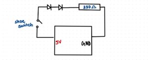
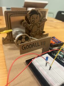
The unusual switch idea for my switch is an inspiration from the interaction between a football net and a ball. In this concept, the switch activates whenever the ball makes contact with the football net. To bring this idea to life, I utilized a combination of materials and components, including:

LED lights
Cardboard
Resistor
Wire
Clips
Metal plate
Aluminum foil
Duct tape
Breadboard
Arduino board
Batteries

By combining these elements, I was able to create a responsive and innovative switch design that engages users through the playful interaction between the ball and the net, triggering the LED lights to illuminate upon impact.

  • Embedded pics and videos

  • Reflection and ideas for future work or improvements

I’m really happy with how my Unusual circuit turned out. I like that it has a fun football theme and it was a creative project that I worked on, and I’m excited about what I’ve learned with Arduino, which is super cool. When I think about what I could do next, I’m thinking of making the circuit even more interactive and trying out other sports themes in my projects also maybe i can add a recorded sound of like someone saying GOOALL! when the ball hits the net.

Week 8: Reading response

The text delves into the intricate interplay between the usability and aesthetic appeal of everyday objects. It posits that while usability is undeniably crucial, the significance of aesthetics and the emotional response they evoke should not be underestimated. Essentially, a product should excel not only in terms of its functional efficiency but also in its capacity to captivate users visually and stir positive emotions.

A central argument which interested me is that our emotional state, referred to as affect, has a profound impact on our ability to interact with products. During periods of stress or anxiety, our focus tends to narrow to immediate tasks, often causing us to overlook minor design flaws. Conversely, when experiencing positive emotions, our creativity and problem-solving capabilities are enhanced, making us more tolerant of design imperfections.

The future of everyday objects lies in achieving a harmonious equilibrium between usability, aesthetics, and emotional resonance. The overarching goal should be to create products that not only fulfill their intended functions effectively but also deliver a delightful and emotionally enriching user experience. In essence, it calls for a comprehensive design approach that takes into account both functionality and emotional impact.

The central idea that I totally agree with is that well-designed, visually appealing products tend to not only excel in usability but also enhance the overall user experience. Striving for a seamless fusion of practicality, aesthetics, and emotional appeal should be the aspiration of designers and manufacturers to create products that deeply resonate with their users.

Week 8 | Reading Response

Emotion & Design: Attractive things work better

Norman’s article explains the often misunderstood relation between design, usability, and aesthetics. It’s a refreshing perspective that challenges the notion that usability and beauty are at odds with each other. Instead, he suggests they can and should coexist, creating products that are not only functional but also visually pleasing.

I found Norman’s personal examples, like his collection of teapots, to be relatable. It’s a reminder that the objects we use daily can be more than just tools; they can be sources of joy and satisfaction. The idea that an attractive design can make a product work better may sound unconventional, but it resonates with my experiences in web development. Often, web visitors experience better browsing and interactivity with a webpage if it is visually appealing.

The discussion about the impact of emotions on design is particularly interesting. Norman’s insights into how positive and negative affect can influence our cognitive processes and decision-making make me rethink the relationship between our emotions and the things we interact with daily.

Her Code Got Humans on the Moon

Margaret Hamilton’s story underscores the significance of gender diversity in the tech field. It prompts us to reflect on the ongoing gender disparity that still plagues the industry. While there has been some progress, we’re far from achieving true gender equality in tech. Indeed, some studies specifically focused on software developers suggest that as few as 8-10% of all software developers are female [1]. Hamilton’s journey from an era when women were discouraged from pursuing high-powered technical roles to becoming a pioneering figure in software engineering is incredibly inspiring.

What strikes me most is Hamilton’s unwavering determination and resilience. Her ability to lead a team, make critical technical decisions, and solve complex problems during the Apollo project is a testament to her expertise and commitment. Her dedication to perfection and her diligence in addressing potential issues serve as a valuable lesson in the importance of rigorous testing and debugging in software development. Moreover, we need to keep in mind the time when she was working, especially in terms of technological progress. Just picture this: the thousands of lines of code we can effortlessly write, compile, and debug in a matter of seconds today were back then written and meticulously refined using the available technology of that era. Here is her photo [2] while standing next to listings of the Apollo Guidance Computer (AGC) source code.

Hamilton stands next to listings of the Apollo Guidance Computer (AGC) source code.


Resources:

[1] https://jetrockets.com/blog/women-in-tech-why-are-only-10-of-software-developers-female
[2] https://www.wired.com/2015/10/margaret-hamilton-nasa-apollo/

Week 8 Reading Response

Norman’s chapter on emotions in good design was enlightening and reminds us that humans are more than just rational, logical machines. People appreciate art and beauty, and I suppose that even in the field of design, where ones of the goal is to make something as logically simple for a user as possible, there is still room for aesthetics. He wrote that ‘attractive things work better’, and I was reminded of how that applies to human interactions too — pretty privilege is a real thing. “Pretty people are perceived as smarter, funnier, more sociable, healthier, and successful” (First link I found on Google). Between two teapots that achieve the same goal of brewing tea, the more attractive design is usually the favored one, and sometimes you might even be willing to give up some functionality in favor of the design. Norman also talks about how different designs might be interacted with depending on the user’s mood or situation. In a stressful situation, a panicking user might not know how pull the fire doors, and might just push harder. This principle should be applied to all manners of design, and consider users that might not have the privilege of the time of figuring out a badly-designed place. For example, a hospital should be well-designed and clearly marked, because a panicking person bringing in their mother will not have the mental capacity to stand and read signs on where the Emergency Room is.

I found the anecdote in Margaret Hamilton’s article on her repeatedly warning the higher-ups about a potential bug really funny, and representative of the experiences I have had so far. A common design principle is to assume the user is stupid. Any error that is possible to be made can be made, even if they’re trained, or given the manual, or even if there’s a written “Do not Touch” sign in front of the object they’re not supposed to touch. From a design perspective, they have done everything right — verbally warn the astronauts not to touch the program, add a reminder in front of the screen to not touch the program. Yet, the astronauts touched the program even when it is usually not run in this scenario. Designs should always have tolerance for fault, no matter how unlikely the fault is. Of course, not every fault can be covered, for example you can’t design a door that can handle being torn apart by someone, so there should be some risk-reward management. How unlikely is it for this fault to be encountered, and how bad will it be if this fault is triggered? In the case of Hamilton’s code, the fault was unlikely to be triggered, but it causes a very scary crash with data loss if it was triggered, thus it would made sense to guard against that case, though I am saying this with the gift of hindsight.

Week 8 reading reflection ( both in the same post )

Emotions & Attractive by Donald A.Norman

The reading about three teapots is incredibly inspiring and thought-provoking. It goes beyond a simple story about teapots and delves into the profound world of human emotions and how they influence the design and usability of everyday objects.

What’s truly inspiring is the notion that design is a delicate dance between beauty, functionality, and user satisfaction. The three teapots exemplify this concept, teaching us that an object can be beautifully designed, functional, and a source of pleasure simultaneously. It’s a reminder that design should not be limited to either aesthetics or usability; it’s about achieving a harmonious balance.

The concept of “affect” introduced in the reading is particularly eye-opening. It showcases how our emotional state can dramatically alter the way we approach tasks and interact with products. Negative affect narrows our focus, enhancing concentration, while positive affect encourages creativity but also increases distractibility. This revelation challenges our traditional understanding of how emotions influence our behavior.

The most striking and, indeed, inspirational revelation is the idea that attractive things work better. This contradicts the common belief that aesthetics are secondary to usability. It suggests that, in our pursuit of enhancing functionality, we should not neglect the importance of creating products that are visually appealing and emotionally engaging.

In a world where we often prioritize utilitarian aspects, this reading encourages us to look beyond the surface. It teaches us that true beauty in design encompasses both form and function. The lesson is clear: we should aim to create products that not only serve their purpose but also bring joy and delight to our lives. This reflection challenges us to think differently about the objects we use daily and to strive for a world where everything we interact with is not only usable but also a source of inspiration and pleasure.

Her Code Got Humans on the Moon

What’s really interesting in this reading is the incredible journey of Margaret Hamilton. She was a woman who, in the 1960s, went against the norm. Back then, women weren’t usually encouraged to do high-tech jobs. But Margaret, with her math degree, got a job as a programmer at MIT. Her original plan was to support her husband’s law studies for three years and then get her own math degree.

But things changed when the Apollo space program came into play. Instead of following her original plan, Margaret stayed at MIT and led a big engineering project. She was among the very few women in that era to do this kind of work. What’s striking is that she brought her 4-year-old daughter, Lauren, to the lab on weekends and evenings. While her daughter slept, Margaret was busy writing code that would be used in the Apollo mission.

People were surprised by her dedication. They’d ask her, “How can you leave your daughter to work?” But Margaret loved her unique job. She enjoyed the camaraderie and the challenges of it. She felt like “one of the guys.” What’s intriguing is that, at that time, nobody really knew what software was. It was like the “Wild West” of technology. There were no courses or training programs for it. But Margaret and her team were pioneering the field as they wrote the code for the world’s first portable computer used in the Apollo program.

What’s also fascinating is that when the Apollo project began, software wasn’t a big deal. It wasn’t even mentioned in the mission’s engineering requirements. But as the project progressed, it became clear that software was essential. Margaret became responsible for the onboard flight software on the Apollo computers. The pressure was intense. She even rushed back to the lab after a late-night party once to fix a piece of flawed code. She worried about making headlines for a mission failure.

In the mid-1960s, more than 400 people were working on Apollo’s software. Software became a key part of winning the race to the moon. But it did more than that. Thanks to Margaret and her team, they set the stage for the software industry we know today, worth billions of dollars.

The process of programming back then was completely different from what we have today. They punched holes in stacks of cards, and these cards were processed on a massive computer. Everything had to be simulated before the actual mission.

Apollo missions carried two special computers: one in the lunar module and another in the command module. These computers were unique. They were designed by MIT engineers and were among the first to use integrated circuits instead of transistors. The computer was responsible for many critical tasks, even though it had very limited memory and computation speed compared to today’s standards.

One particularly intense moment was during the Apollo 11 mission, just before landing on the moon. There was a “documentation error,” and the computer started giving error messages. But thanks to Margaret’s technical arguments, the computer focused on the most crucial task—landing safely on the moon.

Another intriguing detail is how Margaret’s daughter, Lauren, once caused an error during a simulation. This led to changes in the documentation to prevent similar errors. It shows that even in highly technical fields, human elements and foresight play a role.

In the end, what’s most captivating about this reading is Margaret Hamilton’s exceptional journey. She not only helped land humans on the moon but also played a crucial role in shaping the software industry. Her story is a reminder that one person’s determination and innovation can have a significant impact on history.

Week 8- Reading Reflection

“Emotion and Attractive” by Donald A. Norman and “Her Code Got Humans on the Moon- And Invented Software Itself” by Robert McMillan

We were assigned to read two different materials with varying ideas, but both were thought-provoking. 

I would like to start with the most influential article about the mother of software engineering- Margaret Hamilton. She is a living example of the phrase “everything is possible”. While reading the text, I immediately thought about the photo of her standing next to the tons of coded papers- Apollo code. The reading material tells more about the background of that photo, showing the first gigantic step toward software engineering. Her dedication to work and the result of her achievements impressed me the most. Imagine writing the code to the system, which gets the humans on the moon and back when no one even had an idea what the software engineering was. Her biography leaves me astonished every time I read it. 

Scene at MIT: Margaret Hamilton's Apollo code | MIT News | Massachusetts  Institute of TechnologyFig. 1. Scene at MIT: Margaret Hamilton’s Apollo code | MIT News | Massachusetts Institute of Technology. Source: margaret-hamilton-mit-apollo-code_0.jpg

Discussing the reading “Emotion and Attractive” by Norman, I would like to say that the reading told the basic things, which are usually overlooked by the designers. In other words, he mentioned such a foundational, yet significant aspect of the design that is neglected in the production of the goods and services. Making a connection with the previous reading “The Psychopathology of Everyday Things”, I would like to suggest that the complexity of the things is part of the “ugliness” of the goods. The point of view of the author is that the aesthetics of the product is more than its facade, including usability, understandability, and easiness along with beauty. However, I think that this focus on aesthetics may vary depending on the context because the things made for emergency situations need to be as simple and as understandable as it is possible, giving less attention to physical appearance, while the things for the occasional use in free time or for professional purposes can give the priority to the aesthetics. Furthermore, I would like to admit that his idea that the beauty of the product stimulates cognitive thinking better could convince me. We tend to put more mental effort into understanding the usage of the thing subconsciously if we find that appealing than non-attractive things. This might vary depending on the mood and the conditions. He gave a well-drawn example of that with the teapots. If you are in a mood and have free time, you would probably go with the most aesthetic teapot even if it’s not the most user-friendly, but if you are in a hurry, the most usable one, even if it’s not the most pleasurable one. Overall, it can be concluded that Norman emphasized the fundamental aspect of the design in clear terms and examples, which resonates with my perspective of the significance of the aesthetics of products.

Final Midterm Project

Midterm Project Link: https://editor.p5js.org/jiho.choi/full/Iz4oCo4Lf

I wanted to make my Midterm project personal and the first thing that naturally popped into my mind was music. Music is such a big part of my life and I can confidently say that I probably will never be seen anywhere without my earphones. The original plan was to incorporate illustrations to use as music backgrounds, but I was experiencing an art block after my comlab webcomic assignment. I physically couldn’t get myself to draw again so instead I decided to code and make use of my knowledge thus far. Essentially, different songs would show different illustrated backgrounds that corresponded to my most profoundly remaining memory of that music. Whilst the backgrounds came off a bit cliche, it was still an honest memory so I was somewhat fine with it. Because my past assignments lacked a clear focus on aesthetic appearance I tried my best to achieve that particular quality. I thought a vintage radio graphic would look more visually pleasing and doable to code so that was the path I stuck with.

The way it works:
1) press play ==> music plays.
2) pause music ==> background changes to default.
3) skip button + play button ==> plays next song.

This process wasn’t at all a fond memory but instead was incredibly taxing, stressful and frustrating. Up until coding the vintage radio, things were going very smoothly and I was having so much fun… but once it got to coding the backgrounds, there was rapidly building friction. I was unfortunate enough to experience first-hand the importance of manually saving your code every 10secs. I had spent 6 hours coding my bg#1 and I thought it was autosaving as I went. Clearly I was wrong and the webpage malfunctioned and gave me the: “something went wrong” page…
But overall I’m proud that I was able to pull off what I would consider in my books a complex piece. Again, I used assignment#3 as a a guiding reference to creating my own version of this piece.

Parts I am most proud of:

function mouseClicked() { 
  let x = 337; // x-coordinate of the second ellipse
  let x2 = 387; // x-coordinate of the third ellipse

  if (mouseX >= x - 20 && mouseX <= x + 20 && mouseY >= 471 && mouseY <= 511) {
    if (song.isPlaying()) {
      song.pause();
    } else {
      song.play();
    }
  } else if (mouseX >= x2 - 20 && mouseX <= x2 + 20 && mouseY >= 471 && mouseY <= 511) {
    if (playButtonCount === 0 || playButtonCount === 2) {
      currentSongIndex = (currentSongIndex + 1) % songs.length;
      song.stop();
      song = loadSound(songs[currentSongIndex]);
      if (playButtonCount === 0) {
        song.play();
        playState = 1;
        playButtonCount = 1;
      }
    }
  }
}

1) mouse click function to control when the music plays and pauses and skips to the next song. This I really had to sit down and think and for some parts, especially those requiring maths (marking down the boundaries of buttons) it was more trial and error and once again hardcore searching on google.

class Wave {
  constructor(xIncrement, yIncrement, xoff, yoff, color) {
    this.xoff = xoff;
    this.yoff = yoff;
    this.xIncrement = xIncrement;
    this.yIncrement = yIncrement;
    this.color = color;
  }
  displayWave(yOffset) {
    fill(this.color);
    stroke(255);
    strokeWeight(3);
    beginShape(); //creating wave shapes in variation 
    for (let x = 0; x <= width; x += 3) {
      let y = map(noise(this.xoff, this.yoff), 0, 1, 600 + yOffset, 700 + yOffset); //determining minimum/ maximum height of waves
      vertex(x, y);
      this.xoff += this.xIncrement; //increments this.xoff by this.xIncrement 
    }
    this.yoff += this.yIncrement; //increments this.yoff by this.yIncrement 
    vertex(width, height + yOffset);
    vertex(0, height + yOffset);
    endShape(CLOSE); //
  }
}

2) I had been googling different ways people had used p5.js to embody beach art and I spontaneously came across the noise function used by someone with really high qualifications. Of course the code was way too complicated for me to understand fully let alone use so I continued browsing but found another more helpful link, by p5.js. I used the code provided and tweaked around with numbers to understand what each line of code did and what role of the numbers were, since there were a lot… Similar to the one above this also required a lot, A LOT  of trial and error, especially with creating multiple wave layers(?) which took up half my day.

IMPROVEMENTS: There is a lot I’d like to mention for improvements…
1) firstly, I didn’t realise the space in the radio handle was opaque. I was on a race against time and so couldn’t afford to really observe the drawing. This is especially such a shame since it really cuts back on the aesthetics.

2) Another thing I’d like to mention is the fact that the details of the background aren’t quite clear because the radio size is too big. Of course I already went through a prior episode and so didn’t think it wise to change all the numbers relating to class: radio. Instead I opted to make the canvas bigger, originally it had been 800, 800. (prior episode==>) This too was an incredibly onerous process because every positioning detail relies on coordinates. So I had to go through each line of code to adjust the numbers, of course I’d like to believe that there is a much better solution but again, with my current knowledge on coding, this was the best I could come up with.

3) the requirement for this project was that a loop is required, a way to reset the experience. That was what my on/ off button was for. My plan was that when the on/off button was pressed when music was playing, music would pause. But if button was pressed when no music was playing, song would restart and automatically play. This for the life of me would not work. Somehow I got the last 2 buttons to work yet the first one was refusing to cooperate. If I tried to implement some code targeting the first button, then the interaction for the last button would not work. Of course I still have not been able to conquer this specific part of the code…

4) music backgrounds… This gave me such a headache I spent almost 5-6 hours trying to look for a solution but came up with zilch. When I tried to integrate the codes from e.g., sunset.js to sketch.js (my main sketch file), for some reason which to this day I still don’t know, the positioning, stroke weight and order of shapes went haywire. I really cannot think of a reason why since the backgrounds were created on a same-sized canvas. Because I couldn’t present a blank, half finished project, I had to compromise by uploading the png form of these javascript files, which didn’t look too bad. It just looked a bit dull since everything was static.

5) another thing relating to background, I felt like there was a big quality difference in bg#1 and bg#2 which still really irks me and leaves me feeling dubious about the quality of my project. For next time, I’d like to really delve into and experiment with the cool p5.js effects before contemplating a design because that’s how I discovered the noise function. Through serendipitous search!

6) finally along the way a part of my code ceased to work: click radio = radio change colour. There was too much to keep track of and if one thing worked, another didn’t, so I don’t even know at what point it stopped working. I ran out of time at the end and I am planning to go through to try and solve the issue.

Links and images to separate relating javascript files:


background#1 – “rises_the_moon”:
https://editor.p5js.org/jiho.choi/full/G8s6Rfgxn

background#2 “in_my_room”:
https://editor.p5js.org/jiho.choi/full/koRh51OvD


Midterm Project

Full Link to the Project: https://editor.p5js.org/MayaLeeeeee/sketches/-N67RBhJJ

Project: Hey, Breathe

*** The project is shown cut-off due to the layout of the Intro to IM page.

Concept)
The overall concept was to create an interactive game, where the movement of the player would depend on the voice of them. I initially planned to use both pitch and volume for the movement. (Higher pitch would move the character up, lower pitch would move the character down; higher volume would make the character move faster,  lower volume would make the character move slower).

However, as I continued with my work, I had to change that. Although playing with the pitch of sound was interesting (the playing of the game was really funny), it was absolutely impossible to play the game. The pitch changed so much that the character couldn’t stay still and it continuously spiked up and came down. I tried to manipulate it, but there was not much I can do to lower the sensitivity etc.

So, I changed the up and down movement to arrow keys. However, I did keep the idea of the input sound’s volume deciding how fast the character is moving. I wanted the character’s x position to stay still, so this eventually became the speed of the map moving.

Methods)
Basically, I have 3 elements in my game: character, obstacles, and collectibles. The red circle is the player, the black box the obstacles, and the green circles the collectibles. For the obstacles and the collectibles, I had to find a way to keep track of their locations, so that I can check if the player has hit the obstacle or has collected the collectible. I do so by using an array.

for (let i = obstacles.length - 1; i >= 0; i--) {
    obstacles[i].move(characterSpeed);
    obstacles[i].show();
    if (gameStart && character.hits(obstacles[i])) { //check if it hits obstacles
      console.log("Game Over");
      isGameOver = true;
      song.play(); //sound effect for when game over
    }
    if (obstacles[i] && obstacles[i].offscreen()) { //if offscreen, delete the obstacle from array
      obstacles.splice(i, 1);
    }
  }

I push a new obstacle/collectible into the corresponding array. I also use splice when I check if there’s anything off screen. I check the locations of obstacles and collectibles, see if they’re off screen, and if so, delete them from the array by using splice.

Future Improvements)
There is a bug where if the volume of the input sound is too big, the player passes right through the obstacles and doesn’t end the game. I am guessing that the speed of movement is quicker than the speed of checking (or something like that), and the program is not perfectly checking all the obstacles etc.

*** sound used: https://freesound.org/people/MATRIXXX_/sounds/345666/