Week 8: The Sims Green Crystal Connection

^Video of how it works!

I decided on concept for this no-hands switch inspired by the Sims costume my friends did for Halloween. They had made these green crystals (they call it the Plumbob in the games) which we tied to a headband so it stays up on their heads.

Some images for reference:

I basically attached some aluminum foil to 3 sides of the crystal and that acted as the switch. Whenever 2 crystals touch each other, the LED starts lighting up.

Overall, I found it really fun to play around with the circuits. Maybe next time, instead of paper, I could use aluminium crumples to make the crystal and color it green so it is conductive from all sides and it would also look shiny as a bonus!

Week 8: Reading Response

In Norman’s text, “Emotion & Design: Attractive Things Work Better,” the author explores the importance of aesthetics and first impressions in website design. He emphasizes that users tend to judge a website based on its initial look and feel, which significantly influences their perception of its quality and trustworthiness. The concept of the three cognitive stages (visceral, behavioral, and reflective) sheds light on the fact that aesthetics often take precedence over content. The reference to the connection between affect and cognition highlights that our emotions and cognitive processes are intertwined, and designers should consider both aspects to create truly effective and user-friendly designs. One excellent example of interactive media that highlights the importance of both usability and aesthetics is a mobile app. Mobile apps are prevalent in our daily lives and encompass various categories, from social media and productivity tools to games and entertainment. The visual design of the app, including color schemes, typography, and overall layout, significantly affects the aesthetics. A visually appealing app with a well-thought-out design can make users more likely to engage with it and spend more time on it.

Furthermore, Hamilton’s text provides the early days of the Apollo program and her pioneering contributions to computer science and software engineering. She defied societal expectations for women at the time and played a pivotal role in the coding of Apollo missions. Her meticulous attention to detail, evidenced by cautionary notes like ‘Do not touch P01,’ ensured the astronauts’ safety. Hamilton faced challenges and made mistakes during her journey, but her deep passion for her work never wavered. Her lasting commitment, combined with her remarkable contributions, portrays her as a pioneer who left a significant mark on the tech world. I greatly admire Margaret Hamilton and her influence on software engineering. Her story inspires everyone, demonstrating the endless potential that comes from dedicating yourself to your craft with innovation and genuine love.

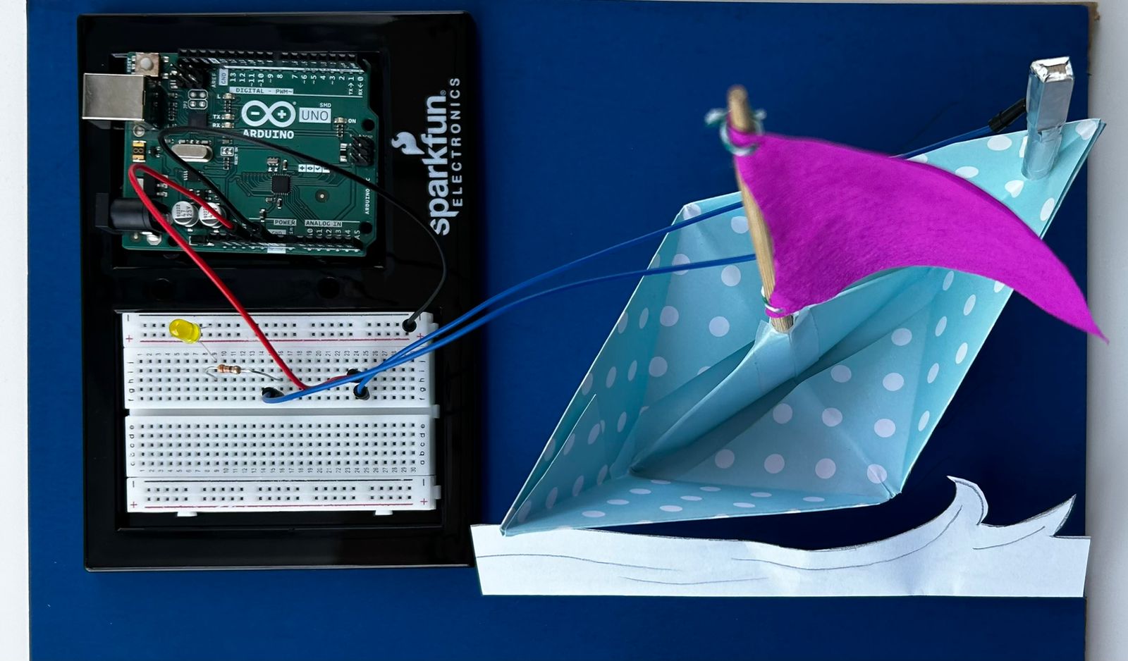
Week 8 – Assignment – Unusual switch – Sailboat

As we begin exploring physical computing, I find it extremely interesting to create simple circuits in replicating mechanisms. This week’s assignment to create an unusual switch provided me the opportunity to get creative. After a lot of contemplation to come up with an idea, I finally decided to create a boat using origami with a sail that flutters with the wind. The idea is inspired from the scenic view of sailboats along Abu Dhabi Corniche. The working of the project is such that when the sail comes in contact with the pole at the back, the circuit is completed and the LED bulb glows.


To implement the simple circuit, I have used a resistor, an LED, a breadboard, the Arduino and connecting jumper wires. The pole and the sail have been covered with Aluminium foil to serve as conductors. The model was tested outdoors, and was observed to successfully work with the wind.

I found this assignment to be particularly interesting, as it involved more ideation than implementation of the concept. I am satisfied with the end result of achieving a switch without the use of hands.

Week 8: Arduino Project | Don’t open the diary!

IMG_9625

(You can watch the video here)

When the diary is closed, it will complete an electrical circuit, allowing current to flow, and turning the switch “on.”  The yellow
LED light should be on when the diary is closed because usually, we should not read someone’s diary. So, in this project, I am using a diary as a privacy indicator. When the diary is closed, a tiny LED on its cover lights up, signaling that it’s off-limits and private. The light is a visual reminder to respect personal boundaries and not read someone’s personal thoughts. It’s a straightforward way to encourage privacy and uphold the tradition of keeping diaries safe from prying eyes.

During the project, there were some challenges. Attaching jumper wires to the diary’s pages was a bit tricky, and electric tape was used to help keep the copper wire in place, even though it may not look very clean. Another challenge was dealing with the copper wire – its insulation had to be removed to ensure the electrical circuit worked. Sometimes, the LED didn’t light up consistently when the diary was closed, likely due to difficulties in securing the copper wire in the notebook. Despite these challenges, the project successfully turned a diary into a privacy reminder.

Week 8 – Reflection Assignment

The reading “Her Code Got Humans on the Moon—And Invented Software Itself” delves into the life of Margaret Hamilton and how she invented software at a time when women were not seen in this type of field. Reflecting back, I was quite surprised how Robert McMillan, a male writer, wrote this pro-feminist reading. If a female wrote this, there might have been a suspicion of biasness. I particularly remember when McMillan mentions how Hamilton often brought her daughter Lauren to work. This made my appreciation for Hamilton increase tenfold since women were already seen less in the workplace, let alone women who were also mothers. One part that slightly annoyed me was when they weren’t listening to Hamilton’s advice on what to do with the error in the program. I believe there may have been misogynistic behavior in play here as they didn’t want to believe a woman would point out their mistakes. This reading also made me contemplate how I used to focus only on the end result and not on the painstaking process that brought the result. I used to focus on how the first man landed on the moon and not who was the reason he was able to land on the moon. I now question several incidents where I only knew the end result, like the discovery of gravity, the creation of vaccines, and several other phenomena where the creators were not credited.

The reading “Attractive Things Work Better” delves into the role our emotions play in our cognitive function and problem-solving abilities. It argues how humans are able to use machines and other systems more accurately if they are attractive to the eye. While I believe something attractive certainly creates a better mood which enables people to solve things more easily, I don’t believe that this works in every scenario. For instance, they probably failed to take into account that some people may already be in a bad mood or a good mood before using the machines. They could also already be accustomed to the machines or just using them for the first time. Similarly, certain gadgets like mobile phones will probably not impact someone’s mood in itself, but rather only from the content displayed on their screens. I remember this reading particularly talked about the Mini Cooper which is a popular car and they associated it with putting people in a good mood. However, it failed to take into account that while this car may look appealing to some, it may not be for others as everyone has different tastes. As a result, several factors are in play here rather than just the aesthetic appeal of the devices and gadgets.

These readings delve into the discovery of systems or thoughts that would change the way we view the world. Hamilton discovered software engineering and was the reason humans were able to land on the moon. Similarly, Masaaki Kurosu and Kaori Kashimura discovered the impact of emotions on functionality. Both these readings also reveal how there is always going to be someone who doesn’t believe in your theory. You just have to prove them wrong.

Just Do It- Week 8 Reading Reflection

This week’s readings from Donald A. Norman, including “Emotions and Attractive” and “Her Code Got Humans on the Moon—And Invented Software Itself,” resonated with me and left me with some valuable insights. On one hand, the story of Margret Hamilton stands out as an inspiring example, not just for me, but for countless young women aspiring to make their mark in a predominantly male-dominated field. Her journey began without a clear goal or ulterior motive, yet it ultimately led to the creation of software that played a pivotal role in the Apollo missions at NASA, laying the foundation for modern computer software. Her story embodies the timeless principle of “just do it.”

Sometimes, self-doubt can creep in when we feel we’re not good enough or lack a full grasp of the subject matter. We might question whether we truly belong in certain spaces, especially when we don’t see others who look like us or have similar backgrounds. However, Hamilton’s remarkable journey serves as a powerful reminder that we can carve our own path and enter spaces we aspire to be in, regardless of the current occupants. You never know who might be watching or following in your footsteps.

Her journey, from starting something with no clear plan to creating an industry worth $400 billion, illustrates the incredible results that can emerge from hard work and dedication. This also connects with Norman’s readings because Hamilton didn’t create something for the sake of it; her work was both functional and aesthetically appealing, leaving an indelible mark on history. It emphasizes that our focus should not solely be on usability or aesthetics but on striking a balance with intention and purpose.

Margret Hamilton didn’t stumble upon the code that we now recognize as software; she crafted it with usability and a form of beauty that only programmers of her time could appreciate. Her deliberate approach propelled her to the position she holds today, serving as a true source of inspiration for me in my own career aspirations. Her story encourages me to follow a path that combines functionality and artistry, much like she did in her groundbreaking work.

Week 8 – Reflection

The human tendency to prioritize appearance when evaluating various aspects of life is undeniable. Whether it’s people, cars, clothing, destinations, smartphones, or even cuisine, visual appeal plays a prominent role in our judgments. Strikingly, aesthetics have overshadowed the intrinsic value of things in some cases, particularly in the world of business. For instance, a product, identical in functionality, can attract a different customer base based solely on how it is presented – be it in a practical or luxurious manner. This phenomenon has extended the age-old adage, “Don’t judge a book by its cover,” beyond books themselves. It now applies to both human beings and machines. Regardless of our reluctance to admit it, appearances wield immense influence, often shaping the initial and most crucial impression we form. This truth underscores the significance of visual aesthetics in our lives, as they continue to guide our choices and perceptions. The article “ Emotion & Design: Attractive Things Work Better” by Donald Arthur the American professor discuss this phenomenon and took the argument to a new level of analyzing why this is the case. He provides examples that highlight how our emotions influence decision-making, such as the contrast between happy and tense individuals when completing tasks. This analysis not only reveals the impact of emotions on decision-making but also emphasizes the importance of aesthetics and emotional appeal in the functionality of objects and systems.

Week 8- Reflection

After reading this week’s readings, a section of the book Emotion & Attractive and the article “Her Code Got Humans on the Moon–And Invented Software Herself”, I can feel a beautiful correlation between the two texts that allows me to have a deep sense of how I may do my work one day. It is inspiring from both texts to see how a simple idea can someday go beyond the point and objective it was made for. Margaret Hamilton’s invention that had a single objective is now a $400 billion industry. I would like to think it is mostly her love and passion for what she does that encourages her to take a few extra steps even after ensuring everything is going to be perfect. Her project reached the moon and came back to earth to fulfill more objectives. Relating this to the book Emotions & Attractive, I think it is very much okay to go above and beyond what the main purpose could be if someone decided to just do it. It serves as some kind of motive to include what makes me happy and not be afraid of the limits cause there really are no limits to begin with. The author collects pots with different shapes, he thinks they are beautiful, but some of them don’t serve the objectives they’re supposed to. This still does not stop him from collecting them simply because he wants to. It is comforting to allow ourselves to do or collect random interests without needing to explain why. However, it is also a good idea to implement aesthetics into the design of an object in order to help people perform the required objective with minimal effort. For example, moments of hazards or anxiety could limit the view of surroundings to someone, so coming up with an ideal psychological design can be extremely helpful to help get out of danger safely and quickly.

Week 8: Lighting Up A Cigarette

A video of my switch is uploaded here.

I complete the circuit and a red light switches on by pressing two cigarettes together and open the circuit and turn off the light by pulling them apart. I taped the connecting wires to the cigarettes. A picture of the circuit is below:

The circuit itself is simple but I like the concept behind it. In smoking circles, if somebody doesn’t have a lighter, a friend will offer to light their cigarette by putting their cigarettes together. It’s surprisingly intimate because the two people have to put their faces quite close to each other for the trick to work. You pause in the moment, and then your cigarette flares bright red, and you pull back. I really liked making this circuit because it resembles that smoking experience pretty closely. There’s something meaningful in it to me, in watching the little red light, which indicates the cigarette lighting, burn and disappear by putting the cigarettes together and pulling them apart. I think it’s a pretty cool switch.

Unfortunately, I burned two red lights out before getting a friend to help me figure out that I needed a resistance wire with a higher resistance. Their remains are pictured below, RIP:

All in all, it’s simple. And it requires the use of my hands but I liked the concept too much to let it go. I want to upload this for now but I plan to ask Professor Riad to help me develop the switch a bit more for the purposes of this assignment.

(Also I am just recognizing how often cigarettes have played a role in my assignments this year. Hm.)

Week 8: Reading Reflection

A friend returned from Bosnia with the nicest pack of cigarettes I’ve ever seen. They were gold tipped, shiny, and bodied black in a velvety way. Smoking one, I felt like a Roaring Twenties aristocrat, a brooding Hollywood actress swept up by the whirlwinds of doomy and gloomy, a Peaky Blinder, a potayto, a potahto, it goes on. Disappointingly, much like the Hollywood actresses I was embodying, the cigarettes were all glitter and no gold, all show and no sand. They were tasteless, bland, and vapid. I write all this to say that I understand Norman’s proclivity towards usability in design. In this day and age, everything is about being pretty to the point of sacrificing utility. Everything is curated for the aesthetic. In the Decade of the Doom Scroll and the Age of the Advert, you don’t really need substance to get by, just sexiness. It’s all tricks and no party. Just look at the Kardashians. We have christened Captain Kim to helm us into the maw of Charybdis. I shudder for our souls.

Nevertheless, we are creatures of beauty. And design really does work better when it works in tandem with the aesthetic tendencies within us. We sort of, sway, together then. Our insides match our outsides and all is right with the world. That’s why it’s important for cities to be beautiful. I hope one day humanity will gain enough sense to raze every American suburb and most Midwestern cities to the ground. Beauty is necessary for objects to reflect the higher profundity within us. Norman nailed it on the head when he said designers have to balance both. The zeitgeist of today prioritizes prettiness over punctiliousness, but I will always petition for prioritizing usability while using beauty like a cherry–an ice cream sundae is never quite right without that cherry.

Everything really is about equilibrium, ain’t it. Norman’s comments on balancing between negative and positive affect struck deep too. We live in an ultra-motivated society, and I think the best way to navigate it is to channel strength and energy from your darker emotions while retaining a positive-enough mentality that keeps you from becoming an incel. I think the greatest individuals are people who achieve both great depth and breadth and while extracting from each side to maximum effect. Margaret Hamilton was probably one such individual. I admire her more than anyone could know.