With this assignment I was a little hesitant on how far I can go just to make an LED light up without heating up or burning my circuit. So for now, I kept it fairly simple. Using a disconnected telephone and making the LED light up whenever “a call” isn’t happening, and off when a person is on the line.
In “Emotion & Design: Attractive Things Work Better,” Donald Arthur Norman puzzles over the question of why things with attractive designs work better. Similarly, Robert McMillan touches upon how Margaret Hamilton’s improved code to fix a bug that wiped out the navigational data used by the Apollo 8 crew. While reading these articles, I could not help but think that we consider a design attractive if it enables us to use a product without risk or extra effort. When McMillan argues that attractive things allow people to use their creative abilities to the fullest, this statement implies that well-thought-out design enables us to make the most out of a product.
As I often find myself dissatisfied when an app or a program crashes, I believe that thorough product testing is crucial for creating an attractive design. Had NASA approved Hamilton’s suggestions, it would have allowed her to create a better code and minimize the risks for the astronauts. These articles demonstrate that researchers and scientists realized the importance of an attractive design and now see it as something that brings enjoyment, enhances people’s cognitive and creative abilities, and improves a product’s usability.
So I feel like I have heard Norman say somewhere that when designing, one should focus more on the usefulness of the work, and reading this it felt like she was correcting the notion that designs should have some emotions attached to them sometimes. I agree with her/him- I’m confused- when she says that emotions(affects as she calls it) affect how one thinks when solving a problem which I also find interesting. I like how she uses real-life situations to describe what she means -I don’t know why I am referring to her as she if it’s he then my bad. For the second reading, as a computer scientist or an upcoming one, I was really shocked that this field was introduced kind of by a woman. It was my first time hearing this story and honestly, I didn’t expect NASA to ignore that possibility of an error. All in all, Hamilton’s story is a motivational one.
In the previous reading from Don Norman, he talked about how design flaws in everyday objects make it difficult for normal people to operate them, and how an object that is “usable but ugly” is more beneficial that an object that is visually pleasing but unusable; but his point was misinterpreted by many and had people thinking he advocated for usability over appealing design. In this reading, he clarifies that this was not to discredit visual appeal, but to bring usability to the same level of importance as it. He hopes that “the future of everyday things [will] be ones that do their job, that are easy to use, and that provide enjoyment and pleasure” [p. 41], emphasizing that even though usability gets the job done, it is still important for the design to be appealing and the functionality to be easy to figure out, because in the end, “it is time to have more pleasure and enjoyment in life” [p.41]. At the same time, he says what I think is the crux of his point: “To be truly beautiful, wondrous, and pleasurable, the product has to fulfill a useful function, work well, and be usable and understandable” [p. 42]. And I can’t argue with that.
Her Code Got Humans on the Moon
Honestly, before reading this, I only knew that Maragaret Hamiltion was a someone who did something in the Apollo missions. But what I didn’t know was the depth of her involvement in the missions; without her, there might not have been a mission. It is inspiring to learn about her essentially pioneering systems programming and leading the software division of 400 people, all while mothering a 4 year old. Makes me think about how I can barely finish my assignments on time even without the taking-care-of-a-4-year-old part. It was also interesting to read about the “That would never happen” story, which is a very apt representation of human fallibility. The purpose of good system programming, I believe, is to minimize this exact fallibility – in other words, to be smarter than humans.
The two readings explore the broad subjects of design, usability, and the impact of emotions on cognition. The first reading (Emotion & design) focuses on the role that emotions play in designing and solving problems. It highlights how our emotions influence our perceptions, decisions, and behaviors. It also discusses how, in design, we frequently have to strike a balance between an object’s usability and beauty.
The second reading (Her Code Got Humans on the Moon—And Invented Software Itself) delves more into Margaret Hamilton’s contributions to the Apollo space program. It illustrates how important software design and usability were to the Apollo missions’ success even if it doesn’t specifically address emotions or usability. The development of flight software by Margaret Hamilton transformed our capabilities in space.
The lessons I learned from both the article and the book is that design and usability principles are crucial in a variety of contexts, from ordinary objects to space missions. Additionally, they recommend that while designing things to improve their functionality and make people happier, we take into account the ways in which our emotions shape our thoughts.
The readings also support the notion that emotions have a significant influence on our decision-making. According to the first reading (Emotion & design), our emotions cause our brains to generate chemicals that have an impact on our perception of reality and decision-making. It’s interesting to observe that our attention span increases and our thinking narrows down when we experience depression or anxiety. However, when we’re happy, we think more broadly and creatively.
Although it doesn’t address this specifically in the second reading, it makes a suggestion that our feelings have an impact on our actions. It demonstrates that anxiety causes us to concentrate intensely (depth-first processing), which is advantageous in some circumstances. However, when we’re in a good mood, we’re more inclined to use our imagination and focus on the wider picture.
In the fascinating world of Arduino projects, creativity knows no bounds. One project that particularly caught my attention was the creation of a sound sensor-controlled LED using the Arduino UNO. To embark on this journey, I realized that I needed a sound sensor, which wasn’t included in the kit I was provided. My curiosity got the best of me, and I ordered the module to explore how it would all come together. The end result was a captivating LED that reacted to sound, and today, I’ll guide you through how I crafted my own sound sensor-controlled LED using an Arduino UNO.
Calibrating of Sound Sensor
Before diving into the assignment, it’s essential to calibrate the sound sensor for accurate results. The sound sensor module comes equipped with a potentiometer, and I followed these calibration steps:
I adjusted the potentiometer until I reached the desired threshold value.
I stood in front of the sensor and clapped my hands.
After continuous adjustments to the potentiometer, I observed the LED blinking.
Required Hardware
Arduino UNO
Sound sensor module
LED
Resistor (330 ohms)
Jumper wires
Breadboard
USB cable
Computer with Arduino IDE installed
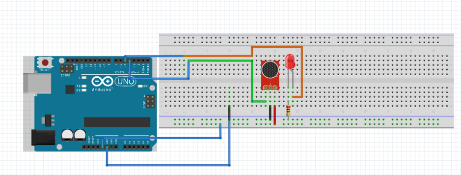
Sound Sensor Module
Circuit Diagram
The circuit diagram was created using Fritzing and includes the sound sensor, LED, resistor, Arduino UNO, and breadboard.
const int soundSensorPin = 5; // Sound sensor connected to digital pin 5
const int ledPin = 4;         // LED connected to digital pin 4

void setup() {
  pinMode(soundSensorPin, INPUT);
  pinMode(ledPin, OUTPUT);
}

void loop() {
  // Read the sound sensor input
  int soundValue = digitalRead(soundSensorPin);

  if (soundValue == HIGH) {
    // If sound is detected, turn on the LED
    digitalWrite(ledPin, HIGH);
  } else {
    // No sound detected, turn off the LED
    digitalWrite(ledPin, LOW);
  }
}
By following these steps, the code effectively monitors the sound for claps or any sound after detection, and the Arduino sends the signal of ‘High’ to the LED.
Connecting the Components
I connected the sound sensor to the Arduino UNO as follows:
VCC of the sound sensor to 5V on the Arduino.
GND of the sound sensor to GND on the Arduino.
D0 of the sound sensor to digital pin 5 on the Arduino.
Connect the LED to the Arduino
I connected the longer leg (anode) of the LED to digital pin 4 on the Arduino.
I connected the shorter leg (cathode) of the LED to a 330-ohm resistor.
I connected the other end of the resistor to the GND on the Arduino.
Hardware Implementation
Video Illustration
Working Explanation, Testing, Fine-Tuning, and Conclusion:
My quest to build an LED controlled by a sound sensor began with designing the circuit and coding it using the Arduino program. I eagerly tested the system by making noises close to the sensor after uploading the code, which caused the captivating LED response. As I fine-tuned the ‘threshold’ value, I found the sweet spot of sensitivity, ensuring the sensor responded with precision. In short, this assignment not only revealed the art of sensor interaction but also brought sound and light together in perfect harmony. With the Arduino UNO as my conductor, I transformed a simple kit into an extraordinary, hands-free LED display, illustrating the limitless possibilities of the Arduino world.
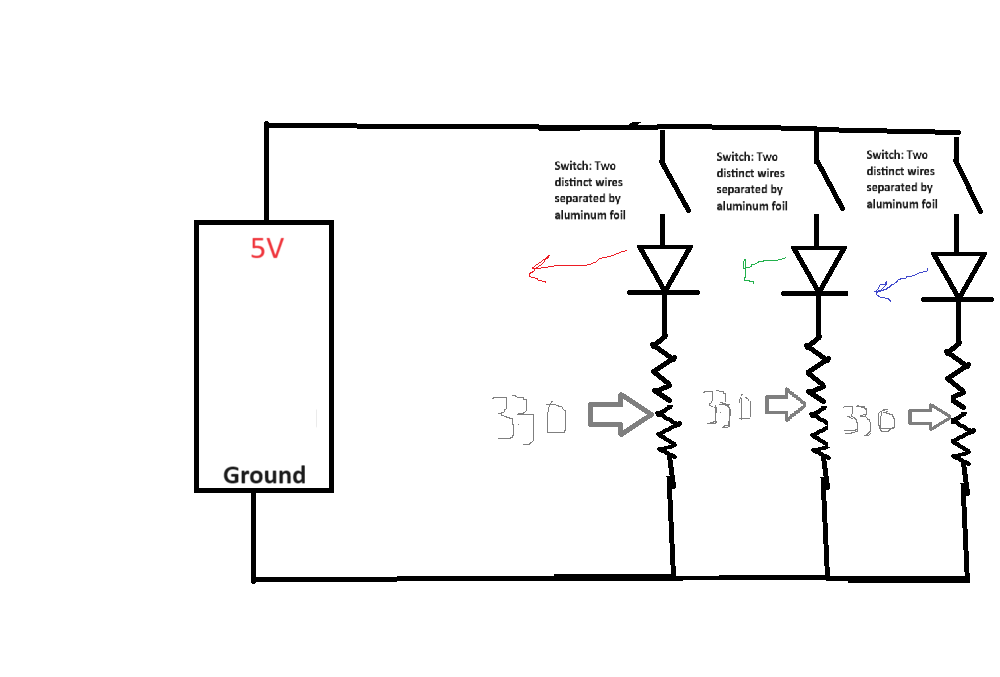
Using the tools and knowledge I have learned in class regarding Arduino, I have created a kid’s educational game-Colordentify- that implements the idea of switches to power the circuit and produce a different outcome on every complete circuit. The main motivation behind this game is to teach children the different colours out there to distinguish between the three main colours: red, green, and blue.
Circuit Diagram:
Three resistors are connected in parallel, each having a different colour. The switch is two wires separated by aluminium foil. As the switch closes, the light colour is emitted.
Project:
Video:
Reflection:
The game is quite simple and incorporates the main point of creating a switch connected through an aluminium foil. The reason that we used aluminium is because of its conductivity of electrons. As electrons are sent into the aluminium platform, another jumper wire touched on top will get in the electrons, ultimately opening the circuit. The game can be expanded with the addition of extra colours. The game can also be exchanged with a bunch of animal pictures on top of the aluminium foil, and instead of LED, there can be an LCD screen that can write the name of that animal according to the different output received by the jumper wire. As for future improvements, cardboard and aluminium- can be better aligned to look pleasing, and jumper wires could be placed under the cardboard connecting to the aluminium instead of being on the front to look better and safe for children.
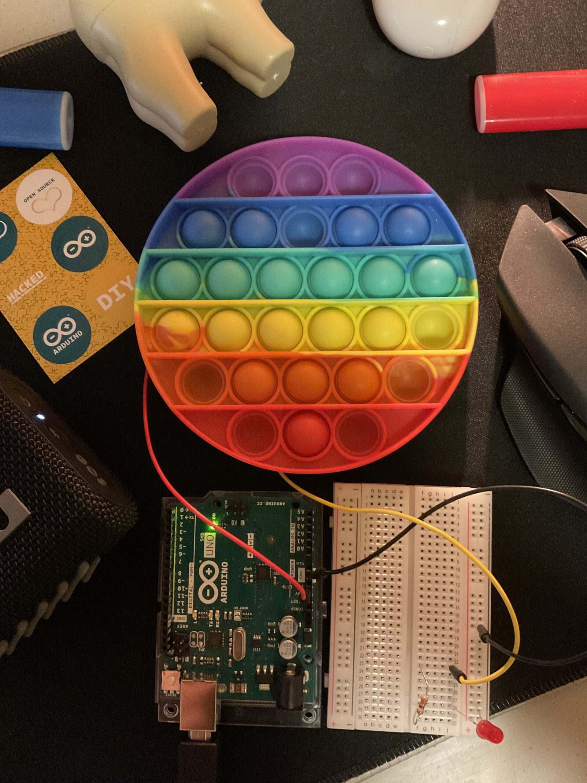
While exploring various methods for devising an inventive switch, I transitioned from the concept of utilizing a door to open and close a switch to envisioning a scenario where a frisbee, upon striking a target, completes the circuit and illuminates a bulb. My mind was brimming with numerous concepts, yet the one that particularly delighted me was the idea of crafting a game. After contemplating various potential game options, I settled on Minesweeper, a universally recognized game that can be enjoyed by individuals or groups. The optimal platform for realizing this game, in my view, is a bubble fidget toy, which features numerous bubbles resembling the grid of squares in a traditional Minesweeper game. One bubble is equipped with two wires, and when this bubble is pressed during the game, it connects both wires, thereby closing the circuit and activating the light resembling a bomb.
below is the image of the project (thought of making it look a bit commercial :p )
I wanted to feature two people play the game to show how it’s a blast for a pair of players, but you get the idea. It was a bit of a tough nut to crack at the beginning, Getting those wires in the right spots and dealing with that stubborn tape not sticking properly to the rubbery toy body made things way trickier than they should’ve been. But you know what? After a few trial-and-error sessions, I finally got those wires snug and secure.
“Design matters, but which design…depends on the occasion, the context, and above all the mood.”
“Pleasing things work better, are easier to use, and produce a more harmonious result.”
“The design should not become a barrier, it should be carefully tailored for a task.”
“A product must be beautiful, have useful function, work well, and be usable and understandable.”
With these quotes, I took away the importance of balance in regards to great design. It is essential to make sure you are covering all aspects of the design process:
Ensuring your product is providing some sort of benefit or fulfilling a certain purpose
Catches the user’s eyes with its attractive design, whether it be adding a combination of colors or cool features that ultimately enhance the likability of the product.
Making sure that there is a certain level of learnability. This is where the human centered design really comes through. A product should be pretty self explanatory to ensure that the user doesn’t become frustrated with the product, therefore halting the usage of it.
Her Code Got Humans On the Moon — And Invented Software Itself.
I really appreciate how this article highlighted the female computer scientist Margaret Hamilton and her role in the Apollo Mission, as well as how her creations deeply impacted the future of computer science. It is refreshing to hear more about female contributions to the field of computer science since the field is so male dominated.
The section of the article about Hamilton being under great pressure to be perfect while building the computer software for the mission was very relatable. I can understand her worries about not being perfect, because she was not only representing herself, but women (at the time) in computer science. The article writes, “I [Hamilton] was always imagining headlines in the newspapers and they would point back to how it happened, and it would point back to me.”. When she says this, she demonstrates how much pressure was placed on her to be flawless. This is something I believe many women, particularly in technical fields, experience.
In Norman’s text, “Emotion & Design: Attractive Things Work Better,” Norman describes how users’ overall experiences with a website are mainly derived from their first experience with the website- as in their first impression. The first impression comprises the website’s aesthetics, functionality, and simplicity. These factors ultimately influence our first impressions and determine whether we trust the website and what they’re selling or not. According to Norman’s explanation of the three cognitive stages—behavioral, reflective, and visceral—people often put more importance on a website’s overall aesthetic than its actual content. Reflective on how the website resembles similar-looking interfaces and our tendency to get accustomed to them and find comfort in them. Reflective and Visceral- aesthetics part- if not met, then our behavior, which is our response, would be more lenient on a lousy impression and our distrust in the website and its content. To gain users’ trust and respect, website creators should incorporate memories and experiences into the design, creating a nostalgic yet professional feel. Striking the right balance between functionality and aesthetics is crucial. I prefer websites with a simple yet profound interface over those crowded with information. For example, consider Google Chrome and Internet Explorer. Despite having similar functionality, most people choose Chrome. Why? Because Chrome offers an aesthetically pleasing and user-friendly interface, while Internet Explorer has an outdated look. While I mentioned the importance of nostalgia, in the case of Internet Explorer, it leans more towards appearing old rather than nostalgic.
Different cultures have unique preferences when it comes to aesthetics and first impressions. Take the Starbucks website, for instance. The American version has a clean, image-focused design with minimal text, presented in an easy-to-read format. It doesn’t overwhelm us with excessive information. In contrast, the Japanese Starbucks website features a dense arrangement of photos and text, which may need to be more aesthetically pleasing to most. This design is quite different from the standard Starbucks site. Japanese users may prefer these busier interfaces because they find it easier to absorb all the information without navigating to multiple pages. They see this as appealing and are more likely to stay on densely populated websites rather than simpler ones. Another reason for this preference could be, as Norman suggested, the influence of the reflective stage. Since Japanese individuals have grown accustomed to these dense websites from childhood, they now find comfort and beauty in them.
Hamilton’s text:
Margaret Hamilton, the mother of software engineering, has had quite a journey to get where she is now. Her contribution to the Apollo program and software engineering is quite impressive. During a period when traditional norms enforced specific stereotypical ideas on women, in addition to being a mother, Hamilton disproved preconceptions and showed a solid commitment to her career. Implementing the “do not touch P01” message within the astronauts’ tech is one of the great examples of how Hamilton’s attentiveness to detail contributed significantly to the astronauts’ successful trips. Even in the times of difficulties and challenges that astronauts go through, they can’t help but make small mistakes that can cost them considerably, which is why Hamilton’s contribution made a big difference to them.
Numerous astronauts’ lives were saved on multiple occasions due to Hamilton’s creative programming concepts and software contributions. Hamilton’s work created something so vast, even though it may have seemed simple and practical at first. Hamilton came up with the idea of relying on software, and billions of computers and other devices worldwide now use the concept of software in general. Her innovative strategy of giving consumers user-friendly interfaces was revolutionary and completely changed how we engage with technology.
Hamilton’s journey was not without its share of difficulties, filled with mistakes and challenging times. One thing to note is how those mistakes ultimately led Hamilton to success. By mistakingly clicking on the P01 button, for instance, she realized that there needed to be a mechanism in place to inform others about it. Therefore, mistakes are something natural, and the implementation of software into programs should also be a natural cure for some of the digital mistakes. Hamilton’s deep love for her job despite facing mistakes and society’s stereotypical ideas pushed her to success. This unwavering dedication and her outstanding accomplishments build a picture of a pioneer who made a lasting impression on the technological world. I have a deep appreciation of her work and the creation of the software engineering field. Her tale serves as an inspiration to everyone, demonstrating the seemingly endless opportunities that result from commitment, creativity, and a sincere love of one’s work.