Reading response #4: computer vision

Computer vision has strong analytical capabilities, but only with proper programming. For example, in Limbotime (the example given by the web), the computer interprets the human body as black pixels, where the head is identified as the vertex of the pixel group. This expands the range of input compared to simpler systems like p5, where input is limited to the keyboard. It also highlights the key difference between computer vision and human vision. While computer vision relies on data and algorithms, human vision rely on context and experience, which is similar to computer vision’s logic but is much more subjective.

Optimizing physical conditions, like using reflective materials or controlled environments, can improve computer vision’s accuracy. But there are broader implications, especially regarding surveillance and privacy. I’m always surprised by how quickly we’ve adapted to technologies like Instagram filters. It’s now expected for the screen to show something when you interact with them.  This also makes me wonder how computer vision might shape human vision, not just physically but in how we perceive ourselves. In terms of servailence, the privacy intrusion may not be as extreme as sci-fi films suggest, but it does subtly alter how we see and present ourselves.

Assignment 4: Box office fireball

Concept

My goal is to practice data visualization in a playful way. I had a clear idea knowing that I want a Marvel character to fire a ball from its hand; the ball’s size is determine by the box office of the movie. 

I access Marvel’s box office data dataset from Kaggle. I deleted unnecessary information such as the length of the film, opening weekend gross, release date, etc and only kept the box office gross and the corresponding movie title (24 in total). I chose the Hulk to be my character because he is the easiest to draw.

Unfortunately, a superhero’s screentime is not determined by what cool power they have, but by the ability for them to make audiences pay 20$ to walk into the cinema.

Highlighted code

As user clicks on the screen, a random movie name from the sheet & a fireball whose size is based on the size of the box office will be generated. For example, The Incredible Hulk has a fireball that is way smaller than Captain America.

The font is accessed from here.

Please click on the canva.

At first, i didn’t set the boolean variable isFiring , so the ball always fires before mouse is pressed and it will no reset once it exits the canvas. I call the variable = false at the beginning, call it true when mouse is pressed, and call it false when the ball exits the frame so that it can be reset.

let isFiring = false; // boolean to check if fireball is in motion
  isFiring = true;
  // Reset fireball once it exits the canvas
  if (circleY < circleSize) {
    isFiring = false; // stop the fireball animation
  }

I also used the min_box = max(float())  method to determine the range so that the fireball can be mapped to fit the size of the screen. Thus, the overall fireball animation look like this:

function fireballAnimation() {
  // map the box office size to a reasonable circle size
  let boxOffice = movies.getColumn('gross_us');
  let max_box = max(float(boxOffice));
  let min_box = min(float(boxOffice));
  circleSize = map(boxOfficeSize, min_box, max_box, 1, 50);
  print(boxOfficeSize,selectedMovie); // just testing if they are corresponding

  // Draw the fireball
  fill(255, 100, 0); // Fireball color
  strokeWeight (2);
  ellipse(circleX, circleY, circleSize);

  // Move the fireball upwards
  circleX += 5;

  // Reset fireball once it exits the canvas
  if (circleY < circleSize) {
    isFiring = false; // stop the fireball animation
  }
}

Improvements

1.Character variety

It would be great if the character can change based on the  movie title on the right. Maybe adding assign if statement to each character might work.

2.Losing stroke

I’m not quite sure why the right arm does not have stroke weight when the canvas is restarted.


Reading response #3: principles of design

One thing that bothers me, and is also mentioned by Norman, is unwanted feedback. The sound of a microwave notifying you that it’s done is especially annoying when you’re trying to grab a quick bite in the early morning without disturbing your roommates. While the feedback from the microwave is immediate and informative, I wish there were an option to mute the sound.

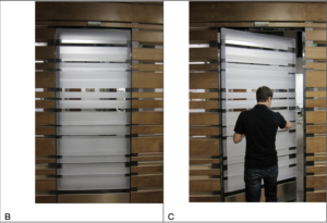
In this case, even well-intentioned feedback can become annoying if users aren’t given enough control, which drive my attention to another question: to what extent should we allow trial and error in a design? For example, the door on page 12 shows us a aesthetically pleasing but also confusing design of a door. You have to try pushing or pulling to test how it works. In this case, users are given more freedom but it might also cost more time. The same dilemma applies to minimalist website designs. Taking the following figures as examples: one that displays a lot of information and another that shows very little.

Websites today often rely on intuitive logic for users who have abundance experiences with technology, but for those without a strong foundation, minimalism can create confusion rather than clarity. This touches on Norman’s concept of the technology paradox, where increased functionality sometimes leads to a steeper learning curve. However, the technology paradox is seen less nowadays as everyone seem to have a relatively good foundation of using tech.

It’s complicated to build affordance and use signifiers, much like trying to understand the “black box” of the human mind and its thinking processes. In IM, striking this balance between clarity and aesthetics is key. One practical thing we can do is to work on a conceptual model. 


Assignment 3: How are you?


Concept

What’s wrong with how are you?

There is nothing wrong with asking or answering how are you, so to speak. It’s just a way to break the ice, to open the conversation. It’s just a filling word for an empty greeting.

There is nothing wrong with how are you, but replying to or initiating countless ‘how are you’ every day can be overwhelming. I want to generate a piece that speaks to this kind of social anxiety. Also I realized that I have never played with text before so this will be a nice chance.

As user presses their mouth, the sentences are going to enlarge to occupy the whole screen, creating the sense of suffocation.  While enjoying the simplicity brought by B&W, I utilize a lot of randomness to make the page look too dull. The inspiration of the basic design comes from this example I found on p5.js website.

Highlighted codes & improvements:

Base on how we generated the bouncing ball, I created the words class in the word.js and called all the functions we set up in the sketch.js. Thanks to this Youtube tutorial, I also learned how to do fade-in fade-out action which is essential for my code.

// Method to fade in the word (255=black)
 fadeIn() {
   if (this.alpha < 255){
     this.alpha = this.alpha + this.fadeSpeed; // Increase transparency
   }
 }

 // Method to fade out the word
 fadeOut() {
   if (this.alpha > 0) {
     this.alpha = this.alpha - this.fadeSpeed; // Decrease transparency
   }
 }

I’m not entirely sure how to keep the text within the edges. I might run another if statement to improve that in the future or just by putting limits on this.x? Also, it would be interesting if the user could click on something to trigger the decrement of the sketch.

Things I wanna try out in the future: 2D collision and blendmode in color.

Reading response #2: Interactivity

Listen (input) – Think  (process) – Speak (output)

One thing that Chris Crawford mentioned at the end really enlightens me: have the right form for the right function. Despite that user interface design and interactivity design are two different things, their should be an inseparable link in between. For my week 2 assignment, I added an if statement to trigger the background changes whenever the mouse moves to a specific area.  This is a last-minute changes to the generative work I have already done with the pure intention of increasing interactivity. Looking back to it, I realize that it breaks the balance between the wave in the foreground and the single-tone background. Although the degree of interactivity seems to rise, the important code I wanted to highlight is interrupted. 

The above reflection brings me to the second point i’d like to discuss: what determines the degree of interactivity, listening, thinking, or speaking? Though Crawford uses book and movies as examples of forms that have low interactivity, I remember reading books that direct you to different sections of the page based on the choices you made for the protagonist. In 2018, Netflix also launched its first interactive film Bandersnatch on their streaming platform with more to come in the following year. These innovations create a conversation between the audience and the actors. However, do these innovations turn the medium into something they are not? Do these books and movies become a game? What more can be done to increase the interactivity of these mediums while not ruining their fundamentals?  

Assignment 2: Worm

Concept

sandworm – circle – sin/cos wave

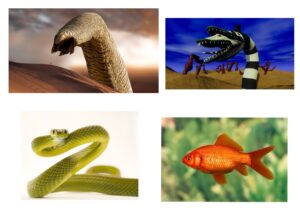
I begin with wanting to create a sandworm-looking creature from Dune. During my research, I found out this B&W worm that is visually more appealing than a big yellow worm hiding in the desert.

Few inspirations
Few inspirations

After the initial brainstorm, I started playing around with circle() & ellipse() just to experiment with the for loop. This snippet I got from one of the readings inspired me to show more of the liveness of the basic shapes.

Keeping the shape of the sandworm and the potential movement they might have in mind, I decided to create a wave. With the help of this Youtube tutorial on sin & cos wave, i was able to create a normal wave. By adding framecount into that, I create the illusion as if this sandworm is 3D. To practice using if statement, I added a colorful background that is only triggered when your mouse is moved there.


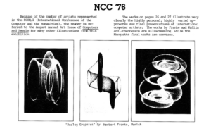
Somehow Casey Reas came in mind, so I decided to explore a bit further. For the clarity of my worm, I removed the background interaction and replaced all cos with tan. Thi si the final result:

Code & future improvement

I am happy with how the frameCount came in handy in both the fill() & circle. In future, I would give more meaning to the background.

for (i=0; i<width+100; i=i+1){
  fill(
    178+177*cos(i/2 +frameCount/2)
  );
  circle(i, height/2  + 100 * cos(i/100+frameCount/20), 50 * cos(i/30 + frameCount/50))

}


Reading response #1: Casey Reas

View code as a tool to bring imagination to life

Reas’ website & talk.

I’m the most impressed by Casey Reas’ ability to code art from the easily overlooked details in life and how some of his works can find their roots in art history.  Every piece he presented contains multiple layers of meaning, with deep consideration before arriving at a final artwork.  Those works draw from scientific concepts, like that neuro model, or something as simple as the characters on a keyboard. They start with such tangible concepts but lands in somewhere abstract. 

What sets coding art apart from traditional forms of art? I believe it’s the ability to accept constant changes. Reas references artists like Duchamp, the Dada movement, and John Cage to illustrate the concept of ‘chance in art.’ These works embrace improvisation as part of the creative process. Coding takes this a step further by having randomness at its core, demonstrating how randomness can have a certain intentionality. It shows how meanings can shift and layer as the program runs. These added-up layers can be endless, not just limited to one canvas and small changes in a code can result in something drastically different from before. Another key distinction is accessibility. Traditional art often requires specific skills and techniques, while creative coding lowers that threshold and provides the public with the tools to easily replicate a great piece of creative coding.


Assignment 1: Self-Portrait

Sketch

Idea

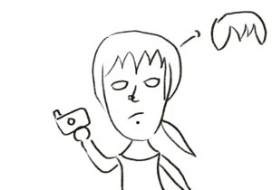
I’m quite new to P5js so I started the project by drawing myself out.

The sketch is easy but I ended up giving up on the complicated version of my bang and chose to use an arc & a transparent triangle. I removed the stroke at the end because I like how an image is created just by these big chunks of color composing together. The blush, the piercing, and the top are all obvious characteristics of mine so I decided to include them apart from just coding my facial features out. The self portrait looks sad because I was sleepy when working on it.

I like photography a lot so I decided to use the background to show that.


Highlighted code

I used the variable & random code that we talked about in class to create the camera that appears at the beginning and the flashes. To make them obvious, I chose a plain green background. The camera’s movement is set using CameraX & CameraY global variables. I used CameraX = frameCount % width to make sure that they will reappear. The flashes appear using random. One thing that I might change in the future is to make the rectangles into a diamond shape and add white highlights so that they = look more like flashes. I might also add interactivity: users click on the camera to produce the flash.

//the flash
//make random camera flashes
frameRate(10);
let x = random(600);
let y = random(600);
fill('yellow');
rect(x,y,90,120);
fill('white');
//the camera
fill('rgb(224,216,216)');
rect(CameraX+4,CameraY-10,40,100,0)
fill('white');
rect(CameraX,CameraY,150,100,10);
fill('grey');
rect(CameraX,CameraY+20,150,60,5);
fill('rgb(175,165,165)');
circle(CameraX+80,CameraY+50,80);
fill('black');
circle(CameraX+80,CameraY+50,60);
fill('yellow');
circle(CameraX+90,CameraY+40,10);
CameraX = CameraX +1
CameraX = frameCount % width
CameraY = frameCount % width
noStroke();