Week #8 assignment: Unusual Switch

Concept:

For this week’s assignment, I wanted to create something universal that could be adapted in various creative scenarios. To the Arduino board, I attached two wires with aluminum foil plates, a connection of which completes a circuit and lights up the LED light. I also wanted for it to be used between 2 people to increase the interactivity aspect and make it more fun (which it actually was a lot!). Here is the initial result:

And here is some more fooling around with it:

Implementation:

Implementing it was quite simple. It was a series circuit, enhanced with aluminum foil. Here is how the setup looked like:

Reading Response – Week #8

Although Donald Norman’s ideas about emotion design and the role of aesthetics in design and Margaret Hamilton’s invention of the modern concept of software may seem unrelated at first glance, I found quite some connecting ideas between these readings, especially in the concepts of user-centered design, and its application in stressful situations.

Donald Norman and Margaret Hamilton both stressed the significance of developing products and software with the end user in mind. Norman’s work on emotional design emphasizes the importance of developing products that elicit good emotional reactions from users. Similarly, Hamilton’s work in software engineering was centered on making software more user-friendly and stable, as well as ensuring that it fits the demands of its users. Although Hamilton was a programmer and her job circled around functionality rather than anything else, she knew that failure might occur not because of mistakes in the system, but because of human mistakes when interacting with it. The story of the prelaunch program called P01 stuck in my mind, when an astronaut accidentally launched it at a wrong time and that almost cost the whole mission. Hamilton was aware that users are not perfect even in using systems that they were well trained on using, and even if they are astronauts themselves: “We had been told many times that astronauts would not make any mistakes,” she says. “They were trained to be perfect.” For me, this story defines what is user-centered design: it is the assumption that users are not perfect and the stress on importance of considering the human element in design and engineering, ultimately leading to more effective and user-friendly products and software.

This has been further backed up by Norman in his discussion on designs for low and high stress environments. I think it is not highly disputable that something like an Apollo mission is quite a stressful situation, which, according to Norman, makes good human-centered design “especially important”. Stressful environments and circumstances increase the chances of human error, and Hamilton was right in her idea to take that into account and to prevent as many misuses due to human error as possible in her design of Apollo software.

Midterm Presentation: The Designer Chair Plunge

Sketch:

Link to full screen: https://editor.p5js.org/llluka/full/EZEndFCFm

https://editor.p5js.org/llluka/sketches/EZEndFCFm

Concept:

The game, titled “Designer Chair Plunge,” is a fun and interactive experience that puts players’ reflexes and decision-making skills to the test while exploring the world of designer chairs. The goal is for the player to save a designer from a risky fall, guided by a humorous story in which the chairs are personified as fighters. As the player, you select your “fighter” from a range of well-known designer chairs including Barcelona, Eames, Panton and Wassily chairs, and the classic white plastic chair is added for the humorous effect. When the game begins, you must manipulate your chosen chair in order to capture a falling designer.  Your score rises with each successful rescue. However, be careful not to let a designer plunge to the ground, as this will result in an offensive game over. “Designer Chair Plunge” combines design appreciation and gaming components, creating a novel and enjoyable way to interact with the world of furniture design.

Technical Implementation:

The game is built on the p5.js framework utilizing object-oriented programming. There are various screens in the game for the introduction, chair selection, gaming, and ending. PNG images and sounds are used in the technological implementation to create an immersive experience. Chairs and designers are represented by images, and interactions are managed through mouse input, where the player selects their chair and attempts to catch designers falling from the top of the screen. The game keeps track of the player’s score and ends the game if a designer hits the ground. The “restart” function not only resets the game state but also ensures the music restarts from the beginning, creating a consistent and enjoyable audio experience for the players. Here is the code for the restart function:

function restart() {
  screen = 0; // switch to intro screen
  score = 0;
  designer.reset();
  designer.speed = 2; // reset the speed of the fall
  mozart.stop(); // stop currently playing sound
  mozart.play(); // start the sound from the beggining
}

Moreover, the falling designer figures are randomized from 3 distinct images. Here is a function inside my Designer class that handles that:

display() {
    if (this.r < 0.3) {
      image(subject_1, this.x, this.y, this.width, this.height);
    } else if (this.r < 0.6) {
      image(subject_2, this.x, this.y, this.width, this.height);
    } else {
      image(subject_3, this.x, this.y, this.width, this.height);
    }
  }

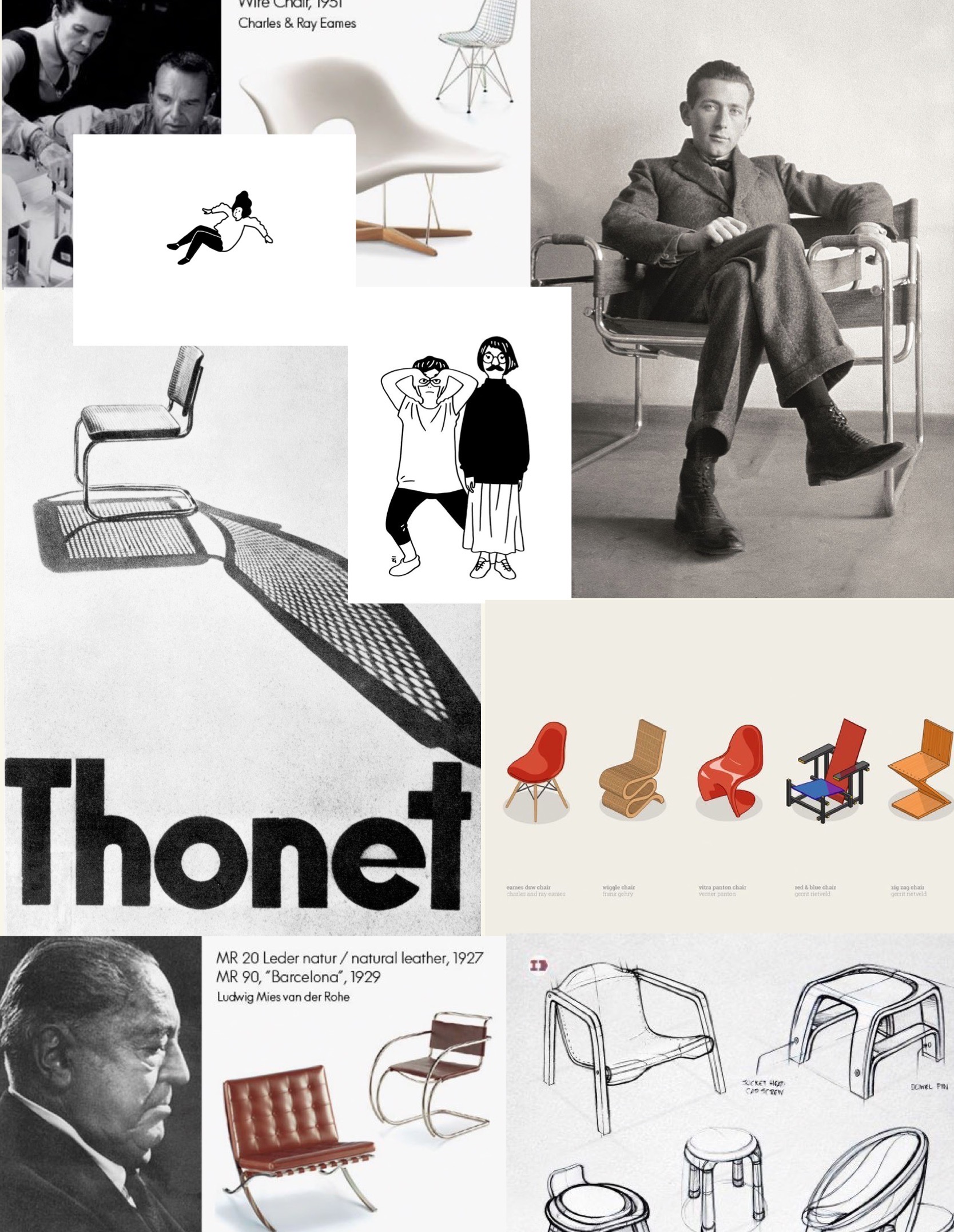
Nevertheless, an important part of the game’s look and feel is not in the code. At first, I experimented with different images of the chairs found online, however, nothing really seemed to match my vision for the game. Therefore, I decided to draw the chairs myself to give the experience a unified aesthetic. Here are my PNG images (I used Adobe Fresco on my iPad to produce them):


Reflection:

I am very happy about the final look and feel of the project. It turned out  exactly as I imagined it to be (refer back to the moodboard in Midterm Progress #1). I am especially satisfied with the concept and design of the game, and how I managed to create and maintain a unified feel of the mid-century modern aesthetic with the tiny details such as my own drawings, sounds, and the two graphic images. I also applaud myself for the humorous aspect of the game – there is no way to “win” the game, and thus the designer is never going to be satisfied, just like in the real life.

Reading reflection – Week #5

The study by Golan Levin delves into the integration of computer vision algorithms within the realm of interactive artworks and creative design. While importance of cleverly designed algorithms that would allow computers to make smart interpretations about digital images and video is unquestionable, I kept thinking about the role of other factors influencing computer vision. One such factor is the optimization of the physical environment where the video data is collected. Especially in the case of artworks and the creative field where the physical environment can be controlled, it is important to consider how the visual data collection is staged, as it can either increase the reliability of computer vision or make it more difficult to analyse. Cleverly designed physical environments can potentially decreased the need for more complex software solutions. This concept highlights the creativity necessary in the world of interactive art and design. It implies that artists and designers can use their spatial and environmental design skills to develop setups that allow for accurate data collection. They can extend the capabilities of computer vision without resorting to advanced and intricate software development by deliberately altering the physical context. This approach reflects the field’s interdisciplinary nature, in which creativity goes beyond the digital domain and demands a complete understanding of both the virtual and physical components of interactive artworks.

A compelling example of the principles discussed in the paper can be found in the artwork “LimboTime.” “LimboTime” is a simple game that was conceived and implemented in a remarkably short span of a single afternoon. Its creators utilized a wall-sized sheet of white Foamcore as an ideal environment for brightness-based thresholding. The usage of this material enabled them to effectively find the game’s three players against the background, demonstrating how physical environment optimization may contribute to computer vision success. Rather than depending on complex software solutions, the detection of players’ hands and heads was accomplished by creative heuristics, such as recognizing the limboer’s head as the uppermost point of the middle ball of black pixels. This elegant solution showcases that a well-designed physical environment can improve the performance of computer vision techniques, simplifying the implementation process, and fostering innovation in the realm of interactive art and design.

Midterm Progress #1

Name: Designer Chair Plunge

Concept: For my midterm project I want to implement a simple game inspired by famous designer chairs. Currently I am taking a core class named “Have a Seat” where we explore various ideas about seating, posture and chair design, and so this class is my main inspiration for my midterm. Regarding the strategy of the game, I want to create a falling designer character that the user has to catch by manipulating the chair on the bottom of the screen. The chair is responsive to the mouseX position therefore the user controls the game just by the movement of the mouse.

Moodboard: –>


Sketch:

I firstly started by implementing the control strategy of the game with simple figures. The ball and the rectangle are both objects, and the ball starts to move faster after each successful catch to increase the pace of the game.

Further/ complex implementations:

The nexrt steps will be to replace the simple figures with the png character and the chair. I would like the chair figure to be randomized from a number of different chairs to increase the variety. I will also need to work on the start game and end game windows to match the aesthetic. I will want to add some background music and add sound effects for each succesful catch or miss. I would love to draw the figures myself, so probably this would be the most challenging part.


Reading reflection – Week #4

Norman’s book, “The Design of Everyday Things,” is a seminal work in the field of design. It provides core ideas that are applied in all design fields, UI and UX design being no exception as it relates more to our class. As I was reading I was reflecting on how Norman’s ideas could be applied to digital design, especially his thoughts about feedback, mapping, and emotional design.

Norman emphasizes the importance of providing clear and immediate feedback to users. In case of digital design, I believe that feedback is especially crucial. Unlike various everyday physical objects, computers appear like black boxes to many of the users and thus communication between the user and the interface is important. Thus, In UI/UX design, feedback is essential to inform users about the outcomes of their actions. Visual cues, animations, and messages should help users comprehend the cause-and-effect relationship of their interactions with the system.

Like anywhere, mapping in digital design is about creating a clear and intuitive connection between user interface elements (controls) and their corresponding actions or functions. This idea made me think how mapping is performed in the virtual space. Here consistency plays a huge role, for instance consistent iconography or color schemes for buttons that perform similar functions such as save, delete, submit. The physical or spatial arrangement of such controls also conforms to user’s expectations and mental models of applications or websites, and working together with feedback results in smooth operations.

Another key thought in the reading that I think is important in digital design is emotional design. Emotional design in UI/UX goes beyond aesthetics and usability; it is about creating interfaces that emotionally connect with users. One brand that comes to mind as a great example is Apple, who’s success can be attributed to its mastery of emotional design in UI/UX. Their products and interfaces go beyond mere functionality; they create products with sense of elegance and sophistication, evoking positive emotions such as admiration and desire. They consistently strive for user experience that focuses on simplicity and intuitiveness, making their users feel empowered and in control. The minimalist aesthetic, friendly interfaces and consistency along their different product define the brand’s identity. This quality generates a strong emotional connection with people, who frequently identify with Apple’s ideals and lifestyle.

Coding Assignment – Week #4

For this week’s assignment I wanted to create a sketch that would be responsive to audio. From the beginning, I knew that I wanted to use a piece of classical music and utilize amplitude to visualize the music. I wanted to recreate a low-fidelity feeling of something like this:

Here is my sketch (open in a separate tab for the sound):

 The p5.js library is used in this project to build an audio-driven visual representation. The Particle class is in charge of creating particles with certain properties such as position, angle, speed, and radius. The amplitude of the Orchestral Suite by Johann Sebastian Bach is utilized to modify the speed and angle of the particle. When the audio amplitude exceeds a predetermined threshold, the particles vary their angle and radius, resulting in visually unique behavior. Furthermore, boundary checks are used to verify that particles do not bounce off the canvas’s edges. The primary program generates a grid of tiny particles and dynamically draws lines between them, resulting in a complicated, developing visual pattern.

This project was a good opportunity to learn about the sound library. Here some crucial lines:

this.amp = new p5.Amplitude();
// and
let vol = this.amp.getLevel();

The p5.Amplitude class is part of the p5.js sound package and allows to measure the amplitude or loudness of audio in real-time. By creating this instance, the sketch has the capacity to evaluate and respond to the dynamics of the audio. The getLevel() function of the p5.Amplitude object (this.amp) gets the current audio amplitude level.  This value changes while the audio plays, offering a dynamic indicator of the intensity of the song.

Another part of the code that I was proud of was the drawing of the lines between particles:

  // looping through all the particles
  for (let i = 0; i < particles.length; i++) {
    let particleA = particles[i];
    particleA.update();
    particleA.display();

    // initializing an inner loop to compare the current particle to other particles and calculating distances
    for (let j = i + 1; j < particles.length; j++) {
      let particleB = particles[j];
      let distance = dist(
        particleA.position.x,
        particleA.position.y,
        particleB.position.x,
        particleB.position.y
      );

      // drawing a line between particles that are closer than 100 pixels
      if (distance < 100) {
        line(
          particleA.position.x,
          particleA.position.y,
          particleB.position.x,
          particleB.position.y
        );
      }
    }
  }
}

This is a very simple principle, where basically every particle in the outer loop is compared to all the other particles by looping through them in the inner loop. It was quite a basic structure but it allowed for of the main effects in the sketch.

Ideas for future improvements would be performance optimization, especially when dealing with a large number of particles. The audio tended to become messy once I would initialize more particles (sometimes it can be heard even in the current sketch). I would also like to introduce different types of particles with varying behaviors, for example, some particles could respond to bass frequencies, while others react to treble.

Reading Reflection – Week 3

Before delving into the first chapter of Chris Crawford’s “The Art of Interactive Design”, my understanding of “interaction” was rather straightforward—I saw it as any form of engagement that elicited a response. However, learning about Crawford’s comprehensive criteria,  which highlight the significance of cyclically reciprocal actions such as active listening, speaking, and thinking, has expanded my viewpoint. His idea allows for evaluation of the depth of interactivity in different mediums, which challenged my previous idea that something either is interactive or not.

Another idea that caught my attention was that interactivity is in fact subjective. This thought makes complete sense, as different users have different expectations, levels of interest, motivation and personal preferences. For instance, someone who prefers a more passive form of engagement and somebody who strikes for a more immersive experience will most likely not find something like the YouTube algorithm interactive on the same level. Another factor I considered after the reading is that interactivity can be staged; in other words, it is not difficult to make something appear interactive when, in fact, it is not. This issue arises for several reasons. First, there is often a false overuse of the term “interactive”, leading to a dilution of its meaning. This aligns with the misconception with which Crawford opens the first chapter, highlighting the need for a more precise understanding and definition of true interactivity. Second, there seems to be a common tendency to mistake participation and reaction as true interaction. While these elements are integral to many interactive experiences, they lack the deep, cyclically reciprocal engagement that Crawford’s definition of interactivity highlights.

An example that comes to mind is gamification, which involves applying game-like elements, such as points, badges, leaderboards, and rewards, to non-game activities to make them more engaging and interactive. Such strategy is often used in various apps, for example, educational applications such as Duolingo. Duolingo gained its popularity since it was perceived as highly interactive due to the visual feedback and competitive elements, but that is more or less only the surface of the application. Upon closer examination, one may realize that the core learning experience remains passive and one-directional, with limited opportunities for genuine engagement, discussion, or deep understanding of the subject matter.

Coding Assignment – Week #3

For this week’s assignment, I drew inspiration from the Impressionist art movement, specifically the post-impressionist Van Gogh and his famous Starry Night oil painting. I wanted to recreate the swirling pattern in the form of generative art.

Here is the sketch:

 This code generates its visual effect by simulating a dynamic movement of particles using object-oriented programming. Each particle’s position and movement are controlled by vectors that are affected by Perlin noise, creating smooth and organic trajectories. The particles transition in color as they move, smoothly blending between two predefined colors based on their angle of movement. The result is a gradual build-up of a visual pattern that also transitions harmoniously between colors.

There were two interesting things I learned with this code. The first was controlling the noise scale. By dividing the coordinates by a constant value (in this case, 100), I managed to influence the scale of the noise. Smaller divisors resulted in finer-grained noise, while larger divisors resulted in smoother noise. In other words, the divisor determines how quickly the noise changes as the particle moves across the canvas. By using a larger divisor I was able to create a more gradual variation.

update() {
  //Calculating the angle based on Perlin noise
  this.angle = noise(this.position.x/100 , this.position.y/100) * TWO_PI;
  // Move the particle's position based on its angle and speed
  this.position.x = this.position.x + cos(this.angle) * this.speed;
  this.position.y = this.position.y + sin(this.angle) * this.speed;

}

The second lesson regarded the transition of colors and the lerpColor() function. I began by defining two colors, ‘color1’ and ‘color2’. The ‘angleIndex’ is a result of mapping the particle’s angle to a value between 0 and 1. lerpColor() then assigns a color between the colors 1 and 2 based on the colorIndex, resulting in a gradient-like color change for each particle. Finally, it sets the stroke color to the blended color and draws a point at the particle’s position, creating a visually appealing color transition effect as the particles move. I wanted to focus more on the aesthetic appeal with this assignment, and the lerColor() assisted me a lot with that.

display() {
    strokeWeight(random(0.5, 1.5));

    // Define the two colors for the transition
    let color1 = color('#274df5'); 
    let color2 = color('#fafcfb');
    
    // map the color based on the angle for smooth transitions between colors
    let angleIndex = map(this.angle, 0, TWO_PI, 0, 1);

    // Interpolating between the two colors based on angleFactor
    let blend = lerpColor(color1, color2, angleIndex);
    
    stroke(blend);
    point(this.position.x, this.position.y);
}

As I was browsing on Pinterest for color and pattern inspiration, I came across Cameron Beccario’s near real-time visualization of global weather conditions. I found his project very interesting, interactive and somewhat connected to our last week’s reading (Casey Reas’ talk, especially the part about data visualization). Beccario’s choice of visuals and aesthetics also appeared similar to what I was going for with my sketch, thus I thought I would share:

https://earth.nullschool.net/#current/wind/surface/level/orthographic=-25.43,16.43,387


Reading reflection – Week #2

Casey Reas opens his speech illustrating how it’s been largely the role of artists to maintain order in the face of nature. However, as he continues further showcasing his own and other artists’ works, I started to doubt this idea of his.

The work that captured my attention the most was “Signals”, created in collaboration with American designer Ben Fry in 2011. This artwork showcases protein communication within a cancer cell, where each graphical cluster represents signals between networked proteins in a cancer cell as they change over time. Individual arcs represent signals from one protein to another; arc size corresponds to signal magnitude. Professor Michael Yaffe’s laboratory provided the data. Here is the artwork in question:


Reas’ approach to data visualization as a creative expression presents important questions regarding how data representation through art affects different viewpoints. “Signals” may convey a feeling of the complicated conflicts taking place within cancer patients’ bodies, perhaps demystifying a difficult biological process and establishing a connection to their own health journey. This type of visualization can also be a significant tool for scientists and researchers in acquiring insights and developing ideas on cellular behavior.

However, when ordinary people without a scientific background are considered, the possibility for bias and misinterpretation emerges. Such simulations’ aesthetic appeal may unintentionally romanticize or oversimplify the complicated realities of diseases like cancer. It is critical to recognize that, while art can improve our understanding, it can also distort it.

To conclude, it is critical to investigate the various perspectives on this junction of art and science. How do patients, scientists, and members of the general public react to data-driven art? What are the ethical and educational consequences of visually representing complicated scientific concepts? These issues emphasize the diversity of data visualization in art, as well as the importance of taking a balanced approach when understanding and appreciating these creative interpretations of knowledge.