Week 8 – Unusual Switch!

Concept

This attempt to create an unusual switch was  inspired by my unhealthy obsession with led light shoes as a kid. With so many lights and colors on my shoes that changed depending on each step and pressure, I have blurred memories of randomly walking and jumping around just for those lights. Since this assignment required us to not use our hands, I thought it would be perfect to try creating something similar to those shoes.

Process & Highlights

Visualizing the circuit was relatively straightforward. It consists of a simple series circuit with two LEDs and a 330-ohm resistor.
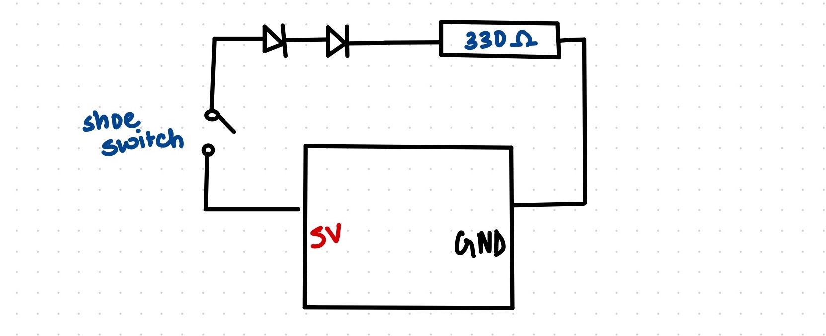
I experimented with various methods to create a switch using two aluminum foil sheets and settled on the following design. I attached one sheet to the back of a sandal and the other to the floor. When stepped on the second sheet, both pieces of foil come in contact and the circuit closes, allowing the LEDs to glow.

Videos of its implementation: IMG_8316,  IMG_8326

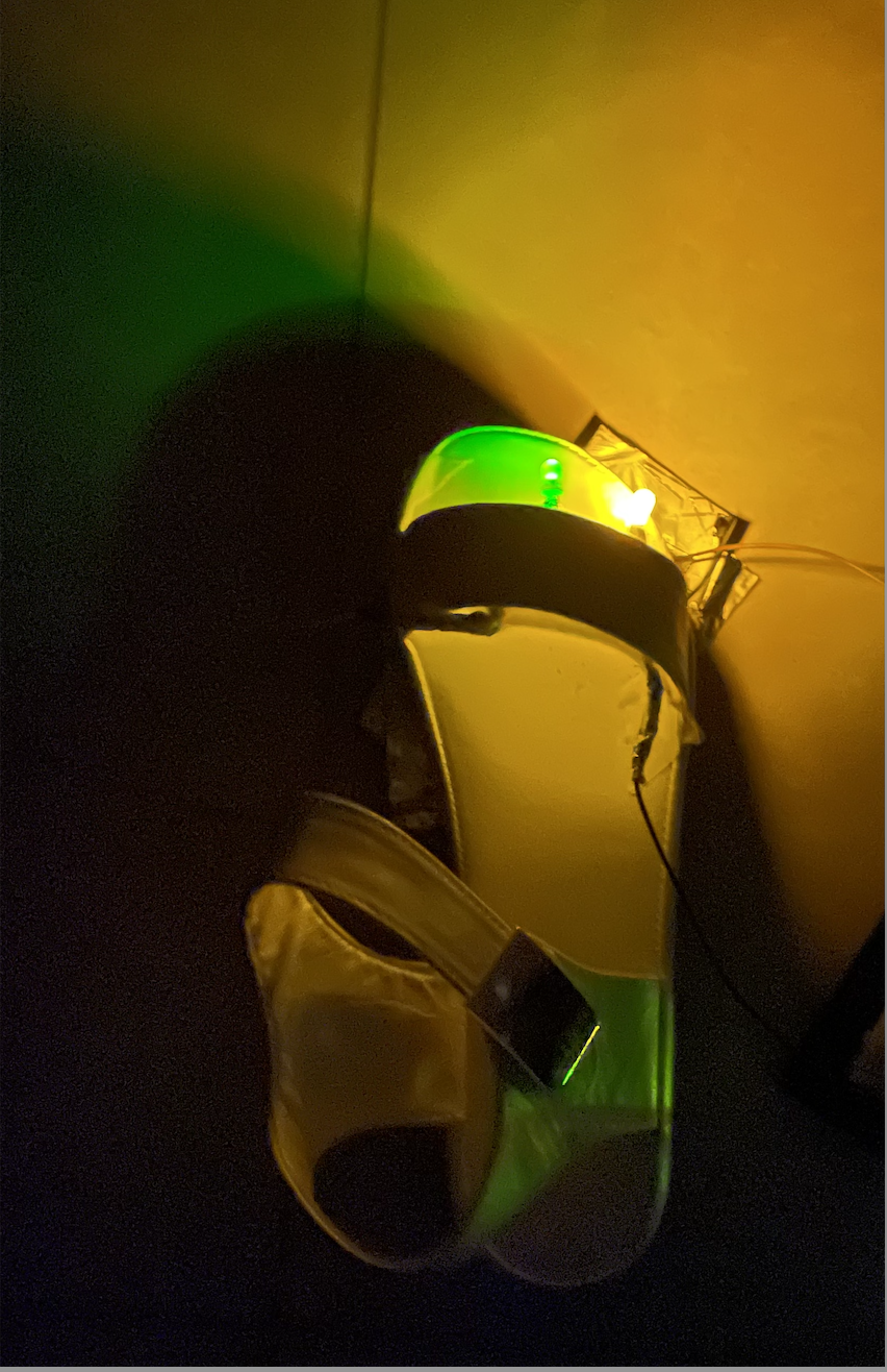
One significant challenge I encountered was positioning the lights on the shoes instead of using a breadboard. To make this work, I used a combination of jumper wires, aluminum foil, and tape. I also intended to use three LEDs: yellow, green, and blue. While the yellow and green LEDs worked when connected in series, the blue LED did not. I suspected it was due to insufficient current, as the bulb wasnt faulty. I tried various resistor combinations but they did not work.

Reflections:

I am content with the outcome of this assignment. While the wiring may not be aesthetically pleasing, I believe that with better resources and materials such as conductive fabric and alligator clips, this project could be further enhanced. During the assignment, I contemplated changing my idea several times but realized that it needed to be hands-free, which limited my options. This project made me realize and appreciate our dependence on our hands. Overall, physical computing seems fun and I’m excited to learn more.

Reading Reflections – Week 8!

“Her Code Got Humans on the Moon—And Invented Software Itself”
Moved by both, Hamilton being an ‘outlier’ as a woman in tech and engineering in the 60s and her as a pioneer of software engineering, “Her Code Got Humans on the Moon—And Invented Software Itself”, was one of my favorite readings for this class so far.
In an era when software was still in its infancy, she and her colleagues were pioneering new ideas and techniques that would shape the future of computing.The pressure and responsibility that Hamilton felt during the Apollo missions serve as a reminder of the importance of attention to detail and the consequences of errors in complex systems. Her commitment to ensuring the software’s reliability, reminds me of the dedication and alertness that I should have, striving to pursue a career in a similar field.

Emotion and Design
I often find myself irritated by misaligned elements and clashing color combinations and end up being called ‘picky’ by some of my friends who think that as long as a message is conveyed, aesthetics can take a backseat. I liked most of Norman’s ideas as they resonated with my thoughts. However, I realized that it’s all about the balance between beauty and usability. This also makes sense in the aspect of many choices that we make. For example, if I were to purchase a drawer, I would choose the push-to-open drawer for its aesthetic over a drawer with a big handle that’s easier to use, because the former too, is user-friendly and also looks better.When he talks about affect and behavior, the cognitive aspects of negative and positive affect make a lot of sense to me but when he mentions pleasing designs can make users more tolerant of minor design flaws. I think it’s true that aesthetics can mask some issues temporarily, users are likely to become more discerning over time. Pleasing aesthetics may initially captivate users, but if underlying usability problems persist, users may eventually become frustrated and abandon the product or service.

One thing this reading leaves me thinking about is, it claims that attractive things work better. However, attractiveness is highly subjective and culturally influenced. What if what one finds attractive might not resonate with another? And how do we take into consideration a diverse target audience?

Week 6 – Midterm Project!

Concept

As we approach the festive months of the year, all I can think about is winter break, my favorite holiday. The warmth, comfort, excitement, and simple joys that this season brings are what I eagerly anticipate for months. When considering ideas for this open-ended and creative project, I wondered if there were others like me who simply can’t wait for the Christmas season and New Year. Thus, I decided to create an Early Christmas Experience as an ode to one of my favorite festivals. The candy canes from school, the joy of exchanging gifts during Secret Santa, and the delight of decorating the Christmas tree are just a few things that make this season special, and I aimed to incorporate them into my project. From the reading ‘Making Art is like setting a trap’, my takeaways were to focus on and convey the simpler things and the feelings behind it

My project aimed to encapsulate the essence of Christmas, focusing on two central elements: decorating a Christmas tree and the excitement of hunting for hidden presents around a cozy house—both cherished traditions in my family. Having spent my entire life in a region where snowfalls are rare, I yearn for snowy vacations. For this project, I wanted to create a visually captivating experience, making it heavily reliant on graphics rather than physical and mechanical elements.

How It Works:

The experience begins with a screen featuring a play button. Upon clicking this button, users are transported to the experience screen—the screen of magic. Santa himself makes an appearance, offering brief instructions on how to navigate the experience. Users can click on the Christmas tree and decorate it by dragging and dropping ornaments. These decorations are saved for later viewing. Clicking on the house triggers a mini Christmas-themed hidden object game. The objective is to find a minimum of 5 presents to win. Throughout the experience, a snowy backdrop adds to the festive atmosphere, and users can navigate through the various parts of the experience using marked buttons in the form of presents with a carol playing in the background and end with a real – time countdown to Christmas.

 View directly in the editor for sound , re run and let Santa guide you further! https://editor.p5js.org/keyaa/full/lvw7KccaA 

Technical Parts I’m Proud Of

The Christmas tree was a major highlight of my project. While the drag-and-drop functionality for ornaments was easy with the reference shared in class, a significant challenge was saving the positions of these ornaments and placing them exactly on the experience screen tree as the user had arranged them on the tree screen. After multiple experiments with vectors in p5.js and other coordinate system functions, I chose to calculate the relative positions of X and Y coordinates of the ornaments and confirm if they were correctly placed on the tree. To add a more realistic touch, I included a layer of snow with gradually decreasing velocity, simulating the accumulation of snow on the tree. This was a personal favorite effect that enhanced the overall experience.

if (decorated == true) {
   for (let draggableObject of draggableObjects) {
     if (draggableObject.onTree) {
       draggableObject.x = draggableObject.relativeX + treeX;
       draggableObject.y = draggableObject.relativeY + treeY;
       draggableObject.show();
     }
   }
 }

 // Check if snowflakes2 touch the tree
 for (let snowflake of snowflakes2) {
   const distanceToTreeCenter = dist(snowflake.x, snowflake.y, treeX + christmasTree.width / 2, treeY + christmasTree.height / 2);
   if (distanceToTreeCenter < 70) {
     snowflake.speed = 0;
   }
   snowflake.update();
   snowflake.display();
 }

The typewriter effect for Santa’s words:

typewriterEffect() {
  if (this.index < this.message.length) {
    this.displayedMessage += this.message[this.index];
    this.index++;
  }
}

The usage of OOP and arrays is at the core of this project. It simplified tasks and made the project more organized. Creating Santa’s movement using sprites was a more significant challenge than anticipated. To enhance the visual appeal, I incorporated images from Shutterstock and designed some of my own using PicMonkey and Canva, opting for efficiency over drawing everything directly in p5.js.

Areas for Improvement

While I’m pleased with the project’s overall outcome, there are many other areas that I can improve and add to. Adding more challenging elements to the hidden objects game, such as a timer, or refining Santa’s movement for smoother animation, could make the project better.

In conclusion, creating this Christmas-themed interactive project for my midterm assignment was a delightful experience. I tried to work more on my creative skills instead of just coding like I would for other classes. I tried to incorporate most of the concepts learnt over the past few weeks and am already excited to see what the second half of the semester in this class holds for me to learn!

References

https://www.shutterstock.com/image-vector/bright-new-year-santa-claus-2d-1563199690, https://www.youtube.com/watch?v=bKEaK7WNLzM, https://www.youtube.com/watch?v=3noMeuufLZY, https://editor.p5js.org/codingtrain/sketches/U0R5B6Z88 

Reading Reflections – Week 5!

The interactive artworks seemed quite interesting but what caught my attention more were the elementary computer vision techniques. I’m always curious to know what goes on behind the scenes so understanding how motion and presence are detected was fascinating. Just as I was thinking about real time issues these could pose with reference to the physical environment, the next paragraph highlighted these and the possible optimization solutions like dim light, thermal imaging and more, I wonder how plausible and multifaceted these are considering the diversity of environments users might be operating from.

However, amidst the technical intricacies of this reading, there was a line that struck me.’In designing systems to “see for us,” we must not only become freshly awakened to the many things about the world which make it visually intelligible to us, but also develop a keen intuition about their ease of computability.‘ This encapsulated the essence of Computer Vision to me and also added some meaning to it beyond code. This whole concept of being awakened to our surroundings, takes me back to something that I try to practice – being mindful about simple things around me. Combining this with code seems like the perfect combination to work on.

As I find this field of Computer Vision quite interesting and fun, I definitely want to learn more and explore its applications in further projects. I would also read up more in-depth about this specifically, the algorithms, the issues that may come up and possible ways to solve them.

Week 5 – Midterm Progress!

Concept

While the holiday season may still be almost 80 days away, this midterm project allows me to bring a touch of early Christmas magic into our lives, especially amidst the upcoming academically intensive weeks. My project is designed to immerse users in an interactive Christmas wonderland, where they can experience the joy and festivity of this cherished time of year.

Design

In this experience, I aim to blend various elements to incorporate the spirit of Christmas. Users will have the opportunity to enjoy the following:

  • They will be able to decorate their own Christmas tree by dragging and dropping ornaments of their choice
  • Snow using the concept of noise
  • A mini game revolving around the idea of collecting presents. Either in the form of a hidden objects game or a secret santa game
  • A Santa claus, gracefully traveling across the night sky in his reindeer-drawn sleigh
  • A collection of Christmas carols playing in the background.

Inspiration:

What I’m uncertain of

One of the primary challenges I anticipate in this project is managing the display of multiple elements on the screen. I think that creating a cozy Christmas wonderland with various components like the Christmas tree, the presents game, and Santa’s journey while maintaining a visually pleasing and harmonious composition can be tricky. All the elements of this project seem quite simple and basic but  managing them together might become chaotic.

How I plan to handle it

To address this challenge, I plan to implement a structured approach. I will utilize multiple classes and functions to keep it organized. For segments like the game, users will have the option to zoom in and play, ensuring that the main screen retains a clean and inviting appearance

I’m excited to continue coding this prelude to the holiday season

Reading Reflections – Week 4!

As an NYUAD student, the door problem is real! Not just the door problem, but many other design problems existed until last semester, and thankfully, many have been rectified since then. From confusingly flipped maps to the oddly configured staircase leading from the performance gym to Falcon Field, I explored these design dilemmas around campus in a class called ‘Wayfinding’, and it wasn’t just about designing for spaces; it was about designing for people. This echoes Norman’s advocacy for human-centered design. I like his thoughts on feedback and why it’s necessary. I’ve impatiently pressed the pedestrian crossing button multiple times, assuming it’s not functioning.  I’d definitely have much more patience if someone told me it was working.

I’m passionate about both technology and design, Norman’s discussion of the paradox of technology fascinated me. In a time where the Apple iPhone 15 and the latest iOS updates are hailed for their cool features, people have started to acknowledge their downsides, such as overheating or performance slowdowns, which overshadow their umpteen benefits. Just as Don Norman mentions, Experience is critical, for it determines how fondly people remember their interactions. Despite the cute bubblegum pink phone color, a full-screen display, or the customizable call features, issues like overheating and lag are starting to deter users and will probably determine how people will remember their user experience with Apple products from now on. It’s a reminder that even the most aesthetically pleasing designs must prioritize functionality and the user experience above all else.

All in all, I really enjoyed this reading as his writing style was quite engaging as well as conveyed all the important concepts and distinctions about them. As I start introspecting more on this reading, I want to think as both, a user and a designer. In the shoes of a user, Am I paying enough attention to the signifiers and affordances that designed objects and interfaces provide? As a designer, how do I navigate the balance between the right amounts of feedback to give or how would I make something more Human-centered?


Week 4 – Audio Visualizer!

For this week’s assignment, I decided to create an audio visualizer using p5.js, exploring both data visualization and generative text. I chose one of my all-time favorite songs for this assignment because it’s filled with diverse sound effects and beats, making it perfect for visualization. This visualizer represents the audio’s amplitude as dynamic circles. Louder beats create larger and more distant circles, and the lyrics sync with the audio, causing more circles when the lyrics begin. I learnt a lot of new functions and concepts in the process of making the following.

Concept
It uses Fast Fourier Transform (FFT) analysis to break down the audio signal into its frequency components. These components are then represented as circles on the canvas. The amplitude of each frequency band determines the size and color of the corresponding circle. The analyze() returns a spectrum array of amplitude values at each.  point.

Sketch

Click anywhere to begin!

 (The interlude that comes after the chorus is particularly interesting to observe, as the amplitude and beats vary significantly.)

Favorite parts of code

While the way this visualizer turned out makes me happy, my favorite part of this, (and my main struggle) was working with the text. I used a csv file I found online with timestamps for each line in the lyrics and then tried to display the lyrics accordingly by first converting the string to time, calculating the next Timestamp and adding color gradients to make it visually match. 

function displayLyric() {
  // check if there are lyrics data and if the current lyrics index is within the length of file
  if (lyricsData.length > 0 && currentLyricIndex < lyricsData.length) {
    // check if the song is playing and the current audio time exceeds the nextLyricTime
    if (song.isPlaying() && song.currentTime() >= nextLyricTime) {
      // display the lyric text for the current index with animation
      let lyricText = lyricsData[currentLyricIndex].split("]")[1];
      
      // calculating the lerp amount based on lyricTextOpacity for text animation
      let lerpAmount = lyricTextOpacity/255;

      let lerpedColor = lerpColor(color(255, 100, 100), color(100, 100, 255), lerpAmount);

    
      fill(lerpedColor);
      text(lyricText, width / 2, height / 2);
      lyricTextOpacity = 255;
      
      // move to the next lyric
      currentLyricIndex++;

      // updating nextLyricTime with the timestamp of the next lyric 
      if (currentLyricIndex < lyricsData.length) {
        let nextTimestamp = lyricsData[currentLyricIndex].split("]")[0].substring(1);
        nextLyricTime = convertTimestampToSeconds(nextTimestamp);
      }
    } else {
      // if the song is not at the next lyric yet, continue displaying the text
      if (lyricTextOpacity > 0) {
        let lyricText = lyricsData[currentLyricIndex - 1].split("]")[1];
        
        // decrease text opacity
        lyricTextOpacity -= 2;
        
        let lerpAmount = lyricTextOpacity / 255;
        let lerpedColor = lerpColor(color(255, 100, 100), color(100, 100, 255), lerpAmount);
        fill(lerpedColor);
        text(lyricText, width / 2, height / 2);
      }
    }
  }
}

It looked different earlier when I had the angle mode set to degrees but when I accidentally commented it out and tried to run it, it looked prettier and more effective. This is how it looked with the angled mode set to degrees.

Reflections and future Improvements

I learnt many new functions and found this assignment quite fun as I listened to the same song a million times. For future improvements, maybe I can make this interactive by adding multiple audios and having a click option where the users can choose the audio they want to be visualized. I can also try adding more animation to the text like creating a falling or a popout effect.

References

Tutorials: https://www.youtube.com/watch?v=uk96O7N1Yo0, https://www.youtube.com/watch?v=2O3nm0Nvbi4

Lyrics timestamps: https://www.megalobiz.com/lrc/maker/Something+just+like+this.54445587

Audio:https://www.youtube.com/watch?v=FM7MFYoylVs

Reading Reflections – Week 3!

When I mention that I study Interactive Media, the response is often followed by a “What’s that?” To explain, I only give the example of the piano-ball piece in Professor Sherwood’s office, which produces different sounds when interacted with. After reading Crawford’s insights, I definitely have a better explanation to provide by talking about the dynamic two-way process, not one-sided reactions. This distinction makes me question my past experiences: did I truly interact, or did I merely react? What makes engagement meaningful, avoiding passivity and limitations?

Crawford’s views that speaking, thinking, and listening are fundamental to interaction makes perfect sense in human-human interactions. But what about human-computer interaction? Can an absence of one component, compensated by two others, make the interaction as unsatisfactory as he suggests?

Considering Crawford’s thoughts on user interface, interactive design and things that one should’t consider interactive, I recall a Netflix series I had seen, “You vs. Wild” with Bear Grylls. While it involves impressive design, filming, and conversations, its interactivity is scripted, lacking real-time interaction with Bear Grylls. This still provides users with an interactive experience, however, it might not be considered Interactive since it sways away from Crawford’s definition.

His final point, “Good interactivity design integrates form with function,” applies broadly, including to the Netflix series, where form (aesthetics and immersion) and function (user experience and purpose) merge quite well thus making it interactive.

In a nutshell, Crawford’s insights challenge conventional notions of interaction, prompting me to consider what truly constitutes interactivity. Whether in human-computer interaction or entertainment like “You vs. Wild,” the integration of form with function remains an important aspect of creating engaging and meaningful interactive experiences. It’s a reminder for me that in interactive design, aesthetics and functionality should move together to elevate the user’s overall experience.

Week 3 – Aurora!

For this weeks assignment, I decided to try to recreate one of nature’s most awe-inspiring phenomena thats probably on everyone’s bucket list – the Aurora , or the Northern Lights!

Concept

I’ve been manifesting to go see this celestial marvel since forever and trying to work on this assignment has added to that. For the assignment, I used Object Oriented Programming and arrays at the very core of it, supported by a few functions. Since this wasn’t my first time using OOP and arrays, I was more curious to explore generative art and looked up for inspiration online. The most common ones I came across were using the Perlin noise. I found it a little tricky to follow this initially, using just the p5.js reference available but after looking at a lot of artworks, the essence was clear – this helps with creating harmonic and natural motion which was perfect for the northern lights.

This program has two classes – the aurora class and the star class. The Star class is a very basic one that just draws stars randomly on the canvas and a function to display. The aurora class has an update and a display function however, trying out the noise had a lot of experimentation involved. I made multiple tweaks, iterations and changes in constants till I was satisfied. While I’m not fully satisfied with how this looks (only because it doesn’t do justice to the real one), here’s my final sketch

Clicking on it adds more Auroras

The parts of the Code I like
I’ve used arrays in almost all places right from storing the northern lights color palette, to the positioning and Y – offset values for each point on the aurora. A particular part of code that I like includes both the update() and display() of the aurora class. It is the part of the artwork that makes it generative with the noise() and adds the required randomness and smoothness to each wave and creates it by calculating each x & y coordinate and joining it together using the beginShape(), endShape() function.

  update() {
    this.yOffsets = [];
    for (let x = 0; x < width; x++) {
      //noise value based on x position, frame count, and yOffset
      let noiseVal = noise(x * 0.002, frameCount * 0.005, this.yOffset * 0.01);
      //add the y offset position for the particular point in the offsets array
      let yoffset = map(noiseVal, 0, 1, -height * 0.124, height * 0.5);
      this.yOffsets.push(yoffset);
    }
  }

  display() {
    stroke(this.col.r, this.col.g, this.col.b);
    strokeWeight(3); 
    beginShape();
    for (let x = 0; x < width; x++) {
      //get x and y coordinates to join points and form the aurora
      let baseY = this.yOffset;
      let y = baseY + this.yOffsets[x];
      vertex(x, y);
    }
    endShape();
  }
}

More than all of this, the one line that I think is magical is this one.

function draw() {
  //trailing effect
  background(20, 24, 82,20);

The fourth parameter in the background function adds the fading and trailing effect in the art that makes the northern lights seem flow-y and smooth.

Reflections and future improvements

While I loved the assignment and didn’t find object oriented program as challenging, I did struggle with the concept of Perlin noise as well as how to start approaching the code once an idea is decided. Even small differences from 0.01 to 0.02 in parameters were making massive differences in the art which I could only figure out by trial and error. I want to try exploring this concept a little more to well understand how to approach these minute details and make this sketch more realistic.

References

https://p5js.org/reference/#/p5/noisehttps://techty.hatenablog.com/entry/2019/05/27/151415https://genekogan.com/code/p5js-perlin-noise/

Assignment 2 – Zentangle!

For this assignment of making an art piece using  Conditionals & Loops, I tried to combine the meditative aspects of Zen art with the precision of code, resulting in a unique and soothing digital art piece.

Concept

The concept of creating Zentangles is to relax, do art, appreciate the simplicity and be grateful for the opportunity and time to do the art! A Zentangle is usually drawing repetitive basic shapes & curves on a tile of paper or cardboard. For me, this tile was the p5.js canvas, the repetitive shapes – for loops I used and my code – the pencil!

The sketch(es)!

I began with a lot of thoughts and abstract ideas on how to go about doing this and made a countless number of edits, bigger or smaller shapes, darker or lighter mode,  time-based creation or mouse-interactive creation, corner positioned or center positioned, and I just couldn’t pick so I decided to give all of them to this blog post!

This one is the mouse-interactive one where, hovering over different positions on the Canvas enables different colors and shapes. To temporarily pause we can mouse click, keypress ‘s’ to stop or release mouse click to resume.

This one is time-based where it changes the color, radius and spacing based on a set time and frameRate. Mouse click pauses the loop by doing noLoop(), and releasing resumes the loop using loop().

.

A part of the code that I’m happy about is the math and the logic that went into making the circles and squares rotate and move in a specific way. I used the map() function to re-map the range of values that the radius of the circle can take, translate() to modify the center, followed by creating a function to check the position of the cursor to adjust color and spacing. For the time based one, I just used the frameCount.

function makeArt(maxRadius,spacing,numCircles,minRadius)
  {
    translate(width / 2, height / 2);

  for (let i = 0; i < numCircles; i++) {
    let x = cos(angle) * spacing * i;
    let y = sin(angle) * spacing * i;
    let radius = map(i, 0, numCircles, minRadius, maxRadius);
    let outerRadius = maxRadius*1.25;
    rectMode(CENTER);
    rotate(angle);
    rect(0, 0, outerRadius * 1.5, outerRadius * 1.5);
    rect(outerRadius*1.5, outerRadius*1.5, 17, 17 );
    push();
    translate(x, y);
    rotate(-rectAngle);
    ellipse(0, 0, radius);
    pop();
  }

  angle += 0.01;
  rectAngle += 0.31;

Reflections 

I’m enjoying the assignments for this class and feel like I’m challenging myself to think more out of the box. This felt like the perfect first step towards balancing the ‘Order & Chaos’ like from the Casey Reas read! For improvements, I think I could add more shapes or curves and not just stick to the ones I did and maybe try to create a more complex mandala/zentangle!