week 8: reading response

“Emotion and Design: Attractive Things Work Better” by Donald A. Norman

I really enjoyed reading Norman’s work, because it perfectly encapsulates many discussions we have been having in class about design and usability. My overall takeaway from the piece was that good design exists at the intersection of aesthetics and functionality, though there is a place in the world for highly functional but ugly or highly aesthetic/creative but unusable items.

Norman’s piece, however, brought an interesting dimension to the conversation that I hadn’t heard of before: the link between design (or more accurately, perceived attractiveness) and emotion. I really agree with his sentiment that in neutral situations, “Attractive things work better”. In my opinion, in everyday objects, the more aesthetically pleasing an object is, it is not only more likely to be purchased but also more likely to be held on to for longer (i.e. it’ll be a long while before it ends up at some random Goodwill). It’ll also be more likely to be treated with care – amongst myself and my peers, I’ve noticed the more aesthetically pleasing an object looks, the more likely we are to be able to take care of it. For neutral objects, in most situations, the efficiency cannot outweigh the ugly – and the moment the user feels no need for the tool, it is more likely to be gone or treated carelessly.

“Her Code Got Humans on the Moon—And Invented Software Itself” by Robert McMillan

I thought this article was quite informative (I didn’t know the inventor of modern software was a woman!) and I didn’t have much thoughts on it, but one point that was really interesting to me was the lack of emphasis on error-checking mechanisms at the time. The idea that higher-ups at NASA believed it was unnecessary the astronauts were “perfect” is so unbelievable to me, not only because the stakes were so high, but also because the fallibility of users is one of the main considerations in software engineering today! I think this reflects a shift in the mindset that has occurred between then and now. Their inability to believe that the astronauts could make a mistake reflects that they believed that user was smarter than the tool, whereas in modern computing we always believe the tool has to be smarter than the user.

Reading Response – Week #8

Although Donald Norman’s ideas about emotion design and the role of aesthetics in design and Margaret Hamilton’s invention of the modern concept of software may seem unrelated at first glance, I found quite some connecting ideas between these readings, especially in the concepts of user-centered design, and its application in stressful situations.

Donald Norman and Margaret Hamilton both stressed the significance of developing products and software with the end user in mind. Norman’s work on emotional design emphasizes the importance of developing products that elicit good emotional reactions from users. Similarly, Hamilton’s work in software engineering was centered on making software more user-friendly and stable, as well as ensuring that it fits the demands of its users. Although Hamilton was a programmer and her job circled around functionality rather than anything else, she knew that failure might occur not because of mistakes in the system, but because of human mistakes when interacting with it. The story of the prelaunch program called P01 stuck in my mind, when an astronaut accidentally launched it at a wrong time and that almost cost the whole mission. Hamilton was aware that users are not perfect even in using systems that they were well trained on using, and even if they are astronauts themselves: “We had been told many times that astronauts would not make any mistakes,” she says. “They were trained to be perfect.” For me, this story defines what is user-centered design: it is the assumption that users are not perfect and the stress on importance of considering the human element in design and engineering, ultimately leading to more effective and user-friendly products and software.

This has been further backed up by Norman in his discussion on designs for low and high stress environments. I think it is not highly disputable that something like an Apollo mission is quite a stressful situation, which, according to Norman, makes good human-centered design “especially important”. Stressful environments and circumstances increase the chances of human error, and Hamilton was right in her idea to take that into account and to prevent as many misuses due to human error as possible in her design of Apollo software.

Week 9 – Reading Response

For the first reading, I think it is very interesting and resonates with another talk I watched for another class. In the talk, the speaker talks about that everything is a remix. He believes that there are hardly completely original works in creativity; they are somewhat based on previous works. The creativity in these works is the way different elements are interpreted, arranged, and connected. I think Tigoe refers to something similar in the field of physical computation. All the examples Tigoe gives are common things with some computational (unusual) features. Indeed, it will be perfect if we all can developed something brand-new. However, it is a more common case that we are unable to do so. So, I think Tigoe is right in pointing out that the challenge of physical computation (or the most innovative, fun part of this field) is how we can turn old, common, or non-interactive things into interactive ones, with the features that are meaningful and intuitive for users. Therefore, I think Tigoe’s writing has two takeaways for me: 1. Creativity is not equal to complete novelty. Interesting arrangements or adds-ons of old things can spark great fun and creativity; 2. These new features added to common things should have meaningful and intuitive interactions.

For the second reading, I generally with Tigoe. For interactive media work, as we discussed in previous weeks about what interaction means, the entire artwork or performance should not only include the artist, but also the audience. The audience input (interaction with the work) is what makes each interactive work interesting and unique to each experiencer. In other words, a good interactive experience should be distinct to each individual as a result of their different behavioral and emotional inputs and experiences. The openness is a significant defining feature of interactive artwork. However, I think Tigoe only touches a bit on the issue of the extent of this kind of openness. He only mentions that ” If they’re not supposed to touch something, don’t make it approachable.” But essentially, where should the expression of the artist stand? Is it always a good practice to make audience explore on their own and make their own sense of the artwork? Maybe, reflecting on my own experiences of visiting interactive exhibition/experiences, for some of the works, which are particularly difficult to comprehend on my own, I would prefer to have the artist’s narration beforehand so that at least I would get lost and think “this doesn’t make sense at all!” Therefore, I think it’s also a good question to ask: in what kind of projects should the artist reveal their own expression before the audience experiences it.

Reading Reflection – Week 9

Physical Computing’s Greatest Hits (and misses)

This reading called me out from the first example, because I was thinking about making some sort of theramin-like instrument for my final project. However, it is true that “non-original” does not equal “bad”, and the themes here provide plenty of room for one’s own unique twist. The examples provided were inspiring, and I appreciated how simple interactions (such as stepping on a square) were made engaging by the conceit behind them (learning how to salsa dance). This reading was a great illustration of how the conceptual and emotional aspects of a project are just as important as the technical aspect, and how different concepts can transform the same interaction. After this reading, I have some more ideas on how I could take these themes and make them more unique.

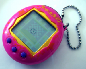
I was thinking it might be interesting to make an “instrument” based on photoresistors which would change the volume of different instrumental tracks (ex. piano, violin, flute), allowing people to “compose” a song by bringing in those tracks. The tracks would only play certain chords so that the composition remains harmonious. Another idea I have is to make a little “pocket pet”, similar to Tamagotchi, that would react to the user’s caresses and pats. However, instead of a “common” pet like a dog or cat, perhaps it could be an endangered species.

Making Interactive Art: Set the Stage, Then Shut Up and Listen

My biggest takeaway from this reading was the quotation, “Your task in designing an interactive artwork is to give your audience the basic context, then get out of their way”. I think this is holds true not only for interactive art but for everything we perceive in life. It almost always benefits us to not enter into things with one set vision about how things must be, and to be open to surprises that happen along the way. As someone who has written and produced songs, I know it is hard to let go of control, but there is only so much you can control, and some of my favorite reactions to my songs are from people who interpreted their own message from it. It is also important to realize that there is no way to please everyone with your art, and just because it is not for one person does not mean that it is inherently flawed.

Week 8 – Unusual Switch!

Concept

This attempt to create an unusual switch was  inspired by my unhealthy obsession with led light shoes as a kid. With so many lights and colors on my shoes that changed depending on each step and pressure, I have blurred memories of randomly walking and jumping around just for those lights. Since this assignment required us to not use our hands, I thought it would be perfect to try creating something similar to those shoes.

Process & Highlights

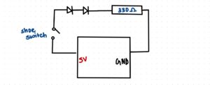
Visualizing the circuit was relatively straightforward. It consists of a simple series circuit with two LEDs and a 330-ohm resistor.I experimented with various methods to create a switch using two aluminum foil sheets and settled on the following design. I attached one sheet to the back of a sandal and the other to the floor. When stepped on the second sheet, both pieces of foil come in contact and the circuit closes, allowing the LEDs to glow.

Videos of its implementation: IMG_8316,  IMG_8326

One significant challenge I encountered was positioning the lights on the shoes instead of using a breadboard. To make this work, I used a combination of jumper wires, aluminum foil, and tape. I also intended to use three LEDs: yellow, green, and blue. While the yellow and green LEDs worked when connected in series, the blue LED did not. I suspected it was due to insufficient current, as the bulb wasnt faulty. I tried various resistor combinations but they did not work.

Reflections:

I am content with the outcome of this assignment. While the wiring may not be aesthetically pleasing, I believe that with better resources and materials such as conductive fabric and alligator clips, this project could be further enhanced. During the assignment, I contemplated changing my idea several times but realized that it needed to be hands-free, which limited my options. This project made me realize and appreciate our dependence on our hands. Overall, physical computing seems fun and I’m excited to learn more.

Reading Reflection – Week 8

Donald A. Norman’s “Emotion & Design: Attractive Things Work Better” was a pleasant read about the importance of the balance between beauty and usability. When it comes to products, especially digital ones, one of the most important characteristics to me is beauty, or, in other words, how aesthetically pleasing a design is. This necessity makes sense considering that beauty increases the satisfaction of the user when using a product, as explained by the author. Now, of course, there is a whole scientific explanation behind this idea, but honestly, I am not that interested in that, since this is such an intuitive concept to me.

For instance, the author gives the example that although colored monitors offer no advantage over black and white ones when it comes to displaying data, everyone strongly prefers them. The fact that colors offer more intrinsic pleasure to the users is incredibly obvious to me. Humans are not robots that just perform tasks over and over again thinking only about usability; we also care about aesthetics and entertainment, and that is precisely why products that look better will always be more successful, even if their performance is a bit inferior.

Moreover, attraction is so important that aesthetics are an actual driving force when it comes to your work style. Some people are essentially driven by the beauties of life, just as much as others are motivated by knowledge or power, for example. Even eating a sandwich cut in half somehow makes it taste better than just eating it plainly for me; that is how much we can be influenced by looks.

The other text, “Her Code Got Humans on the Moon—And Invented Software Itself” was also quite interesting. It is fascinating to me to see the great things that people can accomplish when they are so driven and focused on their objectives. The passage where Hamilton mentioned when she would think about the headlines was especially compelling.

Reading Reflections – Week 8!

“Her Code Got Humans on the Moon—And Invented Software Itself”
Moved by both, Hamilton being an ‘outlier’ as a woman in tech and engineering in the 60s and her as a pioneer of software engineering, “Her Code Got Humans on the Moon—And Invented Software Itself”, was one of my favorite readings for this class so far.
In an era when software was still in its infancy, she and her colleagues were pioneering new ideas and techniques that would shape the future of computing.The pressure and responsibility that Hamilton felt during the Apollo missions serve as a reminder of the importance of attention to detail and the consequences of errors in complex systems. Her commitment to ensuring the software’s reliability, reminds me of the dedication and alertness that I should have, striving to pursue a career in a similar field.

Emotion and Design
I often find myself irritated by misaligned elements and clashing color combinations and end up being called ‘picky’ by some of my friends who think that as long as a message is conveyed, aesthetics can take a backseat. I liked most of Norman’s ideas as they resonated with my thoughts. However, I realized that it’s all about the balance between beauty and usability. This also makes sense in the aspect of many choices that we make. For example, if I were to purchase a drawer, I would choose the push-to-open drawer for its aesthetic over a drawer with a big handle that’s easier to use, because the former too, is user-friendly and also looks better.When he talks about affect and behavior, the cognitive aspects of negative and positive affect make a lot of sense to me but when he mentions pleasing designs can make users more tolerant of minor design flaws. I think it’s true that aesthetics can mask some issues temporarily, users are likely to become more discerning over time. Pleasing aesthetics may initially captivate users, but if underlying usability problems persist, users may eventually become frustrated and abandon the product or service.

One thing this reading leaves me thinking about is, it claims that attractive things work better. However, attractiveness is highly subjective and culturally influenced. What if what one finds attractive might not resonate with another? And how do we take into consideration a diverse target audience?

Week 8 – Reflection

The human tendency to prioritize appearance when evaluating various aspects of life is undeniable. Whether it’s people, cars, clothing, destinations, smartphones, or even cuisine, visual appeal plays a prominent role in our judgments. Strikingly, aesthetics have overshadowed the intrinsic value of things in some cases, particularly in the world of business. For instance, a product, identical in functionality, can attract a different customer base based solely on how it is presented – be it in a practical or luxurious manner. This phenomenon has extended the age-old adage, “Don’t judge a book by its cover,” beyond books themselves. It now applies to both human beings and machines. Regardless of our reluctance to admit it, appearances wield immense influence, often shaping the initial and most crucial impression we form. This truth underscores the significance of visual aesthetics in our lives, as they continue to guide our choices and perceptions. The article “ Emotion & Design: Attractive Things Work Better” by Donald Arthur the American professor discuss this phenomenon and took the argument to a new level of analyzing why this is the case. He provides examples that highlight how our emotions influence decision-making, such as the contrast between happy and tense individuals when completing tasks. This analysis not only reveals the impact of emotions on decision-making but also emphasizes the importance of aesthetics and emotional appeal in the functionality of objects and systems.

Safety Switch

Concept:

For this assignment, I wanted to take the chance to get used to using Arduino, circuits, and everything we learned in class. At first, I was intimidated by the kit we had because I did not know what anything was or how it worked.

It was not easy to get an idea for this assignment mainly because I do not know yet the many things I can do with Arduino. For this assignment, I wanted to do something useful especially when it comes to kids.  As scissors can cause damage when kids touch them, I decided to create a switch that turns on when the scissors are opened or touched. It is a simple idea and the main concept behind it is to learn more about Arduino.

Highlight:

IMAssignment

I always start with research. I personally can start doing something if I am not sure if I fully understand its different components and how it really works.  As you can see in the file attached all the things I learned while doing this small project.

SwitchAssignment

I began by trying to put the project together and see if it would work. I initially used foil to put things together in a circuit. A problem was that I did not use the solderless board and it was not neat, but at least it worked. Then I decided to make it make more sense by using the solderless board and copper tape instead of foil. It was confusing at the beginning but once I understood it it made sense. The code is very simple too. It is a small conditional to indicate when the light will be on and when it will be off.

const int scissor = 3;   // Pin connected to the scissors
const int led = 2;       // Pin connected to the LED

void setup() {
  pinMode(scissor, INPUT);
  pinMode(led, OUTPUT);
}

void loop() {
  int scissorState = digitalRead(scissor);

  if (scissorState == HIGH) {
    digitalWrite(led, HIGH);  // Turn on the LED when scissor is opened
    delay(50);  
  } else {
    digitalWrite(led, LOW);   // Turn off the LED when scissor is closed
    delay(50);  
  }
}


Reflection and ideas for future work or improvements:

In these assignments, I learned a lot, and I broke the fear of using the kit we have. I know that the scissors are not the most creative thing so for future work I would try to make it a switch for a safe or a drawer where someone puts valuable things in.


Smart Journal

Concept 

For this assignment, I decided to make something that can be used in real life. Although the project I made is not necessarily convenient, the concept can be applied in our daily lives. The idea is that sometimes we might want to journal at night on our beds or write a few thoughts in our diaries, and might not have a lamp or quick access to light, hence, I decided to attach the light to the notebook, so that once it’s opened, the light turns on for visibility. This idea definitely needs proper implementation and more serious tools for it to be convenient and easy to use, easy to plug and unplug in reality and it definitely requires a brighter or bigger LED to be connected. Text book with bulb Royalty Free Vector Image - VectorStock

Highlight : I would say that the highlight of this assignment is figuring out how the connection between the wires work and where and how aluminum can be used to facilitate the implementation. I personally found it interesting to play around with the wires and learn how aluminum can connect the wires together to make the LED light up. 

Reflection: I made one mistake in my assignment by using the 10k resistor instead of the 330 without knowing the difference. I’ve also experienced 330 made the LED brighter but I’m not sure if that’s actually the case. It did take me a while to think of something creative without using code which I think was the main challenge in this assignment. I would have tried to make it look more decent and convenient if I had this idea from the start. I initially wanted the LED to light up when someone presses a pen on a piece of paper as they write but I faced some difficulties and thought of this!  For the implementation I used the instructions from the instructors notes and went on ahead with experimenting my ideas.


Video demonstration: https://intro.nyuadim.com/wp-content/uploads/2023/11/IM-Sjournal.mp4