Week#4 – Loading Data


For this particular assignment I wasn’t quite set on the concept. Again, I was more worried about the coding aspect of this assignment that I guess I didn’t have the luxury to be thinking about its aesthetics and data visualization. I do think that my specific way of visualising data was ineffective in the sense that its unable to tell us anything and its unclear what part of the data I’m visualising but nonetheless I used this assignment as a meek approach to solidifying my previous knowledge on object-oriented programming whilst incorporating a new knowledge of json!

Prior to this, I had seen a poster with lines being dispersed outwards similar to that of comics – as a means to depict emphasis. So, I tried to recreate this but ended up with a slightly altered result with a befitting meaning: fireworks. …Now that I’m reevaluating my process in determining an aesthetic by writing this post, I’m currently kicking myself because I just thought of a much better design that would probably make for a more solid conceptual idea which incidentally, would have been easier to code…

I used my previous assignment on object-oriented programming as a reference to creating the code for this piece since it incorporated the use of classes. I created and formatted my own json file data which included a few picks of my favourite songs, which more specifically outlined artist names, song titles and number of replays. I thought fireworks were a good embodiment of the explosion of emotions I felt when listening to music and the only way to cement this would be to link it to the number of replays a song has. The piece of code I’m most proud of is my use of map():

this.minLength = map(replays, 0, 250, 20, 100);
this.maxLength = map(replays, 0, 250, 40, 130);

I had the hardest time linking a specific range of replay numbers to min/max lengths so I ended up spending almost an hour looking for a solution using google, youtube and reddit. Ironically the solution was in my notes the whole time and so whilst it was a frustrating process, I was just glad that it was over and done with. Now comes the improvements…
One thing that I must criticise is the design choice. It isn’t my best work if not the worst.

1) Rather than randomising the position of each firework object, it would’ve been better to give it a static position so that each firework is given enough space for easy visualisation. With randomisation, every time the sketch is refreshed, it could be that the firework objects appear to be on top of each other, making size differentiation difficult. 2) To mimic actual fireworks, each firework object could appear and fade from their designated position. This would continue on as a loop. 3) Each firework object signifies a certain song within the json file, therefore to give it more distinction and meaning, each song could have had its own colour to signify the specific emotion I would feel when listening to the song.

Week 4 – Data

For the week 4 assignment I decided to give a visual representation of the five most successful A24 movies in 2023, by using a bar chart and a csv file containing the 200 most successful movies of 2023. The chart displays the rank of the movie, the total gross, and the title. For the concept I took inspiration from Jacob Rivkin on his video of working with basic data on YouTube.

Week 5 – Reading Reflection

After reading the paper, what I find most interesting is the methods used for computer vision and how simple they actually are. I always thought computer vision requires a significant amount of different complex algorithms, but it turns out to be as simple as comparing pixels one by one at different times. However, I still have no idea how arrays of pixels (how algorithms interpret images or videos) can be used to gain advanced information such as “tracking the orientation of a person’s gaze.”

I also find it interesting how these techniques can be applied to interactive media art. The way it makes artwork interactive is not making the viewer touch buttons whatsoever, but only move around and see what happens. This method of interactivity gives the viewer more freedom to explore what lies beyond the artwork, instead of just playing within the set of rules the artist sets. It also gives viewers an urge to explore the artwork more because they feel freedom when participating in the artwork. They would want to try out different ways of interaction and see what happens, and that’s what I find most interesting about computer vision used in interactive art pieces.

reading reflection: week 5

Reading this article, what I picked up was this: “it took computer scientists a few decades to figure this out, but now you get to play around with it too.” At the beginning, the author states how computer vision used to be a domain exclusive to specialists, such as the military or law-enforcement. Then at the end, there’s the appendix with the sample processing code that even “novice programmers” could use to kick-start a computer vision project “in as little as an afternoon”. This is grounds for celebration because, by lowering the barrier to entry here, we have democratized the technologist community by a notch, and that opens up the scope for so much creativity that would not have such a limitless medium of expression otherwise. The article seems a little old, and newer technologies have entered the space since its time of writing, including as Google’s Teachable machine. It is fascinating how I can now train a ML model and make something like *Cheese* by Christian Möller (2003) in a few hours using Teachable, whereas Möller’s piece was a product of the joint effort of the artist and a whole research laboratory.

Another aspect of computer vision that made me think was the hand of humans, and all of our humane subjectivities, in the development of these algorithms. The author mentions that a computer processes a video stream differently than text, in that there are no principles for semiotic interpretation in place, and so computers need to be programmed to answer even the most rudimentary questions about the images it “sees”. Then, the algorithms are susceptible to absorbing the same implicit biases as their creators. For example, whether a computer thinks it’s looking at a “woman in traditional clothes” or “an exotic foreigner” will depend largely on how the programmers perceive the woman. Biases in AI and computer vision are now a popular topic in contemporary tech discourse, but I wonder how these concerns have evolved over the years, since the inception of computer vision in the 70s until now. Have programmers always been wary of negatively influencing their softwares, or are these 21st century fears? What can technologists do to ameliorate them?

Reading Reflection – Week 5

Computer Vision for Artists and Designers was a fascinating read about the topic of Computer Vision, a concept that is constantly gaining more traction in our world, but that is not understood as much as it should be. Personally, I was already aware of the concept, but not deeply enough as the reading presented, especially when it comes to its history and evolution throughout the years. The examples provided were also amusing, especially the ones that were more focused on people, such as the “Suicide Box” by the Bureau of Inverse Technology and “Cheese” from Christian Möller. What is interesting to me is that computer vision can be used both for purely artistic reasons and for social reasons. For instance, Suicide Box creates several discussions about the ethics of utilizing suicide as an experiment, such as the implications of recording people taking their own lives while doing nothing to prevent it. Or with “Cheese”, an installation that tracks people’s smiles, and plays an alarm when the display of happiness falls below a certain threshold. To some, this could be just a silly experiment, but when you think about it, corporations could absolutely enforce some sort of similar system to their employees, displaying the powers that such a technology can offer in our society.

Additionally, it was also interesting to read about the technological advancements of computer vision in physical optimizations and in multimedia authoring tools. With the examples provided, such as the technique of retroreflective marking materials used for safety uniforms and the “Limbotime” game, it made it much easier to comprehend the practical uses of these methods, which motivated me to know more about them.

Batool Al Tameemi- Midterm Proposal

Concept:

I really like Caramel, the cat who lives at NYUAD’s campus. I think that being an NYUAD student is more enjoyable because of the chance to spend time with the campus cats. I’m a graphic designer, and I wanted to draw a picture of Caramel because it’s a lot of fun for me. I’m also interested in coding, and I want to use my coding skills to make my projects better and learn more about coding.

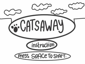
I got inspired to make a game called “Catsaway,” where Caramel can fly around our campus without bumping into the pointy palm tree corners. In “Catsaway,” Caramel can smoothly float through the soft, green palm leaves. All you have to do is press the spacebar to help Caramel enjoy a fun journey through the skies above our campus.

Sketches:

Why I am excited for CatsAway:

Cats Away can be helpful for CAMPUS KIDS to play:

  • Enhanced Concentration and Focus: CatsAway demands that players maintain keen attention to the game’s rapid-paced dynamics. This can support children in refining their ability to concentrate and focus, which can prove advantageous in both academic pursuits and real-world scenarios.
  • Resilience and Tenacity: CatsAway’s demanding nature can instill in children the significance of perseverance. It motivates them to persist, learn from their errors, and cultivate resilience when confronted with challenges.
  • Hand-Eye Coordination: Engaging with CatsAway can refine a child’s hand-eye coordination, requiring precise timing of taps to keep the bird aloft.
  • Stress Alleviation: Despite the potential for frustration, the game can also serve as a method for stress relief for certain children. Immersing themselves in challenging gameplay can momentarily divert their attention from daily stressors.
  • Objective Setting and Attainment: Accomplishing higher scores or advancing further in the game can bestow upon children a feeling of achievement and inspire them to set and realize objectives, a valuable life aptitude.
  • Cognitive Abilities: The game’s demands on spatial awareness and timing can invigorate cognitive development, aiding children in honing their problem-solving proficiencies.

Reading Reflection – Week 5

The other day, Aleks and I were leaving the classroom when I noticed a TV screen just outside the classroom door displaying an image from a webcam using hieroglyphs. It was an interesting project that initially seemed simple to me. However, after reading this week’s material, I realized that creating an art project involving computer vision involves considering numerous factors, making it more complex than I had thought.

I appreciated the way the Golan Levin weaved together various elements in his article. He provided numerous real-life examples and explained the multitude of technologies used in computer vision. The article highlighted the challenges artists face when working with computer vision, where changes in lighting or the brightness of a person’s clothing can disrupt the entire program. It demonstrated how computer vision techniques have been applied in a wide range of interactive art projects, from real-time visualizations of vocal performances to sociopolitical installations. This showcases the versatility and creativity that computer vision brings to the world of art.

Even though our class primarily focuses on art, I was excited to learn that concepts like X-rays, MRI, and CAT scans are also based on the principles of computer vision. This illustrates that computer vision can be applied not only in the art field but also in enhancing people’s lives in critical ways.

Computer vision is a concept with immense potential for advancement. We are witnessing the increasing integration of computer vision in interactive artworks and various applications. I believe that in the near future, computer vision will become even more accessible and seamlessly integrated into our daily lives, enhancing a wide range of applications beyond art, including healthcare, transportation, security, and entertainment.

Week 5 – Reading Response

In the reading “Computer Vision for Artists and Designers,” Levin introduces the computer vision, algorithms for implementation, and its creative potential. I particularly liked the project examples he provided to illustrate how computer vision can be applied in real-world scenarios; they were all so interesting to read about. One project, “Suicide Box,” stood out to me because it aims to address a social issue and privide an evidence, not just for entertainment (which was a bit different from what I was expecting from interactive projects). This project inspired me to consider how technology can be a tool for raising awareness and gathering evidence on important social issues through creative projects. It expanded my thinking on the project ideas I could work on in future assignments, emphasizing that the purpose and meaning behind our work is essential consideration, and it can be one that delivers an important message of social impact.

I agree with Levin’s idea for the reliability of computer vision and its ongoing development. He mentions the challenge that computer vision is “opaque,” meaning it requires explicit programming to distinguish objects based on factors like contrast, color, motion, and brightness. This emphasizes the need for continued efforts to enhance accuracy in machine vision. The reading also made me reflect on the limitations of current AI-generated visuals, which often lack accuracy. For example, chatGPT is quite good at solving math problems and writing essays/texts. However, if we ask it to provide us with code for an aesthetic image, the result would be just a few lines of different colors on the canvas. Of course, it needs more details to design something like that, but my idea is that AI still lacks the ability to recognize images and generate various types of images accurately. Not only chatGPT, also other image generating AI often generate logically wrong images. It raised the question of how working on machine vision and using it to improve AI-generated visuals could be a promising avenue for advancing computer development.

Assignment 4: quotify

CONCEPT

For this assignment, I decided to go with the generative text theme. I chose a random quote generator “quotify” as a concept. I love quotes and the idea came to me from a mobile app I have (Motivation) that generates a random quote daily on my lockscreen, which makes my day. I found the csv. file in Github (link in references). As for the aesthetics, they are pretty simple as I used an aura background and a typewriter effect (following this Github  example). The concept is basically a random quote from the csv. file pops up because of this line: typeWriter(random(quotes), 0, 50, 190, 50)with a typewriter effect. Each time you click you get a new random quote.

INSTRUCTIONS:
  • CLICK ON THE SCREEN FOR A NEW QUOTE.
  • CLICK ON KEY “W” (W FOR WIN!) TO SAVE A QUOTE YOU LIKE AS A PNG IMAGE 🙂
SKETCH:

CODE I LIKE:
function typeWriter(f, n, x, y, s) {
  if (n < f.length) {
    background(bg);
    textSize(25);
    text(f.substring(0, n + 1) + "_", x, y, 400, 250);
    n++;
    //delay the next character's appearance by s milliseconds
    setTimeout(function () {
      typeWriter(f, n, x, y, s);
    }, s);
  } else {
    printing = false;
  }

I like this part because it is new and I have never used effects for my text in any previous assignment. Since the assignment is about text, I needed a cool element to go with my text, which is this effect this case. I find it cool because it is similar to the typewriter machine used in the past: it types letter by letter.

IDEAS AND REFLECTIONS:

This assignment was pretty straightforward and enjoyable. I loved the brainstorming part where I got to search for the csv. file and finally use one to generate a piece. Though I find this piece lacking the “wow” or unexpected element/design, it is still a minimalistic piece with its own aesthetic. If I could do something different, I would have opted for a data visualization concept because my STEM self loves working with data, but I will save it for another time.

csv. file source


The Design of Everyday Things

This reading was great, pretty much because the author’s arguments were clear and direct to the point. In a nutshell, Norman delves into the concepts of usability and design in everyday objects (as the title indicates). 

He emphasizes the significance of design in everyday items and its impact on users’ experiences. One notable example was that of the poorly designed teapot with an unconventional spout and handle to illustrate how design flaws can lead to user frustration and usability issues.

One notable experience I am thinking of right now is this: 

Right-handed desks! I don’t know who designed this product, but I can definitely tell that they are right-handed. What about left-handed people? This product is a good example of how bad design can lead to user inconvenience. Back in high-school, we used to have this type of desks and it caused many issues for left-handed students. This design flaw made their learning experience more complicated.

Furthermore, Norman also introduces the concept of a “conceptual model,” which represents the mental image users have of how an object functions. He underscores that a good design should align with users’ mental models to minimize confusion and enhance usability.

Think of ATM machines for instance. Our mental model when it comes to using this machine is card > money > card. This model was enhanced so that users take their cards before money, in order not to forget it. Now imagine if a random ATM machine decided to randomly function by card > card > money. It will definitely be confusing and may cause many users to lose their cards.

Finally, the chapter underscores the importance of providing feedback to users and making the system’s state visible. Feedback allows users to understand the consequences of their actions and provides a sense of control, a critical aspect of user-centered design.