
Perhaps it was the fact that we spent last class doing translate and rotate to place objects in a circle or perhaps because I love radar charts, I gravitated towards doing a visualization resembling lines in a circle.
Using data from Google Calendar and my memory, I first logged how I spent my last week in terms of the number of hours spent in class and meetings, working, socializing, and practicing self-care.
Next, I started with the layout of the piece, drawing some dummy rectangles to organize the sketch.
 From there, I began experimenting with drawing the strokes in a circle.
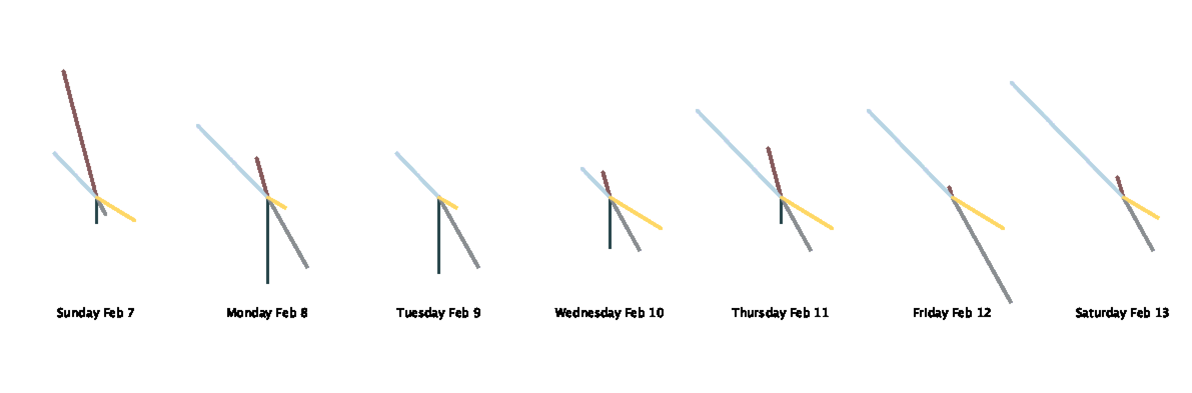
It was rather unclear how long the lines actually were which was important since the length was supposed to convey the number of hours I spent engaged in a particular activity. I also was not vibing with the font.
I ended up drawing smaller circles for each day to have gridlines to show the number. I also learned how to load a font into Processing and used one of my favorite typefaces: Avenir!
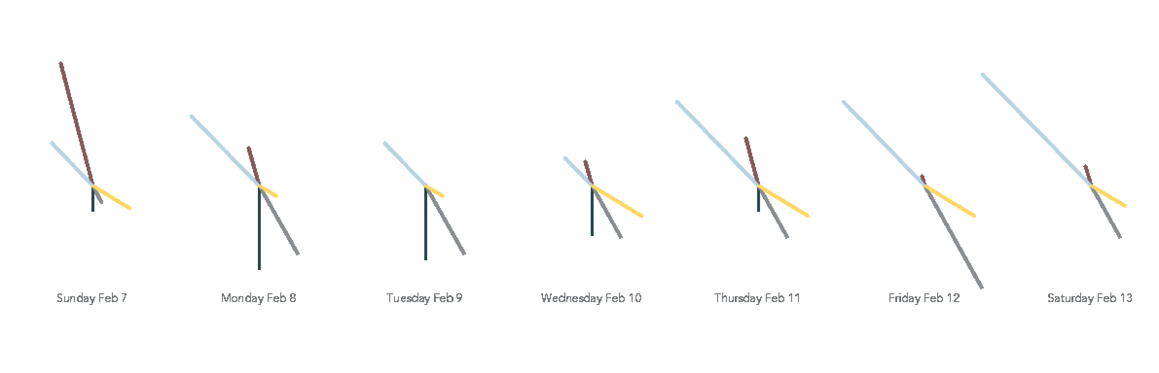
One thing I needed to pay particular attention to was the order of drawing all the elements. Originally, I had my circles in the inner for loop which meant they kept getting drawn on top of so they were thicker than intended, they got drawn on top of the chart lines, and the obvious harm to performance.
Here is my final sketch!
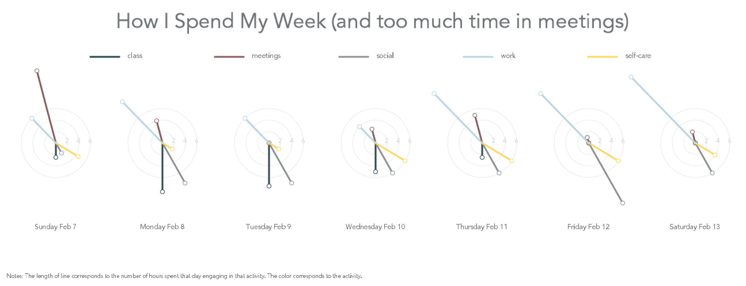
And the code!
//class, meetings, social, work, self-care
float[][] data ={{1.25, 6.5, 1.0, 3.0, 2.25}, {4.25, 2.0, 4.0, 5.0, 1.0}, {3.75, 0.0, 4.0, 3.0, 1.0}, {2.5, 1.25, 3.0, 2.0, 3.0},
{1.25, 2.5, 3.0, 6.0, 3.0}, {0.0, 0.5, 6.0, 6.0, 3.0}, {0.0, 1.0, 3.0, 8.0, 2.0}};

PFont av;

String[] days = {"Sunday Feb 7", "Monday Feb 8", "Tuesday Feb 9",
"Wednesday Feb 10", "Thursday Feb 11", "Friday Feb 12", "Saturday Feb 13"};

color[] palette = {#28464B, #855A5C, #8A8E91, #B8D4E3, #FED766};

String[] legend = {"class", "meetings", "social", "work", "self-care"};

int scale = 20;

void setup(){
  av = loadFont("Avenir-Book-48.vlw");
  hint(ENABLE_STROKE_PURE);
  size(1300, 500);
  background(255);
   fill(#6D7174);
  textAlign(CENTER);
  textFont(av, 36);
  text("How I Spend My Week (and too much time in meetings)", width/2, 50);
  drawKey();
  drawLines();
  textAlign(CENTER);
  textFont(av, 10);
  fill(#6D7174);
  textAlign(LEFT);
  text("Notes: The length of line corresponds to the number of hours spent that day engaging in that activity. The color corresponds to the activity.", 15, height-15);
}

//draws lines at top showing the colors and activities
void drawKey(){
  int x = 800/data[0].length;
  for (int a = 0; a < data[0].length; a++){
    stroke(palette[a]);
    strokeWeight(3);
    line(width/6 * a + x, 100, width/6 *a +x + 50, 100);
    textFont(av, 12);
    textAlign(LEFT);
    text(legend[a], width/6 *a +x + 65, 102);
  }
}

void drawLines() {
  textAlign(CENTER);
  int x = width / days.length;
  float angle = 360/data[0].length;
  for (int i = 0; i < data.length; i++) {
    //draws guiding circle gridlines
    textFont(av, 12);
 noFill();
      strokeWeight(0.5);
      stroke(#D4D8D8);
      circle(x * i + 100, height/2, 2*scale);
      fill(#D4D8D8);
      text("2", x * i + 100 + scale, height/2);
      noFill();
      circle(x * i + 100, height/2, 4*scale);
      fill(#D4D8D8);
      text("4", x * i + 100 + 2* scale, height/2);
      noFill();
      circle(x * i + 100, height/2, 6*scale);
      fill(#D4D8D8);
      text("6", x * i + 100 + 3* scale, height/2);
    fill(#6D7174);
    //draw day labels
    text(days[i], x * i + 100,height- 100);
    for (int j = 0; j < data[i].length; j++){
      //draws the chart lines
      translate(x * i + 100, height/2);
      rotate(angle * j);
      strokeWeight(3);
      stroke(palette[j]);
      line(0,0,0,data[i][j] * scale);
      fill(255);
      strokeWeight(1);
      ellipse(0, data[i][j] * scale, 7, 7);
      rotate(-angle * j);
      translate(-(x * i + 100), -height/2);
    }
  }
}
This is really great Simra, good job! One small suggestion is perhaps to make the lines a little more different in terms of color, sometimes it’s hard to tell in the photo which line is which data set. I do like the palette choice though. Also, you need a break! I’m glad to see you have self-care in there though!