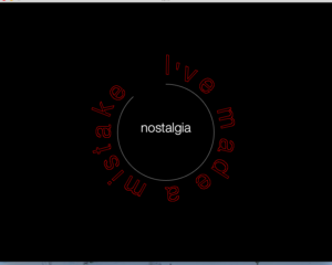
Emotional Circle
This week from the perspective of the class was dedicated to text modification and data visualization, however from my personal perspective it was about mental health. This week i’ve learned a bit about feelings, emotions and mental health. I bumped into different articles and interesting posts. My personal experience + new information gave birth to the visualization of Emotional Circle
First my code looked like this. The color and atmosphere are dark and gloomy, so I decided to be positive and added some motivation to the code
Code:
To make the circle text move I used geomerative library and some piece of code which found in references. To output all the text statements easier I put them in the array.
import geomerative.*;
PFont sourceLight;
RShape   grp;
RShape   circle;
String [] names = {"fear", "sadness", "anxiety", "confusion", "calmness", "exitment", "pain", "horror", "interest", "nostalgia", "disgust", "hatred", "acceptance"} ;
int i = 0;
boolean ignoringStyles = false;
PFont  HelveticaNeue;

void setup(){

  size(900, 700);
  smooth();
  textSize(30);
  HelveticaNeue = createFont("HelveticaNeue-Light",10);
  textAlign(CENTER);

  RG.init(this);

  grp = RG.getText("Choose not to blame yourself", "FreeSans.ttf", 72, RG.CENTER);

  RG.setPolygonizer(RG.ADAPTATIVE);
  RG.setPolygonizerAngle(0.065);
  grp = RG.polygonize(grp);

  circle = RG.getEllipse(0, 0, 20);
  circle = RG.centerIn(circle, g, 220);
}

void draw(){
  translate(width/2, height/2);
  background (0);
  fill(0);
  stroke(254, 184, 198);
  float t = map(mouseX, 0, width, 0.01, 0.99);
  RShape circleSeg = RG.split(circle, t)[0];

  RG.setAdaptor(RG.BYELEMENTPOSITION);
  RShape adaptedGrp = RG.adapt(grp, circleSeg);

  RG.shape( adaptedGrp );

  noFill();
  stroke(255, 200);

  RG.shape( circleSeg );
  frameRate(2);
}

void keyPressed(){

 if (key == 's')
  fill(253);
  textFont(HelveticaNeue);
  textSize(random(30, 60));
  textAlign(CENTER);
  text(names[i], 0, 0);
  i++;
}

void mousePressed(){
  ignoringStyles = !ignoringStyles;
  RG.ignoreStyles(ignoringStyles);
}
This video shows the last result of my coding, but not the last way of thinking


Nice job Varya on puling different references together. I like the theme you’re going for. The different text rendering styles from the circle to the center text are a little jarring though. They don’t have to be exactly the same, but it would be nice to tie them together somehow visually.