
*Trigger warning: as you can see by the title, I walk about deaths of women in my home country and describe the femicide that inspired me to work on this project under the Inspiration section*
Description:
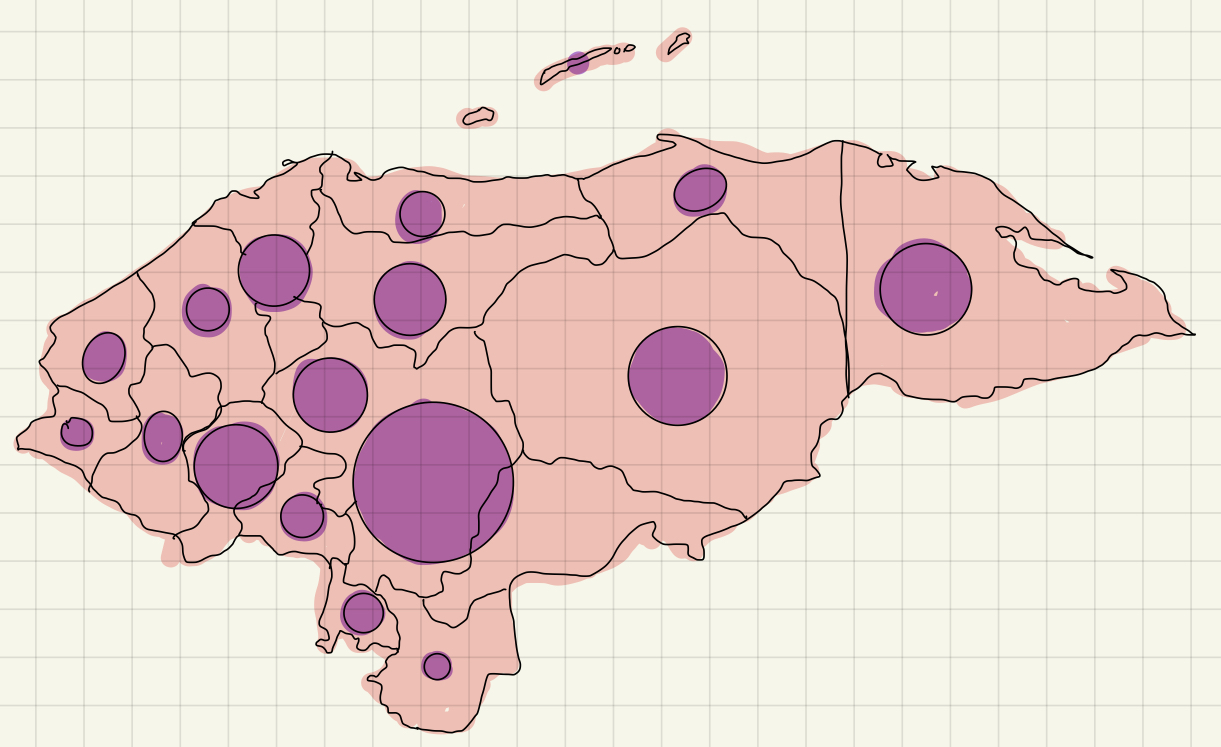
This is a project that showcases the number of femicides committed in the country of Honduras since January 2021. It displays the number of cases by department (Honduran word for state) and the user can place the mouse on top of the bubbles containing the numbers to look at the name of the department. Meanwhile, the map of Honduras can be seen forming in the background, with the bubbles placed on their respective location in the map.
Inspiration:
To be honest, my original idea was to make something using generative text, however, I felt like I understood generative text better than I did data visualization, so I decided to make the project based on data visualization to practice more. The idea of displaying the number of femicides committed in Honduras, my country since the start of 2020 came from I post I saw last week about a girl who was detained by the police at night and was discovered dead in her cell (most likely because she resisted an attempt to sexual assault by the policemen who imprisoned her). The police took her to the hospital already dead, but filed in the report that she was taken alive and died while the doctors treated her and they refused to perform an autopsy, dismissing the case as a suicide attempt. The hospital, however, released their report in which they explained that she was strangled (most likely by men). Because of how boldly the police died, many people in the town where this happened started to make a campaign that grew into a social media under the hashtag JusticeForKeyla (the name of the girl). Nevertheless, though the police has acknowledged that Keyla didn’t commit suicide, they refused to investigate. The policemen who incarcerated Keyla have been re-assign and their whereabouts are not known.
I was outraged by this case, not only because it was the police, the people charged with the safety of citizens, the ones who killed her but also by the fact that they lied to openly about it. Femicide, unfortunately, is not something uncommon in my country and cases like Keyla’s are some of the few that are actually been investigated, if not by the police, by the Honduran people. It is very dangerous to be a women in Honduras and in honor of the 90% of the victims that will not receive justice for their murder, I decided to make this visualization.
Process:
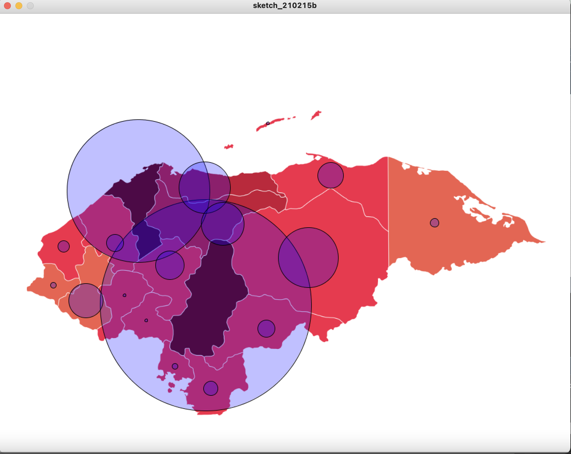
I had no idea how to start the project. I knew what I wanted it to look like and I had the data of the femicides this year from one of the NGO’s back home that advocates for women’s rights., but I didn’t know how to come up with the logic to actually write the code. I decided to make a sketch of how I wanted the visualization to look like to get my ideas in order.
This is what I came up with:
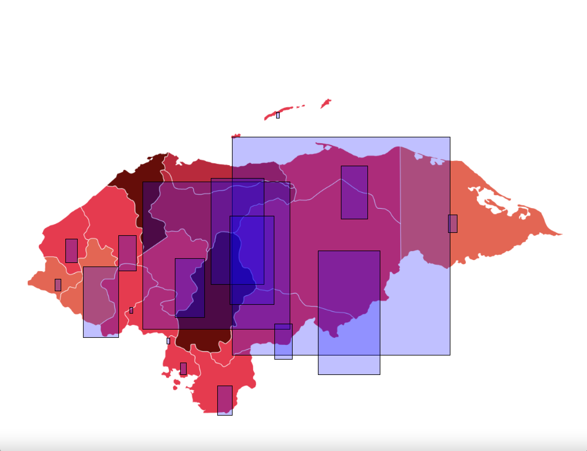
After doing the sketch, I decided to first get the locations of the coordinates in which to place the circles. I did this mainly using trial and error and the mouseX, mouseY . I also tried experimenting with other shapes. The rectangle was a good contender, but I preferred the overall look of the circles.
This is what they looked like:
Once I had the locations, I added them to the data set containing the # of deaths.
Afterwards, I decided to stop hardcoding and get to work with the Table object. This took quite some time as I didn’t really understand how to read the rows of the table that well. Thus, I went to Baba Daniel Shiffman for help and watch a lot of his videos on Tabular Data in Processing.It was a great resource and after following along his examples, I manage to grasp a fair amount of the knowledge needed to proceed. (He also gave me the idea of using a hover so the user could see the number of deaths and the department, which I tried with the original ‘hardcoded’ version).
The difficult part came when doing the objects. I found it very difficult to make the bubbles look like I wanted them to, since there were departments that had 74 to 50 deaths in January, contrasting with other departments that had only 1 or 2 deaths (which are mainly the inhabited territories ), thus I couldn’t use the same scale for make all the circles since one would look too big while the others too small. I opted for having different scaling values for the radius of the bubbles depending on the magnitude of the number of deaths .
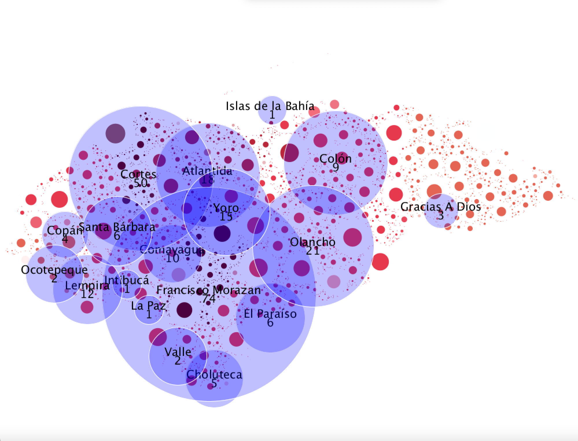
Afterwards, I remember look at my visualization thinking that it looked pretty good regardless of the fact that every 30 minutes I edited something I completely crashed the program. But alas, the main product was finalized. I still wanted to do something more with the background because I wanted more circles in the sketch. I read through some of my class notes and remembered that I have never used ArrayList<>; . I then Googled ideas to practice using ArrayList<>; and someone in a forum mentioned making a background out of digital circles using. I then binged watch for two days how to use ArrayList<>; and did some pretty lame attempts at it, but once I manage to understand what I was doing, I decided to make a background since the map I was using was a transparent png . It look fine, but a little overwhelming because of all the color.
When that was done, I decided to experiment a little with the things we learned last lecture about pixels and took the color values of the pixels in the image I had for the map of Honduras to determine the color of the circles that would comprise the more dynamic map. That created some very interesting results (and also a lot of bugs).
This is what one of my final sketched looked like.
 Then, I recalled that I had forgotten to add the hover function for this ‘final’ version of the sketch, but since I had resized the bubbles, some of the smaller ones where not hovering correctly. Figuring out why my logic was wrong took a lot of time, but at the end it was a silly mistake of not including the scale variable in the radius to calculate the distance between the mouse and the center of the bubble.
Finally, I began to toy around with the colors of the background because I was creating circles for all of the canvas, so the circles outside the map would be white and thus wouldn’t show on the screen. I wanted to see if I could use this circles to make the sketch nicer and a black background provided a very nice contrast. I also decided to add more space between the circles because I thought that the visualization looked better with the spaces. The most interesting thing is that since the circles are created randomly, when I run the program it looks different (even if it is very slightly) every time.
This is the final result
Difficulties:
I already mentioned some in the project description, but my main difficulties were:
- Making sure that the Table set loaded correctly and under its respective variable.
- Finding the x and y locations where the bubbles needed to be. It wasn’t necessarily hard, but it was very time consuming and such a pain.
- Figuring out the logic to create objects using the Table (this took a lot of Google and many tutorials).
- Trying not to get confused about what I was editing in the main function since it is quite long. (I gave up and decided to make functions for each step and then call those functions in the setup() and the draw() ).
- Making the bubbles look good.
- Learning how to use ArrayList. I don’t know why but this was very hard for me to grasp, specially how to compare values of different elements within the array list (the whole for(class object: objectList) thing).
- The circles for the map where very hard. It took a lot of my time just to figure out how to detect if they touched another circle or not.
- I named a variable expand() and it wasn’t working correctly because Processing has an inbuilt function called expand() that I wasn’t aware of.
- I had to add a variable called attempts to control the main loop that loads the map because I read in a forum that if you don’t do it, then you will have an infinite loop and that is bad.
- Figuring out what was wrong with the hover because it wasn’t working after resizing the bubbles.
- SO. MUCH. DEBUGGING (I’m gonna become an exterminator)
Conclusion:
A good chunk of my time for this project was watching and reading tutorials about how to do things. I think it was beneficial in the sense that, I didn’t feel completely lost about what alternatives to try, but it also frustrated me a lot when I thought I was doing everything right but then I made a very small and silly mistake that kept me up at night.
Overall, I liked this project. It was very personal and I think that helped me keep on working regardless of how often stuff didn’t work.
This is the link to my GitHub because the coded is somewhat long and I already took a lot of space with my explanation.
Great job Thais! It’s great in many ways, the topic is close to your heart, you went and did extra work to learn the technical things you needed, and it is well designed. One critique, for the final output, is use a white background rather than a black one. All the white circles outside of Honduras are a little confusing, since you’re using circles to indicate data. It adds more noise to the visualization which makes it harder to absorb the info in the end.