Week 9 – Reading Response

For the first reading, I think it is very interesting and resonates with another talk I watched for another class. In the talk, the speaker talks about that everything is a remix. He believes that there are hardly completely original works in creativity; they are somewhat based on previous works. The creativity in these works is the way different elements are interpreted, arranged, and connected. I think Tigoe refers to something similar in the field of physical computation. All the examples Tigoe gives are common things with some computational (unusual) features. Indeed, it will be perfect if we all can developed something brand-new. However, it is a more common case that we are unable to do so. So, I think Tigoe is right in pointing out that the challenge of physical computation (or the most innovative, fun part of this field) is how we can turn old, common, or non-interactive things into interactive ones, with the features that are meaningful and intuitive for users. Therefore, I think Tigoe’s writing has two takeaways for me: 1. Creativity is not equal to complete novelty. Interesting arrangements or adds-ons of old things can spark great fun and creativity; 2. These new features added to common things should have meaningful and intuitive interactions.

For the second reading, I generally with Tigoe. For interactive media work, as we discussed in previous weeks about what interaction means, the entire artwork or performance should not only include the artist, but also the audience. The audience input (interaction with the work) is what makes each interactive work interesting and unique to each experiencer. In other words, a good interactive experience should be distinct to each individual as a result of their different behavioral and emotional inputs and experiences. The openness is a significant defining feature of interactive artwork. However, I think Tigoe only touches a bit on the issue of the extent of this kind of openness. He only mentions that ” If they’re not supposed to touch something, don’t make it approachable.” But essentially, where should the expression of the artist stand? Is it always a good practice to make audience explore on their own and make their own sense of the artwork? Maybe, reflecting on my own experiences of visiting interactive exhibition/experiences, for some of the works, which are particularly difficult to comprehend on my own, I would prefer to have the artist’s narration beforehand so that at least I would get lost and think “this doesn’t make sense at all!” Therefore, I think it’s also a good question to ask: in what kind of projects should the artist reveal their own expression before the audience experiences it.

Reading Reflection – Week 9

Physical Computing’s Greatest Hits (and misses)

This reading called me out from the first example, because I was thinking about making some sort of theramin-like instrument for my final project. However, it is true that “non-original” does not equal “bad”, and the themes here provide plenty of room for one’s own unique twist. The examples provided were inspiring, and I appreciated how simple interactions (such as stepping on a square) were made engaging by the conceit behind them (learning how to salsa dance). This reading was a great illustration of how the conceptual and emotional aspects of a project are just as important as the technical aspect, and how different concepts can transform the same interaction. After this reading, I have some more ideas on how I could take these themes and make them more unique.

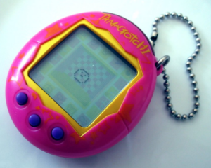
I was thinking it might be interesting to make an “instrument” based on photoresistors which would change the volume of different instrumental tracks (ex. piano, violin, flute), allowing people to “compose” a song by bringing in those tracks. The tracks would only play certain chords so that the composition remains harmonious. Another idea I have is to make a little “pocket pet”, similar to Tamagotchi, that would react to the user’s caresses and pats. However, instead of a “common” pet like a dog or cat, perhaps it could be an endangered species.

Making Interactive Art: Set the Stage, Then Shut Up and Listen

My biggest takeaway from this reading was the quotation, “Your task in designing an interactive artwork is to give your audience the basic context, then get out of their way”. I think this is holds true not only for interactive art but for everything we perceive in life. It almost always benefits us to not enter into things with one set vision about how things must be, and to be open to surprises that happen along the way. As someone who has written and produced songs, I know it is hard to let go of control, but there is only so much you can control, and some of my favorite reactions to my songs are from people who interpreted their own message from it. It is also important to realize that there is no way to please everyone with your art, and just because it is not for one person does not mean that it is inherently flawed.

Smart Journal

Concept 

For this assignment, I decided to make something that can be used in real life. Although the project I made is not necessarily convenient, the concept can be applied in our daily lives. The idea is that sometimes we might want to journal at night on our beds or write a few thoughts in our diaries, and might not have a lamp or quick access to light, hence, I decided to attach the light to the notebook, so that once it’s opened, the light turns on for visibility. This idea definitely needs proper implementation and more serious tools for it to be convenient and easy to use, easy to plug and unplug in reality and it definitely requires a brighter or bigger LED to be connected. Text book with bulb Royalty Free Vector Image - VectorStock

Highlight : I would say that the highlight of this assignment is figuring out how the connection between the wires work and where and how aluminum can be used to facilitate the implementation. I personally found it interesting to play around with the wires and learn how aluminum can connect the wires together to make the LED light up. 

Reflection: I made one mistake in my assignment by using the 10k resistor instead of the 330 without knowing the difference. I’ve also experienced 330 made the LED brighter but I’m not sure if that’s actually the case. It did take me a while to think of something creative without using code which I think was the main challenge in this assignment. I would have tried to make it look more decent and convenient if I had this idea from the start. I initially wanted the LED to light up when someone presses a pen on a piece of paper as they write but I faced some difficulties and thought of this!  For the implementation I used the instructions from the instructors notes and went on ahead with experimenting my ideas.


Video demonstration: https://intro.nyuadim.com/wp-content/uploads/2023/11/IM-Sjournal.mp4


Week 8 Reflection

Emotion & Design: Attractive things work better

Often good design is conflated with designs that incorporate the most mechanically efficient ways to complete certain tasks. For example, a well-designed kettle would be one that pours well, and heats up really fast. It could have some cool features, such as being able to maintain the temperature accurately. Function is the priority. But does that mean that form is unimportant?

Donald Norman addresses this question in Emotion & Design using the examples of three very different teapots: one that is inefficient, with its handle and spout facing the same direction, one that is effective in what it does, and one that is aesthetically pleasing. Yet, not one of them could be labelled as the best designed teapot. 

There are two general reasons for this. The first is that form and function are related; they add to one another. Time flies by when you’re having fun. Similarly, things feel better designed if they’re fun to use.

On the other hand, an object doesn’t even need to be that functional for it to be well designed. For example, take the Impossible teapot. It certainly doesn’t function too well as a teapot. You could brew tea in it, but the ergonomic experience would be terrible. Yet, it serves as a statement piece, or a conversation starter.

However, I think there is some distinction that needs to be made. I don’t think that as long as you enjoy using something, it is well designed. You could find a use for anything and enjoy it, but that would make the design of an object a subjective matter. I believe that there has to be some objectivity and some kind of measure of how well something is designed. In that sense, an object has to be intentionally designed in a certain way, targeted to fit some sort of function, and be good at it. If you allow looking good to be a function, then form and function meld together and we have a consistent system of determining what is well-designed, and what is not.

Her Code Got Humans on the Moon – And Invented Software Itself

Back in 1960, a period when women were discouraged from diving into technical realms, Hamilton began as a programmer at MIT, initially planning to support her husband through law school. But fate had other plans – the Apollo program emerged, and Hamilton found herself leading a groundbreaking engineering venture that would reshape what humanity deemed achievable.

As a mother working in the 1960s and a programmer for spacecraft, Hamilton’s narrative is anything but conventional; it is downright radical. Her story challenges not only the norms of the tech world but also societal expectations. Exploring her experiences made me rethink what I consider success to be. Is it reaching your goals, or the entire journey you take till the end.

Margaret Hamilton’s story challenges norms and suggests that success doesn’t always follow a conventional script. As a college student navigating a landscape of uncertainties, I see in her journey a call to embrace the unconventional, challenge stereotypes, and approach challenges with resilience. Her legacy urges us to view setbacks not as roadblocks but as avenues for innovation. Her unconventional path serves as a reminder that greatness often emerges from uncharted territories. As I navigate my academic and professional journey, I’ll carry Hamilton’s spirit—an emblem of resilience, innovation, and the transformative power of embracing the unexpected.

Unusual Switch

Concept

I was talking on my phone with my friend I remember finding myself thinking about this project and not concentrating on the conversation. This immediately reminded me of the idiom “to have a light bulb moment”, therefore I decided to make a switch that would lighten the bulb when the phone touches my ear.

Circuit Diagram and Highlights 

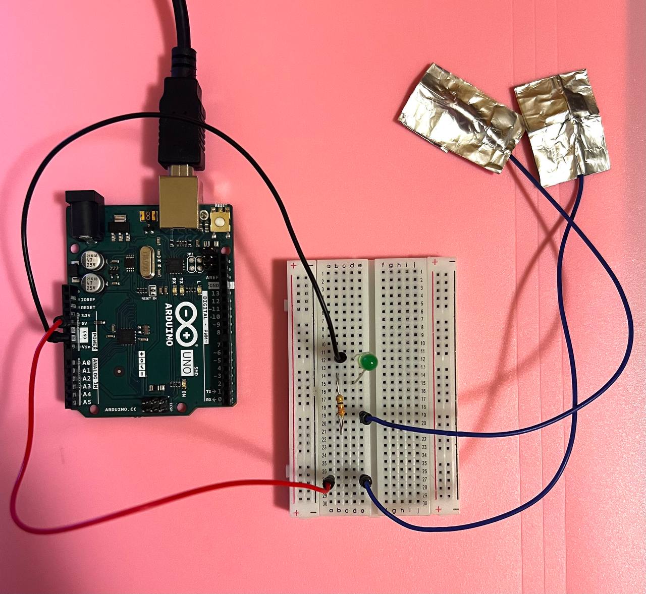
I taped some aluminum foil to my phone case and some to my ear. If the phone case touches the ear, then the LED light will switch on because the circuit is connected.

Here is a link to the video of my project: Light bulb moment

I faced one challenge sticking the wires to the aluminum foil. I needed to make sure that the wire was not moving and tightly touched the foil. I resolved this by using the double-sided tape. I thought about alternative conductive fabrics when making this project, however, I eliminated other options, such as conducting tape, as I am aware that the sticky side of the tape is not that conducting.

Future thoughts and reflection

If I decide to revisit this task, I would enhance its visual appeal. I believe I can use a metal phone case and make some kind of metal accessory that could be worn on the ear. Moreover, to avoid holding Arduino and solderless breadboards, I would need to use longer wires.

I believe this project might function as a start for developing a detection program, which would lighten the bulb any time someone is dissociated and not focused when talking on the phone. Such a program would be helpful for everyone who is trying to stay motivated and not distracted during long calls.

Neuroscience Is... Cool


Week #8 : Reading reflections

Donald A. Norman: “Emotion & Design: Attractive things work better”

I really enjoyed reading this article, as it emphasizes the significance of both usability and aesthetics. The author also recognizes that it is crucial to have human interaction with products and a comprehensive design approach. I feel that the article is especially true in today’s context as the visual attractiveness of a product has the potential to greatly improve the user’s overall experience.  For instance, I found myself mentioning in a family conversation that an application from my home country’s bank is very useful, simple to use, and attractive, compared to other applications I have used in the past, which makes my overall experience with the bank account very pleasant. Although I really enjoyed reading this article, I am still interested in how to find the correct balance ratio between aesthetics and usability.

In my opinion, there is no indication of the author’s bias in this article. However, it is essential to note that the author explicitly states that he is a secret admirer of attractive products, which may emphasize that he leans more toward aesthetics and design than the product’s usability, which may function as a potential bias. Moreover, this article talks a lot about cognition and its effects on the user experience of the product but there is no empirical evidence or extensive research to support the claims the author makes. His arguments rely more on personal anecdotes and observations. This is not a bad thing to do considering the format of the article, but I am sure it would be useful for such readers as myself to have research-based evidence indicated in the article.

Her Code Got Humans on the Moon—And Invented Software Itself

I liked this article because it provides a historical account of Margaret Hamilton’s contributions to software development and her role in the Apollo space program. I believe it is very important to learn about people who pioneered the field of software development because it helps to understand the historical context and evolution of software engineering. This article not only provides insights into the early stages of the field and how it has progressed over time, but it can also provide inspiration and motivation to aspiring software engineers, showing that people with quick thinking, determination, and problem-solving skills, like Hamilton, can make a significant impact in the field. This article made me think that learning about the work of pioneers actually makes us feel appreciation for what has been done before us and what became the basis of our daily lives.

Moreover, I liked this article because it emphasizes that Hamilton was an outlier, as she was one of the few women working in tech and engineering. The article mentions how Hamilton’s role as a working mother and a spaceship programmer was challenging because people questioned her ability to balance her career and motherhood. I believe that by showcasing Hamilton’s accomplishments and contributions, the article challenges traditional gender roles and stereotypes. It sheds light on the importance of recognizing and celebrating the achievements of women in the field of software development, as well as the need for greater diversity and inclusion in the industry.


Week 8 Reading Reflection

Attractive Things Work Better by Donald A. Norman

This preview of Norman’s book “Emotion and Design” discusses the relationship between aesthetics and usability in design, starting with the example of teapots. While some critics argue that adhering to usability alone can result in ugly designs, the author suggests that beauty and usability should not be in conflict, as he describes in his phrase: “pleasurable designs are not necessarily usable”. However, from my point of view, the key point behind his idea is the fact that he relates cognitive studies that explore the concept of affect or emotional reactions in design. Affect has a significant impact on how people perceive and interact with products. In stressful situations, negative affect can lead to “tunnel vision”, while in positive or neutral situations, positive affect can promote “breadth-first thinking” and creativity, making users more tolerant of minor design issues and distractions. The author emphasizes that true beauty in a product should go beyond aesthetics and should be rooted in usability and functionality, and that design should combine and include various factors like marketing and aesthetics, and in my opinion, this is the most important learning we should take from this text.

Her Code Got Humans on the Moon – Robert McMillan

More than just an “outlier”, Hamilton was a pioneer in her field. Not even a pioneer, she was the founding pillar of modern software and the importance of it. The inhuman pressure that was born from the Apollo mission and its dependence on the software Hamilton was producing is, without doubt, one of the main reasons why companies, CEOs, and global leaders all around the world started to put their eyes (and resources) on software development. As she describes, “the original document laying out the engineering requirements of the Apollo mission didn’t even mention the word software”.

For me, it’s impressive how the software for this was produced at that time. Especially considering that the Apollo mission was a life or death matter for the astronauts, and definitely the most ambitious human project ever made at that time. The process in which Hamilton and the “Little Old Ladies” engraved the commands that made the Apollo mission such a famous and ultimately successful project was almost superhuman, and definitely an example for all aspiring software developers around the world. The story behind program PO1 and the “fool-proof” coding style that Hamilton proposed and was initially rejected is without a doubt a fundamental concept in today’s software development: secure, safe, and error-avoiding code.

Week 8 – Getting creative with switches

Concept:

The idea behind this switch was to utilize something different than just our hands to control it. For this project, I decided to focus on one of the human body parts that we rarely include in our interactive projects: the feet.

To control this switch, the user will put together both feet in order to make a bridge between the two cables attached to the socks on each side. Something similar to how a pedal works. This switch would allow the user to use limbs that we usually do not include in our movements that intend interaction with a system: For example, a phone doesn’t need our feet, a camera doesn’t need our feet, and even computers usually don’t require our feet to be there.

Foot Pedal Switch, USB Foot Switch for Computer, Motion Switch, Mouse,  Keyboard, Game, String and Multimedia, Programmable on Any Windows PC: Buy  Online at Best Price in UAE - Amazon.ae

Demonstration:


Challenges and improvements:

At first, I tried taping the tin foil to the socks. Surprisingly, because of how our feet are shaped, taping the cables was a tougher task than I expected because they would move and disconnect the moment I wore the socks. In addition to that, the tin foil is not exactly a strong material, which meant that the contact was interrupted sometimes. This was simply fixed by the most utilized solution in human history: just fix it with more tape, both in the cables and the tin foil surrounding the socks. Also, I taped the cables and the tinfoil after I wore the socks, which solved the foot shape problem.

Week 8: Unusual Switch

Concept:

Although very impractical in its current form, the concept of this switch was to tell the user whether or not their mixing spoon is making contact with the liquid inside the cup when they are mixing it. This switch turns on when the spoon touches the liquid, completing the circuit.

Components:

The following components were used:

  • A spoon
  • A cup filled with an ionic liquid (water and table salt)
  • 4x wires
  • 330 Ohm Resistor
  • LED light
  • Metal straw (to mask the wire)

Demonstration:

Reflection

This was a very fun project, particularly because this was a no-coding project. Therefore, I really had to stretch my imagination and come up with an interesting switch. I think I was inspired to make the mixing switch because I was making coffee for friends that day.

Weekly Reflection _ #8

While reading Emotion and Attractive by Donald A. Norman, a lot of ideas and thoughts were going through my head. Most of what he spoke about made me question the importance of design, practicality, efficiency, and how current feelings affect the decisions we make and actions we take on the spot. One of the first things he mentions is how colorful screens were not necessarily helpful in terms of effectiveness but it gives him a sense of pleasure and hence, he does not want to remove them. He later highlighted that we have evidence that pleasing things work better and produce a more harmonious result. Although I’m not a hundred percent sure what determines a harmonious result in Norman’s context, I interpreted his statement based on the following: Design and adding pleasurable aspects to a product does not necessarily affect how the product itself works, but it affects our interaction with that product that leads to better results. The more attractive a thing is, the more emotionally we connect with something, and the more improvements we can witness in the results. For example, let’s assume I have two different screens with the same efficiency and speed level. If I’m using a small screen to code a game or whatever the project is, the results would be different if I’m using a bigger one. There are many ways to explain the reason for this but the reasons that are not very much discussed in Norman’s text is our feelings towards the product that lead to different results. Based on my interpretation, a bigger screen would be easier for me to program a project, hence, I would feel more motivated to work on it, knowing that I wouldn’t be struggling much with the visibility and display.

Another point Norman highlights in his text is how nervousness and negative affect might change the overall results. I thought of discussing this point because I was able to relate to it on different levels. There is a reason why we need breaks between studying and coding or whatever tasks that require a great amount of focus and mental capacity. In my experience, when I perform such tasks, I see myself drowning back to the same idea or solution I can see. It feels like my brain can not detach from the initial solution, hence, that could create anxiety and overthinking, which ultimately leads me to poor results because I did not have the mental capacity to think out of the box or think differently. When we take breaks, release some tension, and come back with a more positive effect, we think more creatively and possibly see a different way to implement something, leading to better results.